The primary display panel is the most valuable consumer-facing real estate your brand will ever own. 94% of first impressions are driven by design, with packaging alone influencing one-third of consumer decisions. It’s where first impressions are formed and buying decisions are made. And where every element competes for attention, knowing what not to include is just as important as what to cut.
White space in packaging design is a high-impact design element that drives focus and clarity, enhancing the overall visual appeal. Often mistaken for minimalism, negative space helps prioritize content, improve readability, and guide customers to the right cues. What appears to be the simplicity is usually a series of intentional choices made by an intelligent designer.
In this article, you will learn how visual elements, white space, and even lessons from web design come together to boost shelf impact and performance. You will also learn the common mistakes to avoid in packaging design for CPG products.

What is white space and what it’s not.
White space is a necessary visual breathing room that must be designed with a purpose. It’s the deliberate margin between graphics, image, and text, an active design technique used to shape how information is seen and understood. In CPG packaging design, where space is limited and competition is fierce, white space is a designer’s tool for creating focus, guiding the viewer’s eyes, and elevating key visual elements.
White space is a tool for creating clarity and visual hierarchy. Just as in a well-designed website, spacing between lines, shapes, and content provides the viewer with a clear path to follow. It adds sophistication by highlighting the most essential elements, an approach supported by both design theory and market performance.
For instance, Fates Potato Chips’ packaging integrates Greek mythology-inspired illustrations with generous white space. The balance between intricate artwork and negative space creates a visually appealing design that draws consumer attention without overwhelming the senses. This approach enhances the storytelling aspect of the brand while maintaining clarity and focus.
The performance power of white space.
White space is a powerful and high-performance tool for capturing attention on shelves. Across CPG product innovation and packaging design, white space has proven its ability to elevate how products are seen, understood, and valued. When used with purpose, it becomes one of the most effective levers in a modern design process.
Enhance shelf impact through contrast and clarity.
A well-balanced use of white space provides the contrast needed to make key elements, such as logos, product names, and claims, pop. It allows letters and font styles to breathe, creating sharper readability in fast-paced retail environments.
On a cluttered shelf filled with noisy graphics and compressed text, a clean label with a larger area of passive margin naturally draws the eye. In our competitive product audits, designs with ample white space consistently rank higher in terms of shelf visibility and standout appeal.
Take Earth Breeze, a challenger brand in the laundry category. During the PREformance testing process, we introduced a clean visual hierarchy, increased margins, and clearer spacing between claims.
The result: a 13-point lift in purchase intent and a packaging system that helped secure expanded distribution beyond Walmart. It’s a standout example of how brand innovation and packaging refinement, grounded in smart spacing, can make a significant impact on the shelf.
Improving message retention with space to think.
Having excess words that are crowded together creates visual noise and reduces potential memorability. Clear margins, strategic line spacing, and concise, focused paragraphs enhance message clarity. When information is spaced effectively, when font choice and line height are calibrated with intent, consumers retain more. Our data-backed approach shows that white space amplifies message clarity.
During new product ideation, we test how font styles and layout affect the way claims land. We’ve seen that even minor adjustments, such as adding space between lines or limiting the number of words in key zones, can significantly enhance comprehension and recall.
Increasing perceived product value.
In FMCG innovations, perceived quality often hinges on visual presentation. A crowded label can suggest low value or lack of focus. A refined design, with generous white space and clean typography, signals confidence and sophistication.
It’s a simple equation: products that appear to belong in the premium set seem more valuable. From supplements to snacks, our PREformance® purchase intent testing confirms this.
The PREformance® platform allows us to isolate variables and understand which visual elements drive engagement. This enables us to create packaging that performs effectively in the market. Our work in brand innovation and packaging always ties back to measurable outcomes. Whether we’re optimizing an existing SKU or launching a full CPG product innovation, the role of white space is tested, proven, and refined.

Context is everything: white space by category.
The effectiveness of white space in packaging design hinges on the product category, consumer expectation, and the competitive landscape. When applied thoughtfully, white space can elevate a brand’s presence, enhance clarity, and convey a sense of quality. But misapplication can lead to missed opportunities. Let’s examine how white space is utilized across various categories.
Balancing health cues with appetite appeal.
In better-for-you food and beverage packaging design, white space often signals health, cleanliness, and simplicity. But excessive white space can diminish the appeal of products, making them appear bland or uninviting. The key is to balance white space with vibrant visuals that stimulate the senses.
For instance, Twinings introduced a modern twist to their traditional branding with their Sparkling Tea line. The packaging features vibrant colors and clean, sans-serif typography, utilizing white space to convey freshness and healthiness. Subtle bubble motifs hint at the effervescent nature of the beverage, making it stand out in the ready-to-drink category.
Communicating care trust.
Canagan, a premium dog food brand, uses white space to elevate its packaging with refined simplicity. Paired with clean typography and subtle metallic accents, the design exudes an upscale and intentional feel. The open space draws focus to natural landscape imagery and essential details, reinforcing the brand’s commitment to quality and natural ingredients.
Conveying efficacy without sterility.
In household and personal care products, white space can suggest efficacy and sophistication. But excessive white space may render the packaging sterile or uninviting. The goal is to use white space to enhance clarity and focus while maintaining a sense of warmth and approachability.
Head & Shoulders’ “Bare” line exemplifies the strategic use of white space in packaging design. The minimalist design, featuring a fully recyclable bottle and a formulation with only nine ingredients, communicates simplicity and transparency. This approach enhances readability and draws attention to the product’s purity and effectiveness.

Strategic consideration for using white space in packaging design.
White space can be one of the most powerful tools in the designer’s hand, but only when applied with intention. Its role must align with how the packaging serves your customers. The size, shape, format, and purchase context of your product all influence how much space should be given and how it should be used.
When to use more white space.
White space plays a critical role in elevating the perception of premium tiers, complex variants, and new-to-market innovations. These are instances where your packaging shapes beliefs. Whether you’re communicating clean ingredients, product efficacy, or brand sophistication, white space creates a visual pattern that helps separate elements and direct attention.
For example, consider the packaging design of Cool Cat, a sparkling cocktail brand. White space plays a key role in clarifying flavor distinctions and product tiers without crowding the design.
For newer brands like Cool Cat, where consumers are still discovering what the product is and why it matters, visual breathing room becomes essential. It provides key messages, such as ingredients, benefits, and brand personality, on a clear platform to land and resonate.
When to pull back.
Impulse buys, flavor-driven products, and packaging for smaller spaces require a different approach. In these cases, packaging must grab quickly and communicate flavor, fun, or urgency. Dense visuals, bright colors, and overlapping elements often outperform clean, minimalist designs in this context. Remember, too much white space can dilute impact in the wrong context.
Think small-format RTD beverage. If the packaging is too clean or subtle, the consumer may not even register it on the shelf. This is where using space to link bold colors with strong flavor cues becomes essential.
The role of packaging shape.
Shape influences how we perceive space. A tall, narrow box can make vertical white space feel excessive or awkward, while a wide-format tub or pouch allows for breathing room and segmentation.
This is especially relevant when comparing formats, such as glass versus plastic product packaging. A glass jar may benefit from elegant spacing to highlight its purity, while a plastic pouch may require a more compact layout to fit all the required information.
Innovative packaging utilizes white space about the product’s dimensions and category norms. There’s no one-size-fits-all answer. The key thing is knowing the consumer’s expectations and ensuring the layout aligns with the message.
Balancing innovation and brand equity.
Striking the right balance between refreshing packaging and preserving brand recognizability is a familiar tension for CPG leaders. On one hand, the market demands innovation, cleaner visuals, and better performance on the shelf.
On the other hand, your consumers need to recognize your product in a fraction of a second. Too much change too quickly, and you risk losing hard-earned equity. Too little change, and you may be mistaken for a legacy brand falling behind.
This is where an iterative, insight-driven approach becomes essential.
- Innovation: Start by exploring how white space can modernize and elevate the brand early in the concept development process. This includes auditing what space is currently doing, where it’s working, and where it’s hurting clarity or shelf presence.
- Design: Building on this foundation, we create a visual and messaging hierarchy that allows key brand assets to shine.
- Testing: Ensures that concepts are validated before they’re finalized. Through SmashBrand’s PREformance testing suite, we evaluate how white space affects shoppability, perceived quality, and purchase intent. If it doesn’t work, we iterate.
- Positioning: Ties everything together, aligning the visual strategy with the product’s core value proposition and what drives consumer choice. Whether you’re launching a new product line or revamping a legacy SKU, your visual language must effectively convey the reason to believe and buy.
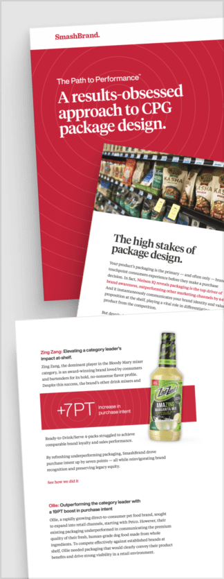
Path to Performance™
Taking a results-obsessed approach to CPG package design.
Discover how SmashBrand’s proprietary process, rooted in scientific principles, informed by data, and validated by your target audience, eliminates the guesswork from package design and delivers guaranteed results.
How white space supports a shopper-centric approach.
Shoppers make lightning-fast decisions, often with limited attention and plenty of distractions. White space becomes a strategic tool in this high-pressure environment because it works. By reducing cognitive load, white space enables shoppers to process what matters more quickly.
Instead of cluttered layouts packed with competing claims, white space separates key information, allowing visuals and words to land with greater clarity. This is where our methodology proves its worth.
We use PREformance Pack Word Testing to reveal how spacing impacts comprehension and retention of key claims. We’ve found that fewer words, when surrounded by ample white space, outperform dense messaging in both attention and clarity metrics. Our PREformance category baseline testing further confirms this.
Brands that use white space to simplify communication consistently achieve higher scores in shoppability and purchase preference. When your packaging makes it easier for shoppers to think less and choose faster, you win.

Nice Package
Don’t miss out on our monthly newsletter Nice Package!
Each month, we deliver a data-driven newsletter directly to your inbox, unpacking a critical topic in the FMCG & CPG industry.
"*" indicates required fields

A seasoned veteran in the CPG (Consumer Packaged Goods) industry, Jason Vaught brings a wealth of knowledge and hands-on experience as the director of content and marketing for SmashBrand. His comprehensive role at the forefront of brand communication ensures that CPG brands remain well-informed about the suite of services SmashBrand offers. Furthermore, his insights derived from the company's strategy, design, and testing services are invaluable to brand owners and managers seeking expert guidance.
From his early endeavors in launching a successful sports nutrition brand that gained prominence in significant bodybuilding and fitness retail spaces to his entrepreneurial ventures in kick-starting multiple brick-and-mortar and e-commerce startups across diverse industries, Jason's career is studded with substantial milestones. Notably, he has innovated numerous products later embraced by leading industry brands, showcasing his knack for anticipating market demands and setting trends.
Jason's journey in the CPG industry commenced at age 21. Over the years, he has worn multiple hats, ranging from a manufacturer and retailer to a distributor and brand owner. This multifaceted experience equips him with the rare ability to offer practical advice grounded in real-world expertise. His mission is to guide and support other CPG brand owners, directors, and managers on their path to success.
Subscribe to
Nice Package.
SmashBrand’s Nice Package: Stay current with our latest insights
Free Resource.

CPG product repositioning guide.
Explore the five undeniable signs your CPG product needs repositioning along with strategies for leveraging consumer insights for a guaranteed market lift.
Download Whitepaper About CPG product repositioning guide.