You’ve just invested thousands of dollars in premium organic dog treats, convinced you’ve created the perfect product, only to watch competitors with inferior ingredients outsell you 10-to-1. Their secret isn’t a better formula; it’s their dog treat packaging design that grabs a busy pet owner’s attention and instantly conveys a premium choice.
This painful reality hits thousands of pet business owners every year. You know your treats are superior. Your ingredients are cleaner, your recipes are more nutritious, and your quality is unmatched. Yet your sales numbers tell a different story, and you’re left wondering why pet parents keep walking past your products to grab the flashy packages next to yours.
In this article, you’ll uncover the specific dog treat packaging design strategies that turn overlooked products into bestsellers. You will learn about the critical design pillars of successful pet treat packaging and how subtle psychological triggers can influence pet parents’ choices, leading them to select your treat over cheaper alternatives. By the end, you will have a clear roadmap for crafting dog treat packaging that genuinely reflects the exceptional product inside.
How to Make Your Dog Treat Packaging Design Stand Out.
Don’t let your dog treat become just another clone competitor lost in generic packaging boxes. When every pet treat vies for attention with the same flat layouts and lifeless color schemes, your offering needs a bold break from the pack. Swap one-size-fits-all packaging solutions for custom packaging that tells your brand’s story, whether it’s luxe pouch packaging or handy dog treat packaging bags built around your signature look.
Too often, brands rely on off-the-shelf packaging materials and templated food packaging designs that send shoppers straight past their product without a second glance. Instead, select thoughtful packaging boxes or bags with premium textures, windows to showcase authentic, appetizing bites, and a hierarchy that highlights your core benefits, such as high-protein recipes or “no added fillers” at first glance.
But functionality alone won’t spark loyalty. Pet owners crave an emotional connection as much as they demand resealable zippers or sturdy barrier films. Great pet treat packaging bridges that gap: lead with compelling ingredient photography or warm illustrations of joyful pups, then guide the eye to clear call-outs of nutritional perks.
Critical design pillars of dog treat packaging design.
In the competitive pet food industry, your packaging must effectively convey your brand’s promise, capture the attention of dog owners, and address all packaging needs across various materials and formats. Whether you’re working on a coffee packaging–inspired rigid box or a flexible packaging pouch for homemade dog treats with high-definition digital printing, these critical design pillars form the blueprint for perfect packaging that elevates your pet product above similar products.
Logo treatment.
Your logo is the first element a dog owner spots when scanning the shelf of pet product offerings or comparing related products online. In the pet food industry, versatility is non-negotiable:
- Horizontal / Vertical Lockups: A horizontal logo lockup works beautifully across wide pouch formats, while a vertical “puzzle-piece” configuration fits neatly on tall packaging boxes. This flexibility ensures your mark performs equally well on flexible packaging films or digital printing plates.
- Size Variations: Test scaled-down versions for trial-size dog treat bags and larger lockups for family-size pouches. Whether embossed on foil laminate, debossed onto kraft material, or printed in vibrant hues on custom dog-treat packaging, your logo must remain legible and distinctive.
- Puzzle-Piece Assets: Break your logo into modular elements that can recombine across SKUs and related products. This custom dog branding approach allows you to create unique layouts while maintaining instant recognition.
Color and tier differentiation.
Color & tier differentiation transform your packaging from a static wrapper into an intuitive guide, drawing the eye and signaling the right product for every dog owner. By marrying vibrant, taste-triggering palettes with a consistent coding system, you create packaging solutions that resonate instantly.
Rich tomato reds, golden yellows, and deep forest greens instantly evoke flavor profiles of beef, chicken, and veggie while tapping into pet treat packaging design trends that favor vivid, mouthwatering visuals. When these palettes are applied to your chosen packaging material, they set off instant appetite cues. In structural packaging design, color can wrap seamlessly around a stand-up pouch or contour to a custom-shaped box, creating a cohesive brand presence.
For custom packaging design ideas, consider gradient fades that mimic real cooking processes (like the caramelizing of chicken) or duo-tone finishes that pair a vibrant background with a neutral foreground. This approach ensures your custom dog treat packaging stands out both in-store and online. A dependable color system lets shoppers navigate your line-up without a second thought. Likewise, differentiate life stages (puppy, adult, senior) with a secondary accent band.
Imagery and iconography.
With your logo treatment and color-tier system firmly in place, the next pillar brings your package of dog treats to life, blending appetite appeal with instant recognition. By pairing mouth-watering photography with a suite of clear, branded flavor icons, you’ll guide every dog owner’s eye and drive purchase intent.
Capture high-resolution images of your pet treats staged in real-world settings; think a rustic bowl of crunchy biscuits or a close-up of a single treat against the printed pouch packaging. These photos should highlight texture, color, and ingredient quality, making your dog food packaging feel as fresh as the treats inside. To validate which compositions resonate most, include these shots in a PREformance packaging design test and analyze heat maps or pin-drop studies.
Complement photography with a streamlined set of illustrated icons. Bundle them into your brand activation toolkits to guarantee every touchpoint speaks with the same visual shorthand. This dual approach ensures shoppers immediately recognize both the flavor and the quality promise behind each pet treat.
Texture, finish, and windows.
Elevating your dog treat packaging from “seen” to “felt” builds an instant perception of quality before a single word is read. Consider these material and finish treatments:
- Metallic Accents: Foil stamping or spot UV on brand marks and flavor icons adds a luxe shimmer that catches light, ideal for top-tier lines.
- Craft-Paper Textures: A matte, uncoated kraft stock conveys a natural, wholesome image, ideal for brands that emphasize organic or homemade products, such as dog treats.
- Slate & Soft-Touch Coatings: A soft-touch laminate on pouch packaging or rigid boxes provides a velvety hand feel that suggests indulgence.
Choosing between a transparent window or a stylized rendering depends on product form and brand storytelling goals:
| Feature | Product Windows | Contextual Renderings |
| Best For… | Visually appealing treats (freeze-dried bites, chunky biscuits) where texture drives appetite appeal. | Products with toppings or mixed textures that may settle unpredictably in a window (e.g., layered bars). |
| Emotional Impact | It builds immediate trust, and pet owners see precisely what they’re buying. | Delivers aspirational lifestyle cues (e.g., treats in a bowl beside a happy pup) to evoke warmth and joy. |
| Design Considerations | Requires precise die-cut and film alignment; choose barrier films that maintain product freshness. | Leverages high-res food photography and graphic overlays; ideal for custom dog treat packaging with brand scenes. |
| Use Case | “Grab-and-go” pouch packaging where transparency is a key selling point. | Premium gift packs or gift-box-style packaging boxes where a controlled composition enhances brand storytelling. |
Define your brand’s essence and your audience’s needs.
Every bag of treats must feel like an invitation to a moment of joy, for your brand and the pet owner. Start by distilling your core attributes into a clear promise: fresh, premium, modern, natural.
Ask yourself: when someone sees your pet treat packaging on the shelf, what single feeling or idea should they walk away with? Write down three adjectives that capture your vision (e.g., “artisan, clean-label, playful”) and let them guide every choice from color palette to copy tone.
On the heart side, tune into the pet owner’s desire for a nurturing bond: imagery of happy pups, soft illustrations, or a “dog-POV” peek through a pouch window. These drivers tap into love, trust, and the joy of shared moments.
On the head side, zero in on nutrition and safety: bold call-outs like “high-protein recipe,” clear ingredient icons, and visible seals that signal freshness. By mapping these “heart” and “head” needs, you’ll ensure your packaging speaks directly to both impulse and logic.
| Step | Action Items |
| Translate Essence into Graphic Design | Brief your design team on core adjectives (fresh, premium, modern, natural). Define color codes and typography that feel modern yet approachable. |
| Lock in Your Logo Design | Test variations of size, placement, and holding shapes on mock-up dog treat bags. Ensure the logo scales well across both rigid packaging boxes and flexible packaging. |
| Choose Your Packaging Option & Material | Compare pouches, boxes, and dog treat packaging bags in terms of shelf impact, cost, and barrier needs. Select packaging material (kraft, foil laminate, transparent film) that preserves freshness and aligns with your “natural” promise. |
| Define Structural Specs for Flexible Packaging | Specify laminate layers, zipper options, and gusset dimensions. Outline how a window or matte finish will showcase authentic bites and reinforce trust. |
| Detailed Functionality & Messaging | Map where to place KSPs (e.g., “grain-free,” “no added fillers”) so they’re instantly legible. Carve out space for small icons or a call-out that guides shoppers to learn more online. |
| Prototype & Validate | Produce small-run samples of your chosen packaging option. Gather feedback from real pet owners on clarity, emotional pull, and shelf standout. |
Messaging and information hierarchy.
An impactful dog-treat package is a roadmap that steers the pet owner’s attention to exactly what matters. By structuring information from most to least critical and pairing it with a clean, purposeful design, you ensure every glance delivers clarity and confidence.
Front-of-pack (PDP) priorities.
- Brand First: Position your logo at the top or upper corner in a way that is instantly recognizable. Consistent placement and scale across SKUs reinforce trust and make your line unmistakable on the shelf.
- Flavor Spotlight: Just below the logo, feature the flavor name in a bold, readable font; consider options like “Roasted Chicken Bites” or “Garden Veggie Crunch.” Pair it with a quick icon or small product shot to cement the taste promise.
- 3–5 Key Selling Points (KSPs): Lay out your most compelling benefits in a tidy bullet list or mini-grid. This bite-sized format lets busy shoppers scan features in a heartbeat.
- Tier Identifier Without Shouting: Use a subtle badge or accent color to denote the tier, such as a small corner flag or an under-logo ribbon. It’s clear and consistent but never competes with your core brand or flavor messaging.
Back and side panels.
- Ingredient Call-Outs: Highlight standout ingredients using small icons or ingredient snapshots. It reinforces quality and transparency.
- Nutrition Facts: Present the guaranteed analysis in a legible table, separated by ample white space.
- Brand Story: Craft a concise narrative about your mission. It builds an emotional connection without overcrowding the front.
- Subscription/Bundle Info: Include details about auto-delivery or multipack savings in a discrete call-out at the bottom or side, using a smaller font or icon.
Clutter-busting tips.
- Embrace White Space: Give each element room to breathe. Generous margins and padding around text blocks prevent visual fatigue.
- Establish a Font Hierarchy: For example, Large, bold sans-serif for headlines (brand/flavor) and medium weight, easy to scan for KSPs
- Use Simple Icons: Replace lengthy text with clear, consistent iconography for ingredients, certifications (e.g., “gluten-free”), or usage instructions.
- Limit Typefaces: Stick to two complementary fonts to maintain a cohesive and readable design.
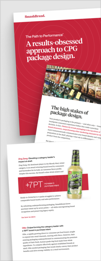
Path to Performance™
Taking a results-obsessed approach to CPG package design.
Learn how SmashBrand’s proprietary process, rooted in scientific principles, informed by data, and validated by your target audience, takes the guesswork out of package design and delivers guaranteed results.
Ensuring Scalability & Brand Consistency.
As your dog-treat line grows from a single pouch to a full pantry of flavors, formats, and seasonal specials, a one-off design won’t cut it. You need a living system, a modular visual language, that guarantees every new SKU looks unmistakably “yours,” whether it’s a trial sachet or a gift-box bundle.
Establish a modular visual language.
Define a consistent palette, typography, logo lockups, iconography, and pattern treatments. Think of these as your building blocks: a stripe for your “Pro” tier, an icon style for flavor calls, and a color accent tied to each life stage.
Create master layouts for every format, allowing designers and printers to easily insert new imagery and copy without needing to reinvent the structure. Document clear dos and don’ts in your brand style guide to prevent creative drift.
Adapt seamlessly across formats.
Leverage your flexible packaging system so that the same logo lockup, KSP grid, and window placement work on a 1-oz trial pack as well as a 10-lb family-size bag. Translate those pouch principles onto flat-panel or multi-panel cartons without losing impact.
Whether you’re rolling out holiday-themed custom packaging or co-branded gift tins, the modular system lets you swap hero imagery and accents while retaining recognizability.
Build a flexible asset library.
Store logos, icons, color swatches, die lines, and mock-ups in a shared digital hub (e.g., cloud-based DAM). Tag assets by format, tier, and use case so anyone can easily retrieve exactly what they need. Bundle approved assets into brand activation toolkits and pre-formatted templates for designers, copywriters, and co-packers.
Include “locked” files for key elements (logo, tier badge) and “editable” files for call-outs and images. When you refine an element (such as tightening your icon stroke for better legibility), push the update to all live templates. A clear changelog in your guide ensures that every new package of dog treats launches with zero guesswork.
Nice Package
Don’t miss out on our monthly newsletter Nice Package!
Each month, we deliver a data-driven newsletter directly to your inbox, unpacking a critical topic in the FMCG & CPG industry.
"*" indicates required fields

A seasoned veteran in the CPG (Consumer Packaged Goods) industry, Jason Vaught brings a wealth of knowledge and hands-on experience as the director of content and marketing for SmashBrand. His comprehensive role at the forefront of brand communication ensures that CPG brands remain well-informed about the suite of services SmashBrand offers. Furthermore, his insights derived from the company's strategy, design, and testing services are invaluable to brand owners and managers seeking expert guidance.
From his early endeavors in launching a successful sports nutrition brand that gained prominence in significant bodybuilding and fitness retail spaces to his entrepreneurial ventures in kick-starting multiple brick-and-mortar and e-commerce startups across diverse industries, Jason's career is studded with substantial milestones. Notably, he has innovated numerous products later embraced by leading industry brands, showcasing his knack for anticipating market demands and setting trends.
Jason's journey in the CPG industry commenced at age 21. Over the years, he has worn multiple hats, ranging from a manufacturer and retailer to a distributor and brand owner. This multifaceted experience equips him with the rare ability to offer practical advice grounded in real-world expertise. His mission is to guide and support other CPG brand owners, directors, and managers on their path to success.
Subscribe to
Nice Package.
A monthly newsletter that unpacks a critical topic in the FMCG & CPG industry.
Free Resource.

CPG product repositioning guide.
Explore the five undeniable signs your CPG product needs repositioning along with strategies for leveraging consumer insights for a guaranteed market lift.
Learn More About CPG product repositioning guide.