Walk through any retail aisle and you’ll see it happen in real time: a consumer pauses mid-stride, eyes locked on a single product among dozens. That quick stop, that unconscious lean-in, is when excellent household packaging design turns passive browsing into active buying. It creates a visual and emotional hook that speaks directly to the need, trust, and desire.
This article dives into what it takes to craft household product packaging design that drives shelf impact. We’ll cover the nuances of logo design, naming strategies, packaging material choices, and how the best packaging designers align with today’s recycling expectations and rising concerns around packaging waste.
Whether you rethink plastic packaging or refine your product packaging for better consumer recognition, you’ll discover insights to sharpen your brand’s edge. You will also learn what innovative brands are doing differently that turns them into industry leaders.
The science of shelf impact.
Shelf impact means how effectively a product grabs attention, communicates value, and converts consideration into purchase, all within a short time window at retail. Consumers scan the household category, like cleaners, when they shop. This is where behavioral science comes into action. Shoppers rely on visual shortcuts: bold graphics, intuitive layouts, and recognizable brand cues to guide their choices.
Products that visually connect to the “job to be done,” like showing a sparkling surface or an easy “spray and done” cue, are more likely to be picked up. This quick-scan behavior means your package design has to do the heavy lifting instantly.
Here’s what matters:
- Surface relevance: If it’s a tile cleaner, show tile. If it’s for outdoor grime, show the result.
- Design simplicity: Complex layouts or overloaded claims slow consumers down, and confusion kills conversion.
- Packaging format: Whether it’s rigid plastic packaging for strength, flexible packaging for ease, or child-resistant packaging for safety, structure reinforces the message.
Shelf performance varies by packaging type.
Custom food packaging highlights freshness or function (like resealability), which drives trust and trial. Similarly, sustainable packaging, especially formats that reduce plastic waste or simplify recycling, can be a key decision driver for eco-conscious shoppers, but only if communicated clearly and visually.
This is one of the main reasons why we at SmashBrand test packaging before it hits the shelves. We validate its effectiveness in contextual environments that simulate real-world shopping. This means side-by-side with competitors, with price tags and distractions. Packaging competes, communicates, and converts under pressure.
A great packaging designer knows that winning at shelf requires more than just aesthetic appeal. It combines strategic clarity, behavioral insight, and market-tested creativity.
Visual cues that convert in the household category.
Packaging is your first and only chance to win the consumer. Buyers’ decisions are guided more by instinct than analysis. That means your packaging must instantly communicate what the product is, what it does, and why it’s better, all without saying a word. The right visual cues can trigger trust, clarity, and purchase intent. The wrong ones? Confusion and hesitation.
Let’s break down the visual strategies that drive real conversion in competitive, fast-moving categories like household products and packaged food.
After imagery wins over lifestyle vibes.
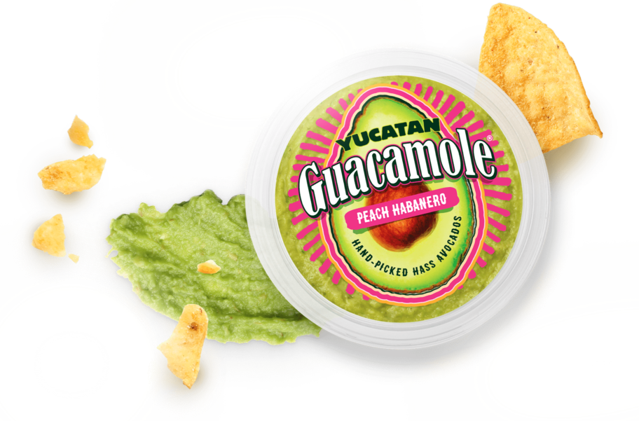
Consumers shopping for household products aren’t looking for inspiration. They’re looking for proof. Bright, clean “after” imagery acts as immediate visual validation. It tells the shopper: “This works.” In contrast, generic lifestyle visuals often confuse or dilute product relevance. A sparkling patio, a gleaming bathroom tile, or a restored deck communicates effectiveness faster than any claim. For both household and packaged food categories, visual clarity beats emotional abstraction.
Sparkles, surface cues, and color contrast.
Sparkle graphics can do more than look clean; they signal high performance. In household products, subtle sparkle overlays or glints can elevate perceived efficacy. Coupled with strong color contrast and surface-specific thumbnails (wood, tile, siding), these visuals enable rapid scanning.
This is critical given how fast consumer behavior shifts in-aisle. Color contrast also reinforces brand differentiation across SKUs while helping consumers instantly match the product to their intended surface, without needing to stop and read.
Layout, logo, hierarchy, and design balance.
Effective package design is as much about what you leave out as what you include. Balanced layouts improve legibility. Prominent logos build brand memory across touchpoints. A clear design hierarchy supports fast comprehension. A good layout communicates function and safety without cluttering the visual field, especially for custom and child-resistant categories. In the packaging industry, shoppability is a critical requirement.
Dark colors signal premium performance.
Insight from real testing shows that darker color palettes, such as indigo, charcoal, or black, create a premium perception. This cue is especially effective when brands want to signal “pro” quality or introduce a premium line. It’s been proven in both household and packaged food categories. Dark hues combined with glossy finishes or metallic accents elevate trust. This is also a great cue when using sustainable packaging with recyclable material or recycled plastic; it visually reinforces durability and value while aligning with sustainability goals.
Design beyond aesthetics.
Consumers want packaging that aligns with their values. Packaging made with recyclable material or reduced plastic is only effective if the design highlights those benefits. For instance, a household cleaner bottle from recycled plastic should visually emphasize its eco benefits without compromising shelf impact. Sustainability must be built into the storytelling, not just the structure. When done well, sustainable packaging can convert without creating confusion.
Messaging that wins in the 3-second window.
The messaging on your bottle packaging design must be concise, compelling, and prioritized to guide instant decisions. It isn’t effective to say your product is “effective.” Your claims must be specific, tangible, and visually organized. A cluttered label with five equally loud messages creates confusion. Great graphic design and a smart messaging hierarchy lead the eye intuitively: product purpose first, benefit second, reinforcement third.
For example, in household packaging waste reduction campaigns, clarity is commercial. Consumers want to see “made with 50% recycled content” or “uses sustainable materials,” which are not vague corporate buzzwords. This principle applies to laundry pods and box packaging design..
When comparing two claims, like “visible results in minutes” vs “2x stronger,” the former wins. Why? It paints a picture. It gives a timeframe, a promise, and a mental image of the result. “2x stronger” leaves questions: stronger than what? For how long? How does that help me?
In the cleaning products space, speed and certainty outperform abstract superiority. Strong claims are rooted in outcomes, not technicalities. The same holds for household chemicals, and the performance of laundry pods must be personal.
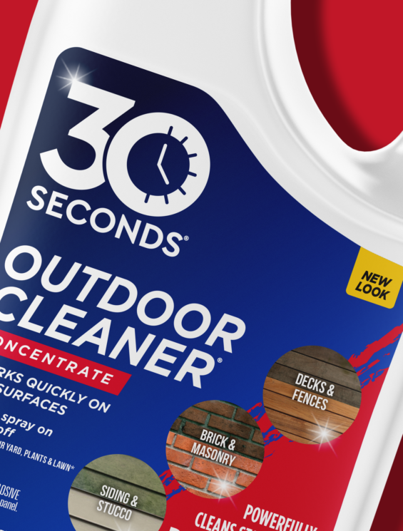
Literal brand names, like “30 Seconds,” can work, but only if supported with context. They can mislead or confuse without clever graphic design and proper supporting claims. If “30 Seconds” doesn’t clearly explain what happens in 30 seconds, consumers may assume it overpromises.
Common household packaging design pitfalls.
Even small packaging mistakes can derail product performance in FMCG, where shelf decisions happen in split seconds. Whether you’re designing for cleaning supplies, supplements, or snacks, avoiding these common pitfalls is necessary to build consumer trust and drive conversion.
Mismatched claims erode trust.
When on-pack claims overpromise or, worse, contradict visual cues or results, they damage credibility. For instance, saying “cleans in 30 seconds” while showing results that take longer creates skepticism. Labeling a product as “eco-friendly” without aligning the recycling process or materials used misleads shoppers looking for environmentally responsible options.
This is especially important in categories like child-resistant packaging, where trust and safety claims must be airtight and supported visually. Consumers expect consistency between benefit statements and reality; mismatches quickly trigger doubt.
Overloaded front-of-pack designs confuse.
Trying to communicate too much on the front of the package backfires. Overcrowded layouts with multiple competing claims, certifications, and icons create cognitive overload. This is a common mistake in FMCG packaging design, especially when brands attempt to cram in every possible selling point without prioritizing.
The most effective palette packaging design systems use restraint: a clear headline claim, visible product benefit, and a supporting visual. These elements should be visually balanced and harmonized with the rest of the pack, not fighting for attention.
Poor product differentiation within the brand line.
When consumers can’t easily distinguish between SKUs like lemon vs. citrus scent, or degreaser vs. mold remover, they make errors or abandon the purchase. This happens when packaging design lacks a clear visual system: inconsistent color cues, vague iconography, or identical names with minimal variations.
To avoid this, perfect packaging doesn’t just look good; it provides instant clarity across product variants. Using consistent types of packaging (like bottle shapes or label zones) along with thoughtful palette packaging design ensures every SKU is visually distinct but connected to the parent brand.
Misinterpreted brand names or SKU labels.
Literal or metaphorical brand names can be misunderstood if not handled carefully. For example, a name like “Rapid Clean” could imply speed but deliver a slower effect, causing disappointment. Ambiguity in SKU naming, like “Ultra Pro” vs “Pro Ultra,” adds to confusion, especially in crowded categories with dozens of similar products.
Clear, strategic naming must be part of your FMCG packaging design framework. Avoid cleverness that lacks clarity. Ensure that brand names and individual SKUs are visually and linguistically distinct, supported by a smart hierarchy and an intuitive design.
Designing for shelf and beyond.
In the packaging sector, success isn’t defined solely by what happens on the shelf; it’s about what happens before, during, and after the purchase. Packaging must perform visually, functionally, and emotionally at every touchpoint. That starts with a disciplined design process and a tightly aligned creative brief.
Here’s what it takes to create packaging that drives performance from first glance to final use.
Consistent brand assets build recognition everywhere.
Consistent use of brand assets like logo treatment, graphic motifs, and typographic style reinforces credibility and strengthens identity across physical and digital environments. Whether consumers see your cleaning products in-store, on an e-commerce page, or in a social ad, they should immediately connect them to the same trusted source.
For example, in baby food product packaging design, repetition of calm, rounded icons and soft color palettes across labels, shippers, and online thumbnails increases trust and reduces decision friction for parents. This principle applies equally to categories like structural packaging design for household or cleaning products, where visual continuity drives confidence and memorability.
Format cues signal strength and ease.
Your packaging’s format, whether a trigger spray, squeeze bottle, or compact pouch, conveys specific value propositions before any words are read. Larger bottle sizes suggest power and volume, while smaller, ergonomic formats suggest convenience or single-use portability.
In cleaning products, for instance, a heavy-duty trigger spray in a wide-base bottle implies industrial strength, while a sleek, narrow format suggests a quicker, less intensive solution. These format cues are a silent but powerful communication layer within your structural packaging design. The graphic designer and structural engineer must work in sync to ensure that functionality enhances the product’s emotional and practical promise.
Packaging performance begins before first use.
Excellent packaging doesn’t wait until the consumer opens the bottle to start working. It begins on the shelf at first glance and continues to perform long after: sitting on countertops, being shared in content, refilled, or recycled.
The design process must consider lifecycle behavior, not just visual impact. Packaging must support easy handling, storage, and sustainable disposal, especially when consumers demand transparency and eco-responsibility. Even the structural and graphic design choices made during the early stages of the creative brief can impact whether a consumer feels the packaging has ongoing functionality or is just wasteful excess.
Path to Performance™
Taking a results-obsessed approach to CPG package design.
Learn how SmashBrand’s proprietary process – rooted in scientific principles, informed by data, and validated by your target audience – takes the guesswork out of package design and delivers guaranteed results.
Ready to make packaging work harder?
If you’re ready to take a more innovative approach to packaging, we’re here to talk. SmashBrand is a data-driven brand development and packaging design agency. With PREformance Purchase Intent Testing and our PREformance Packaging Design Test, we help brands confidently remove the guesswork and design before anything hits the shelves. Let’s create packaging that not only looks good, but also performs. Contact us today!
Nice Package
Don’t miss out on our monthly newsletter Nice Package!
Each month, we deliver a data-driven newsletter directly to your inbox, unpacking a critical topic in the FMCG & CPG industry.
"*" indicates required fields

A seasoned veteran in the CPG (Consumer Packaged Goods) industry, Jason Vaught brings a wealth of knowledge and hands-on experience as the director of content and marketing for SmashBrand. His comprehensive role at the forefront of brand communication ensures that CPG brands remain well-informed about the suite of services SmashBrand offers. Furthermore, his insights derived from the company's strategy, design, and testing services are invaluable to brand owners and managers seeking expert guidance.
From his early endeavors in launching a successful sports nutrition brand that gained prominence in significant bodybuilding and fitness retail spaces to his entrepreneurial ventures in kick-starting multiple brick-and-mortar and e-commerce startups across diverse industries, Jason's career is studded with substantial milestones. Notably, he has innovated numerous products later embraced by leading industry brands, showcasing his knack for anticipating market demands and setting trends.
Jason's journey in the CPG industry commenced at age 21. Over the years, he has worn multiple hats, ranging from a manufacturer and retailer to a distributor and brand owner. This multifaceted experience equips him with the rare ability to offer practical advice grounded in real-world expertise. His mission is to guide and support other CPG brand owners, directors, and managers on their path to success.
Subscribe to
Nice Package.
A monthly newsletter that unpacks a critical topic in the FMCG & CPG industry.
Free Resource.

CPG product repositioning guide.
Explore the five undeniable signs your CPG product needs repositioning along with strategies for leveraging consumer insights for a guaranteed market lift.
Learn More About CPG product repositioning guide.