Rebranding case studies are undoubtedly a goldmine of knowledge for businesses looking to reinvent themselves. They provide real-world examples of how companies have successfully navigated the complex terrain of rebranding. These case studies provide an in-depth examination of the creative solutions and strategic decisions behind the rebranding efforts of various companies, ranging from the bold to the subtle, and the outcomes that followed.
This article examines various rebranding case studies, highlighting their pre- and post-rebranding statuses and providing insights into the lessons to be learned from their strategies. You will learn how companies like Old Spice develop their brand strategy in response to market trends and what makes it successful.
Whether driven by market demands, a shift in company vision, or the need to differentiate in a saturated marketplace, these rebrand case studies illuminate the path to a successful brand transformation and its significant impact on a company’s trajectory. So let’s get into it and
The Essence of Rebranding
Rebranding is a strategic process of transforming a brand’s identity. The primary objective of this step is to align the company’s identity with its evolving goals, market conditions, and customer expectations. It’s not merely a facelift; rebranding reaches deep into a brand’s soul, reshaping perceptions and revitalizing its public face.
The essence of rebranding lies in its power to signal change, to tell a new story about who the brand is, what it stands for, and why it matters in the lives of its customers. It’s a decision that comes to life through a series of calculated steps, each designed to ensure that the new brand identity resonates with the heart of the business and its audience.
Brand strategy leads the charge, creating a narrative that captures the brand’s renewed vision and values. Brand management then takes the helm, steering the brand through the intricate waters of change, ensuring every touchpoint reflects the new direction.
Why rebranding? It’s a question of relevance and resonance. In an ever-shifting marketplace, rebranding is the art of staying ahead and remaining connected to the pulse of consumer desires and industry trends.
Red Gold’s Canned Tomatoes
Red Gold, one of the famous Canned tomato brands, struggled due to high competition. Despite the high quality of their tomatoes, they weren’t capturing the attention they deserved on shelves. Their packaging was not resonating, particularly with millennial moms—a segment critical for market share growth. Competitors like Rotel, Hunt’s, and Heinz were edging out Red Gold, showcasing more modern branding that appealed to contemporary consumers.
The Rebranding Strategy
Red Gold pinpointed millennial moms as their key demographic, recognizing these consumers’ preference for quality ingredients paired with eye-catching designs. To connect with this audience, Red Gold introduced “Tomato Love,” a sub-brand crafted to embody authenticity, quality, and the joy of family meals.
They revamped their packaging, swapping out the old look for vibrant colors and a heart motif that signified their dedication to producing top-notch tomato products. This new design wasn’t just based on a hunch; Red Gold conducted six rounds of rigorous consumer testing to ensure their new image would resonate with their target audience and drive purchase decisions.
After the Rebrand
The rebranding efforts paid off handsomely for Red Gold, doubling sales in the first three months following the rebrand. Consumer purchase intent increased by 148%, indicating a strong connection with the new brand image.
Moreover, the “Tomato Love” sub-brand gained national recognition, being picked up by Kroger stores across the country, thus cementing its success. Red Gold’s strategic rebranding rejuvenated its image and significantly boosted its market presence and brand recognition.
Todd’s Better Snacks
Todd’s Better Snacks reached a pivotal moment when they realized their brand awareness and positioning were not hitting the mark. Despite offering quality snacks, they couldn’t fully connect with their customers or stand out in a crowded marketplace.
To remain competitive and appeal to health-conscious consumers, Todd’s recognized the need to reevaluate their brand’s appeal and how they communicated their commitment to better-for-you snacks.
The Rebranding Journey
With a clear goal to amplify their presence, Todd’s Better Snacks embarked on a rebranding journey. They crafted a brand strategy to redefine their visual identity and strengthen their market position. The branding case study of Todd’s Better Snacks illustrates how they approached this transformation.
The company focused on a design that would resonate with its target demographic and articulate the brand’s values. By aligning their packaging and messaging with the lifestyle of their audience, Todd’s Better Snacks aimed to create a more memorable and appealing brand experience.
Measuring the Impact
The actual test of any rebrand lies in its impact on the market. Brand management and communication were key in rolling out the new brand identity for Todd’s Better Snacks. They closely monitored how the rebrand influenced brand recognition and sales.
Rebranding Success stories emerged as the products hit the shelves, with early indicators showing a positive consumer response and an uptick in sales. By effectively managing their brand’s evolution, Todd’s Better Snacks demonstrated that a thoughtful rebrand could lead to significant gains in a competitive industry.
Jar Joy’s Rebrand
Jar Joy faced difficulty creating a significant market share, especially as a small business with ambitious goals. The challenge was to stand out in a crowded marketplace and effectively communicate their company name and brand message to consumers, persuading them to choose Jar Joy’s over established brands.
The Rebranding Solution
In response to these challenges, Jar Joy took a creative leap in rebranding efforts. They focused on refining their brand identity, ensuring it would stand out on the shelves with an innovative packaging design that promised to catch the eye of shoppers.
The rebranding wasn’t just cosmetic; it aimed to elevate their products’ perceived taste and flavor. By leveraging branding services, Jar Joy’s embarked on a journey to retain their shelf position, enhance it, and increase product trials.
After the Rebrand
The results of Jar Joy’s rebranding were nothing short of remarkable. The strategic overhaul led to a significant increase in brand recognition, securing a more substantial presence in Costco and other national retailers. It is evidenced by an impressive 183% increase and a 33-point rise in market appeal.
This rebranding success story is a testament to the power of well-executed brand strategy and its potential to transform a small business into a competitive force in the retail landscape.
Evamor
Initially, evamor’s brand identity was rooted in its unique offering of pure alkaline water. Still, its brand positioning needed to be more distinct to stand out in the competitive bottled water market.
While the brand had a story to tell, it struggled to make a significant impact against giants like Essentia, Fiji, Evian, and CORE Hydration. Evamor required a refreshed brand strategy highlighting its unique identity and resonating with health-conscious consumers.
The Rebranding Initiative
Evamor’s rebranding strategy was carefully crafted to redefine its brand architecture and strengthen its market position. The company embarked on a data-informed ‘Path to Performance’ strategy, which included a comprehensive packaging redesign.
This initiative was about aesthetic enhancement and creating a cohesive narrative that encapsulates the brand’s essence and effectively communicates its values. The goal was to create a visual identity that would capture consumers’ attention and convey the purity and health benefits of Evamor’s alkaline water.
Rebranding Results
The rebranding process had a transformative effect on Evamor’s market presence. The new packaging and refined brand awareness strategies increased market share as the products began to stand out on the shelves and attract more consumers.
The successful rebranding of Evamor also demonstrated that even in a market dominated by established players, a well-executed brand revamp could yield significant returns. While the cost of rebranding can be substantial, the investment paid off for Evamor proves that a strategic approach to branding can lead to tangible success in a crowded marketplace.
Ollie
In this brand strategy case study, Ollie, like many small businesses in the pet industry, recognized the need to evolve its brand positioning to keep pace with a dynamic market. As a top DTC pet brand, Ollie’s market presence was strong, but the transition to physical retail necessitated a strategic rebrand to maintain and grow its market share.
Crafting a New Identity
Ollie’s rebranding initiative involved a thoughtful approach to creating a new brand identity that would resonate with consumers in a retail environment. Developing a new logo and a refreshed visual identity was central to this process, ensuring that Ollie’s products would attract attention and effectively communicate the brand’s values on the crowded shelves of physical retailers.
Rebrand Success Metrics
The success of Ollie’s rebranding can be measured through enhanced brand recognition and improved brand communication, which were crucial in driving customer engagement and sales. The rebranding success stories are quantified by a 4x increase in purchase intent and securing prime Petco real estate, including end-cap positions and dedicated in-store displays, leading to a 54-point and 378% increase in purchase intent. These metrics underscore the effectiveness of Ollie’s rebrand in the competitive pet industry landscape.

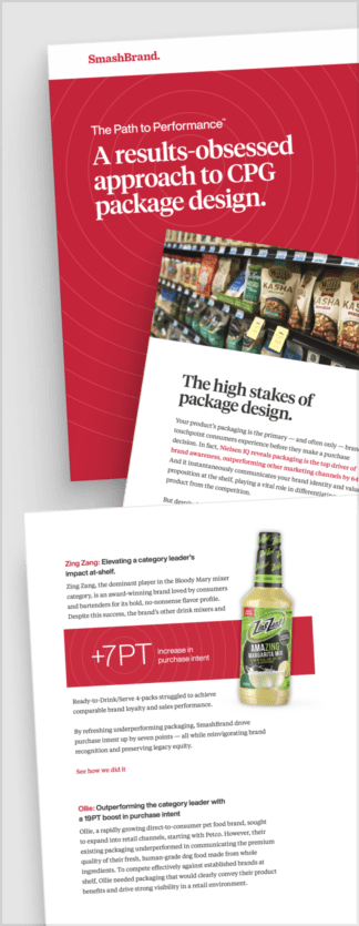
Path to Performance™
Taking a results-obsessed approach to CPG package design.
Discover how SmashBrand’s proprietary process, rooted in scientific principles, informed by data, and validated by your target audience, eliminates the guesswork from package design and delivers guaranteed results.
"*" indicates required fields
Tropicana
Before the rebrand, Tropicana’s packaging was iconic, featuring an orange with a straw sticking out, effectively communicating the brand’s message of fresh and natural juice directly from the fruit.
The post-rebrand packaging design was a stark departure from this familiar imagery. The new design aimed to modernize the brand but ended up stripping away the visual elements that customers had come to associate with Tropicana’s identity.
The Rebrand Backlash
The rebranding of Tropicana serves as a pivotal rebranding example and branding case study in understanding the importance of brand equity and customer attachment to visual identity.
The backlash from the public was swift and severe, with customers and critics alike voicing their discontent. This adverse reaction became a significant public relations challenge for Tropicana, as the new packaging design led to a dramatic drop in sales and a public outcry that could not be ignored.
The Course Correction
Tropicana’s response to customer feedback exemplifies proactive brand management and the flexibility required in an effective brand strategy. The company quickly acknowledged the misstep and reverted to its original packaging design.
This decision directly resulted from listening to their customers and understanding their emotional connection with the brand’s traditional imagery. It indicates the risks of rebranding without carefully developing a working strategy.
Johnson and Johnson Rebrand
This rebranding case study examines how Johnson and Johnson faced significant challenges in public relations and needed to restore brand trust after several publicized incidents.
The company’s response to these incidents is a critical lesson in the benefits of rebranding. By addressing the issues head-on and communicating transparently with the public, Johnson and Johnson worked to rebuild the trust that had been eroded.
A Strategic Approach
The rebranding strategy was multifaceted, involving a comprehensive review of their brand management practices and brand architecture. The rebranding launch was carefully planned to communicate the company’s commitment to safety, quality, and transparency. This approach was essential in re-establishing the company’s reputation and reassuring consumers and stakeholders of its dedication to their well-being.
Rebranding Outcomes
The impact of Johnson and Johnson’s rebrand on public perception was significant in brand recognition and awareness—the company’s successful rebranding efforts aimed at refreshing its image and commitment to consumers.
This strategic move helped to shift public perception positively, as the rebrand was associated with a renewed promise of quality and trustworthiness in the company’s products and practices.

Nice Package
Don’t miss out on our monthly newsletter Nice Package!
Each month, we deliver a data-driven newsletter directly to your inbox, unpacking a critical topic in the FMCG & CPG industry.
"*" indicates required fields
Key takeaways From Brand Strategy Case studies
Analyzing various rebrand case studies reveals several critical takeaways for successful rebranding. A well-thought-out brand strategy is paramount, involving comprehensive planning and execution to ensure the new brand aligns with company values and customer expectations.
One of the critical steps in the process is to ask the right rebranding questions. It involves conducting thorough rebranding survey questions to gather insights from stakeholders, customers, and the market. This feedback is invaluable in guiding the rebranding process, ensuring the reasons for rebranding are clear, compelling, and resonate with the audience.
Some primary reasons for rebranding include staying relevant in a changing market, repairing a damaged reputation, or reflecting a significant change in company direction, services, or products. Each of these reasons must be carefully considered and addressed in the rebranding strategy to ensure the new brand is embraced by consumers and stakeholders alike.
Data-Driven Brand Development With Guaranteed Performance
Are you ready to take your brand to the next level? SmashBrand, a brand development agency, guarantees performance predictability. Our team of experts conducts extensive research, designs stunning visuals, and rigorously tests all products to ensure peak shelf performance. Please book a consultation with our team today, and let us help you achieve your branding goals.
Subscribe to
Nice Package.
SmashBrand’s Nice Package: Stay current with our latest insights
Free Resource.

CPG product repositioning guide.
Explore the five undeniable signs your CPG product needs repositioning along with strategies for leveraging consumer insights for a guaranteed market lift.
Download Whitepaper About CPG product repositioning guide.


