Failing to give packaging design its proper due isn’t just a missed opportunity; it’s a risky move that could cost you market share and your spot on the retail shelf. So why do many FMCG and CPG brands treat packaging like an afterthought?
Your product’s packaging is the embodiment of your brand. A silent salesperson that works tirelessly on your behalf, packaging has the power to communicate your brand identity and value proposition instantaneously.
While other marketing efforts may reach a fraction of your audience, packaging touches every single consumer who encounters your product. Put another way, it’s the only marketing tool with 100% reach. That means your packaging does the job that even the most compelling, expensive ad campaign can’t do.
Here’s what it takes to develop optimized packaging that delivers the ROI you’re after.
1. Make packaging the foundation of your brand strategy.
In the CPG and FMCG world, packaging is often seen as the final step in the branding process. This approach, however, is fundamentally flawed. Packaging should never be an afterthought, but rather the cornerstone upon which you build your entire brand strategy.
Why? Your product’s packaging is the most direct and tangible interaction consumers have with your brand. It’s the first thing they see on the shelf, the object they hold in their hands, and often the deciding factor in whether they make a purchase. If consumers don’t remember your package, they won’t remember (and ultimately buy) your product — no matter what other advertising or marketing campaigns they encounter.
That means everything you do — brand strategy, design, development, and positioning — should be clearly expressed on your package. But it also means your packaging should inform all those elements since it’s the thing consumers see in the 5-50 seconds within making purchasing decisions.
By prioritizing packaging design at the outset of your branding or rebranding journey, you ensure you get those details right while unlocking a wealth of opportunities to create a cohesive and impactful brand identity.
Apply your brand consistently on your pack and across channels.
When packaging design leads your branding efforts, you can develop unique visual and textual elements that become powerful brand assets. These include:
- Distinctive color schemes
- Unique typography
- Iconic shapes or patterns
- Memorable names, taglines, and messaging
- Nutritional or other claims
But why start with the pack?
What looks good on a screen or print ad may not look good on your packaging. But what looks good on your pack typically translates easily to other channels. Therefore, when packaging informs your brand strategy at the outset, you can more effectively create distinctive assets that are consistently applied across all marketing channels — from your website and social media presence to print and digital advertising campaigns.
This packaging-first approach also allows you to create a more memorable and recognizable brand identity. Consumers encounter your packaging repeatedly, reinforcing visual and messaging cues and strengthening brand recall. This repetition builds familiarity and trust, ultimately driving customer loyalty and sales growth.
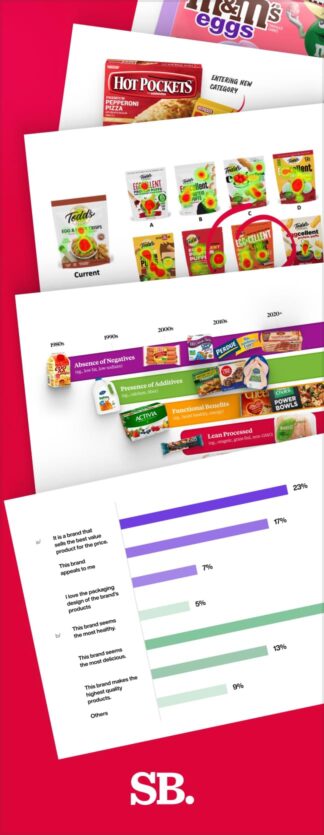
2. Design packaging based on data, not just beauty.
While aesthetics play a crucial role in package design, true effectiveness goes far beyond visual appeal. In the competitive CPG landscape, a data-driven approach is essential to create packaging that not only catches the eye but also drives sales.
However, many brands fall into the trap of hiring design firms that make subjective design choices. These firms lean on personal preferences, popular trends, or a designer’s creative prowess rather than any tangible consumer insights. If they do any validation testing at all, it comes far too late in the process — after key decisions have already been made and budgets depleted.
This data-deficient approach too often results in packages that may win a design award or two, but totally fail to resonate with shoppers or communicate key product benefits in those critical few seconds at the shelf.
The power of quantitative package design testing
To get the market lift your product needs, partner with a CPG design firm that will resist becoming so enamored with their own creative work that they fail to consider consumer preferences. Put simply, you need a partner committed to relentless testing.
Quantitative testing acts as a reality check, ensuring that design decisions are guided by objective data rather than subjective opinions. Employing rigorous testing throughout the entire package design process enables you to:
- Validate design concepts early — before investing significant resources.
- Identify which design and messaging elements resonate the strongest with target consumers.
- Refine messaging and visual hierarchy decisions for maximum impact.
- Accurately predict the sales lift you’ll see from your packaging changes.
SmashBrand’s stage-gate testing process ensures that consumer feedback informs every design decision along the way. This iterative approach allows for continuous refinement, resulting in packaging that not only looks appealing but also effectively communicates brand values and product benefits.
By prioritizing consumer insights over personal preferences, you’ll create packaging that truly speaks to your target audience, maximizing the chances of success in the competitive retail environment.
3. Choose a design firm that understands the unique landscape of CPG brands.
CPG brands face myriad regulatory and legal mandates that govern packaging design. These requirements encompass everything from ingredient listings and nutritional information to warning labels and sustainability claims. A misstep in any of these areas can lead to costly recalls, legal challenges, or damage to brand reputation.
While general design firms may excel in creating visually appealing packaging, they often lack the in-depth understanding of CPG-specific regulations. This gap in knowledge can result in designs that fail to meet compliance standards or effectively communicate product information.
That’s why partnering with a firm that understands these intricacies is not just beneficial — it’s essential for success.
Moreover, the technical aspects of package printing for CPG products require specialized expertise. Factors such as substrate selection, color management, and production processes all play crucial roles in translating a design from concept to shelf-ready product. Without this technical knowledge, even the most brilliant designs may fall short in execution.
Nice Package
Don’t miss out on our monthly newsletter Nice Package!
Each month, we deliver a data-driven newsletter directly to your inbox, unpacking a critical topic in the FMCG & CPG industry.
"*" indicates required fields
Drive market success with strategic CPG packaging design.
Optimized package design represents one of the most impactful investments a brand can make. It serves as the linchpin of your brand’s identity, influencing consumer perceptions and purchasing decisions at every touchpoint.
Missing the mark is simply not an option. If you want to keep and grow your market share while protecting your spot on the retail shelf, it’s essential to make data-driven decisions that enable your package design to win.
SmashBrand knows what it takes to get the market impact your brand is counting on. We’re so confident in our process that we guarantee our results. So when you’re ready to trade in guesswork for certainty, let’s talk.

A seasoned veteran in the CPG (Consumer Packaged Goods) industry, Jason Vaught brings a wealth of knowledge and hands-on experience as the director of content and marketing for SmashBrand. His comprehensive role at the forefront of brand communication ensures that CPG brands remain well-informed about the suite of services SmashBrand offers. Furthermore, his insights derived from the company's strategy, design, and testing services are invaluable to brand owners and managers seeking expert guidance.
From his early endeavors in launching a successful sports nutrition brand that gained prominence in significant bodybuilding and fitness retail spaces to his entrepreneurial ventures in kick-starting multiple brick-and-mortar and e-commerce startups across diverse industries, Jason's career is studded with substantial milestones. Notably, he has innovated numerous products later embraced by leading industry brands, showcasing his knack for anticipating market demands and setting trends.
Jason's journey in the CPG industry commenced at age 21. Over the years, he has worn multiple hats, ranging from a manufacturer and retailer to a distributor and brand owner. This multifaceted experience equips him with the rare ability to offer practical advice grounded in real-world expertise. His mission is to guide and support other CPG brand owners, directors, and managers on their path to success.
Subscribe to
Nice Package.
SmashBrand’s Nice Package: Stay current with our latest insights
Free Resource.

CPG product repositioning guide.
Explore the five undeniable signs your CPG product needs repositioning along with strategies for leveraging consumer insights for a guaranteed market lift.
Download Whitepaper About CPG product repositioning guide.