A shopper picks up a carton, pauses for a second, then puts it back. This isn’t because of the price or brand, but because they aren’t sure what they’re looking at. Is it cooking? Is it something you sip? Is this the high-protein bone broth they’ve heard about, or just another chicken broth for soup? That hesitation is the moment most broth packaging loses.
The category has drifted into a weird middle ground. What used to be a simple pantry staple, something you grab for soup or pasta, now sits next to products pushing protein, collagen, and “drink daily” cues. But the packaging hasn’t caught up. Cartons still look like soup bases, even when they’re trying to behave like functional food. On the other end, some bone broth brands lean so hard into wellness that they stop looking usable in a kitchen.
This article provides a clear breakdown of the packaging design strategies used by successful broth brands.
Broth is a use case decision, not a category purchase.
Broth doesn’t compete on the shelf as a single thing. It shows up as an ingredient, a drink, and a shortcut to homemade, all at once. The problem is that most packaging tries to hold all three at once. That’s where it starts to break.
Shoppers buy for a job.
Broth gets picked up with a specific outcome in mind. Someone making a hearty soup or sauce wants depth of flavor for a dish, something that holds up with beef, onion, garlic, and spice. That shopper is scanning the label for cues that this will perform in cooking.
A different shopper thinks about digestion, protein, or a lighter routine. For them, bone broth behaves more like a functional drink than a soup. The packaging material, pouch, or even a smaller 2-cup format signals whether it fits that behavior. There’s no real loyalty here. Consumers are solving for a moment. If the packaging doesn’t match that moment instantly, it’s skipped.
Competing roles create instant confusion.
As a pantry staple, broth is expected to work across recipes, from ramen and pasta to sauces and vegetables like spinach and thyme. That means clear signals around flavor, shelf life, and how it supports cooking. As functional nutrition, bone broth shifts toward protein, collagen, and digestion benefits. Suddenly, it’s closer to a daily habit than an ingredient.
Then there’s the homemade substitute angle, slow-simmered, no preservatives, real veggies, and perceived freshness stored in an airtight container after opening or used for leftovers. When all three show up equally on one label, the brand identity blurs. The shopper isn’t seeing versatility; they’re seeing uncertainty.
When unclear, shoppers default or walk away.
When packaging doesn’t clearly answer “what is this for,” shoppers move on. They grab the same chicken broth they’ve used before, or the cheapest option they feel safe with. That’s the reality of retail behavior. Ambiguity costs more than missed differentiation; it kills conversion.
Whether it’s a carton, pouch, or other container, the packaging has to do one job well: remove doubt. Because the moment a shopper hesitates, the decision is already lost.
Key purchase drivers for broth packaging design.
Successful broth packaging makes one decision easier than the others. The following are some of the critical purchase drivers that differentiate a winning brand from an ignored one.
Flavor must signal cooking outcome.
“Chicken broth” or “beef broth” doesn’t say much anymore. That’s just the entry point. What matters is whether the shopper believes it will actually carry a dish, whether it can build a hearty soup, deepen a sauce, or hold its own in something like ramen packaging cues often try to imply.
That signal has to come through fast, not through a long recipe or a list of vegetables, but through how the product frames its role in cooking. Depth, richness, and flavor need to feel assumed rather than explained.
Integrity builds trust.
Broth gets judged against something people already trust: what they’d make at home. That’s why generic “clean” claims fall flat. What lands is specificity. Real vegetables. Real bones. A process that doesn’t feel industrial. When retail packaging design leans into that, without overloading the label, it closes the gap between packaged and homemade.
It’s the difference between something that feels like it came out of a factory and something that could sit next to leftovers in your fridge without question.
Nutrition drives trade-up.
Bone broth changed the pricing conversation. Protein and collagen gave people a reason to spend more, but only when it’s clear. The issue is when packaging tries to keep one foot in traditional soup packaging and another in functional positioning.
That tension weakens both. If it’s built around nutrition, it needs to show up that way, direct, visible, and unmistakable. Otherwise, it gets treated like any other pantry ingredient.
Clarity removes friction.
One of the most common breakdowns is simple: the shopper can’t tell how to use it. Is it for cooking? Drinking? Both? Does it replace water in a recipe, or stand on its own? When that isn’t clear, hesitation creeps in. And hesitation kills momentum in retail. The best-performing packs don’t explain, they frame. They show exactly where the product fits, whether that’s in a pot, a mug, or part of a finished dish.
Format signals quality instantly.
Before the label gets read, the format already says something. Cartons suggest pantry use. Glass jars lean more premium, closer to small-batch or homemade. A pouch can signal convenience or single-use. Each packaging material has its own expectations regarding freshness, shelf life, and even sustainability.
Where brands get it wrong is when the design fights the format. When a premium product sits in a structure that feels commodity, or when a convenience format tries to communicate craftsmanship. The strongest packaging doesn’t override those signals. It sharpens them.
Why most broth packaging fails on the shelf.
The main reason why most broth packaging fails on the shelf is pattern repeat: different brands, different claims, but the same decision friction. The major issue in this category is that most retail packaging designs try to solve too many problems at once and end up solving none of them. The following are some of the major issues that affect shelf performance.
Too many messages without a clear priority.
Broth packs are overloaded by default. Flavor, health, sourcing, sustainability, brand story, it all shows up at once. The thinking is: more value signals, more reasons to buy. In reality, it works the opposite way. When everything carries equal weight, nothing stands out.
The shopper doesn’t know what to latch onto first. That’s where most packaging design ideas break down, not because they lack substance, but because they lack order. The strongest packs pick one lead message and let everything else support it.
Bone broth and broth look the same.
There’s a real gap between what bone broth is supposed to be and how it shows up. A product built around collagen and functional benefits often sits in the same visual language as basic pantry broth. Same structures, same cues, same layout logic. It blends in when it should stand apart.
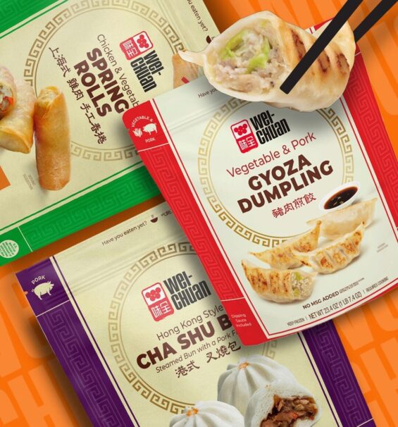
That’s a missed opportunity. Bone broth is positioned as more of a daily-use product. If the packaging doesn’t reflect that shift, it gets treated like any other low-cost option, even in environments like packaging design at Costco, where scale and visibility matter more.
Food imagery creates misinterpretation.
A lot of broth packaging leans on finished food, bowls of soup, plated meals, and styled dishes. The problem is, broth isn’t the final product; it’s the input.
When imagery looks too close to soup or even baby-food packaging cues, it unintentionally repositions the product. It can feel like something ready-to-eat instead of something used to build flavor. That disconnect forces the shopper to rethink what they’re looking at, and that pause is enough to lose the decision.
Key claims are visually buried.
Most packs have the right information. It’s just not doing any work. Protein, simmer time, and sourcing are the things that justify price and differentiate the product. But they’re often pushed into secondary positions, competing with less important details.
This is where innovative packaging design in broth still lags. Not in adding new elements, but in making the right ones unavoidable. Especially in formats like single-serve packaging, where space is limited, prioritization becomes even more critical.
White space as a decision-making tool.
Strategic use of white space in packaging not only makes things look clean but also spotlights the main element. It directs attention, sets priority, and removes the need to interpret, quite the opposite of what other brands try to achieve by adding more claims to the packaging.
Isolating the primary purchase driver.
Most broth packs try to communicate flavor, protein, sourcing, and usage all at once. That’s where they lose control. White space forces a decision: what matters most here? If it’s protein, that number needs room to stand on its own. If it’s flavor, the pack needs to focus on the outcome it delivers for a recipe or dish. If it’s a process, then “slow simmered,” or similar cues, shouldn’t compete with five other messages.
Simplicity as a trust signal.
Broth gets measured against something simple, what people make at home. So when packaging feels crowded or overly styled, it creates a disconnect and starts to feel processed, even if the ingredients say otherwise. Stripped-back design, with space around key elements, reads differently. It feels more deliberate. More controlled. Closer to something made with real vegetables, herbs, and time.
Separating culinary vs functional roles.
Spacing also defines what the product is for. A tightly packed label filled with cooking cues, ingredients, recipes, and food imagery pulls the product toward pantry use. Open space, fewer elements, and a stronger focus on one benefit can shift it toward something more functional, even wellness-oriented. You don’t need to change the format or the packaging material to make that shift. Just how the information is arranged. That’s the leverage.
Data-driven broth packaging design that uplifts shelf performance.
SmashBrand is a data-driven packaging design agency that specializes in structural packaging design, brand identity, and building high-performing packaging systems that convert on the shelf. As a brand architecture agency, we create scalable brand style guides and brand activation toolkits that ensure every touchpoint works harder, from shelf presence to post-purchase experience.
Our process is built to remove guesswork. We integrate strategy, design, and real consumer testing to validate what works before launch. From early concepting through pre-production services, every decision is grounded in purchase behavior, so what goes to market isn’t just well-designed, it’s built to perform.

A seasoned veteran in the CPG (Consumer Packaged Goods) industry, Jason Vaught brings a wealth of knowledge and hands-on experience as the director of content and marketing for SmashBrand. His comprehensive role at the forefront of brand communication ensures that CPG brands remain well-informed about the suite of services SmashBrand offers. Furthermore, his insights derived from the company's strategy, design, and testing services are invaluable to brand owners and managers seeking expert guidance.
From his early endeavors in launching a successful sports nutrition brand that gained prominence in significant bodybuilding and fitness retail spaces to his entrepreneurial ventures in kick-starting multiple brick-and-mortar and e-commerce startups across diverse industries, Jason's career is studded with substantial milestones. Notably, he has innovated numerous products later embraced by leading industry brands, showcasing his knack for anticipating market demands and setting trends.
Jason's journey in the CPG industry commenced at age 21. Over the years, he has worn multiple hats, ranging from a manufacturer and retailer to a distributor and brand owner. This multifaceted experience equips him with the rare ability to offer practical advice grounded in real-world expertise. His mission is to guide and support other CPG brand owners, directors, and managers on their path to success.
Subscribe to
Nice Package.
SmashBrand’s Nice Package: Stay current with our latest insights
Free Resource.

CPG product repositioning guide.
Explore the five undeniable signs your CPG product needs repositioning along with strategies for leveraging consumer insights for a guaranteed market lift.
Download Whitepaper About CPG product repositioning guide.