You’ve sat through the architecture meeting. The deck looked good. The diagram had clean lines and confident arrows. Six months later, the new SKU launched, and nobody could agree on where it fit.
That’s the moment most brand managers realize architecture wasn’t actually decided. It was described.
Architecture is a decision, not a diagram.
A diagram shows what exists today. A decision tells you where every future SKU will live, what role it will play, and how the system will hold when the portfolio doubles.
Most CPG companies can’t produce a clear map of their own product taxonomy when we ask for one. The diagrams exist. The decisions don’t.
The shift is small but consequential. Treat architecture as a measurable input to design, and the system gets concrete. On average:
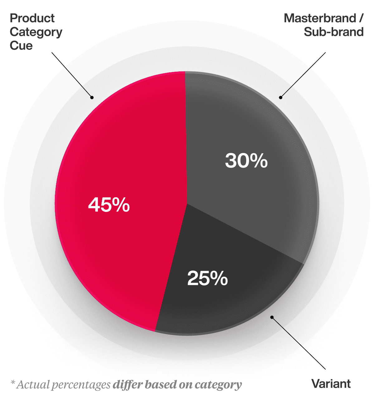
Those numbers move by client and category. The principle holds across both. Architecture is the constraint that tells the design team what they’re allowed to negotiate, and what they’re not.
When architecture fails, your product ends up on the wrong shelf.
Picture a snack brand built from a single hero format. A protein bar that broke out, then expanded into shakes, then powders, then ready-to-drink. Each launch made sense to the team.
On shelf, the powder ends up in the sports nutrition aisle next to body-building tubs. The ready-to-drink lands in the cooler next to coffee. The bar is still in the snack aisle where the brand was born.
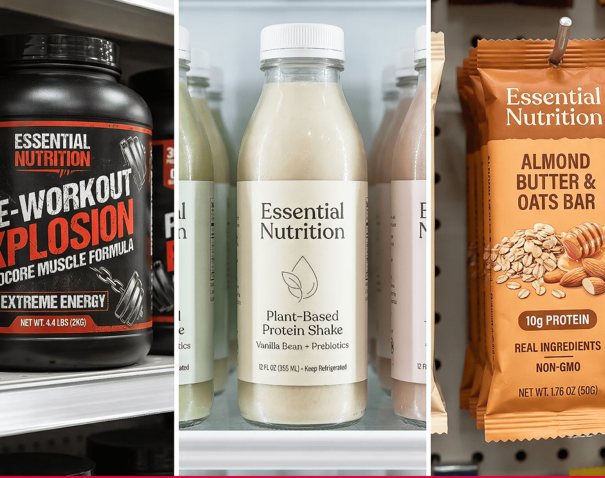
Three different shoppers, three different mindsets, one brand pretending to be the same thing in all of them. The products are still in distribution. Still on the shelf. Still invisible to the people they were built for.
That outcome doesn’t come from a bad designer or a weak SKU. It comes from a portfolio that grew faster than the underlying architecture.
The risk: you let something other than the shelf decide.
Architecture decisions are usually made well before anyone walks down an aisle to check. By the time the packaging hits, the architecture has already absorbed whatever logic the company brought into the room.
Three traps account for most of it.
Sales teams here, business units there, P&Ls split across categories that don’t actually share a shopper. The packaging follows the same logic because it was already there.
Shoppers don’t shop the org chart. They shop the aisle, the shelf, and the purchase occasion. If the architecture matches the company instead of the category, the shelf will sort the products for you, and not in your favor.
Web architecture and shelf architecture aren’t the same problem. A site is built for filtered search, category landing pages, and a shopper who already typed your name into Google. The shelf is a 2-second scan with no filters and no search bar.
A category tree that works online can produce packaging that looks like a spreadsheet on the shelf. The logic of the site is not the logic of the aisle, and treating them as the same thing fragments the brand at the exact moment it needs to cohere.
Most brands can’t afford to test the entire portfolio, and that’s a fair budget reality. The workaround is honest pressure-testing.
Map the system across every category the brand sells in, including the ones outside the project scope. If the architecture only applies to the hero SKU in front of you, the rest of the portfolio will pull it apart, one launch at a time.

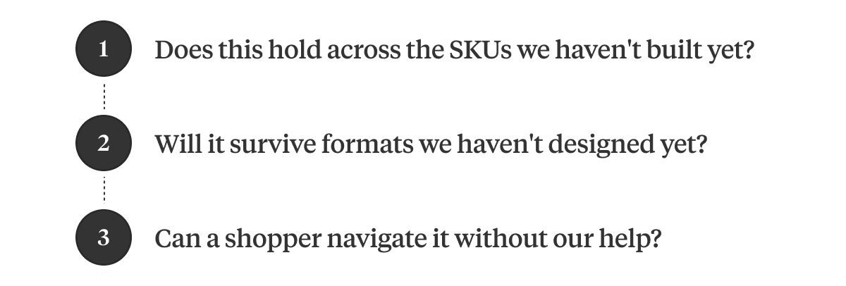
Architecture decisions get hard to reverse the moment they hit packaging. The questions worth asking are the ones that surface the decision before the design starts:
Challenger brands, sitting around 10% familiarity, can’t afford ambiguous architecture. Household names at 80% can absorb it for a while, then they can’t either.
Architecture is a portfolio decision. The packaging is where the decision becomes permanent.
Here’s your next step.
If you’re staring at a portfolio that grew faster than the architecture underneath it, or you want to decide the architecture before the next launch decides it for you, the work is easier now than after.
Book a call, and we’ll walk you through the Path to Performance and the KPIs we’d build the work against.

A seasoned veteran in the CPG (Consumer Packaged Goods) industry, Jason Vaught brings a wealth of knowledge and hands-on experience as the director of content and marketing for SmashBrand. His comprehensive role at the forefront of brand communication ensures that CPG brands remain well-informed about the suite of services SmashBrand offers. Furthermore, his insights derived from the company's strategy, design, and testing services are invaluable to brand owners and managers seeking expert guidance.
From his early endeavors in launching a successful sports nutrition brand that gained prominence in significant bodybuilding and fitness retail spaces to his entrepreneurial ventures in kick-starting multiple brick-and-mortar and e-commerce startups across diverse industries, Jason's career is studded with substantial milestones. Notably, he has innovated numerous products later embraced by leading industry brands, showcasing his knack for anticipating market demands and setting trends.
Jason's journey in the CPG industry commenced at age 21. Over the years, he has worn multiple hats, ranging from a manufacturer and retailer to a distributor and brand owner. This multifaceted experience equips him with the rare ability to offer practical advice grounded in real-world expertise. His mission is to guide and support other CPG brand owners, directors, and managers on their path to success.
Subscribe to
Nice Package.
SmashBrand’s Nice Package: Stay current with our latest insights
Free Resource.

CPG product repositioning guide.
Explore the five undeniable signs your CPG product needs repositioning along with strategies for leveraging consumer insights for a guaranteed market lift.
Download Whitepaper About CPG product repositioning guide.