
 Overview
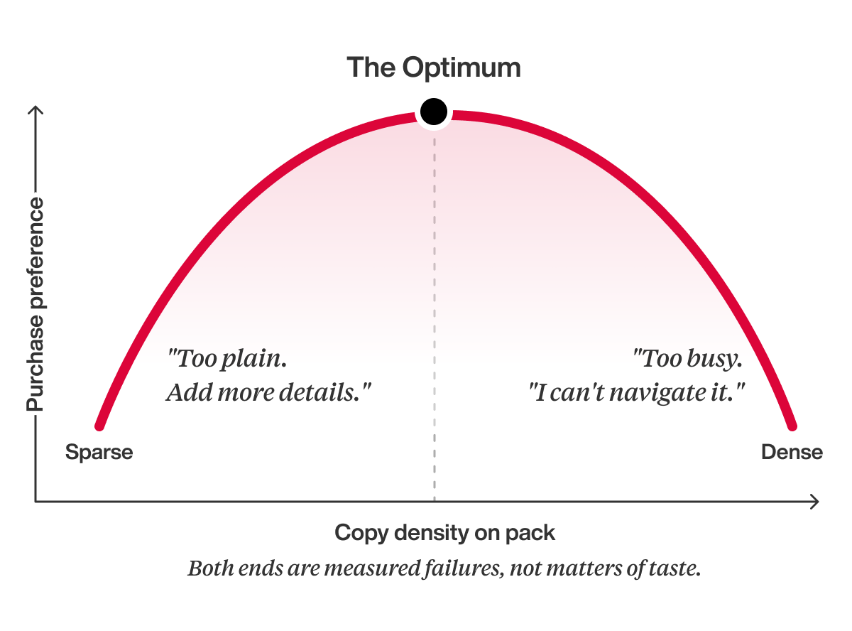
It’s the fight every brand team has before a redesign. Half the room wants the pack to breathe, the other half has a list of things it must say, and both sides argue from taste. The honest answer: there’s no universal percentage, but there is an optimum for your pack. It’s measurable, and missing it in either direction costs you purchase preference. Here’s how to find it.
Attention is a budget.
Every element spends from it.
Think of those survey questions that make you distribute 100 points across options. Every category gives the consumer a fixed attention span, and your job is knowing how much you get and where to spend it, because turning one message up turns the others down.
The mechanism underneath is decoding cost: a pack that requires decoding feels risky, and that friction taxes appeal, believability, and purchase preference all at once. It’s why fixing a cluttered design is the highest-ROI move in our optimization work.
We’ve watched design-only changes, no new claims and no price change, lift purchase preference by double digits.
Your category sets the budget.
Not your designer.
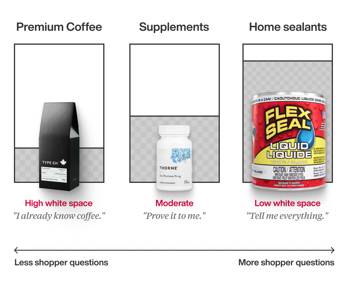
The optimum isn’t aesthetic; it’s the consumer’s information need. Shoppers buying sealants or consumer electronics arrive with questions, their tolerance for information is high, and too much whitespace reads as “why aren’t you telling me?” Shoppers in familiar categories arrive with shortcuts instead. They want the one thing that makes you different, and everything else dilutes their ability to find it. For example, explaining the nuances of why your shade of white milk is better than your competitors isn’t going to win you any new consumers. They already know your milk is white.
Then there’s the Apple problem. Apple’s quiet packaging works well because decades of equity answer every question the pack doesn’t, and thousands of brands have mimicked the look only to learn the hard way that they are not Apple. Minimalism is earned. If your category is still teaching consumers what the product is, you haven’t earned it yet.
The definition that makes this practical.
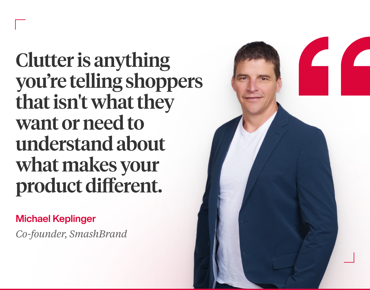
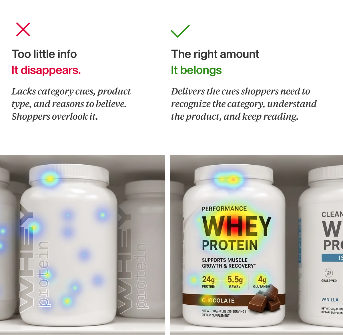
Clutter is anything you’re telling shoppers that isn’t what they want or need to understand about what makes your product different. Everything else is noise their brain has to filter out, which flips the question from “how much whitespace?” to “which elements answer a question my shopper actually has?”
Whitespace is earned, element by element.
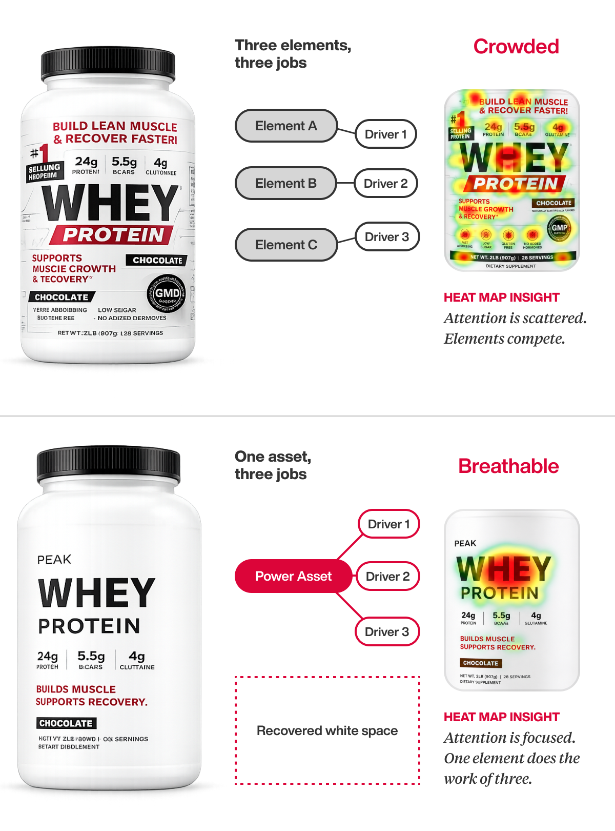
In our design diagnostics, something interesting surfaces when we overlay heat maps with the purchase drivers behind the decision: certain combinations of visuals and words act as power assets, communicating three, four, sometimes six drivers at once. That’s where whitespace comes from.
Find an element working hard on three key drivers, and the other elements just volunteered to come off the pack. Whitespace isn’t allocated; it’s the dividend of communication efficiency. Two packs can say the same things and have completely different optimal whitespace, because one says it in fewer, harder-working elements.
Mind the floor.
Overshoot the optimum and whitespace stops reading as confidence and starts reading as abandonment. We’ve watched consumers face an Apple-look pack and say they couldn’t navigate it, read verbatims begging a stripped design to “add more details, it’s almost too plain,” and tested a pack so white it stopped looking like its own category. Sometimes the clutter is the uniform. The floor is what it is, who it’s for, and the cues that make it belong on that shelf, and the white that remains must read intentional, never vacant.
Do this next.
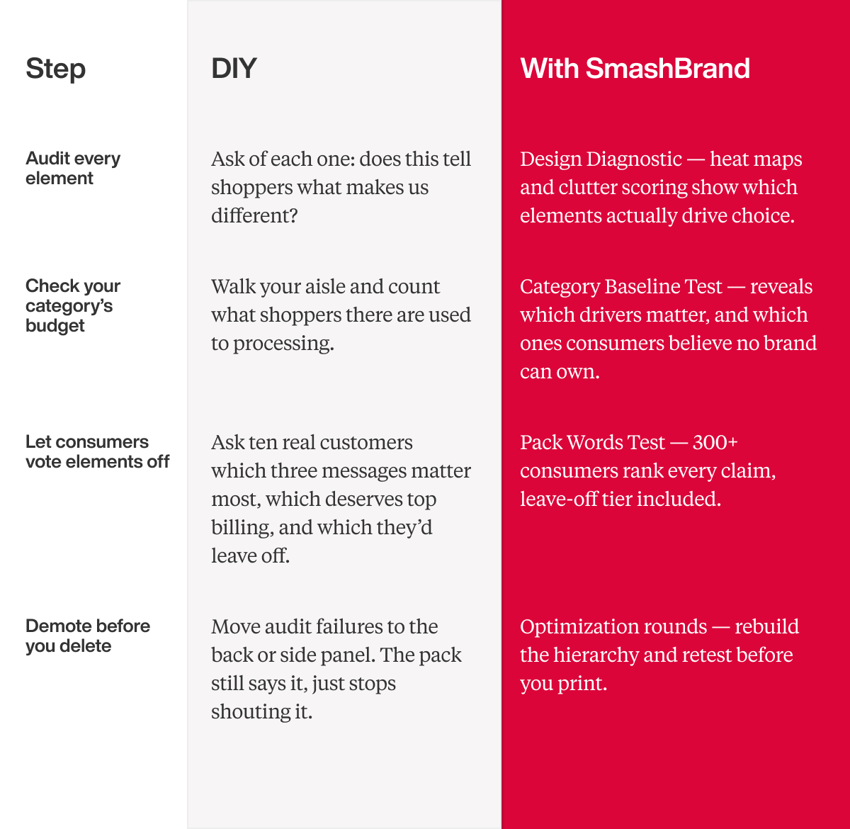
Audit every front-of-pack element.
DIY: ask of each one, does this tell shoppers what makes us different?
Pro: a Design Diagnostic, with heat maps and clutter scoring showing which elements actually drive choice.
Check your category’s budget.
DIY: walk your aisle and count what shoppers there are used to processing.
Pro: a Category Baseline Test that reveals which drivers matter, and which ones consumers believe no brand can own.
Let consumers vote elements off.
DIY: ask ten real customers which three messages matter most, which one deserves top billing, and which they’d leave off entirely.
Pro: a Pack Words Test, where 300+ consumers rank every claim, leave-off tier included.
Demote before you delete.
DIY: move audit failures to the back or side panel. The pack still says it, it just stops shouting it.
Pro: optimization rounds that rebuild the hierarchy and retest before you print.
Here’s your next step.
If you’re staring at a pack that keeps accumulating claims because no one can agree on what to cut, or you want to set the whitespace minimum before the next stakeholder fills it, the work is easier now than after a print run.
Book a call and we’ll walk you through the Path to Performance and the KPIs we’d build the work against.

A seasoned veteran in the CPG (Consumer Packaged Goods) industry, Jason Vaught brings a wealth of knowledge and hands-on experience as the director of content and marketing for SmashBrand. His comprehensive role at the forefront of brand communication ensures that CPG brands remain well-informed about the suite of services SmashBrand offers. Furthermore, his insights derived from the company's strategy, design, and testing services are invaluable to brand owners and managers seeking expert guidance.
From his early endeavors in launching a successful sports nutrition brand that gained prominence in significant bodybuilding and fitness retail spaces to his entrepreneurial ventures in kick-starting multiple brick-and-mortar and e-commerce startups across diverse industries, Jason's career is studded with substantial milestones. Notably, he has innovated numerous products later embraced by leading industry brands, showcasing his knack for anticipating market demands and setting trends.
Jason's journey in the CPG industry commenced at age 21. Over the years, he has worn multiple hats, ranging from a manufacturer and retailer to a distributor and brand owner. This multifaceted experience equips him with the rare ability to offer practical advice grounded in real-world expertise. His mission is to guide and support other CPG brand owners, directors, and managers on their path to success.
Subscribe to
Nice Package.
SmashBrand’s Nice Package: Stay current with our latest insights
Free Resource.
CPG product repositioning guide.
Explore the five undeniable signs your CPG product needs repositioning along with strategies for leveraging consumer insights for a guaranteed market lift.
Download Whitepaper About CPG product repositioning guide.