At the shelf, consumers quickly scan and make decisions based on what they expect something to taste like. The brands that perform best remove ambiguity and make that expectation immediate and unmistakable. Here are eight ways leading brands make taste cues stronger at the shelf.

Taste is flavor and texture.
Taste is communicated through both flavor and texture. Flavor tells the consumer what the product is, while texture signals how it will feel to eat. When both are clear, the product becomes easier to understand and more compelling to choose.

Beverages and Food are not the same.
Food relies on flavor and texture to communicate taste. Cold beverages rely more heavily on refreshment, conveyed through cues such as condensation, splashes, and carbonation. Using the appropriate cues for the category improves clarity and relevance.

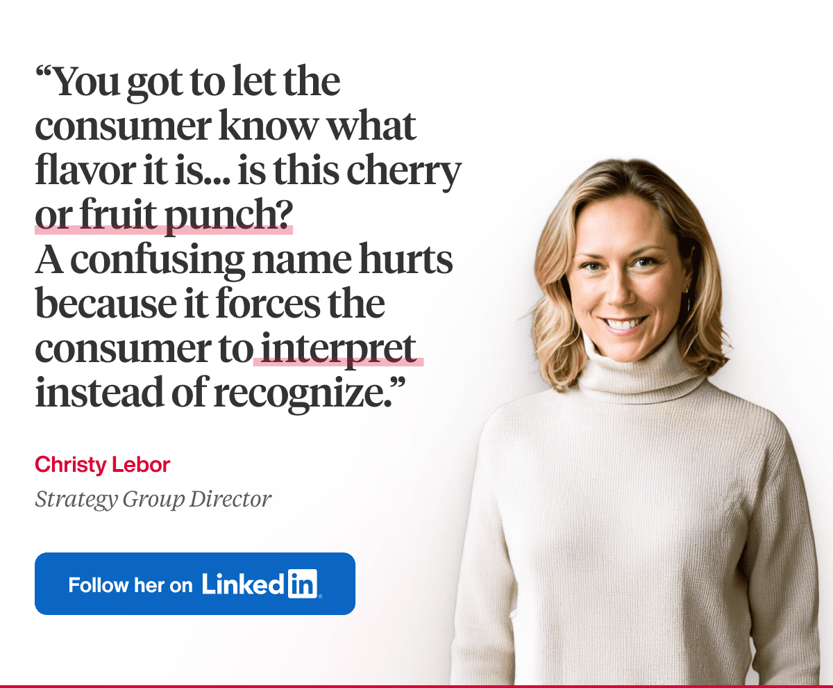
Put flavor clarity first in pack design.
The consumer should be able to identify the flavor instantly. Whether it is cherry, chocolate, chicken, or beef, that signal needs to be clear without interpretation. When flavor is ambiguous, it slows decision-making, reduces confidence, and weakens purchase intent.

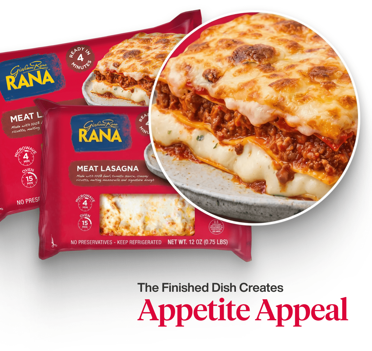
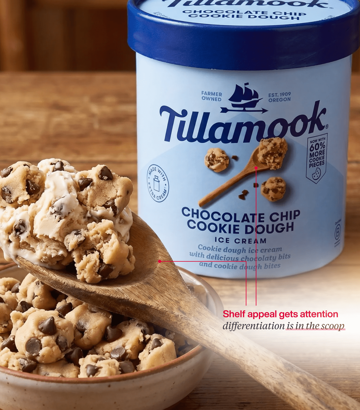
Place greater emphasis on the finished dish.
The finished product establishes the taste expectation and drives appetite appeal. It shows the outcome and answers what the consumer will get.
Ingredients serve a different role. They signal quality by reinforcing freshness, sourcing, and product integrity. When used together, the finished product creates desire, while the ingredients justify its quality.

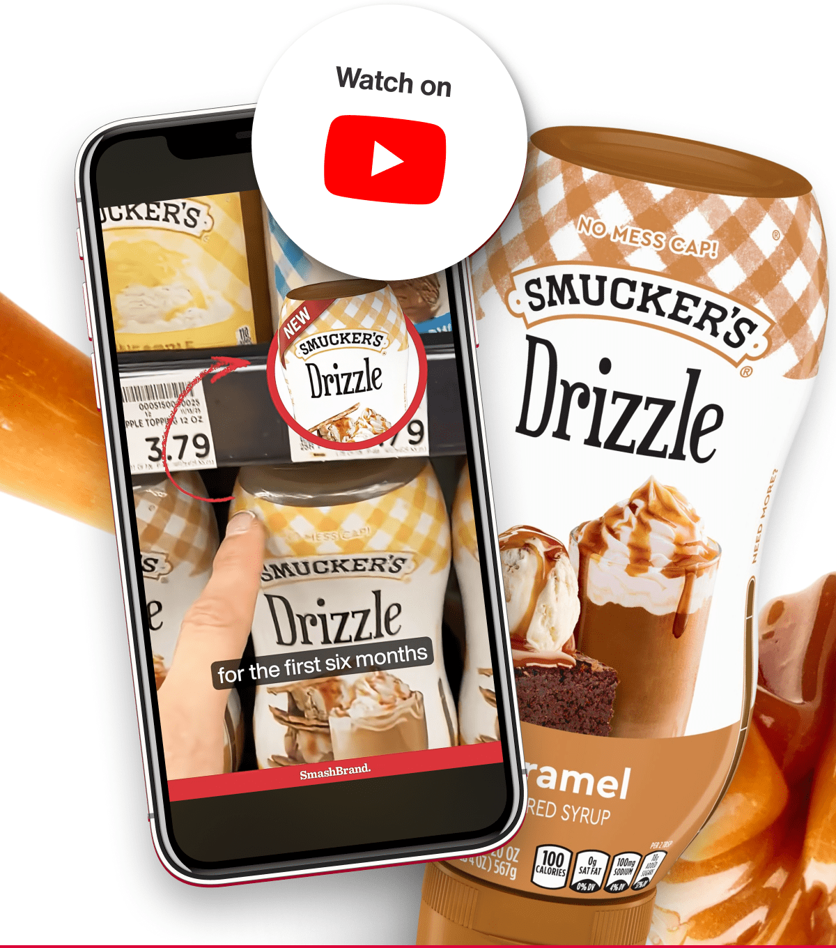
Show the moment of consumption.
A static product shows what something is, while a moment of use shows how it is experienced. A slice being pulled, a bite being broken, or a product in motion communicates taste more effectively than a fully composed product. These moments help the consumer imagine the act of eating.

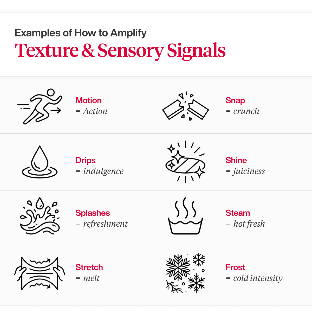
Amplify texture and sensory signals.
Texture cues should be visually clear and easy to interpret. Elements such as shine, stretch, drips, and crunch convey richness, freshness, and indulgence. These signals make the product feel more immediate and increase appetite appeal.

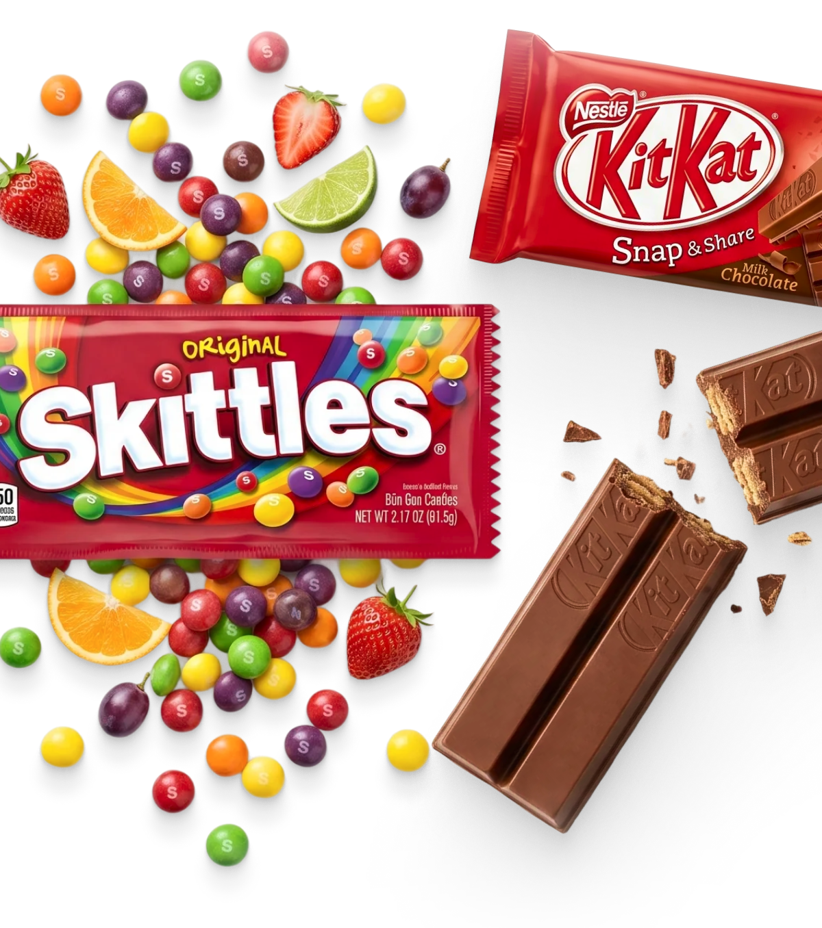
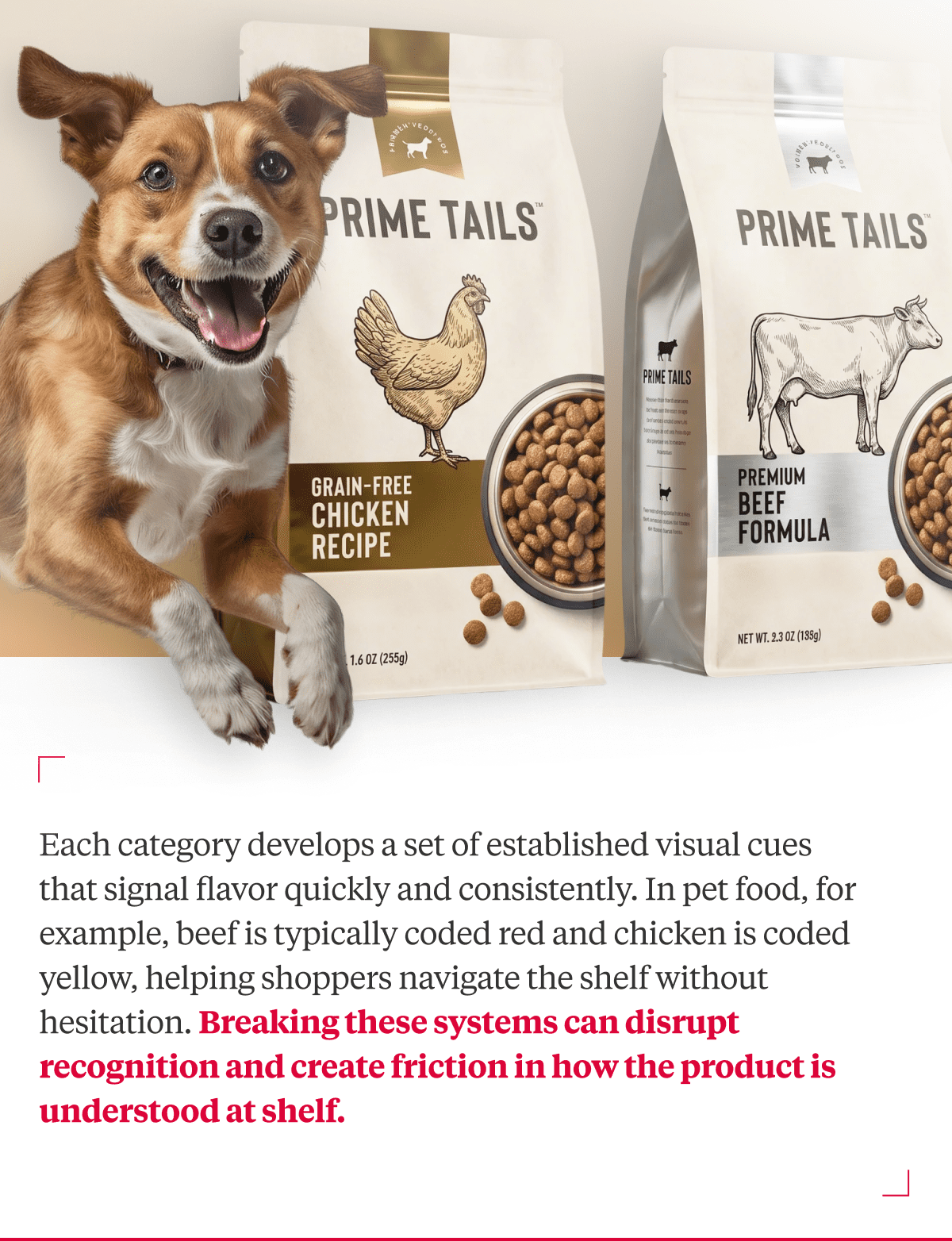
Align with established flavor cues.
Categories develop consistent systems for flavor recognition through color and imagery. Chocolate is brown, strawberry is red, and vanilla is often represented with blue packaging. Aligning with these cues helps consumers quickly understand the product without added effort.

Connect differentiation to the taste experience.
A brand’s point of difference should connect to the expected taste or consumption experience. This does not mean every benefit is visualized as flavor, but the overall experience should feel consistent with what is being claimed. When this connection is clear, the benefit becomes more tangible on the shelf.
See how we apply this in packaging design.
If you are evaluating how your packaging communicates taste at the shelf, this is where we focus.
Our work connects strategy, design, and consumer response through an integrated, stage-gated process. We identify and optimize the elements that drive purchase, so what you intend is what shoppers actually experience in the market.

A seasoned veteran in the CPG (Consumer Packaged Goods) industry, Jason Vaught brings a wealth of knowledge and hands-on experience as the director of content and marketing for SmashBrand. His comprehensive role at the forefront of brand communication ensures that CPG brands remain well-informed about the suite of services SmashBrand offers. Furthermore, his insights derived from the company's strategy, design, and testing services are invaluable to brand owners and managers seeking expert guidance.
From his early endeavors in launching a successful sports nutrition brand that gained prominence in significant bodybuilding and fitness retail spaces to his entrepreneurial ventures in kick-starting multiple brick-and-mortar and e-commerce startups across diverse industries, Jason's career is studded with substantial milestones. Notably, he has innovated numerous products later embraced by leading industry brands, showcasing his knack for anticipating market demands and setting trends.
Jason's journey in the CPG industry commenced at age 21. Over the years, he has worn multiple hats, ranging from a manufacturer and retailer to a distributor and brand owner. This multifaceted experience equips him with the rare ability to offer practical advice grounded in real-world expertise. His mission is to guide and support other CPG brand owners, directors, and managers on their path to success.
Subscribe to
Nice Package.
SmashBrand’s Nice Package: Stay current with our latest insights
Free Resource.

CPG product repositioning guide.
Explore the five undeniable signs your CPG product needs repositioning along with strategies for leveraging consumer insights for a guaranteed market lift.
Download Whitepaper About CPG product repositioning guide.