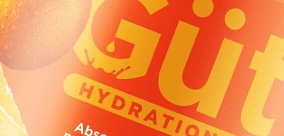
In beverage branding, the difference between sitting in the cart or sitting on the shelf comes down to design. An impactful beverage brand design creates thirst, sparks curiosity, and earns belief in a single glance. From concept to can, every detail of drink design needs to drive desire and deliver a clear edge.
Smart beverage graphic design balances shelf impact with clarity, making sure key info like flavor, function, or alcohol content is seen, understood, and wanted immediately.
Beverage label design is one of the most competitive categories in food packaging. It’s a magnet for awards, but at SmashBrand, we focus on what actually works. It’s not always about shock value. Sometimes, the smartest move is knowing when to dial up flavor cues, lean into the texture of packaging material, or simplify the hierarchy.
This article breaks down five proven ways to make your beverage branding stand out on the shelf. We cover the top purchase drivers, share real examples of drink design that outperform, and offer insights that apply whether you’re building a new soda brand or refreshing an existing portfolio.
Make it a talking point.
In a crowded beverage category, attention is the first win. The best beverage label design gets people talking. Whether it’s a craft brewery can, a sleek glass bottle, or a row of fruit juices, your packaging needs to spark curiosity, stop shoppers, and start conversations.
Beverage can design is where intrigue becomes performance. A bold palette, a surprising graphic, or a sharp turn of phrase can elevate your drink branding from expected to unforgettable. Clever copy builds emotional connection and drives purchase intent.
Every element in your beverage brand design should serve a purpose. Bright colors that break through. Textures that invite a second look. Layouts that shout in the right way. For functional beverages or fruit-forward refreshers, even how you present benefit cues matters. Especially when you’re competing with everything from a $5 latte at the coffee machine to a six-pack on promo.
Great beverage branding builds distinction on-shelf and in-memory. Because when your product packaging creates conversation, it’s no longer just a product. It’s part of the experience.
Make it distinct.
In the beverage aisle, blending in is a fast track to being forgotten. True distinction is your most powerful competitive edge. Power brands define the category by going where others won’t. If the shelf is full of loud, aggressive aluminum cans, take a different route. Go minimal. Go vintage. Go unexpected. The right beverage design challenges category conventions, and that’s what makes it memorable.
Award-winning label design elements don’t need to scream. They just need to stop people. A clever detail. A smart texture. A tactile element that turns a glance into a grab. Whether it’s beer cans, carbonated soft drinks, or craft beverage innovations, the most effective packaging balances visual restraint with just enough risk to break through.
Want to elevate the experience? A multi-sensory label, think premium finishes, layered textures, or unexpected print effects, can make shoppers pause, touch, and ultimately choose your brand.
And while trends change, performance doesn’t. That’s why we build creative brand development around what actually works at shelf, in hand, and across every beverage station where your product competes.
Don’t just design to look good. Design to win. Work with the best drink branding expert who knows how to turn distinction into demand.
Make It Delicious
The best drink branding and packaging design makes consumers crave the product before they even open it. A successful beverage label doesn’t need to shout “delicious,” it needs to look and feel that way through imagery, color, and storytelling.
Highlight the freshness of natural ingredients and show what’s inside through smart visual cues. For a non-alcoholic beverage, that might mean vibrant fruit illustrations and language that evokes refreshment. For richer drinks, such as iced coffees or flavored milks, lean into creamy textures and warmth.
Every detail matters, from the soft drink label design to the copy that captures flavor and experience. The right design style can make a product feel crisp, indulgent, or comforting, depending on what you want consumers to feel.
And remember, modern drinks branding goes beyond taste; it’s about trust. Show transparency in sourcing, nutritional value, and sustainability. When design and storytelling align, your brand doesn’t just look appetizing, it becomes irresistible.
Make It Sexy
Not every beverage label can or should be “sexy” (infant formula immediately springs to mind). Still, for beverages with an adult palate, it’s crucial to give the label alluring lines, graphics, and colors to capture any appeal. The sex aspect should be subtle; gratuitous cheesecake graphics are only desperate and misguided, although they’ll probably be pretty effective talking points.
We can’t promise you immediate recognition and boundless glory, but we can promise you that award-winning beverage labels have incorporated most, if not all, of the above qualities. When designing a beverage label, it’s necessary to consider the type of label that would cause you, personally, to buy that drink.
Examples Of Winning Beverage Designs
Let’s look at designs within different CPG categories and see how they leverage these 5-keys to unlock shelf success.
Responsibly Rain
Plastic bottles are still the predominant seller of bottled water, but attempting to compete in the commoditized plastic bottle market is a bad idea. We see many start-ups entering with glass or aluminum bottles. The easy low-hanging opportunity for marketing is promoting a sustainable design, but how do you stand out when everyone uses the same purchase driver?
Responsibly, Rain’s decision to integrate a raindrop into the recycle logo and place it front and center was strategically smart. CPG brands should note this water bottle design in how they leave plenty of breathing room, allowing us to understand their message.
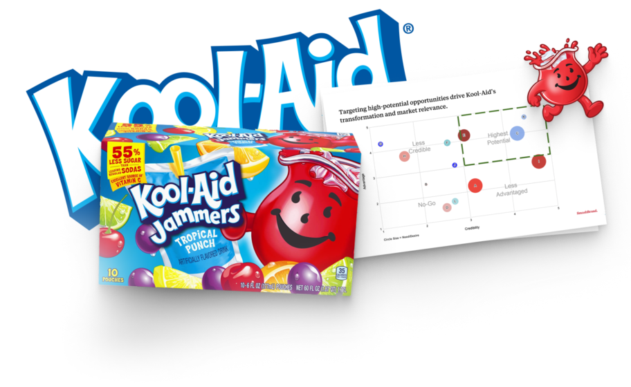
TreeTop Fruit + Water
Millennial consumers raising little ones are more aware of juice products and the sugary nonsense they contain. They hope to find a healthier beverage option kids will love. A package design needs to bring excitement to children.
We worked with TreeTop to create a design for their Fruit+Water juice pouch that outperformed the competition with parents and children. The result was 18% greater purchase intent than CapriSun and a 22% increase in preference compared to Honest Kids.
Bizzy Cold Brew Coffee
Not every consumer is looking to pay a premium for better coffee. Many consumers are looking for a premium product at a fair price. A strategy for this type of product is to attack premium without looking overly costly. An aesthetic that balances premium with price removes consumer’s fear of the product being “too good to be true.”
That’s precisely what Bizzy Cold Brew has accomplished with their coffee packaging design. Without looking bizzy, they place organic in two locations, and the font style matches their caffeinated name. It’s what health-conscious consumers want at a price they can afford.
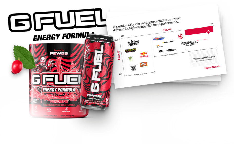
Energy Drink Label
As contrarians to the coffee connoisseur, consumers of energy drinks want more fun from their daily stimulant habit. So when considering how to approach the energy drink label design, boring is out of the question. As a brand known for its relaxed vibe, Alani Nu creates a fun-loving feeling with its electric tie-dye flavor.
Functional Beverage Label
Functional specialty beverages are all the craze and for a good reason. If you drink something for taste, you might as well have a good effect for your body. With plant-based continuing to be a ranking purchase driver, OCA leverages this in their natural energy drink.
USDA organic and plant-based sit side by side, and the brand logo using plant-created words is a supporting element. A great example of how your design can reinforce your messaging.
Nice Package
Don’t miss out on our monthly newsletter Nice Package!
Each month, we deliver a data-driven newsletter directly to your inbox, unpacking a critical topic in the FMCG & CPG indust
"*" indicates required fields
Consumer Testing For Beverage Label Designs
Just because a label looks good doesn’t mean it performs well. Just look at the wine bottle section at discount stores. The discounters are littered with beautiful wine label designs, each with its brand expression on the wine label. If you want to perform against the most formidable competitors, you will need more than an artistic look to turn potential customers into actual buyers.
Beverage Packaging Design Agency
Are you a beverage brand looking to create a product label that outperforms the competition? From design to print, we assist CPG brands with brand strategy, packaging design, and consumer testing. Our beverage label designers start with concept designs, which we present in simulated buying experiences with real consumers.
The result is a packaging design that brands and retailers trust to perform on-shelf. Book a time to discuss your project with our team.

Kevin Smith is the founder of SmashBrand, a brand development agency specializing in the CPG and FMCG sectors. Under Kevin's guidance, SmashBrand seamlessly integrates brand strategy, design, and detailed consumer testing, ensuring impactful market outcomes and enhanced sales velocities for its clients.
Key milestones in his career:
Before establishing SmashBrand, Kevin ventured into entrepreneurship with Nutri-Sport at 21. Recognizing the untapped potential in sports nutrition, he rapidly expanded to seven retail locations within a year. This success led to the formation of a distribution company serving all nutrition stores throughout Arizona.
Subsequent ventures included pioneering e-commerce stores and launching Athletic Xtreme, a globally distributed sports nutrition brand. Notably, Athletic Xtreme won BodyBuilding.com's Brand of the Year in 2006 and found its place on the shelves of major retailers, from GNC and Vitamin Shoppe to Walmart successfully exiting in 2014.
Apart from brand milestones, Kevin's journey includes commendable service as a Marine Corps veteran, where he was honored as a DOD Marine of the Year in 2001.
While leading SmashBrand and investing in budding brands, Kevin is committed to mentoring aspiring CPG entrepreneurs. His profound industry knowledge, from grasping retail trends to understanding shelf dynamics, serves as invaluable guidance for brands striving to carve out their niche.
Central to Kevin's approach is a consistent philosophy: Marry actionable, data-centric findings with proven strategies to ensure brands stand out and succeed in retail.
Subscribe to
Nice Package.
SmashBrand’s Nice Package: Stay current with our latest insights
Free Resource.

CPG product repositioning guide.
Explore the five undeniable signs your CPG product needs repositioning along with strategies for leveraging consumer insights for a guaranteed market lift.
Download Whitepaper About CPG product repositioning guide.