The energy drink industry has now established itself as a required category for retailers of all sizes. Commercial refrigerators with transparent glass displays provide the right environment for colors, stimulating the desire for greater energy and focus. But it isn’t all good news; competition is fierce, and energy drink brands face more challenges than ever.
It isn’t just energy drinks that a brand is competing against. Energy shots, energy slushies, spiked alcohol products, and energy-enhanced foods are just a few examples of stimulant competitors. In such a competitive landscape, energy drink marketing must be carefully thought out, thoroughly tested for performance, and well-executed by the brand.
The good news is that energy drink consumption continues to rise. With the high consumption comes opportunities in niche energy drink categories. For brands willing to embrace a challenge, unique marketing angles can still disrupt the market.
Energy Drink Packaging
In the infancy phase of caffeinated beverages, it seemed like any packaging would work. Reflecting on the silver Xyience cans held by MMA athletes, Spike cans with a straightforward look, and Redline energy drink with its squeezable plastic bottle. It seemed that packaging, canning, or bottling would work, as long as it fits the drink cooler organizer.
This led to considerable subjectivity in packaging design. Decision makers and designers sitting around the table saying, “Wouldn’t it be cool if we shaped our drink like a dumbbell?” Yes, this concept exists, but before you get excited and adopt this idea, recognize that if this type of packaging were effective, you would already be aware of it.
In today’s competitive climate, packaging must undergo a rigorous process to ensure your energy drink design captures consumers’ attention, not just for a glance but to the point of buyer consideration, where they open the door and grab your drink.
Messaging That Stands Out
Black Energy Drink dominates in its home market of Poland, holding the top spot among energy drinks. Its packaging checks all the usual boxes: bold design, aggressive branding, and high-impact visuals. At one point, the brand even enlisted Mike Tyson to push its “Sex Energy” campaign.
But what works in one market doesn’t always translate. Aligning with a controversial figure might have sparked curiosity in Europe, but in the American market, it stalled momentum. Cultural disconnects can kill a brand faster than a bad flavor.
When expanding into new markets, especially in highly competitive spaces like the energy drinks industry, brands must tune in to local culture, values, and humor. It’s the difference between creating a rallying cry (like Red Bull’s “It gives you wings”) and facing public backlash that tanks your brand.
A strong energy drink packaging design isn’t enough. Success demands brand storytelling that resonates across cultures, not just across shelves.
Designing For Nonverbal Purchase Drivers
Ghost energy shines through in a fun and flavorful way throughout the entire look and feel. From floating gummies to Pac-Man referencing ghosts, Ghost speaks to the inner child needing caffeine and stimulants to feel youthful energy.
Nonverbal purchase drivers also encourage greater brand identity and brand recall. A well-designed packaging ensures that the correct target audience takes notice. Creativity alone won’t get the job done. Nonverbal purchase drivers must speak to their buyer persona.
Ensure your energy drink logo design, color scheme, and other graphic elements leave a lasting impression. Do not let the brand experience die once the consumer crushes the can. Designers should know in advance that their job isn’t to create a work of art; it is to create art that generates repeat sales. Let’s take some pointers from a few successful brands in the energy market:
A Look Back At Popular Energy Drink Companies
Competitors come and go from the energy drink market. Our experience tells us those novel ideas are not enough. Without a strong brand strategy, effective package testing, and proper execution, the next best energy drink can become the next catastrophic mistake.
Red Bull Packaging design
This Austrian energy drink remains one of the world’s bestselling energy drinks. Their boots-on-the-ground marketing efforts, combined with the “Red Bull gives you wings” slogan, make for a successful energy drink formula.
The Red Bull packaging strategy features tall yet thin aluminum cans that quickly became the signature design for energy drinks. The can is ideal for its portability, gripability, and durability.
Differentiating yourself from the crowd is one thing, but it can become so significant that taking a different packaging approach risks losing consumers’ recognition. When looking to stand out, test your packaging innovation against the industry standard to ensure that your point of differentiation isn’t a distraction.
Fun Fact: Red Bull Packages are 100% recyclable and cost-efficient. Another win for the Red Bull can design.
The colors of Red Bull include bright, clean lines. Marketing for Red Bull targets young athletes who are involved in extreme sports. Matching their demographic, the symmetrical image of fighting bulls suggests power and endurance. You can almost picture a couple of BMX riders and Formula 1 drivers seeing their image reflected in these powerful beasts of burden.
Monster Energy Drink
Monster crashed onto the scene with cans twice the size of Red Bull’s. While Red Bull leaned into clean minimalism, Monster took a darker, louder approach with a logo you couldn’t miss, even across a crowded shelf. Stories about the Monster logo, myth, folklore, or fact only fueled the brand’s momentum. Before social media existed, Monster tapped into viral marketing by sparking curiosity and conversation in a way most brands could only dream of.
Where Red Bull sponsored polished extreme sports, Monster found a different kind of edge. By aligning with BMX, motocross, skateboarding, and X Games events, Monster became the badge of the bold. A brand championed by tough, gritty influencers who resonated with today’s consumers looking for bold flavor, natural caffeine, and creativity, not polish. Among bright colors and eye-catching designs, Monster proved that sometimes darker and grittier designs grab just as much attention and keep it.
Bang Energy Drink
Fast forward to 2012, and you find a fuse being lit that would soon put a bang in the energy drink market. VPX Sports had previously achieved success with RedLine, but nothing had prepared convenience stores and grocery retailers for what was to come. By increasing the caffeine content, incorporating novel ingredients, and expanding their flavor offerings, Bang surpassed the expectations of the sports nutrition store.
You can now find Bang in almost every consumable CPG store worldwide.
A big ole’ B with a bullseye sits front and center of the packaging. It may not have intentionally let the consumer finish the word, but it works. Using the beginning phonogram sound is how many parents teach children to read.
Unless written sideways, it isn’t easy to display the complete product name in a large enough font on the front of the can. Like Monster, Bang let the first letter carry the weight.
But Bang has a level of graphic design that’s just hard to beat. Bang adopted the concept of using adult drink packaging to evoke memories from our childhood.
Is drinking 300mg of caffeine a good idea? Probably not. But Bang took notice of the exponential rise in pre-workout drinks, matching the dosing to what people consume before they work out. This way, people can have the same feeling when waking up or leaving for work.
International Energy Drink Success Stories
Global brands couldn’t afford to sit on the sidelines. As U.S.-based energy drinks surged in popularity, international players had to be strategic and bold in their approach. Some brands took a controversial approach, delivering packaging and branding that created a powerful pattern interrupt, commanding consumer attention and breaking through the clutter.
By leveraging vibrant colors, bold branding, and packaging innovations, from PET bottles to zero sugar callouts, brands like Red Bull and Monster transformed their shelf presence into dominance. These energy drink disruptors knew the stakes: in a crowded beverage aisle, grabbing and holding attention is everything. The strategic packaging of Red Bull, Monster, and other brands became a catalyst for narratives centered on hydration, energy, and performance that resonated across the soft drink and functional beverage categories.
This isn’t just packaging. Its brand positioning is engineered to win data-driven, consumer-centric, and built for the realities of the retail battlefield.
Black Energy Drink
This remains the number one energy drink in Poland, where it is produced. It contains the usual components of an energy drink packaging design, and at one point, the company even brought Mike Tyson to help market it.
Including a convicted rapist on a can, carrying the slogan “Sex Energy, “ seemed like a good idea to Black’s marketing team. Oddly enough, while Poland and much of Europe struggle to get sufficient supplies, gathering momentum on the American market has been tough. Imagine that.
When introducing a product to a new market, look into local pop culture and references, especially if you plan to promote an energy drink. Cultural context discrepancies differentiate between X-Gamers swearing “it gives you wings” and the public collectively canceling your product.
VAAG Energy Drink
Launched at the start of 2013, this energy drink is popular in Asia and Africa. “Vaag” means “tiger” in particular dialects of India and other parts of Asia. In English-speaking countries, this brand may have had a greater chance of popularity by choosing a name that is not mistaken for the female version of Viagra.
The can features an interesting image of a tiger emerging from swirling vapors, giving the sense of an opium-induced hallucination rather than a lucid energy charge. Strangely, the nutrition label takes up nearly a quarter of the surface area and doesn’t blend with the design.
This may work for Africa and Asia, but this drink will probably remain out of the American consumer‘s selective grip.
For marketing your product, the packaging design delivers the message of what you’re selling. Without stellar packaging and a practical design, it doesn’t matter if your energy product transforms people into the Incredible Hulk.
Delivering a crisp, clear image of what your product can do without the obstructions of controversy and confusion makes all the difference in the open market.
Energy Drink Packaging of the Future
Brands will continue to push the envelope into both can and bottle packaging design. However, innovations may extend beyond the product’s appearance and the consumer’s experience with it. Can design will include unique shapes and textures with 3d effects. Brands may solve problems such as energy drinks warming up to room temperature (gross!).
But it’s not just about form. Brands have an opportunity to solve functional problems, such as drinks losing their chill, by transforming packaging into a performance asset, not just a container.
Sustainability will also take center stage. While most consumers already recognize that cans are recyclable, forward-thinking brands will take it a step further by going beyond the standard icon. Expect to see a stronger narrative around “from recycled packaging” a badge of honor in a marketplace increasingly driven by eco-conscious fitness enthusiasts and young consumers.
Natural ingredients and reduced sugar are defining the sparkling water and sports drink sectors. Yet, in the case of energy drinks, that packaging story hasn’t fully taken hold. Will it? It’s an open question, and one we’re excited to answer through consumer-driven packaging tests that don’t guess, but know.
The packaging trend toward natural ingredients has not yet reached the mass market. Will this happen in the future? Although the details are unknown, we welcome the opportunity to conduct package design testing that will initiate this conversation.
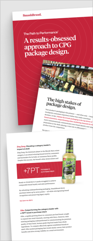
Path to Performance™
Taking a results-obsessed approach to CPG package design.
Discover how SmashBrand’s proprietary process, rooted in scientific principles, informed by data, and validated by your target audience, eliminates the guesswork from package design and delivers guaranteed results.
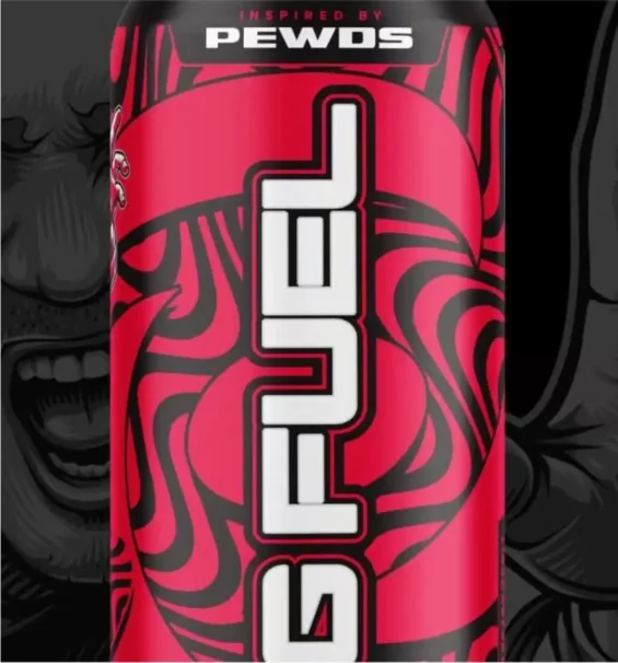
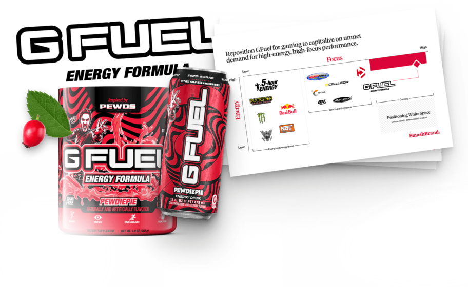
How G Fuel Captured a Wider Audience
G Fuel is not new to the energy drink game. They launched their first version back in 2012. Having a cult following amongst gamers helped them become the go-to choice for the gaming, programming, and content creation communities. But they struggled to translate that to the larger audience sitting at the edges of these communities. By working with our design team, G Fuel increased purchase intent among gamers by 42%! As a result, you find their energy drinks in the largest retailers.
Energy Drink Packaging Design Agency
Are you an existing or aspiring energy drink company seeking a packaging design that delivers? Whether it’s a new-to-market drink or a brand refresh, our team can help. Our proprietary package testing process leaves no stone unturned in ensuring optimal packaging performance. We make the process seamless by handling everything from design to print.
Please discuss your project with our team.
Nice Package
Don’t miss out on our monthly newsletter Nice Package!
Each month, we deliver a data-driven newsletter directly to your inbox, unpacking a critical topic in the FMCG & CPG industry.
"*" indicates required fields

Kevin Smith is the founder of SmashBrand, a brand development agency specializing in the CPG and FMCG sectors. Under Kevin's guidance, SmashBrand seamlessly integrates brand strategy, design, and detailed consumer testing, ensuring impactful market outcomes and enhanced sales velocities for its clients.
Key milestones in his career:
Before establishing SmashBrand, Kevin ventured into entrepreneurship with Nutri-Sport at 21. Recognizing the untapped potential in sports nutrition, he rapidly expanded to seven retail locations within a year. This success led to the formation of a distribution company serving all nutrition stores throughout Arizona.
Subsequent ventures included pioneering e-commerce stores and launching Athletic Xtreme, a globally distributed sports nutrition brand. Notably, Athletic Xtreme won BodyBuilding.com's Brand of the Year in 2006 and found its place on the shelves of major retailers, from GNC and Vitamin Shoppe to Walmart successfully exiting in 2014.
Apart from brand milestones, Kevin's journey includes commendable service as a Marine Corps veteran, where he was honored as a DOD Marine of the Year in 2001.
While leading SmashBrand and investing in budding brands, Kevin is committed to mentoring aspiring CPG entrepreneurs. His profound industry knowledge, from grasping retail trends to understanding shelf dynamics, serves as invaluable guidance for brands striving to carve out their niche.
Central to Kevin's approach is a consistent philosophy: Marry actionable, data-centric findings with proven strategies to ensure brands stand out and succeed in retail.
Subscribe to
Nice Package.
SmashBrand’s Nice Package: Stay current with our latest insights
Free Resource.

CPG product repositioning guide.
Explore the five undeniable signs your CPG product needs repositioning along with strategies for leveraging consumer insights for a guaranteed market lift.
Download Whitepaper About CPG product repositioning guide.