Whether it’s a toy on the shelf or a snack in the pantry, kids respond instantly to what catches their eye. That’s why packaging isn’t just part of the product; it is the product. The right visual cues can turn passing interest into a must-have moment. For brands creating items such as toys, snacks, or educational tools, packaging design must appeal to kids and reassure parents.
From packaging design for toys to baby food branding and packaging, success hinges on striking a balance between fun and trust. Your packaging needs to delight little hands while delivering confidence to the buyers.
Here’s how to make that connection and why it matters.
Make it Pop
Most of us know that kids love bright colors, and there’s science behind it. Children’s brains continue to develop well into young adulthood, including their visual processing. Early on, muted tones are more complex to distinguish, while bright, saturated hues are easier to perceive and more stimulating. That’s why color perception plays such a critical role in packaging for kids.
When creating children’s packaging, especially for early-stage products such as supplement packaging or snack formats, vibrant color palettes are crucial. Consider using block colors like yellow and orange to capture attention, or red to stimulate and energize. These colors don’t just stand out on the shelf; they help form emotional connections that drive trial and repeat purchases.
Clever kids’ packaging design also uses contrast to create focus and clarity. Supporting tones can make the hero colors feel even more vivid, but the overall look should stay warm, cheerful, and inviting. This is especially true for box packaging design in categories that require strong shelf visibility across retail and digital channels.
In the age of omnichannel packaging, capturing a child’s attention isn’t enough; you need a design system that performs consistently across various formats and platforms. And when done right, your kids packaging does more than look good. It performs.
Winning With Both Children and Parents
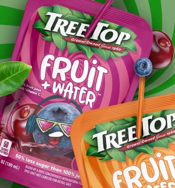
TreeTop captured market share in an established and competitive market with its Fruit + Water product. They showed a greater intent to purchase compared to both Honest Juice and Capri Sun. This increase in purchase intent was achieved by designing juice boxes that emphasized their product is a fun and healthy food alternative.
Both kids and parents resonated with the pouches, which showcased a lighter design, fun elements, and a 50% less sugar product feature. Meanwhile, targeted messaging aimed at the parental audience effectively communicated health benefits significant to parents.
Zig Zag
Minimalism is a design trend that has become prevalent in most adult products, ranging from consumer electronics to web pages. This isn’t a packaging trend that transfers over to kids. Your kids don’t want sleek and efficient. They want an adventure straight off the shelf.
This isn’t to say that your product packaging design should be so cluttered that it turns into a game of “Where’s Waldo”. However, you want enough going on in terms of varieties of shapes, word bubbles, and graphics that you can capture a kid’s attention. It should be vibrant enough to have children grab it off the shelf with an attractive enough copy to make a mother set it in the cart.
Put another way, food products with custom packaging that emphasizes taste to the children and nutrition to the parents are a recipe for on-shelf success.

A Whole Cast of Characters
It isn’t a coincidence that the cereal aisle looks like a dating website for cartoon characters. Look at just about any brand of cereal marketed to kids, and at first glance, you see the pearly white smile of a cartoon animal greeting you. Again, this is another design choice backed by complex numbers. Multiple studies indicate that product image and cartoon character are the most significant elements of packaging for kids.
Fun and friendly are safe bets for choosing a kid’s mascot for your product line. For foodstuff, a friendly face is a must-have to get kids to relate to your brand. However, even if you’re selling a toy or figurine that’s already on display in packaging, a cartoon rendition can help further tickle a kid’s imagination. Keep in mind that you’re not limited to creatures that already have faces. Some of the most memorable children’s characters range from anthropomorphic vehicles to household furnishings. Get creative with it.
Peek-a-Boo
Speaking of packaging that displays an item, transparent packaging is another solid tip for kids’ products. If the product is something a kid wants to get their hands on, then making the package stand out on the shelf is the right move. Even grown-ups have that ingrained impulse to yank something out of the box when it feels that close to touch. Kids are no different.
Narrow it Down
This article provides general guidance for children’s products, but your packaging design needs to be targeted, which is a key part of our package design process. A food product design that appeals to a 3-year-old will not sell to a kid getting ready for middle school. Early infancy is the most rapid stage of development; however, children continue to grow and develop throughout the various phases of childhood.
With each new step, they acquire a set of new faculties that influence their preferences in products, brand mascots, and the packaging that showcases them. There are numerous resources available that cover the stages of childhood development, and you should conduct thorough research before planning for packaging.
Have Fun with it
The world has enough sad clowns. Sometimes, proceeding into the design process with what you think kids will like can miss the mark. The easiest solution is to embrace your inner child and create branding and food packaging that’s fun to make. If you’re letting your imagination run wild, having a blast when creating kids’ packaging ideas, there’s a good chance that kids will follow suit. So, knock yourself out, get creative, and put some genuine joy behind making your product shine.

Nice Package
Don’t miss out on our monthly newsletter Nice Package!
Each month, we deliver a data-driven newsletter directly to your inbox, unpacking a critical topic in the FMCG & CPG industry.
"*" indicates required fields
Showcase Safety Features
Last but not least is safety. Depending on the age of the kids that you’re targeting, keeping some basic safety tips in mind is a good idea. For younger children, the product packaging must be hygienic and child-safe.
Far too often, CPG brands assume that the fearful mom understands without being told that their product is safe. For example, design baby food packaging in a way that communicates the safety features to the consumer.
While kids are involved in the consideration stage, parents take over during the evaluation stage before making a purchase decision. They want to know that your product has child-friendly packaging and is safe for their kids. In the same breath, while children may or may not become eco-friendly consumers, their parents might already be.
Can you manage sustainable packaging with biodegradable materials? If so, then it’s worth spending the extra penny, both for your conscience and to score a few points with parents trying to do the right thing.
Packaging Design For Kids That’s Proven to Perform
SmashBrand has significant experience in designing kid-friendly packaging. Our package design process and proprietary testing methods ensure that your brand succeeds. See our work for examples of how our CPG packaging design agency increases purchase intent and brand recall for CPG companies.
Start a conversation
1-877-429-4812 hello@www.smashbrand.com

Kevin Smith is the founder of SmashBrand, a brand development agency specializing in the CPG and FMCG sectors. Under Kevin's guidance, SmashBrand seamlessly integrates brand strategy, design, and detailed consumer testing, ensuring impactful market outcomes and enhanced sales velocities for its clients.
Key milestones in his career:
Before establishing SmashBrand, Kevin ventured into entrepreneurship with Nutri-Sport at 21. Recognizing the untapped potential in sports nutrition, he rapidly expanded to seven retail locations within a year. This success led to the formation of a distribution company serving all nutrition stores throughout Arizona.
Subsequent ventures included pioneering e-commerce stores and launching Athletic Xtreme, a globally distributed sports nutrition brand. Notably, Athletic Xtreme won BodyBuilding.com's Brand of the Year in 2006 and found its place on the shelves of major retailers, from GNC and Vitamin Shoppe to Walmart successfully exiting in 2014.
Apart from brand milestones, Kevin's journey includes commendable service as a Marine Corps veteran, where he was honored as a DOD Marine of the Year in 2001.
While leading SmashBrand and investing in budding brands, Kevin is committed to mentoring aspiring CPG entrepreneurs. His profound industry knowledge, from grasping retail trends to understanding shelf dynamics, serves as invaluable guidance for brands striving to carve out their niche.
Central to Kevin's approach is a consistent philosophy: Marry actionable, data-centric findings with proven strategies to ensure brands stand out and succeed in retail.
Subscribe to
Nice Package.
SmashBrand’s Nice Package: Stay current with our latest insights
Free Resource.

CPG product repositioning guide.
Explore the five undeniable signs your CPG product needs repositioning along with strategies for leveraging consumer insights for a guaranteed market lift.
Download Whitepaper About CPG product repositioning guide.