
 Overview
A tier is how your portfolio sorts itself.
Tiers sit under the master brand and its platforms. They separate products by strength, function, dietary need, or price step. Some show up on pack as a color, an eyebrow line, or a finish. Others live only in a spreadsheet.
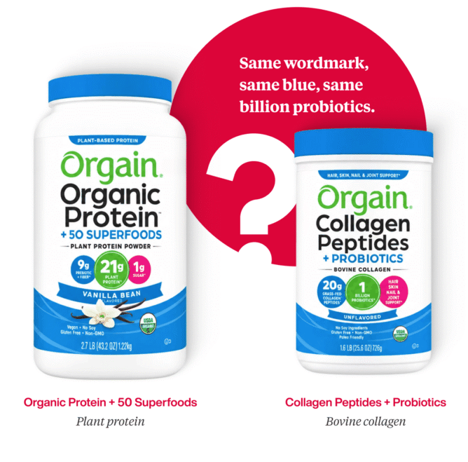
The trouble grows with the portfolio. Brands that add one SKU at a time end up treating the same tier three ways across three platforms. Each launch made sense on its own. Together they stop reading as a system.
The screen and the shelf break tiers differently.
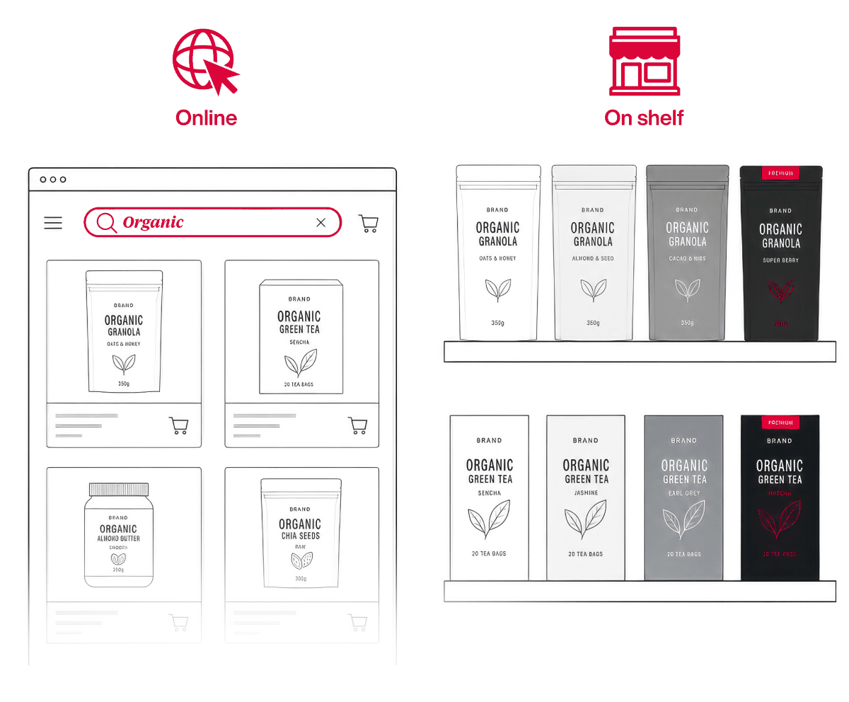
Online, shoppers who don’t see “organic” in the menu can type it into the search bar. The aisle has no search bar, so they read every pack.
The screen has a second blind spot. Every size in a line renders as the same thumbnail. We’ve seen brands that grew up online blow the size up across the front to prevent wrong orders. On shelf, the shopper can see and hold the pack, and that space can go to the benefit.
Retail adds one more problem. One retailer may stock only your middle tier while another carries only the top one. Each tier has to make sense with its siblings missing, which starts with knowing the hero SKU inside each tier.
Every tier has to work alone, on a screen or on a shelf that skips the rest.
Build the ladder in three layers.
A tier that reads at a glance stacks three things. The name says what it’s for. The number says how much. The design makes the difference visible.
You build it name first. The shopper reads it design first.
Name the job the product does.
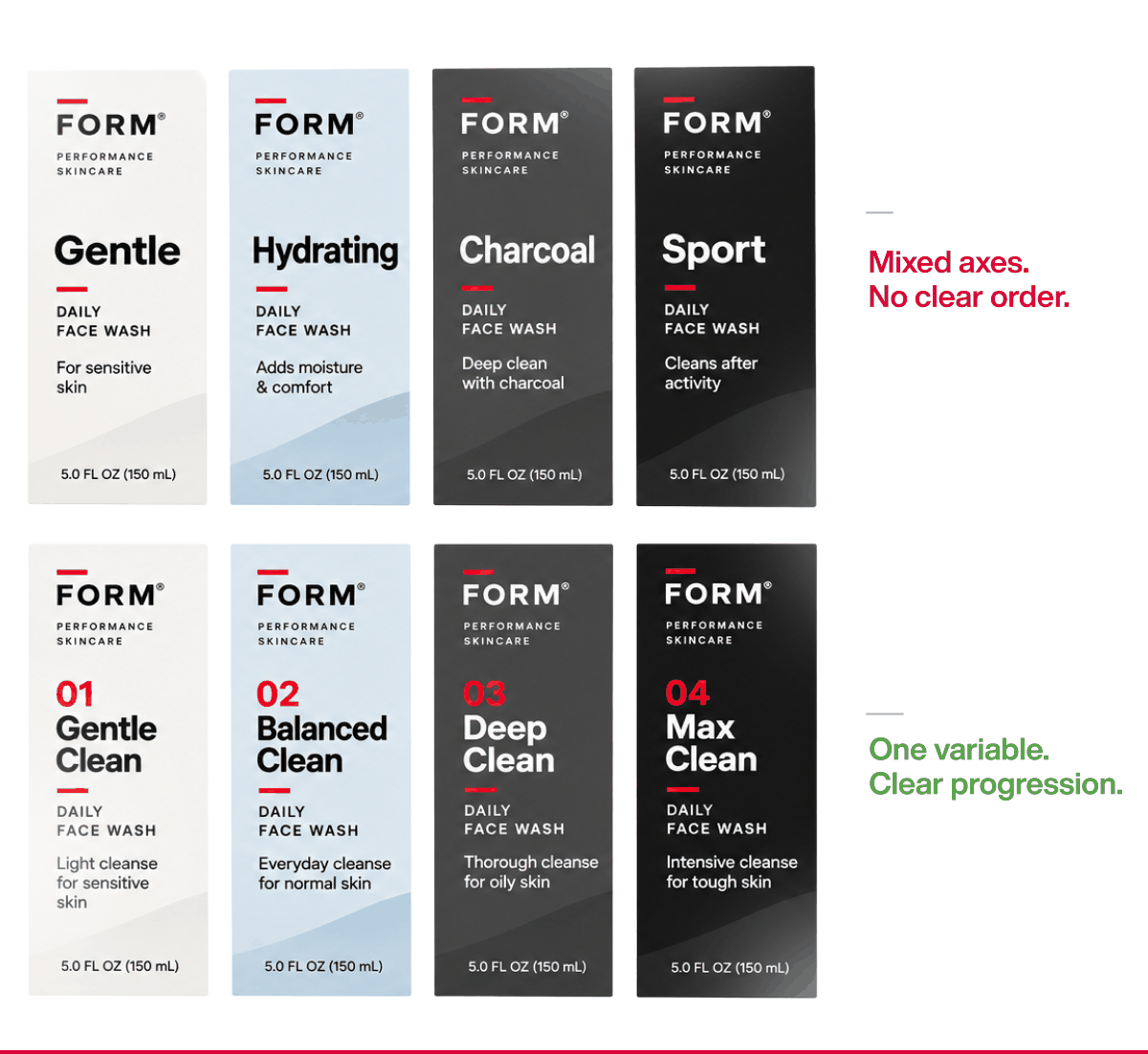
Unless a tier exists to build its own ownable name, it should say what the product does. Creative tier names ask the shopper to decode them. Functional names tell the shopper which one fits the task in front of them.
Mixed logic breaks a ladder fastest. A line that runs mild, medium, strong, then switches to a word like “pro” on the last step forces the shopper to stop and work out what changed.
Borrowed words carry baggage too. XL means a clothing size to most people, whatever it means on your pack.
Back the name with a number.
Consumers in our testing keep telling us a stated multiple, like 5x, reads as stronger than the word “powerful.” Alone, though, a number has nothing to measure against. Absorbent categories show it. Every brand runs its own scale, and the pack also carries a size and a count, so the shopper ends up comparing numbers that don’t relate.
Clients ask us the same thing every time. Does our 8x lose to their 10x? Sometimes it doesn’t matter. What matters is that shoppers can find your maximum.
Quick tip. If one roll equals four regular rolls, show it. Don’t print it as an equation. Shoppers will not do math at shelf.
Make the difference the first thing the eye hits.
When the master brand, the platform, and the layout match across a ladder, the eye goes straight to whatever changes. A lotion line that moves from “for dry skin” to “for cracked skin” tells the shopper which jar to grab before they read a single claim. The headline also has to carry the tier when the pack stands alone.
Then the design backs the headline up. Lighter blues read as everyday, while darker blues and black read as tough. Premium tiers can earn a metallic, a richer finish, or a different structure. A word printed on an otherwise identical bag carries none of that.
Hold everything else steady and change one thing hard.
Four checks you can run this week.
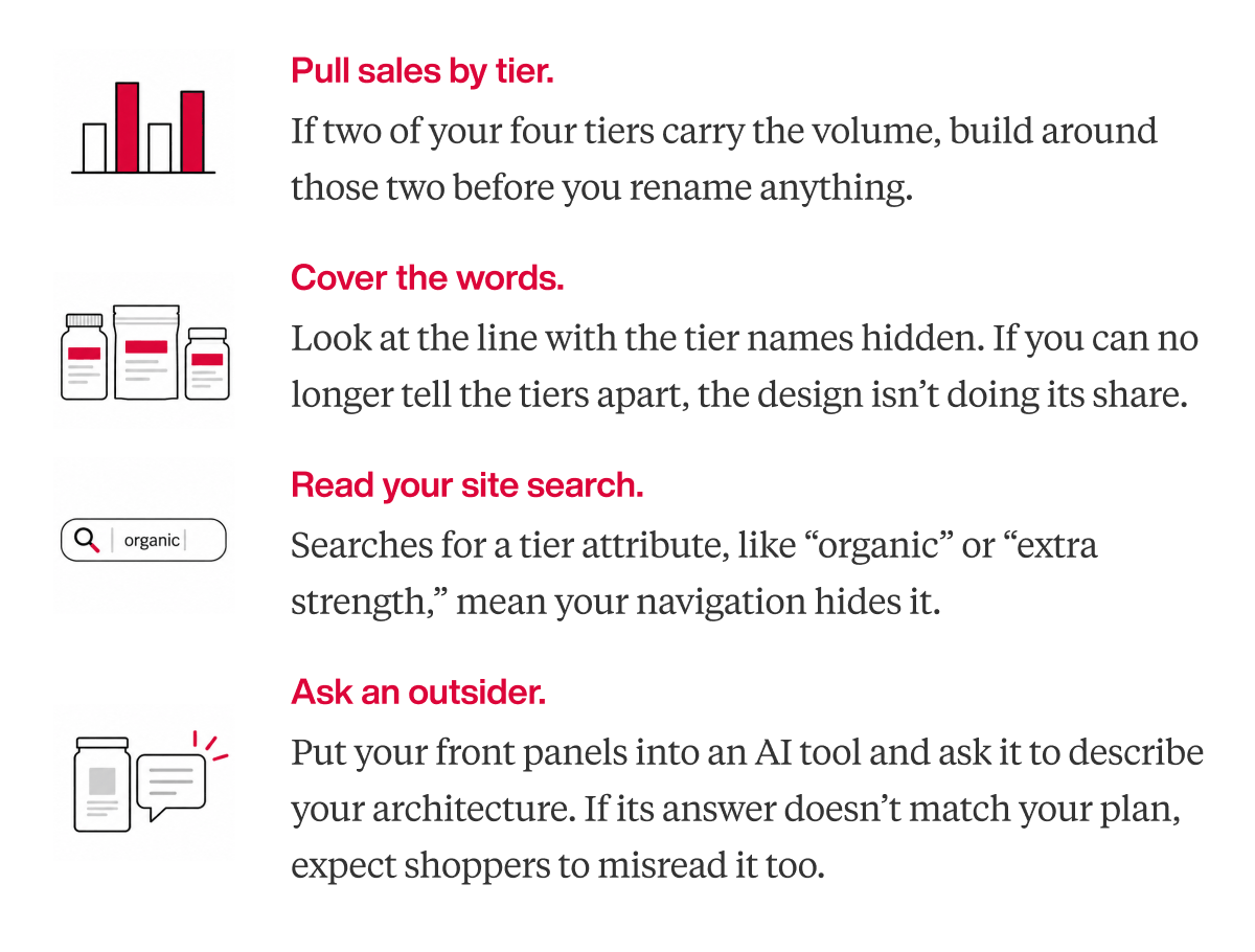
One more thing to request from your own team is a product taxonomy. We rarely receive one from a client, so building it is usually our first step.
Here’s your next step.
Tier names fail when the architecture under them was never planned.
Our brand architecture work maps the full portfolio, and our naming and claims testing checks tier names with category shoppers before anything goes to print. If one of the four checks turned up a gap, settle it before your next run.
Plan the ladder before you name the rungs.
Discuss a project with our team.
"*" indicates required fields

A seasoned veteran in the CPG (Consumer Packaged Goods) industry, Jason Vaught brings a wealth of knowledge and hands-on experience as the director of content and marketing for SmashBrand. His comprehensive role at the forefront of brand communication ensures that CPG brands remain well-informed about the suite of services SmashBrand offers. Furthermore, his insights derived from the company's strategy, design, and testing services are invaluable to brand owners and managers seeking expert guidance.
From his early endeavors in launching a successful sports nutrition brand that gained prominence in significant bodybuilding and fitness retail spaces to his entrepreneurial ventures in kick-starting multiple brick-and-mortar and e-commerce startups across diverse industries, Jason's career is studded with substantial milestones. Notably, he has innovated numerous products later embraced by leading industry brands, showcasing his knack for anticipating market demands and setting trends.
Jason's journey in the CPG industry commenced at age 21. Over the years, he has worn multiple hats, ranging from a manufacturer and retailer to a distributor and brand owner. This multifaceted experience equips him with the rare ability to offer practical advice grounded in real-world expertise. His mission is to guide and support other CPG brand owners, directors, and managers on their path to success.
Subscribe to
Nice Package.
SmashBrand’s Nice Package: Stay current with our latest insights
Free Resource.
CPG product repositioning guide.
Explore the five undeniable signs your CPG product needs repositioning along with strategies for leveraging consumer insights for a guaranteed market lift.
Download Whitepaper About CPG product repositioning guide.