
 Overview
We ran a study recently where the brand’s target consumer skewed millennial and the category’s actual buyer skewed Gen X. Both numbers were accurate. They described two different people.
Mid-size brands get one packaging cycle every few years. Point it at the wrong buyer, and you’ve wasted the cycle. So before anything else, find out whether your category’s buyer and your target buyer are the same person, not just the same age, because most brands have never checked.
Then decide whether winning the next generation is your fight at all right now.
Not chasing them is a legitimate strategy.
AriZona has held the same core brand and its 99-cent price since 1992. Instead, it has courted new drinkers through new formats, adding hard tea, premium cold brew, and snacks over the last three years. The face on the original never changed.
Its co-founder took the other route. John Ferolito, bought out of AriZona after a split with his partner in 2012, launched Saint James in 2022, an organic tea in Tetra Pak aimed at younger buyers who read ingredient labels.
Both are defensible. Not knowing which one you picked is not.
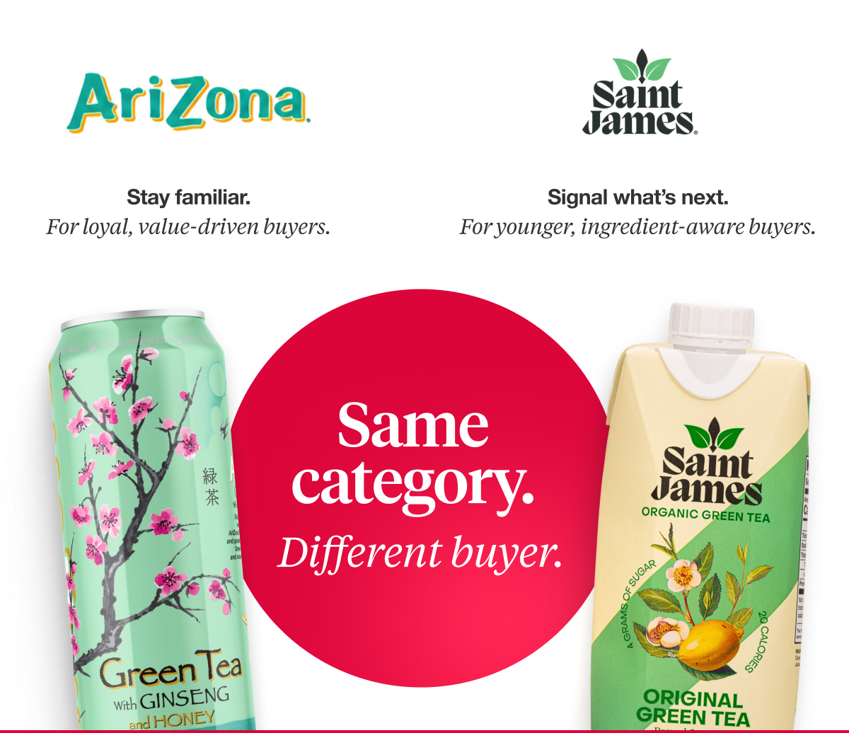
Winning online doesn’t mean you won the next generation.
Brands point to online traction as proof they have won younger buyers. Shelf performance usually carries to the screen. The reverse does not. We tested a competitor brand that performs well online. Its pack under-indexed on every KPI we measure. Sparse design reads as clean on a product page and as absent in an aisle.
Online velocity tells you people bought. It does not tell you the pack did the work.
Every claim you add is paid for by the brand.
You cannot fit every claim you want on the front of a pack and still make the brand feel worth buying. Claim count and brand appeal trade off, and most packs settle that argument by adding one more badge.
That trade lands harder with newer buyers. A twenty-year category shopper reads a wall of claims as a checklist and finds the line they came for, while a first-timer cannot tell which claim matters. Density rewards a fluency built by time in the category, which is why it fails a first-timer of any age. Instead, they read the brand.
The move is conversion, not deletion. Siete gave one ingredient claim its own shape, so it reads as a mark rather than another line of type.
Every badge on your pack is a claim you decided not to design.
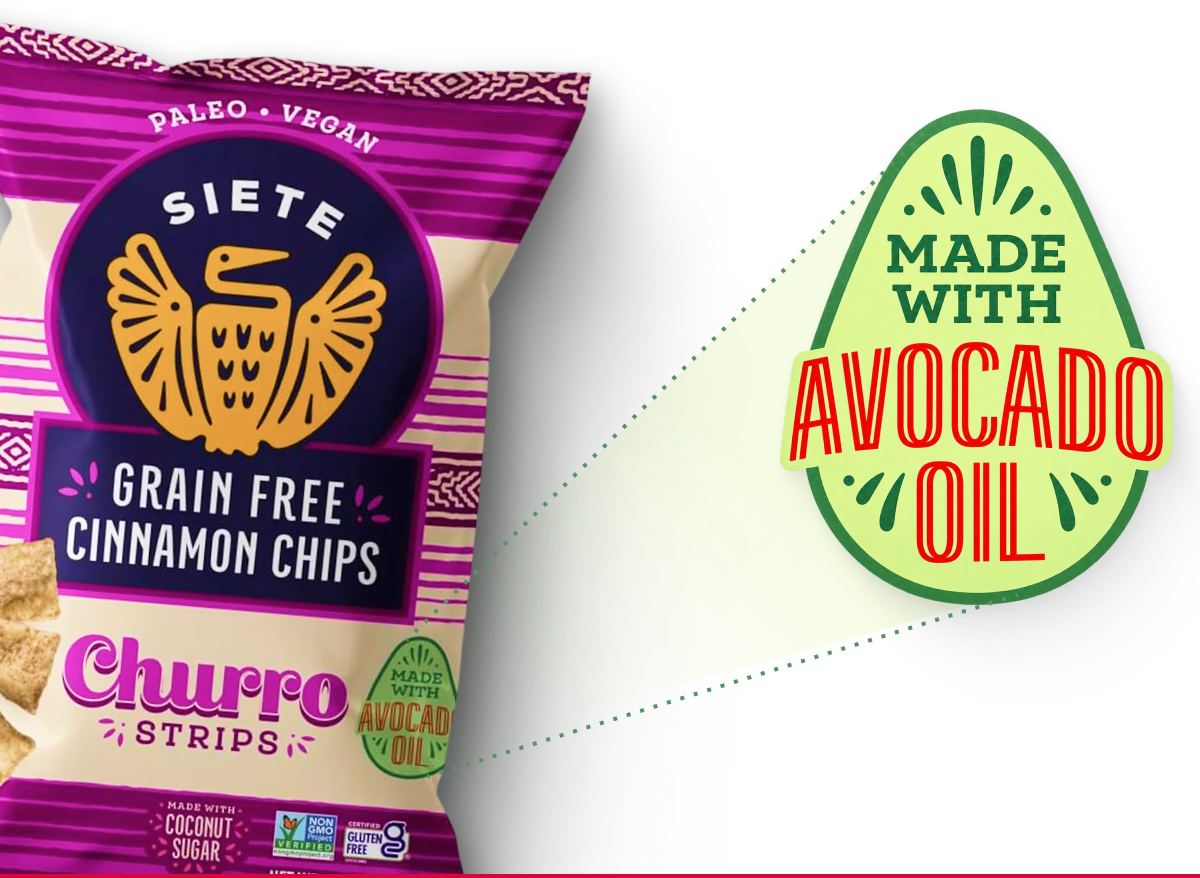
Distance from the category norm pays in three ways.
If younger buyers don’t know your category’s conventions, do those conventions still protect you? Our testing says less than you would expect.
Positioning that sits close to category norms gets liked and dismissed as familiar. Positioning that sits farther out scores higher on new and different, on believability, and on purchase intent at the same time. Believability rising alongside novelty removes the usual objection that leaving your category costs you trust.
Matching your category makes you legible and forgettable.
Reweighting beats rebuilding.
We reviewed a pack that read roughly eighty percent natural cue and twenty percent proof, and recommended flipping it closer to thirty and seventy. No new logo, no new brand, just a reallocation of hierarchy that was already on the pack.
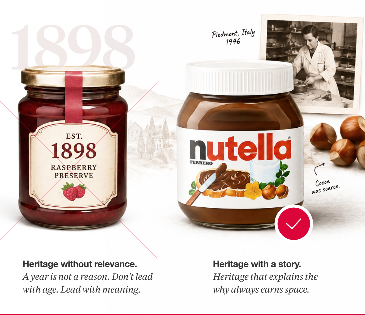
Heritage answers to the same test. Nutella exists because cocoa was scarce after the war, and a pastry maker in Piedmont stretched the little he had with the hazelnuts growing around him. The shortage is the reason the product tastes the way it does, which is a better reason to care than a founding year.
Age alone does not do that work. If you cannot write one sentence explaining why your history matters to somebody buying this week, heritage is taking up space rather than earning it.
When the brand still works, and the relevance does not, change what the pack emphasizes before you change what it looks like.
Not one of those is a design failure.
Read back the six failures in this issue.
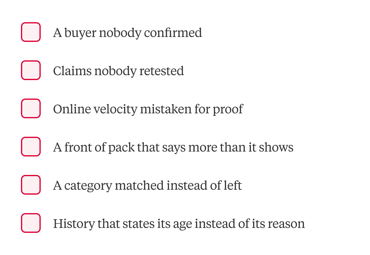
Each one is a decision about who the pack is for and what it says first, which is why you can revisit most of them at your next print run rather than your next design cycle.
So start with the buyer, because every other decision in this issue depends on who you are actually building for.
Here’s your next step.
We test packaging against consumer response rather than internal judgment, which is usually the difference between knowing and assuming. If one of the six above sounds like your pack, settle it before the run, not after.

A seasoned veteran in the CPG (Consumer Packaged Goods) industry, Jason Vaught brings a wealth of knowledge and hands-on experience as the director of content and marketing for SmashBrand. His comprehensive role at the forefront of brand communication ensures that CPG brands remain well-informed about the suite of services SmashBrand offers. Furthermore, his insights derived from the company's strategy, design, and testing services are invaluable to brand owners and managers seeking expert guidance.
From his early endeavors in launching a successful sports nutrition brand that gained prominence in significant bodybuilding and fitness retail spaces to his entrepreneurial ventures in kick-starting multiple brick-and-mortar and e-commerce startups across diverse industries, Jason's career is studded with substantial milestones. Notably, he has innovated numerous products later embraced by leading industry brands, showcasing his knack for anticipating market demands and setting trends.
Jason's journey in the CPG industry commenced at age 21. Over the years, he has worn multiple hats, ranging from a manufacturer and retailer to a distributor and brand owner. This multifaceted experience equips him with the rare ability to offer practical advice grounded in real-world expertise. His mission is to guide and support other CPG brand owners, directors, and managers on their path to success.
Subscribe to
Nice Package.
SmashBrand’s Nice Package: Stay current with our latest insights
Free Resource.
CPG product repositioning guide.
Explore the five undeniable signs your CPG product needs repositioning along with strategies for leveraging consumer insights for a guaranteed market lift.
Download Whitepaper About CPG product repositioning guide.