Your range of vitamins might be exactly what consumers need, but that doesn’t matter if your packaging doesn’t get them to pick it up from the shelf. In stores packed with hundreds of other nutritional supplements, all claiming similar benefits, being helpful alone isn’t enough; your product must get noticed. Your vitamin packaging design must win where it counts.
The reason why most vitamin packaging fails is that it relies on category norms, neutral brand colors, hidden key claims buried in clutter, and visuals that blend in with every other product on the shelf. If customers can’t immediately see what makes your product different, your formulation advantages and product benefits will likely be ignored.
This article explains how to develop a vitamin packaging design strategy that commands attention and enables product trial right at the shelf. You’ll uncover the secrets to building a clear message hierarchy, using functional cues that matter, and crafting packaging that not only builds trust but drives purchase before your competitors even get a second look.
The real challenges behind vitamin packaging.
Vitamin brands are not just selling benefits but packaging beliefs. And belief is fragile. They ask customers to trust what’s inside a bottle they’ve never opened, based solely on what they see in three seconds or less. That’s the real challenge, and most brands aren’t getting it right.
Explaining complex benefits in seconds.
Functional benefits in the VMS category rarely speak for themselves. A line like “boosts ATP levels” might excite a formulator, but for the average customer, it’s meaningless without translation. The mistake? Assuming people will take the time to figure it out. They won’t.
Take, for example, Ritual’s multivitamins. Their packaging strips the message down to what matters: “Essential for Women,” “Supports Brain Health,” and a handful of transparent ingredients listed with purpose. While these claims could be iterated for greater distinction, the approach exemplifies clarity and focused consumer relevance.
Balancing clinical credibility with shelf appeal.
Vitamin brands exist in a peculiar middle ground; they need to appear trustworthy without appearing dull. If your packaging leans too far into clinical territory (sterile colors, heavy ingredient tables, dry claims), it starts to feel cold. But if you dial it up too much, such as with loud fonts and gimmicky graphics, it loses all credibility.
A smart middle path? Consider the Care/of packaging. Their daily vitamin packs use soft gradients and bold iconography to capture attention, while still communicating science-backed benefits. The result? A pack that feels both modern and reliable. This balance is even more critical for moisture-sensitive formats, such as powders and capsules.
Overcoming regulatory constraints and small pack sizes.
Designing packaging for a vitamin gummy is like writing a novel on a postage stamp. Regulatory mandates consume space quickly (e.g., disclaimers, NLEA panels, serving), and yet, you still need to convey the product’s value at a glance. And that glance is happening on a pouch the size of a snack bag.
To address this issue, brands like SmartyPants Vitamins utilize clarity and a clear message hierarchy in their packaging. They use playful illustrations at the front, but keep critical information (such as dosage and benefits) in consistent locations across all SKUs.
That makes them easy to shop, even with small bottles and lots of legal copy. Most brands fail to address this issue. They either shrink the text to the point of unreadability or try to convey everything at once, creating a visual mess.
Avoiding the tone mismatches (too playful, too technical, too generic).
Tone is one of the most overlooked elements in vitamin packaging design, and one of the most damaging when done wrong. If your product promises sleep, but its design resembles an energy drink, customers won’t trust it. If your ingredients are cutting-edge, but your tone is juvenile, it comes across as unserious.
The strategy behind packaging that wins the customer decision.
Effective supplement packaging design works like a system. It captures attention, signals quality, and convinces the customer of two critical things: this is worth it and this is for me. If your packaging isn’t doing both, it’s not doing its job.
Rational drivers: Is this worth it?
The rational side of the decision is built on logic and credibility. Customers need to know: What’s in it? Why does it matter? And is it better than the five other bottles next to it?
This is where most vitamin packaging design should start. The goal is to connect your target customers to tangible benefits clearly. If a product promises “immune support,” show the science. If it contains magnesium, explain its function rather than the number of milligrams.
And don’t underestimate the importance of protection and quality cues. If your single-serve stick packs are prone to moisture, customers need to know that your material choice not only prevents contamination but also ensures a sleek appearance. If your plant-based packaging design reduces the carbon footprint, say it, but tell it in a way that matters to their life, not just your ESG slide deck.
Emotional pull: Is this for me?
The purpose of emotional resonance is to make the customer feel seen and understood. It starts with color, structure, tone, and hierarchy that speaks their language. For instance, a pet supplement’s packaging must feel premium enough to stand out alongside human-grade products.
A single-serve packaging targeting active women must not only convey portability but also evoke energy, simplicity, and trust. Visual elements like matte finishes, reduced plastic use, or elegantly minimal typography signal “this brand gets me.” It’s how you turn curiosity into preference, and preference into loyalty.
Why both the head and the heart must be present.
The brands that fail usually lean too far in one direction. Some obsess over logic, listing every feature, benefit, and certification, and forget to be visually distinct. Others go full throttle, focusing on vibes and aesthetics, with soft-focus photos, but say nothing of substance.
When that happens, you either bore or confuse your target customers. As a result, you don’t capture attention and ultimately fail to close the sale. You look like everyone else. You become a “maybe.” Your supplement packaging design must earn trust (rational) and drive desire (emotional). One without the other is like a product without a customer. Doesn’t matter how good it is; it’s not getting picked.
The process that builds standout packaging for vitamin products.
Excellent packaging is built with purpose, pressure tested by real people, and designed to win in every environment, from shelf to screen. Whether you’re launching a new SKU or refreshing an entire line, this is the process behind CPG packaging design that outperforms.
Diagnosis.
If you don’t understand the competitive landscape, the consumer mindset, and what truly drives purchase, you’ll design based on guesses, not growth opportunities. Diagnosis begins with a market audit, examining what competitors are doing, how they’re positioning themselves, what’s resonating, and where the white space lies.
We pair that with consumer targeting to identify precisely who the pack must speak to, and what visual and verbal cues win their attention. From there, we build the benefit ladder, mapping functional ingredients (such as collagen, magnesium, or adaptogens) to emotional outcomes (like energy, focus, or calm), ensuring the product’s story climbs all the way from logic to loyalty.
Testing.
Packaging that hasn’t been tested is just a creative opinion. In high-stakes categories like vitamins, assumptions cost shelf space, trust, and velocity. At SmashBrand, we utilize the PREformance packaging design test to simulate the actual buying experience. We test which claims, names, and benefits actually motivate consumers to take action.
Next comes diagnostic testing, where multiple design directions are presented to real category shoppers to measure perceptions such as clarity, premium feel, shelf impact, and credibility. We finish with purchase intent testing to see which design truly converts.
Optimization.
One wrong message, one confusing visual, one poorly placed claim, and you’ve just lost the sale. Optimization turns learning into lift. Based on feedback from real users, we refine the strongest design concepts. That could mean rewriting the front panel to highlight a more motivating benefit, adjusting contrast for better shelf presence, or restructuring the layout for omnichannel performance.
System buildout.
Your packaging must scale across flavors, formats, and channels without compromising clarity, consistency, or distinction. Once the hero SKU is locked, we expand the system by defining a modular visual framework that works across all sizes, substrates, and platforms.
We codify everything into brand style guides that cover color usage, typography, claims hierarchy, iconography, and claim placement, ensuring every new SKU launch is a repeatable win, not a brand risk.
Vitamin packaging strategy by benefit category.
| Category | Messaging Strategy Focus | Packaging Implication |
| Joint & Mobility | Emphasize dual-action benefits, fast relief + long-term health. | Bold benefit claims, 2-in-1 visuals, clinical tone with supportive imagery. |
| Immune Support | Lead with Vitamin C and immunity as a functional benefit. | Bright, fresh colors; clear “immune” callouts; avoid clutter to spotlight benefit. |
| Gut Health / Digestion | Focus on digestive comfort and hydration; immunity as a tertiary benefit. | Soft, trustworthy design; fluid visuals; clean typography to suggest digestion ease. |
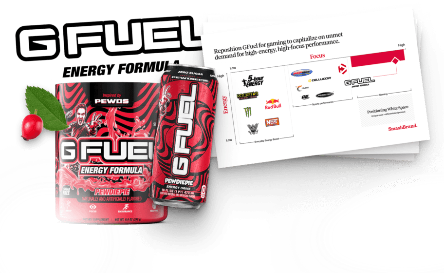
| Energy / Wellness | Frame around health, vitality, and “zero sugar” as a BFY marker. | Sharp, active design; energetic but not chaotic; emphasize clean energy & clarity. |
| Mood / Calm | Emotive language that resonates with daily emotional relief. | Soft gradients, serene color palettes; pack words like “calm,” “balance,” “serene.” |
| Brain / Focus | Communicate mental clarity, focus, and cognitive function. | Structured layout; “clean brain” visuals; iconography that suggests clarity and thinking. |
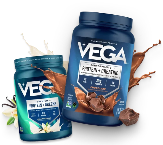
| Protein + Boosted Function | Reframe as a performance-first product with added nutritional depth. | “Plus” or “boost” language; prominent protein callout; modern, optimized visual hierarchy. |
| Meal Replacement | Message complete nutrition with clear daily utility. | Structured labels; full-panel benefit layout; “all-in-one” language prioritized. |
What drives purchase intent in vitamin packaging design?
Purchase intent in vitamin packaging design is a strategic blend of clarity, credibility, and standout visual cues.
- Customers need to immediately grasp the specific functional benefits, whether it’s energy, immunity, or focus, and trust that the product works. That trust is built through efficacy messaging that feels both confident and believable.
- Perception of quality is equally critical. If the packaging doesn’t look premium at first glance, it’s likely to be skipped. Brands that win attention use distinctive and ownable visual assets.
- Clarity of flavor is also a major driver, especially in formats such as powders or gummies, where taste expectations significantly influence trial. When customers see delicious fruit cues or well-defined flavor names, they anticipate a better experience.
Top Purchase Drivers for Vitamin Brands
| Purchase Driver | Why It Matters | How Packaging Should Address It |
| Efficacy / Works Well | Performance is the #1 drive, especially for energy or functional benefits (e.g., focus, immunity, sleep). | Lead with specific benefit claims (e.g., “Supports Brain Health”) and clarify what actually works. |
| Quality / Trust | Supplements are consumed regularly, and consumers demand safe, clean, and reputable products. | Use clean design, recognizable ingredients, certifications, and transparent language. |
| Taste / Flavor | Especially critical for powders, gummies, and flavored formats, taste drives trial and repeat. | Feature vibrant flavor cues, realistic imagery, and flavor names that inspire appetite appeal. |
| Health & Wellness | Consumers want to feel better, not just treat symptoms. | Connect functional benefits to lifestyle outcomes (e.g., glow, energy, calm). |
| Holistic Wellbeing | Needs extend to cognitive health, mood, immunity, and gut health. | Highlight comprehensive wellness benefits, not just isolated outcomes. |
| Better For You (BFY) | BFY claims (like Zero Sugar or Non-GMO) are often must-haves, not bonuses. | Prominently place top BFY claims on the front panel (PDP). |
| Specific BFY Claims | Consumers look for products labeled as “Zero Sugar,” “No Preservatives,” and “No Artificial Sweeteners,” among others. | Don’t bury them, elevate these as core selling points. |
| Price / Value | Consumers want to feel they’re getting value for the benefit offered. | Premium design must still convey performance, not just luxury. |
| Specific Functional Claims | Clear articulation of what the vitamin helps with: energy, immunity, and focus. | Use everyday language, not scientific jargon, to clearly spell out the benefits. |
| Relevance (Need State Fit) | “I want this” and “I need this” are what trigger action at the shelf. | Match tone, benefit, and design to the intended use occasion and consumer mindset. |
Innovation that breaks the mold.
- Structural Differentiation: Utilize unexpected formats, such as single-serve packaging or premium secondary packaging with trays or layered reveals, to transform standard bottles into elevated brand experiences.
- Visual Metaphors: Incorporate design elements that represent the function, such as ripple effects for hydration or molecular grids for immune support, to convey more with less and minimize visual clutter.
- Disruptive Messaging Frameworks: Shift the narrative from basic ingredients to broader lifestyle outcomes with frameworks like “total wellness” or “bio-upgrade” that position your product as a performance enhancer.
- Memorable Naming and Linguistic Disruption: Leverage naming conventions that break away from category norms, create new terms, use cultural references, or introduce unexpected word pairings that grab attention and build recall.
- Strategic Norm-Breaking: Challenge category conventions with purpose. Push boundaries where it creates a competitive advantage, but anchor in clarity to avoid confusion or disbelief.
Vitamins break down by demographics.
| Demographic | Key Needs & Behaviors | Packaging Strategy Notes |
| Kids | Parents buy for them; need fun, trust, and ease of use. | Bright, playful packaging; use gummies or liquid drops; emphasize safety & immunity benefits. |
| Teens | Prefer gummies over pills; driven by taste and cool factor. | Edgy, colorful packs (single-serve formats); tone must be relatable, not childish. |
| Young Adults | Value energy, beauty, and mood support; busy lifestyles. | Modern, minimalist design; stick packs or supplement pouch formats for on-the-go use. |
| Women (Millennial Moms) | Seek daily wellness, immunity, and multitasking benefits. | Clean packaging; BFY claims (no sugar); emphasis on self-care, total wellness messaging. |
| Active Adults | Demand performance, hydration, and recovery support. | Rugged yet premium; clear benefit messaging; powders in moisture-resistant packaging. |
| Older Adults (50+) | Look for joint, memory, and heart health benefits; trust is crucial. | Simple, legible design; premium cues; PET bottles for protection and contamination control. |
Data-driven vitamin packaging design that boosts sales velocity.
SmashBrand is a data-driven vitamin packaging design agency that specializes in creating packaging systems proven to win at shelf. From regular vitamin packaging to supplement pouch systems, we help brands stand out in crowded aisles and convert shoppers at first glance. If your product is excellent but your packaging isn’t pulling its weight, we’ll build a solution grounded in consumer insights.
Our process begins with diagnostic testing to uncover what your customers actually respond to, followed by design, optimization, and validation through our proprietary PREformance™ methodology. Every concept is pressure-tested for clarity, premium perception, and purchase intent before it ever hits production. Contact us now to discuss your project today!
Subscribe to
Nice Package.
SmashBrand’s Nice Package: Stay current with our latest insights
Free Resource.

CPG product repositioning guide.
Explore the five undeniable signs your CPG product needs repositioning along with strategies for leveraging consumer insights for a guaranteed market lift.
Download Whitepaper About CPG product repositioning guide.
