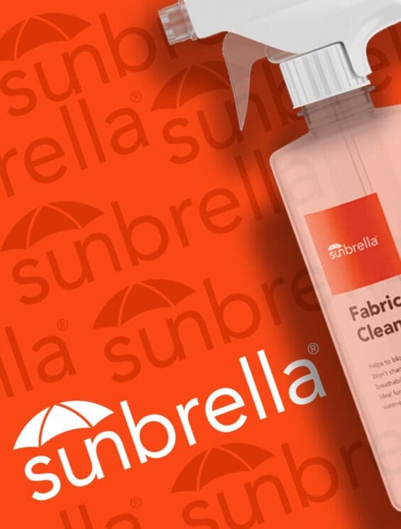
You can spend two years perfecting a formula and lose the sale because your packaging signals the wrong thing. In personal care, perception precedes performance. For instance, if your skincare packaging doesn’t instantly communicate efficacy, safety, and relevance, consumers won’t wait to find out what’s inside. They’ll move on.
Packaging design for personal care brands is caught between clinical authority and clean minimalism. White space dominates, sustainable packaging claims multiply, and cosmetic packaging design leans toward softer, simpler, quieter design. Yet category growth is driven by brands that look unmistakably effective.
In this article, we will break down what actually drives performance in packaging design, from purchase drivers to hierarchy to structure, and how to engineer beauty packaging that earns trust, commands attention, and converts in-market.
What makes personal care packaging different?
Personal care operates at the intersection of science, emotion, and identity. Unlike many CPG categories, packaging decisions directly influence perceived safety, performance, and credibility before a beauty product is ever used. That complexity reshapes everything from graphic design choices to structure and claims strategy.
High perceived risk.
Applying skin care directly to the body immediately increases perceived risk. Consumers worry about skin reactions, especially when using formulas long-term. In the baby and oncology subcategories, that risk sensitivity intensifies.
Skincare packaging must therefore signal safety, stability, and reliability without hesitation. Colors, materials, and custom packaging structures all play a role in reinforcing confidence. Even minimalist packaging must communicate strength and protection.
Emotionally loaded purchases.
Many beauty packaging decisions are tied to vulnerable moments. Acne affects confidence. Aging challenges identity. Hair loss impacts self-image. Intimate concerns and chronic irritation often carry embarrassment or frustration.
That emotional weight changes how a beauty product is evaluated. Skincare design cannot feel dismissive, overly playful, or aggressively clinical. It must balance reassurance with authority.
Clinical vs. cosmetic tension.
Personal care must signal efficacy without becoming pharmaceutical. Consumers want proof that the formula works, but they do not want their bathroom to resemble a hospital shelf. Cosmetics packaging must feel elevated yet credible.
Minimalist packaging can communicate modernity, but without the right graphic design structure, it risks looking weak. Skincare product packaging must carefully layer clinical cues, typography, and color to communicate strength while maintaining approachability.
Regulatory guardrails.
Unlike many categories, skin care is subject to strict regulatory scrutiny. Drug claim sensitivity limits how benefits are communicated. Avoiding overpromising is critical, especially in treatment-focused beauty packaging design. Proof must be present, but positioned carefully to avoid liability. Graphic design choices must support compliance without diluting perceived efficacy.

How do personal care categories differ?
| Category | Primary Purchase Driver | Secondary Driver | Packaging Design Implications |
| Deodorant | Fragrance identity | Long-lasting protection | Fragrance name prominent, bold color coding, expressive design, benefit duration emphasized |
| Lotion (General Use) | Hydration efficacy | Skin comfort | Hydration claims lead, calming color palette, softer hierarchy, fragrance optional or secondary |
| Sensitive Skin Lotion | Safety & non-irritation | Gentle efficacy | Clean layout, soft neutrals, “dermatologist tested” cues, minimal visual noise |
| Acne Treatment | Visible results & speed | Clinical proof | Bold efficacy headline, strong contrast, structured typography, quantified claims |
| Luxury Serum | Ingredient potency | Prestige | Glass bottle formats, controlled minimalism, premium finishes, ingredient spotlight |
| Baby Care | Safety | Gentleness | Soft tones, rounded typography, reassurance claims, simplified hierarchy |
| Intimate Care | Discretion & relief | Comfort | Balanced tone (not clinical, not playful), clear problem-solution framing, calm design |
| Body Wash | Sensory experience | Moisturizing benefit | Fragrance naming, bold, vibrant colors, lifestyle imagery, expressive beauty packaging |
| Treatment Cream (Medical-Adjacent) | Condition relevance | Authority | Clinical palettes, proof placement near primary claim, clear usage instruction |
| Hair Loss Treatment | Efficacy | Authority | Structured hierarchy, scientific cues, measured dispensing formats |
Key purchase drivers in personal care packaging design.
Every packaging solution in personal care must be engineered around what actually moves consumers to act. Purchase decisions are driven by perceived results, reassurance, and clarity. When Beauty product packaging design aligns with these drivers, it strengthens brand identity, accelerates conversion, and builds long-term brand loyalty.
Perceived efficacy.
Perceived efficacy is the dominant driver in most treatment categories. Consumers scanning cosmetic products want immediate proof that the product will deliver visible results. Clear benefit statements, structured hierarchy, and confident branding reinforce performance.
Brands like Drunk Elephant succeed by prioritizing outcome-focused messaging that strengthens brand credibility without overwhelming the design.
Safety & non-irritation.
In sensitive subsegments, safety becomes equally critical. Consumers seek reassurance that a beauty product will not cause irritation, particularly in skin care designed for reactive or compromised skin.
Beauty product packaging must communicate hypoallergenic cues, dermatologist testing, or ingredient transparency. This balance protects brand trust while reinforcing brand loyalty.
Condition relevance.
A clear problem-solution fit is essential. Cosmetic products that directly name the concern, whether dryness, acne, or hyperpigmentation, convert more effectively than generic positioning. A packaging solution that visually highlights the condition ensures the brand speaks directly to the consumer’s need, strengthening brand identity and purchase confidence.
Authority and credibility.
Authority is built through structured design, proof cues, and expertise signaling. Certifications, clinical language, and disciplined branding elevate perception. Brands like Fenty Beauty demonstrate how cohesive brand identity and confident packaging can reinforce credibility while maintaining accessibility. Smart packaging that integrates QR-based proof or ingredient education further deepens trust.
Value justification.
Many product formats are small yet premium-priced. Concentration education, usage clarity, and benefit framing must justify the cost. A thoughtful packaging solution explains why less product delivers more results. When branding clearly communicates potency and efficiency, it strengthens brand equity and reduces price resistance.
Shelf visibility.
If it cannot be seen, it cannot be trusted. In crowded retail environments, shelf visibility drives first engagement. Strong contrast, legible typography, and cohesive branding systems ensure cosmetic products stand out. Smart packaging architecture that creates visual consistency across SKUs enhances recognition and builds lasting brand loyalty.

Mapping purchase drivers to packaging decisions.
Purchase drivers only create impact when they are translated into intentional packaging choices. Every design element, from color to structure, either reinforces or weakens the purchasing decision. Effective skincare packaging design connects behavioral insight to visible execution.
Color strategy.
Color is never decorative in a high-performing personal care brand; it is strategic. Clinical palettes, whites, blues, muted neutrals, reinforce efficacy and safety. Botanical cues signal natural ingredients, but an overreliance on green can unintentionally soften perceived performance, particularly in treatment-focused categories. In luxury skincare, deep contrast and controlled color blocking elevate the brand image while improving shelf visibility.
Typography and hierarchy.
Claim clutter kills clarity. When every benefit is bold, nothing stands out. Strong packaging design uses bold, benefit-first architecture to guide the eye. A minimalist design approach works only when hierarchy is disciplined. The primary outcome should dominate, followed by supporting ingredients and proof cues. A clean structure improves comprehension and speeds up the purchasing decision.
Claims architecture.
Primary messaging must answer the core consumer need. Secondary claims support it. Proof should sit near the main benefit, not buried in fine print. Quantified claims (“clinically tested,” “24-hour hydration”) outperform vague language (“supports healthy skin”). This precision strengthens brand image and positions the beauty brand as credible. Clear ingredient callouts also elevate perception without overwhelming the packaging.
Structural decisions.
Structure signals substance. Airless pumps suggest potency and formula preservation. Flip caps improve accessibility for everyday products like lip balm. A glass bottle communicates premium positioning in luxury skincare.
Secondary cartons increase perceived weight and authority. Custom cosmetic packaging that reinforces usability, enhances credibility, and reinforces the skincare brand’s professionalism.
SKU architecture and regimen systems.
Step-based design simplifies routines and reinforces cross-sell. Clear severity-level cues (mild, moderate, intensive) guide decision-making. Regimen-based systems strengthen brand identity and encourage loyalty across multiple cosmetic products. When packaging supports structured use, the beauty brand moves from single-purchase to system adoption, strengthening long-term brand equity.
Multichannel trust engineering for personal care brands.
A packaging system must perform on shelf, in a one-inch Amazon thumbnail, and inside a DTC unboxing moment. The brands that win engineer consistency across every touchpoint while optimizing for channel-specific behavior.
Retail Shelf
At retail, legibility of distance determines survival. If the primary benefit cannot be read from three feet away, it cannot influence choice. Contrasting against category norms matters, especially in clinical skin-care aisles dominated by white and blue.
Architecture clarity across SKUs reinforces navigation and strengthens brand recognition. Luxury packaging must balance premium finishes with bold hierarchy to stand out without losing authority.
Amazon
Amazon product packaging design is a different discipline. Thumbnail readability becomes the primary battlefield. Benefit-first dominance is critical because consumers scan, not study. Large typography, high contrast, and simplified layouts outperform subtle minimalism. Packaging must be engineered for conversion optimization, ensuring the core claim is unmistakable even at reduced scale.
DTC
DTC packaging expands the conversation. Educational layering through inserts, QR codes, and ingredient storytelling builds deeper credibility. DTC packaging can introduce regimen building and system architecture that strengthen lifetime value. Here, the experience extends beyond the box, reinforcing the brand’s authority, transparency, and long-term trust.
Why does most personal care packaging fail?
Personal care packaging fails because the strategy is replaced by an assumption. In a category driven by perceived efficacy and safety, even subtle design misalignments can erode confidence, reduce conversions, and quietly weaken performance.
Designing for aesthetics instead of purchase drivers.
Trend-chasing minimalism has become a common trap. Brands strip back the visual hierarchy in pursuit of a modern appeal, but in doing so, they mute efficacy cues. Clean layouts are powerful only when anchored to dominant drivers of purchase. When design prioritizes style over clarity, consumers struggle to understand why the product works, and hesitation replaces intent.
Overcorrecting toward “clean.”
The push toward “clean beauty” has led many brands to soften their palettes and reduce clinical signals. While natural positioning can build reassurance, overly muted colors and gentle typography can dilute perceptions of performance. In treatment categories, especially softness can unintentionally signal weakness, reducing perceived efficacy at the shelf.
Claim overload.
Too many badges. Too many icons. Too many promises. Without hierarchy, every benefit competes for attention. Consumers scan quickly, and when messaging feels crowded, nothing stands out. Strong packaging simplifies, prioritizes, and structures claims so the primary benefit leads and supporting proof reinforces it.
Redesigning without validation.
Founder preference, internal bias, or competitive mimicry often replace consumer insight. Without testing purchase drivers, brands risk weakening performance signals. Packaging should be engineered around validated behavior, not internal opinion.
Ignoring channel reality.
Retail and Amazon operate under different visual rules. What performs beautifully on the shelf may disappear in a one-inch thumbnail. Conversely, bold digital-first layouts can feel aggressive in-store. Packaging must be optimized for both environments. When channel realities are ignored, trust fractures, and performance suffer quietly.

Nice Package
Don’t miss out on our monthly newsletter Nice Package!
Each month, we deliver a data-driven newsletter directly to your inbox, unpacking a critical topic in the FMCG & CPG industry.
"*" indicates required fields
Data-driven packaging design for personal care brands.
SmashBrand is a data-driven packaging design agency that specializes in performance-focused solutions for personal care brands. We help you identify the true purchase drivers in your category, optimize claims hierarchy, and engineer packaging systems that build trust, improve conversion, and reduce in-market risk.
Our integrated process combines strategy, creative exploration, and predictive consumer testing into one stage-gated workflow. We validate messaging, diagnose design impact, and refine before launch, so your packaging is based on measurable insights that protect performance and drive growth.

A seasoned veteran in the CPG (Consumer Packaged Goods) industry, Jason Vaught brings a wealth of knowledge and hands-on experience as the director of content and marketing for SmashBrand. His comprehensive role at the forefront of brand communication ensures that CPG brands remain well-informed about the suite of services SmashBrand offers. Furthermore, his insights derived from the company's strategy, design, and testing services are invaluable to brand owners and managers seeking expert guidance.
From his early endeavors in launching a successful sports nutrition brand that gained prominence in significant bodybuilding and fitness retail spaces to his entrepreneurial ventures in kick-starting multiple brick-and-mortar and e-commerce startups across diverse industries, Jason's career is studded with substantial milestones. Notably, he has innovated numerous products later embraced by leading industry brands, showcasing his knack for anticipating market demands and setting trends.
Jason's journey in the CPG industry commenced at age 21. Over the years, he has worn multiple hats, ranging from a manufacturer and retailer to a distributor and brand owner. This multifaceted experience equips him with the rare ability to offer practical advice grounded in real-world expertise. His mission is to guide and support other CPG brand owners, directors, and managers on their path to success.
Subscribe to
Nice Package.
SmashBrand’s Nice Package: Stay current with our latest insights
Free Resource.

CPG product repositioning guide.
Explore the five undeniable signs your CPG product needs repositioning along with strategies for leveraging consumer insights for a guaranteed market lift.
Download Whitepaper About CPG product repositioning guide.