The durable goods category represents one of the most overlooked opportunities in CPG packaging. While the products are built to last, the packaging rarely reflects that promise. From small kitchen appliances to electric grooming tools, most packaging design decisions are driven by operational convenience rather than strategic intent. The result is packaging that protects the product but fails to move it off the shelf.
Effective packaging design for durable goods must convey value at a glance, justify the price point, and build consumer trust within seconds. Yet the majority of product packaging in this space relies on generic visuals, diluted messaging, and outdated design systems that lack impact.
Take handheld vacuums, a billion-dollar category. Walk the aisle and you’ll see the same recycled template: grayscale product shots, uninspired typography, maybe a “2X Suction Power” badge that’s been used on every model since 2012. No clarity. No emotion. No reason to believe.
Packaging materials are selected for cost efficiency, not for how they reinforce quality. Custom packaging is underutilized. Critical design elements, such as hierarchy of claims, product imagery, and finish, are often handled as afterthoughts rather than performance drivers.
What makes durable goods packaging so different?
Durable goods packaging demands uncompromising precision. These purchases cost more, last longer, and face more consumer skepticism than fast-moving goods. Every facet of the package must deliver proof. Buyers expect tangible signals: weight in hand, finishes that feel engineered, structure that resists daily use.
Unlike packaging in flavor-led categories where color or imagery can mask weaknesses, durable goods require clarity in construction and honesty in presentation. Every material choice, whether in plastics, rigid shells, metals, or corrugated cardboard, becomes a credibility test. Thickness, joint quality, seal integrity, and texture all influence whether the pack is believed.
Sustainability initiatives can’t be cosmetic. Reusable packaging, recycled content, or minimalist design must still sustain physical performance. If a box warps, a plastic clasp breaks, or finishes crack, the eco badge becomes a liability. The right packaging solution integrates environmental responsibility with structural robustness.
Durable product packaging design must anticipate how consumers assess products long before they try them. Online specs, expert reviews, and side-by-side comparisons make inconsistencies unforgiving. Consistency across channels, from on-shelf presence to online thumbnails, reinforces credibility.
Durable packaging lives or dies at the intersection of utility and promise. When both are present, it fosters trust. When either is missing, it undermines value.
Where most durable goods packaging designs fall apart.
The shelf exposes every weak link: unproven claims, noisy layouts, flapping thin material, hidden products, or wildly inconsistent branding. People don’t buy what feels unsure. They only commit when the product packaging design shows confidence.
If any design element gets compromised, a claim, the material, the visibility, the brand architecture, the whole thing falls apart. The following are some of the common reasons behind almost every failed packaging design for durable goods.
Claims that lack credibility kill trust.
Claims like “lasts for a lifetime,” “99.9% performance,” or “rust proof” become poison when product packaging design doesn’t back them up. Consumers test, research, and compare online (Amazon reviews, Home Depot specs, Consumer Reports). When what’s inside doesn’t match what the box promises, trust dissolves.
Innovative packaging solutions avoid sweeping, vague statements. They favor specific benefit claims, verifiable proof points, and third-party endorsements. Overpromising damages long-term faith. Performance is remembered longer than flashy slogans.
Too many messages are competing for attention.
Packaging overloaded with icons, features, colors, badges, and logo variations loses clarity. The result: consumers see nothing and move on. Durable packaging demands visual economy. One primary benefit. One standout design element. Clean grids. Controlled color palette.
This is where white space in packaging design becomes helpful. Avoid packing ten messages onto one face of the primary packaging or using every inch to shout features. You want impact, not confusion.
A flimsy structure sends the wrong message for high-value goods.
Selecting thin stock, lightweight plastic rather than rigid plastics or corrugated packaging, or slick, cheap coatings looks cost-efficient, but it tells the buyer you cut corners. Material feels carry weight: metal textures, matte coating, weight in hand, strong hinges or closures.
Industrial packaging cues matter; product packaging design suggesting engineering, structural strength, and long-term use builds perceived value. Using the wrong packaging material undermines premium positioning, even if the product inside is of high quality.
Lack of product visibility.
When the product is hidden, inside a tray, opaque box, or behind graphics, trust drops. Buyers want to inspect: the tool head, the accessory, the texture, and the scale: transparent windows, cutouts, mockups, or even just high-quality photography on the pack help. Product-as-hero converts well.
When visibility is missing, consumers fill in blanks with doubts: “Does it feel durable? Is it the real size? Does it look credible?” You can have the best design, but if the product stays invisible, you lose.
Proliferation of SKUs without cohesion weakens shelf presence.
Multiple SKUs under the same brand that look different create friction. One SKU makes a statement; ten that look unrelated confuse the eyes, weaken recognition. When someone researches online, sees inconsistent branding on Amazon and Home Depot, and in stores, it erodes confidence.
The brand looks fragmented, not professional. Effective package design maintains a firm brand identity, encompassing a shared structure, hierarchy, design element system, logo placement, materials, and finish.
The packaging elements that actually drive selection.
Bold design and aggressive color blocking cut through the static. Consumers scanning aisles won’t pause for indecision. They react to packaging that telegraphs confidence without drowning in decoration. Smart packaging eliminates visual noise in favor of fast, instinctive recognition.
This is especially true in omnichannel packaging design, where consistency between retail and ecommerce platforms is non-negotiable. Creative packaging design that leads with precision is what makes them stop and engage.
Show the product like it’s worth buying.
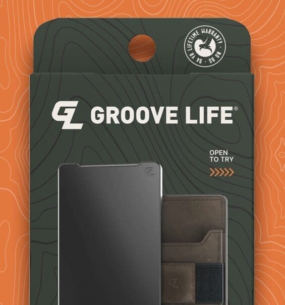
No amount of design trickery replaces the consumer’s need to see the product, whether it’s clear plastic packaging that showcases a tool’s ergonomic shape, or secondary packaging with a custom cut-out that reveals part of the product.
Durable goods often succeed when their form suggests function. From toothbrushes to power tools, putting the product front and center communicates more than any marketing line could. For packaging designers working across platforms, this means anchoring the brand experience in physical reality, even in digital environments.
Only promise what performance can prove.
Words like “heavy duty,” “rust proof,” or “long lasting” are promises. But in packaging design for durable goods, these claims only work when they’re supported by real-world performance. These are not impulse buys, and exaggerated claims can create friction instead of conversion.
Effective packaging designers use claims with surgical precision, placing them where they add value without becoming noise. In categories such as laundry packaging design or flexible packaging applications, performance cues must feel earned, not invented.
Feel matters more than you think.
Visual polish without physical substance breaks trust instantly. Matte finishes, reinforced edges, molded components, and rigid substrates communicate permanence. Whether it’s primary packaging or secondary packaging for high-involvement products, the tactile experience must align with the expected longevity.
Even recyclable or compostable formats need to hold their shape, protect the product, and resist damage across the supply chain. Premium packaging doesn’t always mean high cost, but it must always mean high perceived value.
Lead with what converts.
Most durable goods buyers are information-hungry, but not all at once. The front of the package should communicate the one thing they need to know first: what it is, why it’s different, and why it’s worth it. Secondary details, such as specifications, certifications, or compatibility, should be placed on the back or side panels.
Effective omnichannel packaging design mirrors this hierarchy across platforms. Whether it’s on an Amazon carousel, a retail endcap, or a YouTube unboxing, the structure should hold. Even categories like edible packaging or cosmetic packaging benefit from this clarity. The more complex the product, the more critical the order of communication.
Design alone doesn’t win.
Packaging that looks pretty but isn’t tested is a liability. When you skip the data, you’re betting on hope instead of strategy. In durable goods, where price, performance, and trust matter more than color trends, you need proof. That proof comes from testing, not design alone.
What separates packaging that moves off the shelf from the stuff that collects dust are four cornerstones: attention mapping, claim performance, competitive validation, and risk mitigation. Let’s get into each one.
Heat maps reveal attention gaps and visual confusion.
Heat maps show you where eyeballs go, and where they don’t. That tells you which parts of your product packaging design are being ignored. Maybe your logo is buried. Perhaps a performance cue is never seen, but a decorative flourish takes up prime space. In the context of durable goods, this is even more brutal: customers have limited patience for ambiguity.
For example, a handheld power tool with a heat map study might show that people look first at the handle shape, not the “extra watt” badge. When that happens, your packaging strategy needs adjusting: move critical design elements to where people look first. Good design without attention is just decoration.
Pack words testing reveals effective claims.
Words matter. But in durable packaging, many brands assume that “heavy duty” or “rust proof” will always land. Pack Words testing throws those assumptions out. It isolates potential claims to reveal what resonates and what feels like hype. For example, a brand selling outdoor power equipment might test both “rust proof” vs “weather resistant + 5‑year warranty” to see which actually converts.
That testing will also expose which claims undermine brand image by sounding like marketing fluff. An innovative packaging design process uses this testing early so that every phrase on the box builds credibility instead of causing skepticism or noise.
Purchase intent tests validate the effectiveness of design.
Purchase Intent (PI) testing forces your packaging to compete. It’s not just “Do you like this design?” It’s “Would you buy this over that one for the price shown?” That matters a lot when shelf or ecommerce competition is intense. PI tests validate whether your packaging solution earns shelf space and justifies premium pricing.
Think about sustainable packaging design: you can have all the right materials, but if shoppers don’t believe you’ll deliver on durability, they won’t pay extra. PI testing shows what people are willing to spend money on, not just what they think looks nice.
Without testing, you’re gambling.
Designing packaging without testing is like launching a product unbranded: you hope it sticks, but expect failure. The risk is financial loss, inventory issues, and brand erosion. Durable goods have high unit costs, extended supply chains, and often high retail or marketplace exposure.
Suppose your packaging wastes developer effort, uses subpar plastics or industrial packaging materials without validation, or leans on cosmetic packaging impressions instead of structural proof. In that case, you lose twice: the cost in materials and lost sales.
Brands investing in testing see vastly lower packaging waste, avoid over‑spec’d claims that fail, and build better alignment between what the pack looks like and what consumers will buy based on trust, proof, and brand image.
Steps to an impactful packaging design for durable goods.
The following are the key steps to an effective packaging design strategy for durable goods.
Step 1: Strategy First.
Start with research. Audit the shelf, understand how your product is judged, and define the trust signals your packaging must deliver. Choose packaging materials that align with category expectations; consider corrugated cardboard over thin plastics when durability is a priority.
Step 2: Visual Concepts.
Explore multiple packaging design directions. Test structure, layout, and packaging trends. Validate whether product-as-hero or utilitarian visual cues resonate better before finalizing the direction.
Step 3: Lock in Messaging.
Refine every word before structural mockups. Durable goods need proof-driven language, not vague marketing lines.
Step 4: Prototype & Pressure Test.
Build real-world mockups using actual materials. Test handling, durability, and shelf presence across DTC and retail environments.
Step 5: Test What Matters.
Design diagnostics, pack words, and purchase intent tests. Identify weak spots in structure, messaging, or material perception before launch.
Step 6: Refine & Finalize.
Make data-driven tweaks. Then finalize dielines, color specs, and tolerances. Ensure primary and secondary packaging are aligned.
Step 7: Align Across Channels.
Sync your retail packaging design, DTC unboxing, and eCommerce visuals. Ensure consistency in look, feel, and performance from shelf to doorstep.

Nice Package
Don’t miss out on our monthly newsletter Nice Package!
Each month, we deliver a data-driven newsletter directly to your inbox, unpacking a critical topic in the FMCG & CPG industry.
"*" indicates required fields
Data-driven packaging design for durable goods that win shelf attention.
SmashBrand is a data-driven packaging design agency specializing in packaging durable goods and CPG products, combining real consumer insights with bold creative execution. Our difference? We test and create custom packaging that earns trust and drives sales through behavioral data, category diagnostics, and purchase intent validation.
From industrial tools to smart home gear, we build packaging systems that resonate across retail and DTC channels. Our process starts with positioning, evolves through structural packaging design, and is validated by in-market testing. Ready to create packaging that performs as hard as your product? Let’s talk.
Subscribe to
Nice Package.
SmashBrand’s Nice Package: Stay current with our latest insights
Free Resource.

CPG product repositioning guide.
Explore the five undeniable signs your CPG product needs repositioning along with strategies for leveraging consumer insights for a guaranteed market lift.
Download Whitepaper About CPG product repositioning guide.


