You’ve poured your energy into a new animal packaging design, but when it hits the shelf, it gets passed over. You know it deserves better. Whether it’s farm animal food, supplements, or a specialty feed, too many packages fail to connect with today’s shoppers and their evolving expectations.
Successful animal packaging design resonates well with livestock farmers, especially those who treat their animals, such as chickens, goats, or cows, more like family than livestock. It must strike a balance between shelf impact, clear communication, and sustainable packaging choices without compromising brand integrity.
In this article, you will discover why most animal food packaging design fails, how to fix it, and what strategic packaging design looks like, so your next launch isn’t just good-looking, but high-performing.
What buyers notice first in animal packaging design.
Buyers don’t usually have time for second-guessing. The product that gets picked up is the one that instantly communicates what it is, who it’s for, and why it matters. Whether it’s a treat, health supplement, or everyday dog food packaging, clarity wins. In the animal food industry, standout branding and innovative packaging design are essential.
Buyers evaluate food package options not just on aesthetics but on consumer relevance and visual structure. Strong logo design, strategic use of flexible packaging, and intuitive layout make the difference between getting listed and getting overlooked. If your design doesn’t immediately speak to modern farm owners or convey industry trends, your product gets passed over, no matter how good it is for animals.
Why most animal packaging designs fail.
Most animal packaging falls short due to strategic blind spots. Too often, brands dive into package design without a clear roadmap. They build for internal preferences instead of consumer realities, assuming they know what the buyer wants without validating it. This guesswork leads to packaging that looks nice but fails to convert.
The real issue? A lack of alignment between the product’s purpose and how it’s visually communicated, especially across different retail environments. What works for a dog treat won’t necessarily work for a farm-and-feed store selling a horse feed or cat food. Animal food companies that ignore these distinctions end up with packaging that feels off, unclear, or irrelevant.
The clarity gap that kills velocity.
The top reason most animal packaging design underperforms? Consumers don’t immediately understand the product. It’s not enough to be cute or clever. Terms like “Dog Chow” might sound charming, but when shoppers can’t quickly identify what the product is or who it’s for, they move on. Confusion on the shelf means lost sales, no matter how good the formula inside the bag is.
This is where most brands stumble. The best-performing packaging is straightforward and to the point. That means literal product visuals, benefit-driven naming, and a tight front-panel hierarchy that does the heavy lifting. Whether it’s compostable packaging, flexible packaging, or a premium custom packaging solution, structure matters. Materials and design follow the purpose.
Only emotional design isn’t enough.
Of course, emotion matters in animal packaging. Livestock farmers often form a deep connection with the products they purchase for their animals. They gravitate toward warmth, care, and storytelling, especially from animal brands that align with their values. But here’s why many brands get it wrong: emotional design without functional clarity creates friction.
Your animal packaging might showcase charm and personality, but if it leaves consumers unsure of what the product does, it won’t sell. A design that makes people smile but doesn’t communicate its purpose creates hesitation, and hesitation slows conversion. Effective animal packaging must strike a balance between emotional appeal and functional clarity, ensuring that the message and use case are instantly understood.
Product understanding must be instant.
Even the most thoughtful shopper will struggle to decipher confusing packaging. If they’re standing in the aisle or scrolling online, and the purpose of your animal product isn’t instantly clear, they’ll move to something that is.
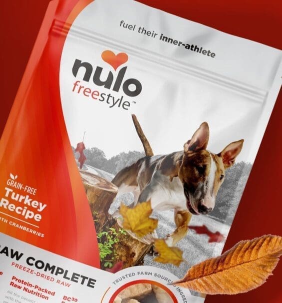
This is a common miss in animal packaging design. Clever names or vague descriptors might sound unique internally, but they leave buyers guessing. When Kreamer Feed tested concepts, literal visuals, like a baby chick for starter feed, consistently outperformed poetic names. What worked? Strategic naming, such as “Little Beaks,” with smart iconography and a clean front-panel design.
Whether it’s pet food packaging, sustainable packaging, or elevated retail packaging design, function must come first.
Every retail channel has different demands.
Every channel comes with its own set of expectations, and what works in one can fail in another. That’s why a single approach to animal packaging design often underdelivers. Farm and feed channels, such as Tractor Supply and local co-ops, demand packaging that signals durability, utility, and a clear product purpose. These environments favor straightforward messaging, rugged aesthetics, and materials that withstand the rigors of real-world conditions.
On the other hand, specialty pet retailers like PetSmart and Hollywood Feed expect packaging that communicates lifestyle appeal, wellness cues, and emotional storytelling. Shoppers in these environments are often looking for premium experiences and expect the packaging to reflect that. Trying to force one format or message across both audiences ignores this strategic reality. The most effective brands adapt their packaging design process per channel, tailoring structure, messaging, and visual hierarchy to match the buyer’s mindset.
This is where PREformance package design testing and brand style guides become non-negotiable. They ensure your look, tone, and hierarchy flex appropriately, whether it’s rugged feed bags for co-ops or polished DTC packaging design for premium retailers. Pre-production services help refine these adaptations before they go to print.
Strong packaging design ideas are only practical when shaped by the channel they’re meant to serve. Stay aligned with packaging design trends, but always let function and audience dictate execution. That’s how smart brands scale with intention and win on every shelf.
Packaging formats must serve real-world use.
Great design falls flat when it ignores how the product is handled, stored, and displayed. Too often, brands default to what looks good in a presentation but breaks down in real life. For instance, Paper bags gave early concepts a natural, vintage packaging design appeal. But on the shelf and in transit, they tore too easily. The fix? Moving to more durable bags printed with a craft texture, retaining the premium look while delivering on performance. That shift balanced modern packaging design aesthetics with real-world durability.
Structural choices like this aren’t cosmetic. They affect how retailers view the product’s quality, how easily it catches the consumer’s eye, and how confident a buyer feels placing it on the shelf. Today’s top-performing brands treat structural format as an extension of the brand itself, whether they’re pursuing eco-friendly packaging design or innovative packaging design that stands out and holds up.
The digital shelf demands its own strategy.
Platforms like Chewy don’t give you a second chance. If your packaging design doesn’t pop at thumbnail size, if the benefits aren’t immediately clear, you’re invisible.
Too many brands treat digital as an afterthought, resizing a physical package instead of rethinking how it performs in a scroll-first world. Visual consistency, sharp benefit-forward messaging, and a layout that reads well at mobile scale are the key differences between abandoned carts and conversions.
Great packaging scales. The same structural discipline that drives in-store performance must translate seamlessly to the digital shelf. Anything less? You’re leaving an opportunity behind.

Why testing and iteration matter in animal packaging design.
Packaging decisions made without consumer input are high-risk. It’s easy to get attached to an idea that appears strong internally but falls short on the market. The only way to avoid that disconnect is by putting concepts in front of real consumers, early and often. During the testing phase at SmashBrand, we typically find that one design outperforms the rest by a wide margin, with a three- to four-times higher purchase intent.
This is mainly due to refining the structure, visuals, and messaging based on actual customer feedback. Packaging is too visible and too expensive to rely on mere assumptions. Animal brands must integrate data-backed testing and an iteration process as part of their design strategy to test, adapt, and scale what works.
The framework for packaging that performs.
High-performing animal packaging is the result of a structured process that aligns consumer insights, strategic design, and channel-specific execution. For brands looking to win in today’s competitive landscape, here’s what that framework looks like in practice:
Start with insight.
Before exploring visuals or naming, the process begins with understanding the data that drives consumer decisions at the shelf and online. From ingredient priorities to emotional triggers, these insights shape the foundation for design. Without this step, packaging often reflects internal bias instead of external behavior.
Align emotion, clarity, and channel demands.
Every channel has its own rules. As mentioned earlier, what works in a farm and feed store won’t succeed in a premium pet aisle or an e-commerce scroll. Packaging must strike a balance: providing an emotional connection for pet parents, offering functional clarity for new livestock owners, and maintaining a visual hierarchy tailored to the location where the product is sold.
Design systems built for growth.
Isolated designs don’t scale. A strategic package design system creates consistency across categories and SKUs while allowing for necessary differentiation. From color coding and species-specific visuals to adaptable brand architecture, the goal is cohesion that flexes with your portfolio, not reinvention with every launch.
Validate and iterate with real consumers.
Testing is where strategy becomes performance. Concepts are refined through direct consumer feedback on naming, imagery, structure, and claims. This step reduces risk, confirms what resonates, and ensures every pack earns its shelf space.

Nice Package
Don’t miss out on our monthly newsletter Nice Package!
Each month, we deliver a data-driven newsletter directly to your inbox, unpacking a critical topic in the FMCG & CPG industry.
"*" indicates required fields
Data-driven animal packaging design that wins shelf space and consumer attention.
Looking for the best animal packaging design that outperforms competitors on the shelf and gains attention? We can help! Our PREformance™ testing suite takes the guesswork out by validating what works before you launch. We ensure every element is built for velocity, shelf standout, and real consumer impact. Ready to see how your packaging performs before it hits the shelf? Let’s talk.

A seasoned veteran in the CPG (Consumer Packaged Goods) industry, Jason Vaught brings a wealth of knowledge and hands-on experience as the director of content and marketing for SmashBrand. His comprehensive role at the forefront of brand communication ensures that CPG brands remain well-informed about the suite of services SmashBrand offers. Furthermore, his insights derived from the company's strategy, design, and testing services are invaluable to brand owners and managers seeking expert guidance.
From his early endeavors in launching a successful sports nutrition brand that gained prominence in significant bodybuilding and fitness retail spaces to his entrepreneurial ventures in kick-starting multiple brick-and-mortar and e-commerce startups across diverse industries, Jason's career is studded with substantial milestones. Notably, he has innovated numerous products later embraced by leading industry brands, showcasing his knack for anticipating market demands and setting trends.
Jason's journey in the CPG industry commenced at age 21. Over the years, he has worn multiple hats, ranging from a manufacturer and retailer to a distributor and brand owner. This multifaceted experience equips him with the rare ability to offer practical advice grounded in real-world expertise. His mission is to guide and support other CPG brand owners, directors, and managers on their path to success.
Subscribe to
Nice Package.
SmashBrand’s Nice Package: Stay current with our latest insights
Free Resource.

CPG product repositioning guide.
Explore the five undeniable signs your CPG product needs repositioning along with strategies for leveraging consumer insights for a guaranteed market lift.
Download Whitepaper About CPG product repositioning guide.