You’re not losing at Whole Foods because of your natural or BFY food product, but because your packaging design is quietly telling consumers, “I don’t belong here.” At Whole Foods Market, earthy fonts, craft textures, and swapping plastic for sustainable packaging won’t always guarantee performance. Here, they can become category camouflage.
The problem here is that most brands still rely on overused natural tropes, lazy product packaging swaps, and unnecessary white space. Some brands also make surface-level sustainability claims, such as reduced single-use plastic, without rethinking packaging materials, bags, or the fundamentals of structural packaging. What looks “healthy” may not always convert.
In this article, you’ll learn about winning Whole Foods packaging design strategies. You will learn the key purchase drivers to include in your Whole Foods packaging design to improve your sales performance. This article will also walk you through common pitfalls to avoid when designing whole-foods packaging.
Understanding the Whole Foods shopper.
At Whole Foods, you’re designing packaging for someone browsing the shelf with a reusable water bottle in one hand and their phone in the other, double-checking whether they added organic baby spinach to their delivery cart. Whole Foods Market shoppers are looking for the right story, told quickly. In this grocery store, packaging design is about trust at speed.
These customers don’t need convincing that your product is better for them. They’re already bought in. What they need is a food packaging design that proves your brand is worth their premium dollars in the 3-13 seconds they spend evaluating it. And in those seconds, it’s not about shouting louder, it’s about saying the right things, with clarity, in a way that fits seamlessly into their lifestyle.
Let’s break down what actually drives their decisions.
Clarity comes first.
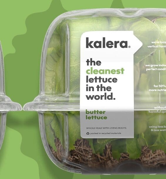
The first job of packaging design in Whole Foods is simple: Say what it is, and why it matters, fast. Shoppers are scanning for value and trust signals. Ingredients, sourcing, and freshness need to be instantly legible. If your design is buried in clutter, you’re out.
This is where brands fall apart, trying to do too much, say too little, or hide behind vague “natural” language. The best food packaging here makes buying feel effortless.
Visual disruption.
On Whole Foods shelves, especially in categories like produce or refrigerated items, the packaging palette is often a blur of whites, soft greens, and minimalist sans-serif fonts. It’s clean—but also visually monotonous. In this environment, blending in is the fastest way to be ignored. But there’s a fine line between disruption and dissonance.
The Whole Foods shopper is visually literate. They interpret loud or overly commercial food packaging design as suspicious. Introduce a confident pop of color, a standout structural element, or a refined illustration style, and suddenly, you’ve created what we call “pattern interruption.” SmashBrand knows how to disrupt just enough to earn the nod, from both the shelf and the soul.
Believability beats buzzwords.
People at Whole Foods aren’t just impulse buyers; they check labels, scan categories, and plan their pantry. So if your claims feel inflated or your ingredients list feels engineered, they’ll put your beautifully boxed fresh turkey slices right back on the store shelf. Believability isn’t about saying less, it’s about saying what matters, clearly and credibly.
Your packaging design shouldn’t have to scream “ethical sourcing” if it’s baked into your structure and story. Your straws shouldn’t need a plastic-free badge if the material already communicates it.
Emotional alignment drives the “yes.”
Rational cues get you considered. Emotional cues get you chosen. Whole Foods customers aren’t just shopping; they’re curating. And when your packaging aligns with their values, it signals more than product quality.
It tells them: “This is for people like you.” Design that reflects lifestyle wins more than design that pushes product. If your soups or produce packaging design doesn’t spark a feeling of “that belongs in my fridge,” no amount of copy can save you.
Simplicity meets intelligence.
Whole Foods customers want simplicity, but they’re also high-information shoppers. They’ll scan labeling freshness details and then make an instinctive call in moments. Your packaging must balance clear structure with layered intelligence.
Think clean panels, a tight claims hierarchy, and optional depth, like QR codes that link to sourcing or side panels that tell the full delivery options story.
Designing for Whole Foods’ merchandising and shelf realities.
Shelf presence at Whole Foods is a constraint. With tighter layouts and curated assortments, your package design has less room, less time, and far fewer chances to prove it belongs.
With tighter shelf space, your strategy needs to be smarter.
Compared to big-box grocers and mass retailers, Whole Foods operates on a smaller footprint with fewer refrigerated and frozen sets. Especially in specialty, produce, and grab-and-go categories, you’re not dealing with expansive shelf runs; you’re competing in inches.
That means food packaging design has to punch above its weight. Clarity, structure, and impact become tools for survival.
Your packaging has to work harder with fewer facings.
Most brands at Whole Foods get one or two facings, tops. No billboard spreads. No front-and-center endcaps unless you’re in rotation or part of a feature. This forces every food product package to perform solo.
If your visual identity doesn’t communicate clearly and memorably in isolation, you’re invisible. That means no reliance on shelf blocking or surrounding product cues, just one shot to catch a shopper’s attention and hold it.
Color blocking, vertical flow, and scan speed.
In Whole Foods, shelf aesthetics are visually quiet. White backgrounds, natural textures, and subtle cues dominate. To break through:
- Use color with intent. Not default greens or overused neutrals, but brand-ownable hues that signal taste, category, or function.
- Design vertically. Shoppers scan top to bottom, especially in tight spaces. Structure your labeling, freshness, ingredients, and claims accordingly.
- Speed matters. If a customer can’t understand your food packaging at a glance, it’s a missed sale.

Competing in a natural retail environment with a strong private label.
In Whole Foods, private label is the benchmark. The 365 brand has redefined what “good enough” means on grocery shelves. Their packaging is clean, their color palettes are tight, and their flavor cues are intuitive. They don’t waste space on the shelf or the pack. For instance, consider Whole Foods’ 365 line, from peanut butter to frozen vegetables; it delivers clarity, consistency, and category trust at a lower price.
This is the “default yes” for many Whole Foods shoppers. And that’s the problem. If your food product only offers incremental value, or if your packaging design looks like a slightly prettier version of a private label. You’ll get passed over before the branding even has a chance to speak.
Why private label sets a high bar.
365 by Whole Foods is setting the standard for clarity. One glance communicates what the product is, why it’s healthy, and what it costs. They’ve mastered simplicity, and with fewer internal suppliers to wrangle, they move fast and execute efficiently. The result: food packaging that delivers quick wins in categories like fruit, vegetable snacks, or shelf-stable pantry items.
How emerging brands rise above “good enough.”
To win in a space dominated by elegant utility, you can’t out-simple the simple. You have to out-strategize it. Emerging brands must elevate their packaging by going deeper. That means:
- Crafting a clear, differentiated value prop
- Using premium cues (matte finishes, minimalist architecture, elevated color palettes)
- Highlighting sustainable packaging choices without defaulting to single-use plastic guilt tactics
- Owning a story that a private label doesn’t have time to tell
Whether it’s a coffee packaging design or delivery-friendly packaging for DTC snacks, the goal is to convince the consumer you’re worth it.
The core characteristics of winning Whole Foods packaging design.
If your packaging design looks like it belongs at a discount store, it won’t perform at Whole Foods. This is an environment where shoppers expect more, more clarity, more intention, more alignment with their lifestyle values. They’re not hunting for the cheapest item or the flashiest spirits packaging. They’re curating their cart, one meaningful choice at a time.
Clean, modern, natural aesthetics.
Those days are gone when “natural” meant burlap textures and hand-drawn leaves. That’s Whole Foods 2011. Today, modern natural wins, aesthetic minimalism with the emotional cues of simplicity, wellness, and clarity. Think Scandinavian restraint, clean lines, disciplined color palettes, subtle materials. Whether it’s frozen food packaging for cauliflower gnocchi or vitamin packaging for daily blends, the pack needs to feel as intelligent as the consumer scanning it.
Modernity doesn’t erase natural cues; it sharpens them. Soft neutrals, matte finishes, and intentional whitespace now signal the quality Whole Foods shoppers expect, without slipping into dated or rustic territory.
Radical front-panel clarity.
Whole Foods shoppers process the front panel like a headline, skeptical, and looking for a reason to trust. They want facts, innovative structure, and clarity that doesn’t try too hard.
The hierarchy should be brutally simple:
- What it is (product)
- Why it matters (benefit)
- Why it’s true (proof)
Strategic use of whitespace can be your best friend. Whether you’re designing spirits packaging or a new line of vitamin packaging, clarity beats clever. Always.
Ingredient-forward visuals and transparency.
Whole Foods is a trust-driven retail space. That means shoppers want to see (or believe) what’s inside. If your packaging has a clear window, and your product looks fresh? Use it. If it doesn’t? Then lean into photography or illustration that feels honest, not stylized.
Authenticity matters. Whole Foods shoppers reward packaging that puts ingredients first, not abstract lifestyle cues. Your pack should feel like a confident handshake, not a sales pitch.
Differentiation without breaking category logic.
Every natural aisle has its visual clichés: green matcha, beige protein, white supplements. And yet, trying to “stand out” too hard just alienates the buyer.
The trick? Disrupt the shelf responsibly:
- Use color to pop, not confuse
- Use shape or structure to interrupt the pattern without causing whiplash
- Use pattern and layout to catch the eye, then organize it
Common pitfalls that hold brands back.
We’ve seen brilliant food products flop because their packaging design leaned too hard on assumptions and not enough on context. Whole Foods is a curated space where innovative design earns a spot in the cart. Here’s where most brands go wrong:
Relying on rustic, outdated tropes.
Let’s be honest, brown kraft paper and leafy illustrations had their moment. That moment passed. Shoppers today associate overly rustic visuals with “trying too hard” or “out of touch.” The Whole Foods aisle has evolved, but too many food packaging systems are stuck in 2010.
Clean, modern cues outperform the “farmers market” aesthetic. If your package design still screams “handmade” instead of “well made,” you’re already behind.
Front panel overload or burying the lead.
Clarity wins always, but far too many brands cram their packaging with every benefit, callout, certification, and mission statement, and then wonder why shoppers walk away. On the flip side, some brands bury their strongest selling point in fine print or side panels.
Looking like everyone else.
When your packaging design looks too much like the competition, it disappears. When it seems nothing like the category, it confuses. This happens frequently in frozen food packaging, the vitamin, and supplement categories.
The shelves are filled with muted palettes and sterile layouts. If your design doesn’t carve out visual space while still signaling category relevance, you’re not distinctive, you’re lost.
Designing for mass-market impact.
Bold colors, big fonts, and loud branding may be great for general retail packaging, but they’re a terrible choice for Whole Foods. Designing like you’re in a big-box environment makes you look cheap, or worse, like you don’t belong.
At Whole Foods, packaging must speak in a lower, smarter register. That means nuance over noise, credibility over claims, and design that aligns with educated, values-driven buyers.

Nice Package
Don’t miss out on our monthly newsletter Nice Package!
Each month, we deliver a data-driven newsletter directly to your inbox, unpacking a critical topic in the FMCG & CPG industry.
"*" indicates required fields
Data-driven packaging design that performs in Whole Foods.
SmashBrand is a data-driven packaging design agency specializing in packaging for Whole Foods and other premium retail environments. Our approach is built for brands that need to stand out on the shelf, connect with high-intent shoppers, and outperform private label competition.
Our process integrates brand strategy, consumer behavior testing, and world-class creative into a single, stage-gated workflow. From initial concept to shelf-ready package design, we validate every decision against real category shoppers. Contact us now to discuss your project.

A seasoned veteran in the CPG (Consumer Packaged Goods) industry, Jason Vaught brings a wealth of knowledge and hands-on experience as the director of content and marketing for SmashBrand. His comprehensive role at the forefront of brand communication ensures that CPG brands remain well-informed about the suite of services SmashBrand offers. Furthermore, his insights derived from the company's strategy, design, and testing services are invaluable to brand owners and managers seeking expert guidance.
From his early endeavors in launching a successful sports nutrition brand that gained prominence in significant bodybuilding and fitness retail spaces to his entrepreneurial ventures in kick-starting multiple brick-and-mortar and e-commerce startups across diverse industries, Jason's career is studded with substantial milestones. Notably, he has innovated numerous products later embraced by leading industry brands, showcasing his knack for anticipating market demands and setting trends.
Jason's journey in the CPG industry commenced at age 21. Over the years, he has worn multiple hats, ranging from a manufacturer and retailer to a distributor and brand owner. This multifaceted experience equips him with the rare ability to offer practical advice grounded in real-world expertise. His mission is to guide and support other CPG brand owners, directors, and managers on their path to success.
Subscribe to
Nice Package.
SmashBrand’s Nice Package: Stay current with our latest insights
Free Resource.

CPG product repositioning guide.
Explore the five undeniable signs your CPG product needs repositioning along with strategies for leveraging consumer insights for a guaranteed market lift.
Download Whitepaper About CPG product repositioning guide.