That moment when a consumer grabs your product is a response to a system of visual cues on packaging design built to influence instinct. Every color choice, icon, and layout is a strategy. Picking the right design cues triggers trust, appetite, clarity, and curiosity.
From household packaging design to food packaging and everything in between, visual cues like color, layout, packaging material, and logo design can trigger instant consumer action.
Whether it’s rigid plastic packaging, flexible packaging, or sustainable packaging alternatives, what your consumer sees first dramatically influences what they buy, and what ends up as packaging waste or gets a second life through recycling.
In this article, you’ll discover how packaging, from plastic to premium packaged food, can drive purchase intent. We’ll discuss visuals’ strategic role in packaging design, brand perception, and e-commerce performance.
Purchase Intent in branding and packaging.
Purchase intent is the likelihood or willingness of a consumer to buy a product. In branding and product packaging, it’s the moment when consumer behavior moves from consideration to decision. This intent is shaped by practical reasoning and emotional connection, often influenced by what the consumer sees first.
Rational drivers, or “the head”, include functional benefits communicated through packaging design: price, product, performance, usability, and features. On the other hand, emotional triggers, or “the heart”, are tied to how a product makes someone feel. These can be sparked by visual cues such as packaging color, typography, or textures that suggest trust, excitement, or premium quality.
Packaging and visual design are critical in bridging these two forces. Combining graphic design and structural choices can shift consumer perception and reinforce brand identity. A well-crafted visual cue, like a bold flavor label, an appetite-inducing photo, or a distinct color block, can instantly grab attention and influence intent.

The psychology of visual cues.
Effective packaging design shapes consumer decision-making at a psychological level. From shelf standout to online unboxing, each visual element in product packaging design contributes to how the brand is perceived. Let’s break down the psychology behind the most impactful visual design cues:
Attention.
Your package design must earn attention instantly. Strategic use of bold color blocking, clean layout, and sharp contrast helps products stand out among competitors. These visual elements act as signposts, guiding consumer eyes and helping achieve instant brand recognition in cluttered retail environments.
First impressions often happen through small Amazon/Walmart thumbnails or influencer-led unboxing moments in the digital space. Custom packaging design must scale visually, using simplified but striking design elements that resonate on screens. These impressions often define perceived value and drive early purchase decisions before a product is held in hand.
Understanding.
Design elements like intuitive icons, resolution badges, and typography help consumers quickly understand a product’s functions and differences. These visual design cues cut through cognitive load and reinforce functionality, especially in tech and household categories.
Incorporate real-life imagery to add narrative depth, like a coffee shot steaming on a kitchen counter. This visual element helps consumers envision the product, enhancing brand management through contextual relevance. Complex products benefit from simplified packaging design. Clean layouts, minimal design elements, and innovative use of whitespace reduce confusion and create confidence.
Emotion.
Every visual decision, from finish to font, is a tool to influence perception and drive consumer behavior. Color psychology and texture trigger subconscious associations: matte black and gold whisper luxury, while soft pastels suggest playfulness or approachability. These are strategic cues engineered to influence how your product feels in your consumer’s hands and minds.
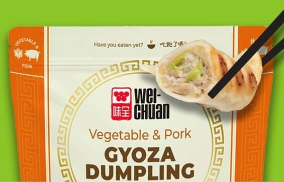
A food brand might use bold, taste-forward imagery to stoke appetite, while a sleek, minimal design could evoke high-tech precision. The goal is to create instant emotional clarity. Your product gets chosen when design cues resonate with the right shopper instinct.
Trust and confidence.
Trust begins with clarity and consistency. Every detail, from the quality of your packaging material to the structure of your design, sends a message. Impactful packaging design reinforces that the product is reliable, safe, and worth the investment. Visual elements can even signal abstract attributes like security and privacy. Brilliant packaging designers use design to imply performance and trust without saying it outright.
Visuals and the zero moment of truth (ZMOT).
Consumer decision making starts long before the shelf. This early phase, known as ZMOT, occurs when a potential buyer researches a product online. Whether scrolling through Amazon, watching unboxing videos, or browsing review sites, their purchase intention forms well before they pick up a package.
High-impact visual packaging elements also serve as digital sales tools. Platforms like Amazon rely heavily on strong visual hierarchy, where key product claims, use cases, and visual design elements must come through clearly in thumbnail views. Effective lifestyle content enhances consumer engagement by showing the product in context, reinforcing how it fits seamlessly into the buyer’s life.
Visual cues in physical packaging must be translated into digital formats without losing their punch. Consistent use of brand colors, icons, and structural cues supports consumer preference across digital and physical channels.
Marketing research consistently shows consumers judge product credibility and appeal based on these digital assets. Packaging shape, color, and hierarchy must now serve double duty in e-commerce environments to capture attention and convert intent into action.
Aligning visual cues with purchase drivers.
Behind every successful product is a deep understanding of what motivates consumers to buy. These motivations, called purchase drivers, form the rational and emotional foundation of consumer choice. Whether someone is evaluating a new food product or a household good, they unconsciously weigh performance, clarity, ease of use, and emotional pull before deciding.
Visual cues play a critical role in supporting these purchase drivers. Each design element, from packaging material to sensory perception, is an opportunity to reinforce value and win consumer attention on the shelf and online.
Below is a breakdown of how visual design can reinforce key purchase drivers:
| Purchase Driver | Supported By Visual Design Through… |
| Performance Communication | Icons, quality seals, or graphic representations that suggest function, results, or durability |
| Ease of Use | Clean layouts, intuitive icons, and simplified messaging enhance the perception of usability. |
| Premium Perception | Use of rich textures, minimalist layouts, and different colors (e.g., black or metallics) to convey quality |
| Clarity | Legible fonts, ample whitespace, and consistent hierarchy reduce confusion and guide consumer choice. |
| Cravability (Food) | Appetite shots, close-ups of textures, and strategic colour choices to enhance visual appeal and taste cues |
For food packaging, visual appeal is especially directly tied to taste expectations. The right colour can trigger hunger, signal flavor, or suggest freshness. For example, warm hues enhance capability, while cool tones might signal health or refreshment.
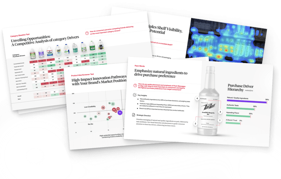
Packaging designers must leverage consumer testing and design diagnostics to ensure these visual cues work as intended. These tools help identify which cues resonate most, uncover communication gaps, and refine packaging design to better align with consumer attention and expectations.

Nice Package
Don’t miss out on our monthly newsletter Nice Package!
Each month, we deliver a data-driven newsletter directly to your inbox, unpacking a critical topic in the FMCG & CPG industry.
"*" indicates required fields
The Risk of Getting It Wrong
Cluttered layouts, inconsistent visual tone, and unclear messaging are some of the most common design pitfalls. For brands in categories like baby food packaging design, where trust and clarity are non-negotiable, missteps in structural packaging design can confuse consumers or even damage brand perception.
When visuals misalign with consumer expectations or the brand’s positioning, the consequences are fast: poor retail shelf conversion and high online bounce rates.
Guesswork in packaging is expensive. Without the backing of strategic design diagnostics and consumer testing, even the most creative packaging risks missing the mark. Every decision, from pre-production services to final pallet packaging design, must convey a clear, consistent message.
This is where a testing-driven approach and the guidance of a strategic brand architecture agency can make all the difference. By grounding creative decisions in research, brands design for performance.

A seasoned veteran in the CPG (Consumer Packaged Goods) industry, Jason Vaught brings a wealth of knowledge and hands-on experience as the director of content and marketing for SmashBrand. His comprehensive role at the forefront of brand communication ensures that CPG brands remain well-informed about the suite of services SmashBrand offers. Furthermore, his insights derived from the company's strategy, design, and testing services are invaluable to brand owners and managers seeking expert guidance.
From his early endeavors in launching a successful sports nutrition brand that gained prominence in significant bodybuilding and fitness retail spaces to his entrepreneurial ventures in kick-starting multiple brick-and-mortar and e-commerce startups across diverse industries, Jason's career is studded with substantial milestones. Notably, he has innovated numerous products later embraced by leading industry brands, showcasing his knack for anticipating market demands and setting trends.
Jason's journey in the CPG industry commenced at age 21. Over the years, he has worn multiple hats, ranging from a manufacturer and retailer to a distributor and brand owner. This multifaceted experience equips him with the rare ability to offer practical advice grounded in real-world expertise. His mission is to guide and support other CPG brand owners, directors, and managers on their path to success.
Subscribe to
Nice Package.
SmashBrand’s Nice Package: Stay current with our latest insights
Free Resource.

CPG product repositioning guide.
Explore the five undeniable signs your CPG product needs repositioning along with strategies for leveraging consumer insights for a guaranteed market lift.
Download Whitepaper About CPG product repositioning guide.