At a dinner table where wine and cocktails set the tone, a non alcoholic beverage enters the moment carrying a different burden. There’s no alcohol to justify the choice, no ritual doing the work. In that setting, packaging design for mocktail brands quietly decides whether the drink feels intentional or out of place. The glass bottle, the restraint of the label design, and the confidence of the branding either hold their own or signal compromise.
This is the reality of the market in which mocktails compete. Here, packaging design, creative direction, and the physical bottle must replace alcohol’s authority in a way most non alcoholic beverages never have to, even within the broader mocktail club.
In this article, you will learn the secret recipe of failproof packaging design for mocktail brands. You will learn about the “must-have” key purchase drivers to include in packaging, and some common mistakes to avoid during the design process.
How consumers frame mocktails on the shelf.
When consumers encounter a mocktail brand, they don’t evaluate it as a new nonalcoholic beverage innovation. They frame it through substitution. The question is immediate and unspoken: What would I typically be drinking instead? The packaging is judged against a familiar cocktail moment, not against other beverages. Design that ignores this framing forces unnecessary cognitive work and loses ground fast.
Effective mocktail packaging doesn’t invent a new ritual. It stands in for an existing one. Whether the reference is classic non alcoholic cocktails, aperitifs, or elevated mixers, the brand identity must clearly signal which experience it replaces. A subtle hint of familiarity allows the packaging to inherit meaning without explanation.
Why novelty cues suppress repeat purchase.
Novelty can attract attention, but it rarely builds habit. Playful graphics, unexpected formats, or overly expressive cans may generate curiosity, yet they undermine repeat purchase by breaking ritual continuity. Over time, consumers don’t want surprises; they want confidence. Familiarity with flavor and flavor cues reinforces trust and supports repetition.
Positioning mocktails as a new beverage category forces consumers to relearn their usage, expectations, and value. That’s a high bar. Strong mocktail brands borrow equity from known alcohol moments instead. Grounded analysis should guide how brand values, packaging structure, and messaging align to support substitution. When done right, the design doesn’t ask to be understood. It simply belongs.

Flavor clarity as a primary purchase driver.
In the mocktail market, hesitation rarely comes from price alone. Many mocktail brands already lean heavily into health, wellness, or functional cues. The real friction comes from uncertainty about what the drink will actually taste like. Unlike wine or spirits, mocktails don’t benefit from long-established taste expectations.
That puts pressure on retail packaging design to provide immediate reassurance. When customers can’t confidently imagine the flavor, trial stalls, this is consistent across the beverage industry, where unfamiliar taste profiles are the fastest way to lose a first purchase.
How abstract naming increases hesitation.
Many brands try to sound elevated through abstraction, but names that obscure taste slow decision-making. A shopper should not have to decode what’s inside. Brands like Ghia succeed because their flavor systems are anchored in recognizable cues, bitter, citrus-forward, aperitif-style, without overexplaining. Abstract names may look refined, but they weaken consumer preference by increasing risk at the shelf.
Structuring flavor communication for instant comprehension.
High-performing mocktail packaging prioritizes clarity through hierarchy. Flavor should be legible in seconds, supported by familiar references and natural ingredients consumers already trust.
Ghia does this more effectively by letting flavor lead visually. Color blocking, contrast, and graphic density work together to telegraph bitterness, citrus, and aperitif-style depth before a word is read.
The illustration supports the flavor signal rather than explaining it. This mirrors the discipline seen in strong wine packaging design, where structure, color, and visual weight communicate taste more quickly and confidently than storytelling ever could.
When creativity helps, and when it hurts flavor confidence.
Creativity works when it reinforces flavor expectations. In contrast to gen-alpha packaging, which often prioritizes visual novelty, mocktail brands benefit from restraint.
Overemphasis on functional ingredients or unexpected graphics can distract from what matters most: confidence in taste and repeatability. Brands like Kin Euphorics balance this by leading with clarity of mood and flavor, supporting brand loyalty without sacrificing comprehension.

Justifying a premium without alcohol.
No one says it out loud, but every shelf interaction starts with the same calculation: Why does this cost as much as a cocktail without the alcohol content? For drinkers exploring non alcoholic alternatives, that question is unavoidable.
Unlike traditional cocktails, alcohol itself no longer carries the value. The burden shifts entirely to the mocktail product, and packaging becomes the proof. If the pack can’t justify the price in seconds, the bottle goes back on the shelf.
How packaging visually explains value.
High-performing mocktail brands let packaging answer the price question before logic kicks in. For example, Seedlip uses restraint, materiality, and hierarchy to signal seriousness. The cues are familiar to retailers and consumers alike: clarity over clutter, confidence over claims. This is how packaging separates a considered alternative from a novelty functional beverage chasing trends.
Signals of complexity, craft, and experience density.
Premium mocktails must communicate that you’re paying for experience, not absence. That comes through signals of layered flavor, sourcing discipline, and the rejection of artificial flavors.
For instance, Three Spirit leans into this by visually expressing botanical complexity and mood, offering inspiration without explanation. For younger consumers and health-focused consumers, this signals sophistication without defensiveness.
The fine line between premium and pretentious.
Where many brands stumble is in mistaking minimalism for meaning. Ultra-quiet design without clarity can feel exclusionary, not elevated. Lyre succeeds by balancing familiarity with refinement, grounding its premium cues in recognizable cocktail references rather than abstraction. That balance builds trust, supports repeat purchase, and keeps premium positioning accessible.
Occasion signaling that removes friction.
In the mocktail market, usage cues don’t come baked in the way they do with traditional cocktails. Shoppers don’t automatically know when to drink it, who it’s for, or what moment it belongs to. That uncertainty undermines consumer preferences and slows trial. Packaging has to do the work alcohol usually does, especially in beverage packaging sets where mocktails sit next to spirits or RTDs.
Communicating when, where, and how it fits.
High-performing mocktail brands use packaging to answer three questions quietly:
- When do I drink this?
- Where does it belong?
- How is it served?
Seedlip makes occasion legibility clear through format, tone, and disciplined visual restraint. The bottle structure, label hierarchy, and muted palette borrow directly from spirits packaging, not functional beverage design, so the product immediately reads as a bar-worthy alternative.
That clarity helps retailers merchandise with confidence and reduces hesitation for drinkers navigating non-alcoholic alternatives, because the usage moment is already understood.
Social vs. solo cues.
Some mocktail products are designed for shared moments, others for personal rituals, but the packaging must be chosen. Social cues show up in multi-serve formats, bottle presence, and table-ready aesthetics.
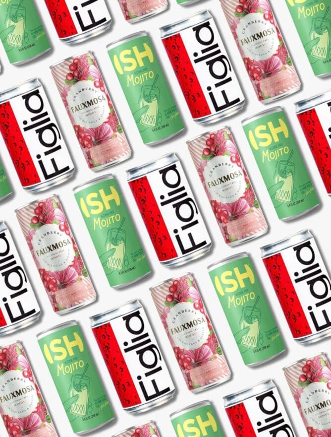
Solo cues lean lighter, more casual, often closer to food packaging norms. Ghia balances both by signaling aperitif-style social use while remaining approachable for individual consumption, supporting repeat behavior and brand loyalty.
Everyday ritual vs. special moment positioning.
The final decision is whether the brand shows up every night or only on occasion. Overemphasizing functional ingredients can push a mocktail into weekday utility, appealing to health-focused consumers but weakening celebratory relevance.
Conversely, over-indexing on ceremony limits frequency. A noticeable example here is Kin Euphorics, which strikes the balance, grounding mood and ritual in a way that resonates with younger consumers without feeling exclusive.
Designing for adult identity and social confidence.
Mocktails try to replace the feeling alcohol gives in social moments. That’s why packaging carries emotional weight in a way few categories do. Innovative packaging design here reassures that the choice feels adult, intentional, and socially fluent.
Once a bottle hits the table, the packaging speaks before anyone does. In group settings, bottle packaging design becomes a proxy for taste, discernment, and status. Mocktail packaging must hold its own alongside wine or spirits without explanation. Subtlety is the signal. Controlled color palettes, confident typography, material choices, and proportion all act as quiet validators.
The strongest mocktail packs align with broader packaging design trends that favor restraint over performance. These cues protect social confidence by making the product feel familiar enough to trust and refined enough to respect. What hurts most often isn’t what’s added, it’s what’s borrowed from the wrong place.
The proper role of “non-alcoholic” on the pack.
When “non-alcoholic” leads the pack, it reframes the product around what it lacks. In mocktails, that instantly triggers a downgrade mindset. Shoppers aren’t looking to be reminded of absence; they’re looking for a credible alternative to an adult moment. Leading with zero-proof language makes the packaging work against itself by anchoring the decision in compromise rather than choice.
The primary hierarchy should establish the experience first: flavor, occasion, and ritual parity. “Non-alcoholic” should appear where reassurance is expected, not where value is defined. When placed correctly, it resolves questions without hijacking attention or diminishing perceived worth.
Reassurance is most effective when it’s calm and confident. Subtle placement, restrained typography, and precise but quiet language signal certainty. The message becomes: this already belongs, alcohol isn’t just part of it. That framing preserves confidence and lets the product stand on its experience, not its exclusion.
Visual codes that help, or hurt, mocktail performance.
When mocktails borrow muted palettes, soft typography, or “clean” visual language from health-forward categories, they inherit expectations of compromise. That undermines their role as alcohol substitutes. In alcohol-adjacent sets, wellness codes quietly reframe the product as functional, something you should drink, not something you want to drink.
Mocktails win when visual systems borrow confidence from alcohol, not supplements. Deeper hues, controlled contrast, and tactility in finishes signal weight and intention. Typography should feel decisive and legible at a distance, less decorative, more assured. These choices work because they read fast and hold presence during a 3–5 second shelf scan.
Over-indexing on novelty can push mocktails into novelty territory, while over-minimalism can feel precious. The sweet spot is distinction rooted in familiarity, recognizable structure with a modern edge that feels credible next to spirits, not adjacent to sparkling water
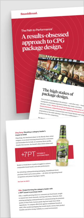
Path to Performance™
Taking a results-obsessed approach to CPG package design.
Discover how SmashBrand’s proprietary process, rooted in scientific principles, informed by data, and validated by your target audience, eliminates the guesswork from package design and delivers guaranteed results.
Format, structure, and physical cues.
In mocktails, Cans cue casual, personal consumption and lower commitment. Bottles imply ritual, sharing, and parity with alcohol. Multi-serve formats signal hosting, value, and repeatability. These containers tell the consumer how seriously to take the product before a sip. Choose the wrong format and the mocktail is mentally misfiled.
Beyond format, physical structure does quite work. Weight, opening mechanics, neck height, and pour behavior all imply how the drink should be used. A bottle that pours like a spirit suggests intention. A can that cracks open like a soda suggests convenience. These cues remove guesswork and reinforce the role the mocktail plays in the moment.
Format shapes habit. Products designed only for novelty or first trial often struggle to earn repeat business because the format doesn’t fit real routines. Mocktails that align format with usage, weekday unwind, dinner table, social hosting, slot naturally into behavior, increasing frequency and loyalty over time.
The most common packaging mistakes mocktail brands make.
The following are some of the most common mistakes that mocktail brands make unintentionally. These mistakes slow down trials and risk making the product lose in the sea of options on the shelves.
Leading with what’s missing.
The fastest way to weaken a mocktail on the shelf is to define it by absence. When packaging leads with “non-alcoholic” or zero-proof language, it frames the product as a subtraction in a category built on replacing alcohol occasions, immediately positioning the mocktail as a compromise, not a choice. Confirmation matters, but absence should never be the headline.
Over-Explaining the Product
Because the category is still forming, many mocktail brands try to stand out on the shelf. The result is dense copy, stacked claims, and visual noise. Explanation signals insecurity. At the shelf, clarity wins. The more a pack tries to justify itself, the more doubt it creates. Mocktail packaging should resolve questions quietly, not answer them loudly.
Designing for Brand Story Instead of Purchase Drivers
Founders often design packaging to express mission, values, or personal taste. But mocktails aren’t bought for ideology in the moment; they’re bought to fit an occasion. When brand story outranks flavor clarity, occasion signaling, and substitution cues, the packaging may look thoughtful but underperform. In this category, purchase drivers come first. The story earns attention later.
Confusing Sophistication With Complexity
Sophistication in mocktails is about restraint, not obscurity. Many brands equate premium with abstract naming, layered visuals, or minimalism without clarity. That forces shoppers to decode instead of decide. Complexity increases hesitation, and hesitation kills the trial. The most sophisticated mocktail packs feel simple because they’re confident.
Treating Packaging as an Aesthetic Asset, Not a Sales Tool
One of the most common mistakes is viewing packaging as a branding exercise rather than a decision architecture. Beautiful packs that don’t communicate what the mocktail replaces, how it tastes, or when it’s best suited often stall after launch. In mocktails, packaging is its primary mechanism for earning trial, justifying the price, and normalizing the choice.
Designing Mocktails Like Beverages Instead of Alcohol Replacements
This is the underlying error behind many others. When mocktails borrow cues from soda, wellness, or functional drinks, they lose ritual parity. The product may look appealing, but it no longer belongs in the same category as alcohol. Mocktail packaging must be designed with substitution in mind, or it will always feel adjacent, never equal.
Most mocktail packaging mistakes stem from prioritizing expression over function. The brands that win design with discipline, removing friction, reducing doubt, and letting the packaging do the work alcohol usually does automatically.

Nice Package
Don’t miss out on our monthly newsletter Nice Package!
Each month, we deliver a data-driven newsletter directly to your inbox, unpacking a critical topic in the FMCG & CPG industry.
"*" indicates required fields
Data-driven Mocktail Packaging Design That Drives Purchase.
SmashBrand is a data-driven packaging design agency that specializes in helping mocktail brands win at shelf. We don’t design for taste, trends, or opinions; we design to remove doubt, earn trial, and justify premium pricing in alcohol-adjacent moments where packaging does the heavy lifting.
Our process integrates strategy, design, and predictive consumer testing into one stage-gated system. Every decision is validated against real purchase drivers before launch, so mocktail packaging doesn’t just look right, it performs when it matters most.

A seasoned veteran in the CPG (Consumer Packaged Goods) industry, Jason Vaught brings a wealth of knowledge and hands-on experience as the director of content and marketing for SmashBrand. His comprehensive role at the forefront of brand communication ensures that CPG brands remain well-informed about the suite of services SmashBrand offers. Furthermore, his insights derived from the company's strategy, design, and testing services are invaluable to brand owners and managers seeking expert guidance.
From his early endeavors in launching a successful sports nutrition brand that gained prominence in significant bodybuilding and fitness retail spaces to his entrepreneurial ventures in kick-starting multiple brick-and-mortar and e-commerce startups across diverse industries, Jason's career is studded with substantial milestones. Notably, he has innovated numerous products later embraced by leading industry brands, showcasing his knack for anticipating market demands and setting trends.
Jason's journey in the CPG industry commenced at age 21. Over the years, he has worn multiple hats, ranging from a manufacturer and retailer to a distributor and brand owner. This multifaceted experience equips him with the rare ability to offer practical advice grounded in real-world expertise. His mission is to guide and support other CPG brand owners, directors, and managers on their path to success.
Subscribe to
Nice Package.
SmashBrand’s Nice Package: Stay current with our latest insights
Free Resource.

CPG product repositioning guide.
Explore the five undeniable signs your CPG product needs repositioning along with strategies for leveraging consumer insights for a guaranteed market lift.
Download Whitepaper About CPG product repositioning guide.