
Everyone loves a multi-tasker. Whether it is a wine carrier that doubles as a wine rack, a smartphone box that doubles as a display case or a pizza box that doubles as a defibrillator, package design that has a use above and beyond merely transporting the product is a highly effective marketing tool. However, while the package doesn’t necessarily need to metamorphose, Optimus Prime-like, into a wholly different product, it is possible for a package to highlight the product in a unique and aesthetically pleasing way.
When it comes to marketing, package design isn’t a wholly exterior phenomenon. It is possible to use the inside of the package to continue to bolster the image of the product it contains. For example, Lytro uses boxes for its cameras that create a kind of clean and almost museum-like pedestal. For those of you unfamiliar with the Lytro camera line, Lytro cameras were the first commercially available cameras that allowed the photographer to capture the entire light field, allowing the pictures to be refocused even after they were taken, so that blurry pictures of cheating spouses that would have once been inadmissible in court can be adjusted to crystal, alimony-collecting clarity.
Package Interiors
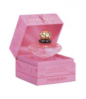
The Lytro camera box isn’t the first example of pedestal packaging — several irate Apple devotees pointed out that the iPhone box used an elevated display before Lytro. (Apple is always the first to do anything. Just accept it.) Regardless of who was the first, numerous examples of display packages elevate the product both physically and conceptually. Perfume package designers have noted, and designed boxes that not only display the bottle, but also require a host of passwords just to access the product within.
Alright, so pedestal display packaging might be a little convoluted for coffee filters or 6-packs of athletic socks. Nevertheless, if the product itself is skillfully designed, why not highlight it?
Elegance, Incorporated
Be honest with yourself; when you see a well-constructed box that houses a product carefully and lovingly, you immediately think that the product inside must be pretty darned exclusive (and when we say “exclusive,” we mean “expensive enough to fund several Olympic ceremonies”).
Packaging says quite a bit about the product. If a product is hastily wrapped in a transparent plastic bag, it tells the customer that it is cheap. If a product is contained inside a silk-covered hardwood box with a gold plated Quintet typeface logo, the product manufacturer can legitimately charge an outrageous amount for the product, even if the product is nothing more than shredded newspaper and lawn clippings.
We’re only kidding of course (the newspaper must obviously be of only the highest quality). Regardless of whether the item is a hand-crafted, artisan bauble or a mass-produced piece of plastic landfill fodder, packaging is the customer’s introduction to the product, and the more conscientiously it was developed, the more trust it inspires.
All that being said, it’s still tough to walk the line of interesting packaging choices without falling into the chasm of marketing flimflammery. We may joke about charging top dollar for a fancy package surrounding a worthless product, but the public won’t be fooled for long; if your costly package is spectacular, the product better be, too.
So, what have we learned today? We’ve learned that packaging is a product in and of itself. We learned that a package can act as a product protector and a product highlighter. We learned that Lytro cameras are so high-tech that they can photograph the future. We learned that fancy-schmancy packages are good for dazzling electronics and perfumes made from liquefied diamonds, but over-packaging a low-market item fools no one. Finally, we learned that if Apple decides to venture into aeronautics, it is our responsibility to behave as though flying machines never previously existed and yield to the dominion of iAir.
Data-Driven Brand Development
Want a best-selling brand? SmashBrand is a brand development company for FMCG and CPG brands. From brand strategy to packaging design testing, our Path To Performance™ process guarantees a retail performance lift. Book a time to discuss your project with our team.
Subscribe to
Nice Package.
SmashBrand’s Nice Package: Stay current with our latest insights
Free Resource.

CPG product repositioning guide.
Explore the five undeniable signs your CPG product needs repositioning along with strategies for leveraging consumer insights for a guaranteed market lift.
Download Whitepaper About CPG product repositioning guide.