Walk into many Walmart departments and you’ll see locked displays of high-value items, display-ready trays stacked to eye level, and shelves organized into price zones. In that ecosystem, a winning Walmart packaging design strategy builds a structural system that must adapt to trays, height constraints, and shelf logic or risk never getting noticed.
Designing for Walmart means rethinking everything. From how recyclable containers perform in corrugated trays to how your packaging conveys value in a vertically priced aisle, every decision influences trial, trust, and sell-through. The same approach that works at Target or any other store may not work here. That said, brands with highly distinctive identities, like Liquid Death, can sometimes carry their success across channels.
This article breaks down the science behind packaging design that performs in retail stores like Walmart. You will learn clear tactics and a framework built for suppliers creating packaging that earns its space. You will also discover the common challenges most brands face when developing Walmart packaging.
Why Walmart Is Unlike Any Other Retail Channel
Walmart operates at a different scale and with a different set of rules. It isn’t Costco, where shoppers linger and load up on bulk items. Walmart shoppers move quickly, often making mass trips that combine groceries, household goods, and snacks in a single pass. Your packaging needs to speak fast, and perform even quicker.
What makes Walmart unique is its system. Suppliers must follow specific packaging guidelines that support operational efficiency, including Display Ready Cases (DRCs), corrugate strength requirements, and orientation standards, which help staff restock more efficiently and maintain a consistent shelf presence.
Locked shelving is common in selected categories, especially for higher-value items, which limits consumer interaction. In-store promotional signage is minimal due to Walmart’s EDLP pricing model.
Your brand can’t rely solely on shelf talkers or price breaks to drive conversions. It all comes down to the pack itself, including its appearance, content, and how well it functions within the Walmart system.
If your packaging doesn’t align with both the visual and operational expectations of this environment, it might never get on the shelf in the first place.
The real-world impact of shelf height, color, and clutter.
In Walmart’s retail environment, the packaging either works hard or gets ignored. Shelf height, color, and layout are strategic variables that influence velocity, visibility, and shopper decisions. Let’s see their impact:
Shelf height drives performance.
Product visibility is dictated by shelf placement. Mid-shelf positions, roughly eye to waist level, consistently outperform lower placements. Internal velocity tests have shown that even a modest shift upward in the planogram can significantly increase unit sales, especially in high-turn categories such as snacks and household consumables. Designing primary packaging that communicates clearly from below or above the eyeline is a compliance-level consideration.
Walmart stores often segment shelves by price tier. Higher-priced or premium-positioned items are frequently slotted higher, with value SKUs placed lower. Packaging has to do more when positioned below the shopper’s natural field of vision, making layout, typography, and callout hierarchy critical.
Color is the first point of differentiation.
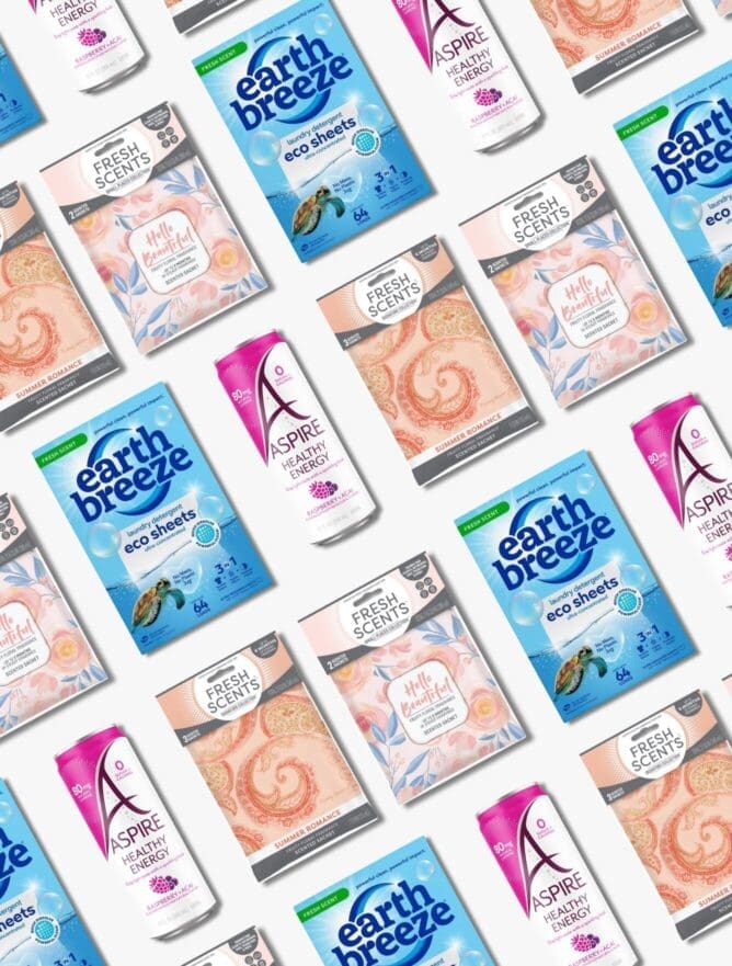
Bold, ownable color strategies help shoppers find and choose your product faster. Walmart’s aisles are filled with dense visuals, rollback signs, stacked trays, and a mix of branded and private brand packaging. If your product blends in, it’s already behind the curve.
Successful packaging systems use consistent color blocking, clean contrast, and repeatable visual cues across SKUs to create a billboard effect on the shelf. These techniques improve findability, especially when your product is merchandised in cardboard or corrugate displays.
Design teams should also consider how plastic packaging reflects light under Walmart’s overhead fixtures; it can alter the appearance of colors and impact their standout.
Clarity wins in cluttered environments.
Walmart customers move with intent. They’re picking up essentials across multiple categories, often with limited time to spare. Packaging that tries to convey too much usually ends up conveying nothing. Messy claim hierarchies, various fonts, or inconsistent layouts only create friction.
Effective packaging leads with the one or two claims that matter most. If your product utilizes sustainable packaging or is designed for recyclability, clearly indicate this within the context of the product’s features.
It should support the product’s core promise, not compete with it. Walmart’s focus on packaging guidelines and shelf compliance means your visual structure needs to hold up whether it’s sitting alone or inside a tray with six facings.
The “premium trap”: when modern design undermines value perception.
Design should signal trust. Especially at a Walmart Supercenter, where price cues, visual familiarity, and a subconscious read on value within seconds shape the shopper’s expectations.
When packaging tries to look premium but the product or brand story doesn’t support it, consumers notice and walk. It’s a quiet brand killer. This mismatch becomes even more perilous when brands expand into new categories without updating their positioning to align with them.
Modern doesn’t always mean more effective.
Across general merchandise and consumables, modern visual cues such as muted tones, minimalist layouts, and premium fonts can unintentionally cue higher pricing. While clean design is often celebrated in other channels, it requires precision in the Walmart environment.
If a design transition triggers confusion around price or quality, especially when there is no established awareness or credibility, velocity suffers.
The NBE trap: looking the part without earning it.
Designing to look like a national brand equivalent (NBE) works until it doesn’t. Matching the premium tone of an established leader without delivering the expected quality, brand trust, or clear use case creates a disconnect. Consumers are quick to sense it.
This is where packaging innovation needs to align with the product’s role and the audience’s mindset. A wellness supplement displayed in a blister pack with sleek rectangular labels and boutique cues might look elevated. Still, if the pricing or messaging doesn’t close the gap, it feels like posturing. Value-minded consumers see through it.
Walmart wants packaging that builds confidence, not questions. Packaging teams should evaluate whether a brand is ready to enter that aesthetic tier, or if the NBE leap introduces more friction than lift.
In value-driven environments, clarity beats aspiration
Walmart shoppers are constantly seeking trust, performance, and a reason to choose. That’s why clarity always wins over aspiration. Packaging that immediately communicates use case, benefit, and alignment with Walmart standards avoids costly misfires in category velocity.
It is especially true in crossover categories, where a product may belong to both the wellness and baby care categories. The pack needs to resolve that ambiguity before the shopper asks the question. Implement messaging hierarchies that connect emotionally and functionally.
Leverage tactile structures like matte finishes, intentional blister formats, or perforation details that enhance usability, not just visual appeal. And ensure that every packaging decision aligns with Walmart’s circular economy and broader sustainability goals.

Packaging functionality that wins with Walmart buyers.
Packaging that meets Walmart’s tray and display expectations has a positive impact on sell-through. When a pack holds its structure, protects facings, and fits cleanly into a display-ready configuration, it reduces friction for store teams. That kind of performance builds trust with buyers and supports future expansion decisions. Whether you’re working within box packaging or flexible formats, structural design must support both brand aesthetics and backend compliance.
Anti-theft setups demand more from the structure.
In specific categories, such as electronics, supplements, and select general merchandise, Walmart often utilizes locked glass or security wraps. This limits how consumers interact with the product, meaning shelf impact and clarity must come solely from the front panel. If the shopper can’t turn it, open it, or scan it, your pack needs to do more with less. A clean structure, non-reliant orientation, and zero dependency on back-panel storytelling are baseline expectations.
Innovative design takes center stage on the shelf and gets noticed.
Walmart responds to packaging innovation that reduces in-store complexity. That might mean retail packaging design that eliminates perforation waste, a more durable blister format for high-velocity items, or even a rectangular structure that improves stackability in aisle-ready trays.
Innovative brands anticipate Walmart standards. It includes aligning with sustainability goals by selecting recyclable, low-emission materials and designing products for future reuse or circular recovery. Packaging that does this without compromising clarity or cost becomes a real asset to the retailer and earns its space.
Common mistakes that kill sales at Walmart.
Walmart doesn’t leave room for packaging that “almost” works. Every panel, claim, and layout must earn its keep, and when it doesn’t, the fallout is evident in sales velocity. These are the most common failures, and they’re all preventable.
Overdesigned, underperforming.
Too many brands confuse complexity for effectiveness. When packaging is crammed with layered visuals, callouts, and multiple fonts, the result isn’t differentiation, it’s distraction. This is especially damaging in categories that benefit from visual systems, like palette packaging design.
When every SKU distinctly demands attention, you lose the billboard effect and compromise shelf cohesion. What feels expressive in design reviews often becomes visual clutter in Walmart’s high-traffic aisles, pushing consumers away before they ever engage.
Minimalism without meaning.
Minimalist design is often mistaken for sophistication, but in Walmart’s value-driven environment, too little information signals risk. Packaging still has to do the work, especially in categories like cleaning products, where clear usage and performance benefits must be prominently displayed.
When the front panel goes too quiet, shoppers assume the product is either generic or not for them. That misfire can be the difference between landing in the cart or being passed over for a more communicative competitor.
Claims that confuse or overpromise.
Every claim on a package must be believable, specific, and relevant to the product. Ambiguous phrases like “2x strength” or “fast-acting” without a clear context create skepticism. It becomes even more problematic in omnichannel packaging design, where claim consistency has to extend across shelf, DTC, and digital listings. If the pack says one thing, but the shelf tag, online product description, or brand story doesn’t support it, trust erodes, and so does purchase intent.

A Proven Step-by-Step Process for Walmart-Ready Packaging
Winning the shelf means understanding how shoppers think, how buyers decide, and how packaging can’t afford to fail under either lens. At SmashBrand, we don’t leave that to chance. Our integrated methodology moves from data to dominance, backed by a process built to eliminate guesswork at every stage.
Strategic discovery and category audit.
It starts with insight. We extract internal knowledge through strategic stakeholder workshops and pair it with external data: trend analysis, shopper insights, and real-world audits of Walmart stores. It includes evaluating how packaging performs on actual shelves, assessing layout constraints, adjacent competitors, and merchandising systems such as DRC trays and locked displays.
Positioning and messaging hierarchy.
With a clear understanding of the environment, we define the brand’s positioning and create a tight messaging hierarchy. It ensures that every line on the package earns its space, clear, credible, and consumer-relevant. We build this from validated purchase drivers, not marketing hunches.
Pack design and diagnostic testing.
We translate strategy into packaging design, starting with the Primary Display Panel. Multiple design directions are developed and tested with real shoppers using our diagnostic tools. This testing reveals what works, what confuses, and how the design performs in a cluttered, high-pressure retail environment.
Purchase intent simulation in shelf context.
Then comes validation. We simulate Walmart’s retail environment, including complete shelf sets, competitive products, and real pricing, to measure actual Purchase Intent. This includes shelf standout, claim resonance, and final preference data. It’s not theoretical, it’s real consumer behavior under real retail conditions.
What Most Designers Miss About Walmart Aisles.
Walmart aisles are governed by logic that doesn’t always follow traditional retail playbooks. The difference? At Walmart, packaging success is about understanding how and why a product shows up where it does.
Start with vertical price segmentation. In categories such as canned goods and general merchandise, we’ve seen planograms that group products by price rather than brand. Higher-priced SKUs go up top. Budget or value options live low. If your pack isn’t designed to perform at a distance, it’s at an immediate disadvantage.
Then there’s category logic, which often breaks with convention. Take “adult box meals”, a Walmart-specific grouping that includes Hamburger Helper and similar boxed meal kits. Brands unfamiliar with this structure can inadvertently enter the wrong competitive set, expecting to be positioned near gourmet pastas or canned meals when they’re actually competing for relevance in a different context.
Walmart also places some trip-driver categories deep within the store. Consider car care or some household SKUs; they’re often found in the auto section, not adjacent to their brand cousins in grocery or cleaning. If packaging isn’t calibrated for low-light, low-traffic zones, it can’t carry its weight and won’t get a second chance.

Nice Package
Don’t miss out on our monthly newsletter Nice Package!
Each month, we deliver a data-driven newsletter directly to your inbox, unpacking a critical topic in the FMCG & CPG industry.
"*" indicates required fields
Data-driven packaging design to boost sales velocity.
SmashBrand is a data-driven packaging design agency, specializing in packaging designs optimized for Walmart and other mass retailers. We help brands earn shelf space by designing for how consumers shop, not how marketers hope they will.
From sustainable packaging for private brands to retail packaging for general merchandise, our focus remains the same: creating package designs that drive sales and outperform competitors in real-world retail environments.
Our process begins with insight and culminates in validated, shelf-ready solutions. We simulate Walmart’s planograms, price tiers, and shopper behavior to ensure your packaging works. If the goal is guaranteed performance on Walmart shelves, the first step is designing with the shopper in mind. We can help you do just that. Contact us today to discuss your project.

A seasoned veteran in the CPG (Consumer Packaged Goods) industry, Jason Vaught brings a wealth of knowledge and hands-on experience as the director of content and marketing for SmashBrand. His comprehensive role at the forefront of brand communication ensures that CPG brands remain well-informed about the suite of services SmashBrand offers. Furthermore, his insights derived from the company's strategy, design, and testing services are invaluable to brand owners and managers seeking expert guidance.
From his early endeavors in launching a successful sports nutrition brand that gained prominence in significant bodybuilding and fitness retail spaces to his entrepreneurial ventures in kick-starting multiple brick-and-mortar and e-commerce startups across diverse industries, Jason's career is studded with substantial milestones. Notably, he has innovated numerous products later embraced by leading industry brands, showcasing his knack for anticipating market demands and setting trends.
Jason's journey in the CPG industry commenced at age 21. Over the years, he has worn multiple hats, ranging from a manufacturer and retailer to a distributor and brand owner. This multifaceted experience equips him with the rare ability to offer practical advice grounded in real-world expertise. His mission is to guide and support other CPG brand owners, directors, and managers on their path to success.
Subscribe to
Nice Package.
SmashBrand’s Nice Package: Stay current with our latest insights
Free Resource.

CPG product repositioning guide.
Explore the five undeniable signs your CPG product needs repositioning along with strategies for leveraging consumer insights for a guaranteed market lift.
Download Whitepaper About CPG product repositioning guide.