Most packaging is designed in isolation. Design teams focus on the product, the brand story, and the opportunity to create something visually distinctive. But consumers don’t evaluate packaging that way. They evaluate it in a competitive context, against everything they see on the shelf and everything they already know about the category.
In most categories, consumers arrive with a pre-formed mental model. Years of shopping shape what they expect a product to look like, communicate, and promise. When brands try to “look different” without understanding those expectations, the result usually isn’t differentiation. It’s friction.
Why Brands Get This Wrong.
The industry often treats packaging like artwork. Designers chase originality, agencies chase trends, and brands chase differentiation. But packaging is actually a decision tool that helps consumers quickly understand what a product is, what it does, and whether it’s worth buying.
In packaging, there’s good different and there’s bad different. And if your main reason for doing something is “no one else is doing it,” that’s usually a red flag. Categories develop visual and messaging cues for a reason, because they help consumers make fast decisions.
Competitive Context Shapes Expectations.
Consumers don’t encounter products for the first time when they reach the shelf. They arrive with an understanding of the category already formed from years of shopping experience. That mental model shapes how they interpret packaging almost instantly.
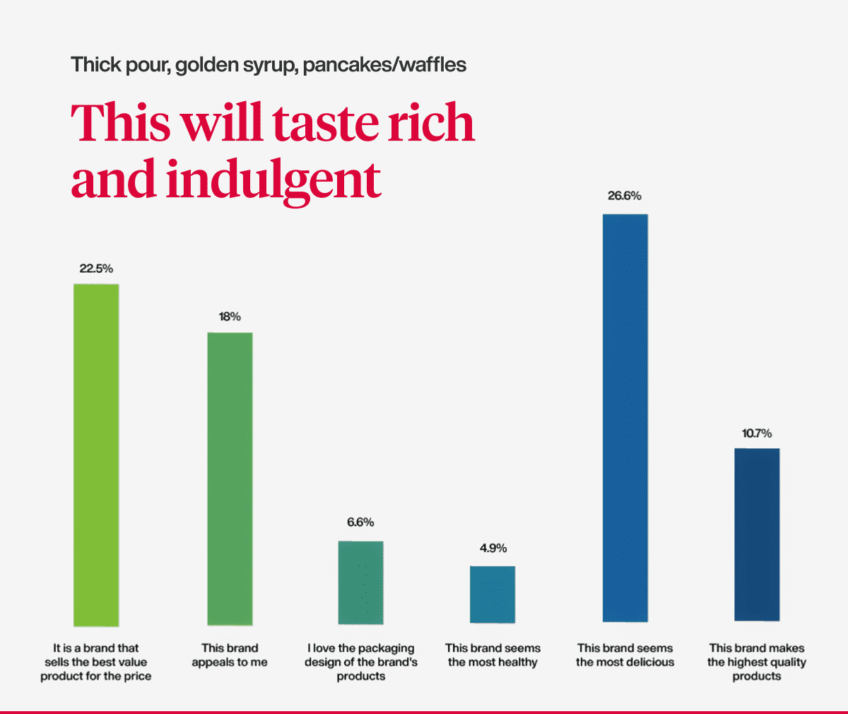
Some category signals aren’t optional. They’re required just to be taken seriously. In food and beverage, especially, products must look like they will taste good. When packaging removes those cues or replaces them with something unfamiliar, consumers hesitate, and hesitation often means the sale goes to a competitor.
Eventually Brands Re-Align to the Category Context.
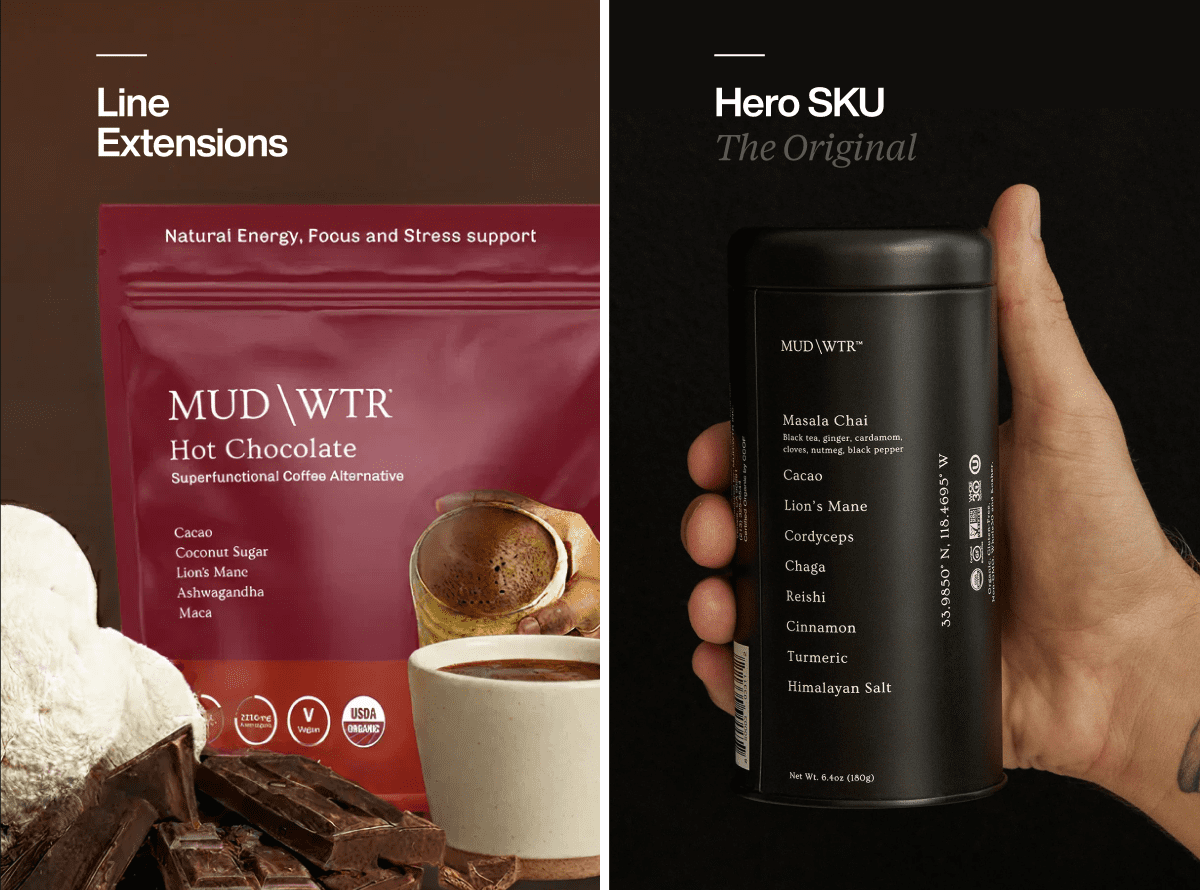
Take MUD\WTR, where the hero SKU leans heavily into a minimalist, supplement-style aesthetic. The packaging gave few cues about the product itself, leaving consumers unsure about what it was or how it would taste.
The brand is now exploring line extensions that feature clearer coffee cues and product imagery. The change helps shoppers immediately understand the product and reduces hesitation at the shelf. This leaves an open question of when the hero SKU will align more closely with coffee cues and flavor expectations.
But Why Did it Work for Brands Like RXBAR?
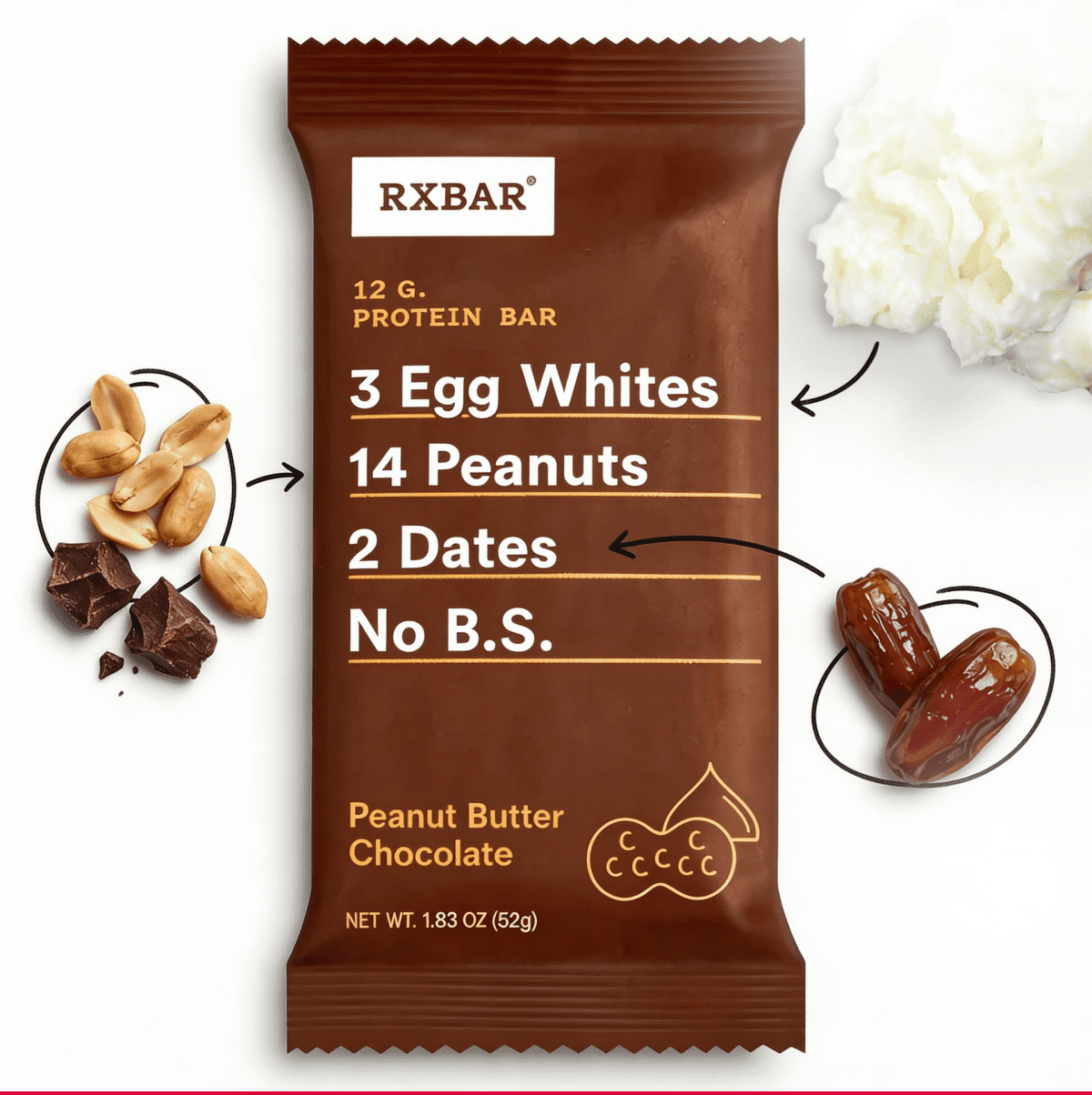
RXBAR is often cited as proof that breaking category rules works. The brand removed traditional product photography and replaced it with a bold list of ingredients across the front of the pack, creating a distinctive look in the snack bar aisle.
But the design still worked within consumer expectations.
Ingredients like dates, nuts, and chocolate already serve as strong taste cues, helping shoppers easily imagine the product. Even RXBAR has evolved over time, with newer formats incorporating stronger product and taste signals. That’s very different from brands like MUD\WTR, where many of the ingredients are unfamiliar and don’t carry a preset positive taste impression, making it harder for consumers to quickly understand or trust the product.
“Too Much Change” Problem.
Another common mistake is asking consumers to process too much newness at once. Each unfamiliar element adds cognitive load, and when brands stack multiple changes together, the product becomes harder to understand.
For example, a brand might introduce:
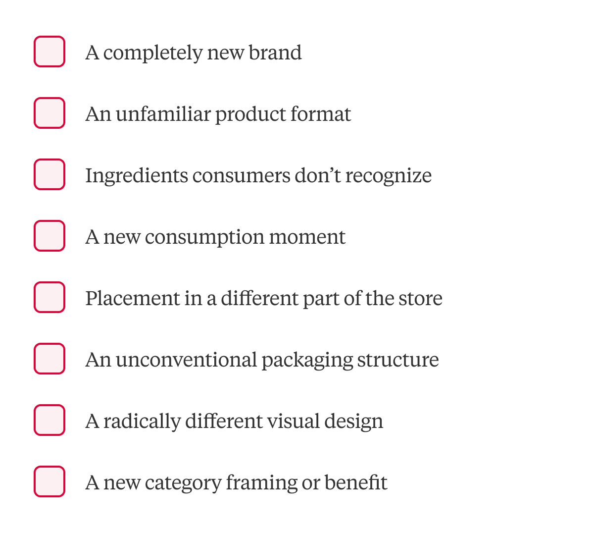
Each change may make sense individually. But when all of them appear at once, consumers have to work too hard to understand the product—and confusion usually leads to inaction.
This pattern shows up frequently in many “vibe-driven” brands emerging from shows like Expo West. The packaging may look modern, playful, and different, but it often ignores the cues consumers rely on to quickly understand the product.
Great packaging makes money. Packaging built around aesthetics instead of expectations rarely does. Because if it doesn’t drive purchase, nothing else matters.
The Real Job of Packaging
Packaging isn’t about looking different for its own sake. Its job is to create stand-out while still feeling familiar enough for consumers to immediately understand what the product is and why it matters.
That’s why SmashBrand begins with Category Baseline testing, Competitive Audits, and Retail Audits to identify the purchase drivers and visual cues shaping consumer expectations before design begins.
If you redesign packaging without understanding the competitive set and category expectations, you’re guessing. And in a category where consumers decide in seconds, guessing is rarely a winning strategy.

A seasoned veteran in the CPG (Consumer Packaged Goods) industry, Jason Vaught brings a wealth of knowledge and hands-on experience as the director of content and marketing for SmashBrand. His comprehensive role at the forefront of brand communication ensures that CPG brands remain well-informed about the suite of services SmashBrand offers. Furthermore, his insights derived from the company's strategy, design, and testing services are invaluable to brand owners and managers seeking expert guidance.
From his early endeavors in launching a successful sports nutrition brand that gained prominence in significant bodybuilding and fitness retail spaces to his entrepreneurial ventures in kick-starting multiple brick-and-mortar and e-commerce startups across diverse industries, Jason's career is studded with substantial milestones. Notably, he has innovated numerous products later embraced by leading industry brands, showcasing his knack for anticipating market demands and setting trends.
Jason's journey in the CPG industry commenced at age 21. Over the years, he has worn multiple hats, ranging from a manufacturer and retailer to a distributor and brand owner. This multifaceted experience equips him with the rare ability to offer practical advice grounded in real-world expertise. His mission is to guide and support other CPG brand owners, directors, and managers on their path to success.
Subscribe to
Nice Package.
SmashBrand’s Nice Package: Stay current with our latest insights
Free Resource.

CPG product repositioning guide.
Explore the five undeniable signs your CPG product needs repositioning along with strategies for leveraging consumer insights for a guaranteed market lift.
Download Whitepaper About CPG product repositioning guide.