
We occasionally get a bee in our bonnets to explore examples of really interesting and successful food packaging and label designs. However, we’ve also noticed that such packaging and label designs are extremely difficult to find. Most of the best food and drink designs are either very obscure or don’t actually exist in the marketplace (student concepts). Why must this be? What are we food and drink packaging design companies afraid of? Excellence?
Whenever we do hit the jackpot and find well-conceived and aesthetically pleasing food and drink label designs, we find that they’re more in service of graphic art than they are to making the food or beverage look scrumptious. Nevertheless, after many agonizing hours of search, we’ve found several labels which, even though they don’t necessarily depict the glorious deliciousness of the contents within, enhance the product’s overall appeal.
Sir Kensigton’s Gourmet Scooping Ketchup
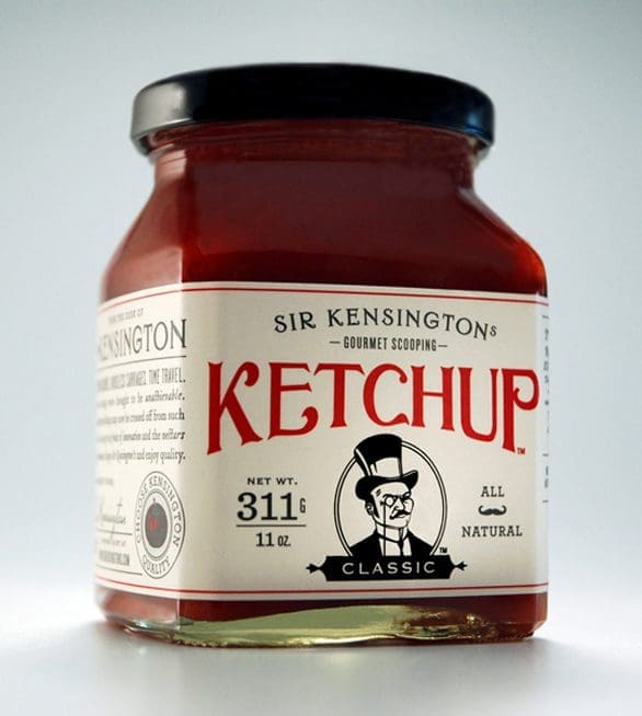
The very first brand of ketchup officially endorsed by both the Monopoly and New Yorker Magazine mascots. We consider this a triumph of packaging and label design, because both working in tandem makes the consumer believe there is something more special and classy in the jar than flavored tomato paste.
Villa Russo
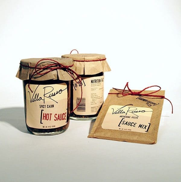
This design combines a modern, trendy typographic concept with a general-store aesthetic. We just love paper-capped, ribbon-tied mason jars; they make everything look so darned adorable.
Justin’s Butters
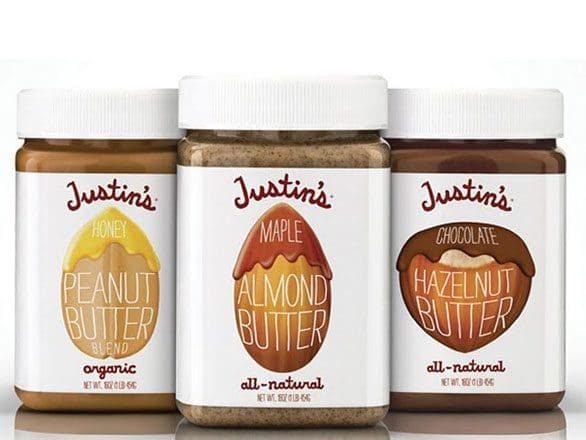
There is something natural and comforting about a nut butter label that reminds us exactly how ooey-gooey and decadent the product really is. The Justin’s Butters label is such a huge graphic departure from most major commercial peanut butter brands that it makes the product seem wholly different from what you’d get at a major supermarket.
The Bay Tree
Although deceptively simple, The Bay Tree condiments line uses a warm, hunger-inducing series of colors and illustrations, combined with intriguing product descriptors. “A traditional pickle for a wedge of cheddar” makes us wonder if we’ve used pickles in untraditional ways all these years.
True Fruits
True Fruits, a German natural fruit smoothie brand, uses its labeling to allow the natural attractiveness of the product shine through — a good-looking food product doesn’t need fanciness to sell itself. The typeface’s design is bold and easy to read, and the bottles are uniquely shaped; jar-like but can fit in a standard cup holder.
Bottle Green
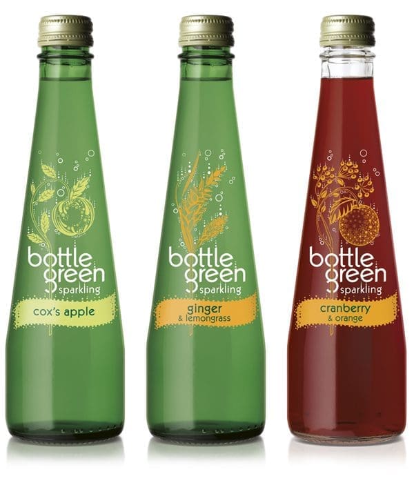
Clean, fresh and clear — everything a sparkling beverage should be. This UK-based brand offers slightly nostalgic packaging juxtaposed with a thoroughly contemporary labeling design.
Waxing Kara
Yet another example of how an appetizing food doesn’t need to be obscured by an overly ambitious label. The Waxing Kara honey line uses a high-end, boutique white label with a combination of classic general-store fonts, giving it warmth and clarity.
Pro Bar
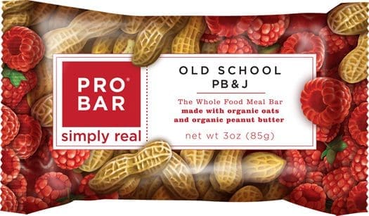
We can’t get over how yummy this Pro Bar label is; especially when considering what the old Pro Bar package used to be. The Pro Bar Old School PB&J has bright and warm colors inviting to the palate. Moreover, the labeling is structured well; it offers a lot of information, but it is easy to read and doesn’t appear crowded.
WayFare Ice Cream
Et voila! Just look at the rich, bright colors on this ice cream packaging design! The dazzling packaging graphics! The luster! This is SmashBrand’s example of thoroughly delicious packaging and label design that highlights all of the best qualities of its product. Check out the blueberries, for heaven’s sake! They look so rich that they could make you forget that they’re a superfood, containing some of the highest concentrations of antioxidants found in any fruit, vegetable or spice (not that we’re trying to sell you a luscious container of WayFare Blueberry Cheesecake dairy-free frozen dessert, or anything).
Subscribe to
Nice Package.
SmashBrand’s Nice Package: Stay current with our latest insights
Free Resource.

CPG product repositioning guide.
Explore the five undeniable signs your CPG product needs repositioning along with strategies for leveraging consumer insights for a guaranteed market lift.
Download Whitepaper About CPG product repositioning guide.