With convenience being at the core of the snack industry and consumers demanding more convenience, snack foods continue to achieve significant profits. With over $100 billion in annual revenues in recent years, snacking is a growing trend that shows no signs of slowing down. New and old brands have taken notice, and now, with competitors coming from every corner, a snack packaging design needs to distinguish itself from the cluttered shelf it sits on.
In this article, we clarify each segment of snack packaging and guide the design of a package or label that resonates with your hungry consumers. You will learn valuable tips and tricks to succeed with this form of food packaging design, along with examples that inspire your packaging strategy.
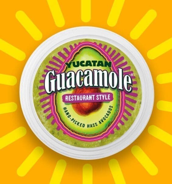
Packaging Design For Snacks
To begin, let’s discuss the snack packaging of each of the two divisions.
- Single Serving Snacks
- Bulk Package Snacks
Most CPG brands eventually enter both markets, but smart ones know where to start. Leading with one format doesn’t mean neglecting the other. Each requires its own snack package design built for marketability and growth.
In healthy snack packaging, the message should strike a balance between indulgence and nutrition, appealing to both impulse shoppers and repeat buyers. When exploring snack packaging ideas, consider how consumers interact with your product at various points of sale, such as vending machines, checkout counters, or warehouse clubs.
A common pitfall? Using the same visuals and claims for every format. The mindset of a bulk buyer differs from that of the on-the-go consumer. Strong snack branding recognizes that distinction and tailors packaging accordingly.
Focus on creative snack packaging design that adapts tone, hierarchy, and storytelling across sizes. Testing innovative snack packaging and format-specific snacks design ideas ensures each SKU works hard for its audience.
Understanding how to package snacks for both channels is more than just a design decision; it’s a strategic approach to growth. The brands that master this flexibility win shelf space and loyalty.
Single Serving Snacks
Single-serving products are the driving force behind the snacking world. This format is often the first introduction to your brand. Great snack packet design makes that first impression count, converting quick purchases into long-term loyalty.
In this fast-moving category, every inch of space matters. Effective chip packaging design utilizes bold visuals, a clear hierarchy, and concise claims to capture attention instantly. Shoppers make decisions in seconds; your design must win that moment.
When designing snack packaging, think of it as a form of storytelling on a small canvas. Unified color, typography, and messaging draw focus to your brand promise, even in a crowded shelf.
Strong food packaging for snacks combines appetite appeal with distinction. Whether your goal is flavor excitement or better-for-you clarity, visual alignment is key.
In the growing healthy snacks packaging design segment, consumers want permission to indulge. Packaging that signals both health and enjoyment doesn’t just get noticed, it gets purchased.
Designing For Bulk Purchases
When consumers shop in bulk, their definition of convenience shifts. Packaging for snacks in this category must appeal to planners, moms preparing lunches, hikers stocking up, or anyone seeking quick, ready-to-grab solutions.
In the packaging of snack foods, the goal isn’t just impulse; it’s justification. These shoppers think ahead, evaluating value, variety, and practicality. Your packaging should reflect that longer decision process while still feeling fresh and inviting.
Effective and shelf-ready product packaging for snack foods should guide the eye across claims and visuals that reinforce trust, such as nutrition information, portion control, or benefits for family sharing. With more space to work, every design element should contribute to the overall story.
When approaching snack bar packaging, clarity is key. Larger packs allow room for storytelling—where ingredients, sourcing, or brand mission can shine without clutter.
Strong snack food packaging leverages this space for narrative and emotional pull while maintaining quick-scan appeal for retail environments.
In today’s market, consistent snack foods packaging across single-serve and bulk SKUs isn’t optional—it’s how brands build recognition, repeat purchase, and shelf dominance.

What Does Your Snack Stand For?
A snack, whether regular or fruit snack, brand must be clear about what it is and what it stands for. Successful snack companies can unify their brand identity and product positioning under a single theme that their target market will readily embrace.
Designing For Taste
In the candy category, the top purchase driver is taste. It makes little sense to deliver a candy packaging design that excludes taste and flavor from the overall appeal. Sometimes this is a minimalist design, whereas other times, it may be more of a maximalist design.
Designing For Fuel
There’s a sneaky secret in this snack sub-category. In most cases, the sugar and fat content of snacks such as trail mix and energy bars exceeds that of snacks designed for “taste.”
Dried fruit, granola, and energy bars must differentiate themselves from their calorie content and speak to their ability to sustain performance. Depending on the product, the design needs to be innovative or raw. We can see this with the packaging redesign of the Tiger’s Milk bar.
- A trail mix design uses a transparent snack packaging design where the food is an active part of the design.
- An energy bar takes a more collective approach to how all the ingredients work together.
What’s Your Opinion? Does this packaging redesign work for The Tiger’s Milk Brand? Or is it a wasted opportunity for the brand to reposition itself in the energy bar market?
Designing For Health
“A healthier planet means healthier individuals.”
Emerging healthy snack brands are free to steal this slogan. We introduce consumer values into the packaging equation for healthy snacks anytime we design a snack containing natural ingredients.
Most consumers are aware of the amount of waste generated by the snack category. Whether it’s snack bars or chip alternatives, there’s a subtle need to introduce sustainability into your packaging design. But how do we express this on a single-serving package? In this case, using materials, colors, and fonts that convey sustainability is a good approach.
Using colors and fonts that imply health information can act as a distraction, thereby reducing the need to prominently feature sustainability on the package. Rhythm Kale Chips is a strong example of how colors, fonts, and the overall design convey sustainability without relying on words as a purchase driver.

Nice Package
Don’t miss out on our monthly newsletter Nice Package!
Each month, we deliver a data-driven newsletter directly to your inbox, unpacking a critical topic in the FMCG & CPG industry.
"*" indicates required fields
Packaging That Performs
Ready to launch the following best-selling snack product, we can help. SmashBrand is a brand development and packaging design agency that performs iterative consumer testing to ensure your product performs in any retail environment. We believe that the best snack packaging design is not the one that wins votes, but the one that wins transactions. Book a time to learn how our CPG packaging expertise can benefit your project.

Michael is a partner and the Director of Testing and Insights at SmashBrand, where he spearheads SmashBrand's Path to Performance™ process, a proven, data-driven framework designed to put high-performing consumer packaged goods on the retail shelf. In this role, he believes that packaging acts as a product's "front door", and is almost entirely responsible for shaping how consumers perceive and engage with the brand, ultimately determining whether they will buy the product or a competitor. Thus, he defines the testing methodologies SmashBrand uses to optimize packaging designs to align with the brand's strategic vision, ensuring aesthetic appeal and market viability.
With an educational background and an early career in computer engineering, he transitioned into the entrepreneurial space, launching and owning CPG brands and quickly discovering a knack for innovative market strategies. At SmashBrand, Michael leverages this expertise to lead the research team, focusing on a holistic, data-driven approach to market research, product design, and consumer testing. His philosophy centers on the importance of understanding consumer perceptions, a viewpoint he considers vital for the success of any consumer product.
At the core of Michael's approach is an iterative cycle of specific consumer testing and integrating the insights gained directly into the creative process, leading to optimized and high-performing packaging. This commitment to a data-driven strategy ensures that the packaging designs and branding strategies SmashBrand develops are not just based on aesthetic or conceptual appeal but are proven to resonate with consumers. Over the past decade, he has integrated an agile methodology and a proven platform for consumer testing into SmashBrand's entire operational framework, solidifying the agency's reputation for guaranteeing market performance.
With a unique blend of technical skills, entrepreneurial spirit, and consumer insight, Michael Keplinger offers a multidimensional approach to brand development. His ability to connect seemingly unrelated elements for innovation and his commitment to consumer-centric optimization makes him an invaluable asset to SmashBrand and its clientele. Under his leadership, brands don't just imagine the potential success of their consumer products—they experience it.
To book Michael for speaking engagements and podcast appearances, please email hello@SmashBrand.com
Subscribe to
Nice Package.
SmashBrand’s Nice Package: Stay current with our latest insights
Free Resource.

CPG product repositioning guide.
Explore the five undeniable signs your CPG product needs repositioning along with strategies for leveraging consumer insights for a guaranteed market lift.
Download Whitepaper About CPG product repositioning guide.