Don’t even think about launching your new product without a solid branding strategy. Studies show that 81% of consumers need to trust a brand before considering buying. A good product branding strategy presents the product as the only solution to their problems, thus building trust and converting them into loyal customers. There are hundreds of product branding examples to learn from.
This article discusses some of the most effective multi-product branding examples in which companies have gained consumer trust through clever tactics. You will learn the secrets behind the brands that have masterfully woven brand strategy into every fiber of their products, captivating consumers with brilliant storytelling, bold innovation, and an unwavering commitment to their brand identity.
Get ready to be inspired as you explore exceptional CPG branding tactics. See how ordinary products become extraordinary through strategic positioning, compelling narratives, and a deep understanding of the target audience. Learn how to make your ice cream like the following Baskin-Robbins or your chocolate like the next KitKat.
Top Product Branding Examples
CPG brands use various branding strategies to attract consumers and boost sales. Individual branding involves each product creating its unique identity, allowing targeted marketing to specific customer groups. On the other hand, brand extension involves leveraging an established master brand by expanding into related product categories.
For many established brands, refreshing their marketing with impactful graphic design and updated packaging reinvigorates consumer perception. Meanwhile, new disruptors often adopt bold, minimalist branding to position themselves as a fresh alternative to traditional industry norms.
As the image source for forging connections, small business branding must deftly articulate the founder’s vision through distinctive visual identities and compelling storytelling. Seamlessly translating purpose into packaging elevates brands from commodities into talismans of consumer affinity.
The following are some of the best product branding examples:
Liquid Death
Liquid Death’s innovative branding ethos is a bold masterclass in disrupting staid product categories through unapologetic individuality. With iconic tallboy cans reminiscent of craft-beer packaging and heavy-metal-inspired graphics, every aspect of the brand boldly bucks traditional water-brand tropes. This distinctive b2b branding firmly positions Liquid Death as a refreshing counterculture alternative for customers fatigued by generic, saccharine-sweet beverage marketing.
Their “murder your thirst” tagline and viral #DeathToPlastic campaigns demonstrate their adept fusion of branding fundamentals with internet-age provocations. It’s a provocative parody of the wellness sector, underpinned by genuinely sustainable, health-conscious values that strongly resonate with younger demographics.
Liquid Death has captured the essence of punk rock icons and streetwear trends, transforming their edgy attitude into a famous brand. This is a powerful reminder that staying true to your originality is critical to creating a solid and memorable brand identity.
Jasmon
Jameson’s brand positioning as the quintessential Irish whiskey is reinforced by its annual St. Patrick’s Day limited-edition bottles, a product-branding strategy that blends tradition with innovation. Among the myriad branding examples vying for consumers’ attention each March, Jameson stands out by gamifying the design process. Jameson cultivates brand loyalty through participatory co-creation, allowing fans to submit custom-label artwork via NFC/QR code-activated microsite experiences.
This contest generates substantial brand awareness as dedicated designers promote their visions across social platforms. The winning artworks are proudly displayed on actual bottles, creating a triumphant fusion of user-generated content and premium products that amplify Jameson’s cultural relevance.
The branding strategy yields results through increased brand engagement, social impressions, and sales during the critical St. Patrick’s season. The brand fosters emotional connections beyond transactional consumption by involving its community in the design of its bottles. Jameson’s inspired melding of analog tipples and digital activations epitomizes how heritage brands can stay innovative and cultivate enduring brand affinity across generations.
21 Crimes
21 Crimes has cultivated a memorable brand image by breathing life into the rogues’ gallery adorning each bottle – fostering brand loyalty through immersive storytelling. The bold labels featuring mugshot-style portraits grab attention amid crowded wine aisles while piquing curiosity about the roguish personal-brand backstories behind each unrepentant scoundrel.
This bold brand strategy rejects traditional product-brand clichés and embraces a rebellious, edgy persona aimed directly at younger consumers seeking distinct drinking experiences. By portraying their lineup of red blends as notorious 18th-century outlaws banished to Australian penal colonies, 21 Crimes ignites intrigue while cleverly defying conventional norms.
Yet the brand transcends mere novelty by reliably overdelivering on liquid quality. It boasts a strong product brand foundation, substantiating its premium pricing. Seamless customer service and widespread availability amplify brand awareness and recognition among mainstream audiences.
RXBAR
RXBAR has revolutionized the protein bar aisle with a branding approach that prioritizes radical transparency, resulting in significant brand value. Their minimalist packaging eliminates gimmicky graphics in favor of a bold, ingredient-centric design that powerfully conveys the brand’s “no B.S.” philosophy. This unyielding product brand identity fosters fierce brand loyalty among consumers exhausted by overly processed, perplexing snack options.
Using clean typography showcases each bar’s simple recipe list and clever product naming, amplifying brand recognition. RXBAR’s “kitchen cupboard simple” brand equity extends beyond tangible products into content marketing, promoting the benefits of easily digestible, whole-food ingredients.
By boldly embracing simplicity as a key differentiator, it has risen above the nutritional bar category to establish itself as an aspirational brand that epitomizes authenticity and unwavering values. Its transparent approach forges an emotional connection that fortifies customer affinity, driving exponential brand loyalty and bottom-line growth.
Ocean Bottle
Ocean Bottle builds its positioning directly into the product. Each bottle removes plastic from the ocean, with every purchase funding the collection of 1,000 ocean-bound bottles. That impact is not abstract. Customers can track it through an NFC tag, turning the product into an active part of the experience.
This is where the brand stands out. Sustainability is not a message layered on top. It is embedded in how the product works and how customers engage with it. That clarity strengthens trust and deepens the connection with consumers who care about measurable impact.
The result is a brand that attracts more than functional buyers. It appeals to people who want their purchase to contribute to something tangible. By aligning product, experience, and purpose, Ocean Bottle builds loyalty and reinforces its position as a practical solution to a real problem.
Friso Infant Formula
Friso’s product branding strategy ingeniously utilizes QR codes and digital storytelling to establish unmatched supply chain transparency, setting it apart in the fiercely competitive infant formula market. By enabling customers to trace their purchases back to their origin, Friso builds trust and caters to contemporary parents’ demand for genuine, information-backed stories behind their purchases.
The 360-degree virtual tours highlight the charming Dutch farm environments and real-time monitoring data. This strategy establishes a compelling brand image centered on quality assurance and accountability. The immersive retail branding seamlessly connects Friso’s rich European heritage with its global audience of parents who refuse to compromise on their children’s nutrition.
Nestlé
Nestlé has made sustainability a core part of how its brands operate across categories.
The company has set clear targets around packaging and emissions, including a net-zero goal by 2050. More importantly, it applies these commitments across its portfolio, shaping how products are developed, packaged, and brought to market. This consistency is what makes it one of the more relevant cases of best company branding in global CPG.
Across multiple product branding examples, Nestlé integrates sustainability into packaging choices, sourcing, and communication. These decisions show up directly in the product experience, not just corporate messaging. That is what strengthens trust with consumers who prioritize environmental impact.
As one of the more visible product brand examples, Nestlé demonstrates how large-scale execution can support positioning. For teams looking at branding ideas for products, the takeaway is practical: align commitments with execution across every touchpoint.
This is why Nestlé is often cited as a top branding and brand example. It connects strategy to action in a way consumers can recognize, making it a useful example brand, company, or product when evaluating scalable, sustainability-led branding.
Ben and Jerry’s
Ben & Jerry’s has built a clear position by embedding sustainability into its product branding from the start. The brand sources fair trade ingredients and invests in responsible production, but what matters is how consistently that shows up across the product. Packaging, messaging, and flavor concepts all reinforce the same point of view. That alignment has made it one of the most recognized product brand examples in its category.
This is what strong execution looks like. Sustainability is not treated as a campaign. It is part of the product experience, which is why it resonates with consumers who prioritize ethics in their purchase decisions.
As a product brand example, Ben & Jerry’s demonstrates how a focused idea, applied consistently, can drive differentiation and loyalty. It stands alongside other successful product branding examples because it connects belief to behavior in a way consumers can see and trust.
For brands looking for product branding ideas, the takeaway is straightforward: clarity and consistency outperform complexity. That is what turns positioning into performance and defines good and great branding in practice.
Kellanova
Kellanova is leading an innovative, sustainability-focused branding approach to reshape the CPG landscape. Their “Better Days Promise” initiative unifies individual product brands such as Pringles and Cheez-It under a cohesive family branding vision centered on eco-friendly packaging.
Strategic naming and branding assets, such as the signature leaf logo branding, demonstrate Kellanova’s dedication across revamped labels and social media campaigns. This transparent approach fosters brand loyalty and appeals to mindful consumers.
Kellanova supports its statements with innovative research and development partnerships focused on plant-based and recycled packaging materials. Their plan to achieve 100% reusable, recyclable, or compostable packaging by 2030 validates their commitment to the environment.
By integrating sustainability into its brand identity rather than treating it as an afterthought, Kellanova has solidified its position as a leading force in the industry, driving tangible positive change. This is a compelling model for consumer packaged goods brands aiming for purpose-driven transformations.
Seventh Generation
Seventh Generation demonstrates how to integrate sustainability into an e-commerce and corporate brand seamlessly. The company builds eco-friendly household and personal care products using plant-based and recycled materials.
This mission shapes every brand touchpoint, from its vibrant yet earthy visual identity and product photography to its emotive “Generation Good” tagline. Their service branding extends beyond retail, educating consumers on environmental issues through content marketing.
Seventh Generation’s unwavering commitment to environmental and social responsibility has fostered a devoted customer base. The brand’s ethos seamlessly permeates all marketing channels and company operations, striving for absolute transparency.
By wholeheartedly embodying its values, Seventh Generation has established its corporate brand as a trusted authority for conscientious consumers seeking effortless ways to reduce their environmental impact. It stands as a compelling example of robust, sustainability-driven branding.
Aldi
Aldi has built a strong brand by focusing on one core promise: consistent quality at the lowest possible price.
Its private-label strategy simplifies choice for potential customers while reinforcing a clear value position. Every element, from product branding to packaging, follows strict brand guidelines, ensuring a cohesive, efficient customer experience. The minimalist brand design signals simplicity and control, while supporting a strong brand identity that is easy to recognize and trust.
This approach shows why product branding is an important decision that cannot be separated from execution. Aldi’s tightly curated ассортимент and disciplined rollout create strong product branding that performs in-market. The consistency extends across stores and digital marketing, reinforcing a unified message at every touchpoint.
The result is successful product branding built on clarity, not complexity, and riving loyalty from customers who prioritize value without compromise.
Costco and Walmart
Costco and Walmart have established substantial brand equity by utilizing bulk pricing and private-label brands to appeal to price-sensitive consumers. Costco’s Kirkland Signature has successfully developed significant brand recognition as a high-quality yet affordable option, reflecting the company’s fundamental value proposition. Similarly, Walmart’s private label brands, such as Great Value and Equate, embody the retailer’s commitment to the “everyday low prices” ethos.
Both retailers have effectively captured significant market share by aligning their product assortments and brand positioning around budget-consciousness. They have surpassed commoditization to forge powerful brand loyalty among customers who value their unwavering commitment to maximizing savings without compromising quality. It is an exceptional achievement for retail branding operating at such a massive scale.
Nice Package
Don’t miss out on our monthly newsletter Nice Package!
Each month, we deliver a data-driven newsletter directly to your inbox, unpacking a critical topic in the FMCG & CPG industry.
"*" indicates required fields
Data-Driven Product Branding for Shelf Impact
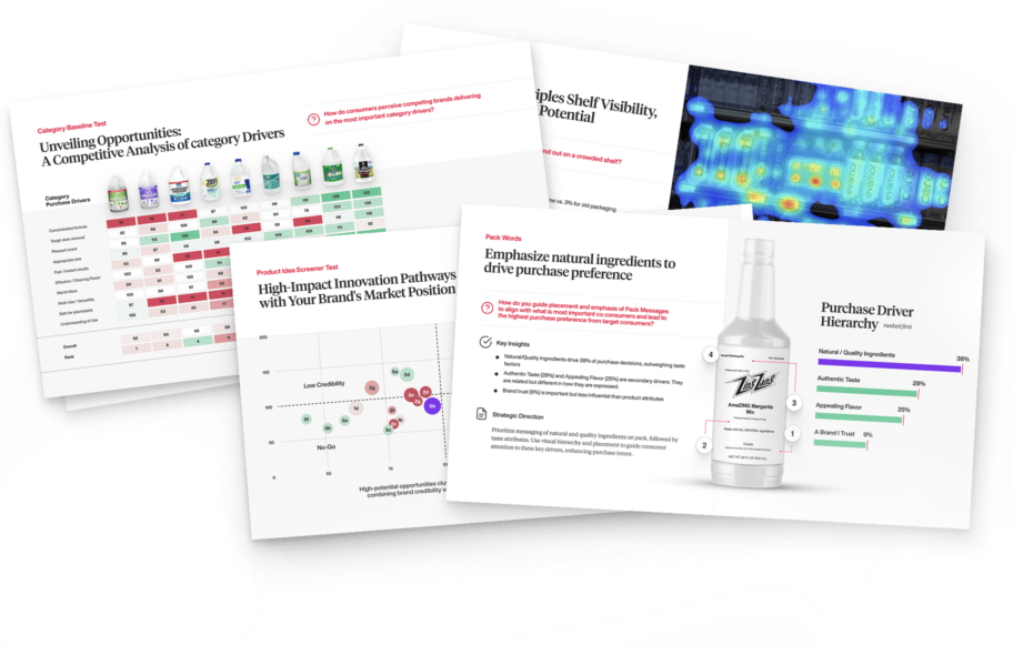
SmashBrand is a data-driven product branding agency focused on building a successful brand that performs at the shelf. We connect consumer psychology to real purchase behavior, shaping brand assets and brand identity examples that drive trial and repeat purchase. The goal is simple: create a better product experience that converts.
Our approach integrates strategy, design, and testing into one system. Every marketing effort is informed by validated insights, ensuring your marketing strategy is built on what consumers actually respond to, not assumptions. If you are looking to strengthen product performance, we can help.

A seasoned veteran in the CPG (Consumer Packaged Goods) industry, Jason Vaught brings a wealth of knowledge and hands-on experience as the director of content and marketing for SmashBrand. His comprehensive role at the forefront of brand communication ensures that CPG brands remain well-informed about the suite of services SmashBrand offers. Furthermore, his insights derived from the company's strategy, design, and testing services are invaluable to brand owners and managers seeking expert guidance.
From his early endeavors in launching a successful sports nutrition brand that gained prominence in significant bodybuilding and fitness retail spaces to his entrepreneurial ventures in kick-starting multiple brick-and-mortar and e-commerce startups across diverse industries, Jason's career is studded with substantial milestones. Notably, he has innovated numerous products later embraced by leading industry brands, showcasing his knack for anticipating market demands and setting trends.
Jason's journey in the CPG industry commenced at age 21. Over the years, he has worn multiple hats, ranging from a manufacturer and retailer to a distributor and brand owner. This multifaceted experience equips him with the rare ability to offer practical advice grounded in real-world expertise. His mission is to guide and support other CPG brand owners, directors, and managers on their path to success.
Subscribe to
Nice Package.
SmashBrand’s Nice Package: Stay current with our latest insights
Free Resource.

CPG product repositioning guide.
Explore the five undeniable signs your CPG product needs repositioning along with strategies for leveraging consumer insights for a guaranteed market lift.
Download Whitepaper About CPG product repositioning guide.