Between 2018 and 2022, the number of new consumer packaged goods launched with a plant-based claim increased by 302%, and Mintel forecasts that the market could reach $160 billion by 2030. What started as a niche has evolved into a lifestyle, embedded in every aisle, from snacks to supplements.
In a category where taste, clarity, and perceived value win the consumer’s attention, plant-based packaging design systems must do more than look natural. They must compete head-to-head with conventional products in flavor appeal, functional cues, and packaging performance. If your pack doesn’t quickly communicate what the shopper gets and why it matters, it won’t make it past the cart.
The shelf doesn’t care about your ingredients.
Consumers seek solutions that address factors such as energy, taste, convenience, and freshness. Here’s a quick reality check! “Plant-based” is a product fact, not a differentiator. Yet too many brands build entire packaging strategies around that fact, burying what truly matters.
Take a hydration beverage that leads with “botanical blend from natural sources.” That sounds clean, but if the design doesn’t scream cold, crisp refreshment, the message falls flat. Or a snack brand that loads the front panel with farm imagery and fine print, burying what really matters, taste and fuel.
Consumers want packaging that stands out on the shelf, without sacrificing function, taste, or credibility. As a brand, you must defy the expectation that ingredients alone drive loyalty. Your packaging must effectively convey the benefits of your products, then let the plant-based material play a supporting role.
What actually drives trial and purchase in the plant-based category?
Every visual, message, and structure of your packaging must sell before the consumer even sees it. In crowded categories, weak signals don’t earn a second look. To win trial and drive repeated purchases, your packaging must tap into the deep-seated levers that actually influence behavior (such as desire, trust, and relevance).
The following are the basic drivers mainly used in high-performing CPG launches, grounded in testing.
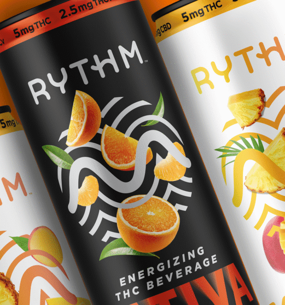
Visuals that trigger desire.
Looking irresistible always has an edge over looking “only responsible.” A pack printed with lush fruit imagery or a vivid pouring shot from a natural source triggers desire.
Instead of leaf motifs, brands that showcase their products in dynamic, appealing states (such as pouring liquids or bursting fruit) tend to pull stronger engagement. A design that leans into desire, with signals, vivid colors, realistic textures, and contrast, stands out in a sea of virtue-driven, muted palettes.
Efficacy, taste, relevance, and premium perception: the four must-win cues.
Four cues consistently top the charts in diagnostic tests.
- Efficacy assures the consumer that the product works.
- Taste promises enjoyment
- Relevance ensures it fits my life.
- A premium perception makes me confident that it’s worth paying more.
For instance, a pet supplement might highlight enzyme performance (efficacy), natural flavors (taste), “for urban cats” (relevance), and a clean, metallic emboss (premium). When packaging material choices also reduce environmental impact, it reinforces the brand’s responsibility behind the performance message.
Why “flavor + function” outperforms “healthy” in test results.
In head-to-head experiments, flavor and function cues can beat health-focused cues. Shoppers are drawn to packaging that promises a great experience or solves a problem.
For example, rich cocoa taste and muscle recovery garner more attention than high fiber and all-natural ingredients. Because function gives you a reason to try; health is just a bonus. Especially in saturated categories, packaging that leans into functional storytelling tends to be more successful.
Clarity over cleverness: messaging must mirror consumer logic.
If your customer can’t tell what the product is or why it matters in two seconds, clever copy won’t save you. Messaging hierarchy is a conversion strategy. Lead with the promise: what they get. Follow with proof: how it delivers. Then back it up with context: why it matters.
A high-performing snack pack might say “Boosts Energy | 25g Protein” upfront and then mention plant-based sourcing later. Too many brands flip that logic, starting with origin stories or details that bury the benefit and kill momentum. Design should guide the eye, not scatter it.
Why most plant-based packaging design fails.
Most plant-based brands lean into the same visual tropes: white space, minimalist logos, muted greens and browns. That aesthetic looks clean, but on a crowded shelf, it tends to blend in.
If your visual language doesn’t create contrast or identity, you become invisible. Your brand identity is erased in favor of a safe, soothing look everyone else is already wearing.
Design overload destroys purchase intent.
When your packaging is jammed with imagery, claims, shapes, or icons, you’re asking people to solve a puzzle before they even consider buying.
While you might win a design award, in retail, consumers don’t have the patience to view your pack as a piece of art. Busy designs introduce friction; the brain rejects complexity in a fraction of a second. Even if your message is valid (e.g., “our new plant-based formula reduces carbon footprint”), it’s buried and devalued.
You can’t game function with style alone.
You might have brilliant branding, but if your format is incorrect or your materials are subpar, it undermines everything. A flexible pouch that droops, a label that peels in heat, a structure that can’t stack, these “defects” destroy trust.
“Natural” becomes synonymous with cheap.
Leaning too hard into “natural” cues can be dangerous. If your packaging looks like kraft paper, cheap stock, or hand‑made, consumers might infer “low quality” or “unreliable.” Worse, it confuses the shopper entirely.
Beyond Meat is a prime example: their burger packaging, featuring a cow silhouette and phrases like “even meatier,” led nearly 59% of consumers to believe the product contained real meat. When your packaging contradicts your product, trust crumbles fast.

How to avoid the “me too” trap in plant-based packaging design.
Scan any plant-based aisle and it’s a blur of sage greens, Kraft tones, and lowercase logos. It is visual white noise. To break through, packaging needs distinctiveness, not decorum.
For example, Soylent shakes up the beverage shelf with its stark, minimalist layout, but subverts the trend with bold vertical architecture and a data-forward label that feels more tech-startup than health food. You remember it. You don’t confuse it with the eighth kombucha brand to your left.
If “Plant-Based” is your headline, you’ve already lost.
Plant-based is a feature and must always be treated as a feature. When it leads the conversation, consumers don’t see benefits; they see sameness. Winning packaging focuses on outcome and utility.
For instance, Mid-Day Squares doesn’t lean on its plant-based status; it leads with indulgence, functional performance, and snackability. You get the value proposition before you ever scan the ingredients list.
Structural and material moves your competitors can’t copy.
Visuals can be knocked off, but materials and form factors are challenging to replicate. Structurally innovative packaging wins attention and raises the barrier to entry. For instance, Lunchskins uses compostable, grease-proof paper for sandwich bags, merging structural convenience with sustainability in a format that’s still rare in grocery aisles.
Design by default is the design that dies on the shelf.
Defaulting to “what everyone else is doing” is a fast track to being forgotten. Especially in saturated verticals like plant-based protein snacks, your packaging must stand out above the visual noise. For example, when KIND refreshed its packaging, it leaned hard into its signature multicolor bars and made those bars more vibrant and visible.
Rather than hiding behind muted hues and natural motifs, they pushed color contrast, simplified claims, and ensured the pack “popped” in aisle view. While many brands fade into beige and botanical motifs, this move proved that expressive assets (color, hierarchy) can create shelf distinction without sacrificing clarity or brand cohesion.
The strategic use of white space in plant-based food packaging.
White space can be risky in dense shelf environments, too much and your pack vanishes; too little and you collapse into noise. The smart balance is deliberate margins around your logo, claim, and imagery to create focal contrast.
In “better-for-you” food and beverage design, many winning designs utilize white backgrounds, pairing them with vibrant flavor visuals or bold accent colors, so the pack appears clean and expressive. In supplement packaging design, clean layouts with generous white space now define the most legible, premium packs.
Design rules for utilizing negative space to capture attention and establish trust.
- Prioritize key elements: Let your promise, proof, and flavor visuals take center stage. Surround them with a margin so they don’t fight each other.
- Use negative space as contrast, not void: It should amplify your visual assets, not erase them.
- Leverage shape and format: Vertical pouches, tubs, or jars change how space is perceived. The shape can augment or compress white space.
- Accent with color or material contrast: A stark white canvas combined with one bold hue or textured paper draws the eye.
- Connect trust and sophistication: Lots of space signals confidence. When everything is crammed, consumers assume you’re hiding something. In luxury packaging design, white space has long been used to telegraph premium status; food brands can borrow that cue.
- Test across formats and positions: What reads well on a flat mock-up may break down on the shelf or when scaled to a smaller SKU.
What works across categories.
When you peel back the category boundaries, the same purchase drivers pulse beneath: taste/flavor appeal, perceived efficacy/function, relevance to lifestyle, and premium trust. The brands that win adapt these drivers to their domain.
Below is the breakdown of how standout packaging emerges in pet food, protein, snacks, hydration, and how you retain unity across your brand.
Category-specific standout cues.
- Pet Food (plant-based or alternative proteins): Packaging that leads with imagery of happy animals, combined with intense ingredient callouts and shelf‑worthy premium cues, bridges emotional and rational purchase drivers.
- Protein & Supplements: A pack that leads with “Rich chocolate + 25 g protein” appeals immediately to taste and function. Bold imagery (e.g., a chocolate swirl) combined with a structured layout reinforces trust.
- Snacks & Bars: These are impulse-driven. You win by using vibrant flavors, dynamic ingredient visuals (such as nuts, fruit, and chocolate), and contrast that breaks the shelf rhythm.
- Hydration / Beverages: Because these packs are typically simpler formats (bottles, cans), standout often comes from color differentiation, fruit imagery, and clean typography that signals both refreshment and clean ingredients.
Strategic adjustments by use case.
| Use Case | Shift to Make | Why It Helps |
| Snacks/Bars | Lead with flavor + indulgence, follow with health support | Taste drives trial; health supports repeat purchase |
| Hydration Drinks | Use vibrant accents and fruit visuals instead of full green palettes | Distinguishes from generic “health drink” cues |
| Pet Food | Blend human-style food cues with pet-level trust signals | Connects emotionally with owners, reinforces performance for pets |
| Protein/Supplements | Maintain consistent visual identity across formats (pouch, tub, stick) | Builds brand recognition and reduces cognitive load |
| Frozen Pizza | Show cheese pull or crisp crust over “plant-based” badges | Appetite appeal triggers faster purchase decisions |
| Ice Cream | Use indulgent textures, drips, and scoop shots over ingredient icons | Consumers want a treat first, plant-based second |
| Frozen Meals | Prioritize meal imagery and convenience before nutrition callouts | Visualizing the meal builds desire and relevance instantly |
| Coffee Creamers | Use real-ingredient visuals with froth cues rather than “non-dairy” labels | Reinforces flavor and function, reduces risk of tasting “off” |
| Dairy Alternatives | Focus on taste cues (creamy, rich, smooth) more than what’s missing | Consumers buy for experience, not subtraction |
| Produce Adjacent | Use crisp photography and freshness indicators over generic farm visuals | Reinforces quality and minimizes visual clichés |
Tailoring without losing brand cohesion.
- Visual equity anchors: Choose one or two signature accents (such as a color splash, pattern, or icon) that carry across all SKUs. Let those unify, even when category demands differ.
- Flexible grid systems: Utilize a layout structure that adapts (e.g., one variant prioritizes photography, while another emphasizes icons), but maintains hierarchy and spacing.
- Modular messaging zones: Reserve zones for promise, proof, flavor, or function, even if the order shifts per category.
- Material & finish consistency: Whether your snack bars use matte films and your pet food pouches use textured laminates, maintain consistent touches (e.g. gloss highlights, emboss, signature fold) that feel of the same family.

Nice Package
Don’t miss out on our monthly newsletter Nice Package!
Each month, we deliver a data-driven newsletter directly to your inbox, unpacking a critical topic in the FMCG & CPG industry.
"*" indicates required fields
Data-driven plant-based packaging design that maximizes growth and efficiency.
SmashBrand is a data-driven plant-based packaging design agency that makes your product stand out on the shelf. From zero-based strategy to market-validated packaging systems, we transform plant-based facts into consumer-facing stories that drive conversions. While others chase trends, we engineer packaging grounded in behavioral data, competitive differentiation, and real-world purchase drivers.
Whether you’re launching a new product or reinventing a tired SKU, our process ensures you stand out in the sea of sameness. If you’re ready to move beyond clean fonts and muted greens and start building a brand consumers actually reach for, let’s talk. The right packaging is your most powerful sales tool.

A seasoned veteran in the CPG (Consumer Packaged Goods) industry, Jason Vaught brings a wealth of knowledge and hands-on experience as the director of content and marketing for SmashBrand. His comprehensive role at the forefront of brand communication ensures that CPG brands remain well-informed about the suite of services SmashBrand offers. Furthermore, his insights derived from the company's strategy, design, and testing services are invaluable to brand owners and managers seeking expert guidance.
From his early endeavors in launching a successful sports nutrition brand that gained prominence in significant bodybuilding and fitness retail spaces to his entrepreneurial ventures in kick-starting multiple brick-and-mortar and e-commerce startups across diverse industries, Jason's career is studded with substantial milestones. Notably, he has innovated numerous products later embraced by leading industry brands, showcasing his knack for anticipating market demands and setting trends.
Jason's journey in the CPG industry commenced at age 21. Over the years, he has worn multiple hats, ranging from a manufacturer and retailer to a distributor and brand owner. This multifaceted experience equips him with the rare ability to offer practical advice grounded in real-world expertise. His mission is to guide and support other CPG brand owners, directors, and managers on their path to success.
Subscribe to
Nice Package.
SmashBrand’s Nice Package: Stay current with our latest insights
Free Resource.

CPG product repositioning guide.
Explore the five undeniable signs your CPG product needs repositioning along with strategies for leveraging consumer insights for a guaranteed market lift.
Download Whitepaper About CPG product repositioning guide.