Protein powder decisions happen fast, and they happen quietly. A shopper picks up a tub of whey protein powder, scans the label, and instinctively makes a call. No one is debating brand values. They’re judging quality, credibility, and whether the packaging feels worth the price. Here, the packaging design is doing the selling before the product ever gets a chance.
Most protein powder packaging fails at this moment. Why? Because labels are often cluttered, protein signals are buried, and brand designs borrow too heavily from existing designs. The result is packaging that looks busy but communicates very little.
This article breaks down packaging design for protein powder that converts. You’ll learn how protein packaging should work, why most packaging breaks down on the shelf, and how healthy food brands build packaging systems that make the purpose unmistakably clear.
Why protein powder packaging is a revenue lever.
In grocery and club stores, packaging doesn’t get time to impress. Packaging that looks good can still fail if it doesn’t help shoppers decide fast. Designs that convert do one thing well: they make the protein obvious, credible, and worth the price in seconds. That difference is what separates brands that grow velocity from brands that sit on the shelf.
Protein powder is unforgiving because it’s bought on a price comparison. Shoppers scan plastic jars, protein powder bags, and pouches side by side, filtering by type, count, and label clarity. If the whey protein label design is cluttered or the hierarchy is unclear, the product is immediately dropped. In club stores, oversized jars magnify every weakness. Confusion scales faster than appeal.
That’s why packaging quietly drives revenue. The right label design earns trial by removing friction. The right printed packaging design builds trust by looking intentional. In mass retail, packaging confirms the choice quickly. That confirmation is what moves volume.
How protein powder is actually chosen on the shelf.
Protein powder isn’t chosen emotionally or casually; it’s scanned and evaluated. Shoppers approach the shelf with a specific health outcome in mind and a narrow tolerance for confusion. The role of packaging design here is closer to wayfinding than persuasion.
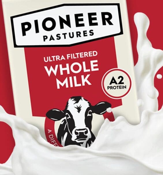
The best protein powder packaging solution behaves more like medical device packaging design than lifestyle branding. It organizes information, reduces risk, and makes the right choice feel obvious without explanation.
The reality of high-intent, low-patience shopping behavior.
People buying protein supplements already know why they’re there. They’re thinking about digestion, recovery, weight management, energy, or overall health improvement, not abstract brand stories. Flavor and ingredients matter just as much as protein count because this is a product they’ll consume repeatedly.
Whether the product is in flexible packaging, a protein powder bag, or a rigid container, shoppers want confirmation that it fits their routine and dietary expectations. Packaging that forces interpretation creates friction. Packaging that aligns immediately with intent keeps the product in consideration.
What shoppers scan first and what they ignore entirely
Attention goes to protein type, flavor clarity, key ingredients, and attributes tied to health benefits. Everything else becomes background noise. Overworked graphics, secondary claims, and trend-driven visuals rarely land.
Many protein products make the mistake of adopting packaging design trends borrowed from fintech branding, where polish signals credibility. On a protein shelf, clarity signals credibility. The label must prioritize function over decoration, and the structure must support fast comprehension rather than visual drama.
Why “brand love” rarely exists at the moment of decision
Loyalty in protein products is conditional. Even familiar brands are reassessed if another option communicates benefits more clearly or feels better aligned with health goals. Brand equity is built after use, not at shelf.
At the moment of choice, shoppers are managing risk. Practical packaging design ideas acknowledge that reality. They don’t ask for trust. They earn it by being clear about what the protein does, how it fits into daily life, and why the ingredients support that promise. That’s what drives trial. That’s what earns repeat purchase.

The non-negotiables that every protein package must instantly communicate.
In mass retail, shoppers don’t give packaging credit for effort. They give it credit for doing the basics exceptionally well. When those basics are missing, no amount of unique packaging or brand design trends can recover the lost sale. These non-negotiables are the price of entry.
Protein quantity and type as entry-level requirements
Whether the product comes in a plastic jar, a rigid container, or another format, shoppers expect to immediately understand how much protein it contains and what kind it is. Hiding this information behind multiple layers of messaging or visual noise creates doubt.
Big brands that move volume treat protein quantity and type like regulated information, similar to how disinfectant brands communicate efficacy or how deodorant packaging designs surface performance claims. If shoppers can’t verify the basics at a glance, the packaging project has already failed.
Goal clarity over broad appeal
Weight management shoppers look for low-sugar, calorie-controlled options. Fitness-focused buyers look for amino acids and recovery support. Lifestyle and wellness audiences focus on ingredients, digestibility, and shelf life. Trying to speak to everyone leads to vague messaging that resonates with no one.
This is where many Gen Z brands struggle, borrowing visual cues from skincare packaging designs or IPO branding strategies without grounding them in a clear functional goal. The most effective packages trade broad appeal for relevance and let the right shopper self-select.
Trust signals that reduce skepticism
Protein buyers assume skepticism is warranted. Packaging must actively reduce it. Clean hierarchy, restrained claims, and deliberate structure communicate seriousness. Overdesigned graphics, trend-heavy aesthetics, or excessive storytelling undermine credibility, even when the formulation is strong.
Shoppers trust packaging that feels intentional, not fashionable. The most successful protein packages don’t chase brand design trends. They signal discipline. Trust is built when the packaging looks like it was designed to inform first and impress second. That’s what keeps the product in the cart and brings it back the next time.
Where most protein packaging quietly breaks down.
Protein packaging rarely fails in obvious ways. It breaks down through small design decisions that feel reasonable in isolation but compound at the shelf. What looks like good packaging design in a review often underperforms in retail because it’s solving the wrong problem. In protein, credibility, relevance, and clarity matter more than polish.
Design choices that unintentionally erode credibility
Many protein brands borrow cues from vitamin and broader food packaging, where warmth, color, and lifestyle cues are adequate. On a protein shelf, those same choices can backfire.
Overworked graphics, decorative typography, or dense visual systems reduce perceived seriousness. Shoppers expect protein to feel precise. When retail packaging design prioritizes style over structure, the product feels less trustworthy, even if the formulation is strong.
The risk of over-indexing on lifestyle aesthetics
Lifestyle-led packaging has become the default, especially as brands chase relevance in the wellness culture. But protein is still a performance-driven category. Leaning too heavily into soft color palettes, editorial photography, or trend-led visuals borrowed from food packaging can dilute perceived efficacy.
Packaging that feels aspirational but vague often loses to simpler, more functional designs that communicate purpose without distraction.
How trying to appeal to everyone dilutes relevance
Protein packaging breaks down fastest when it refuses to choose a primary consumer. Broad messaging meant to attract athletes, weight-loss shoppers, and everyday wellness consumers simultaneously creates confusion.
Good packaging design makes exclusion a feature, not a flaw. Precise positioning helps the right shopper recognize themselves immediately. When everything is emphasized, nothing is believed, and the product quietly disappears into the shelf.

The real role of claims, copy, and visual hierarchy
Claims don’t sell protein powder on their own. Copy doesn’t either. What matters is how information is organized and revealed on the shelf. Visual hierarchy is the system that turns complexity into clarity. When that system breaks, confidence drops. When it works, the product feels easy to choose.
Why don’t more claims increase confidence?
More claims often signal more insecurity. Long lists of benefits, badges, and callouts make it more complicated for shoppers to understand the product. In protein, that effort feels like a risk.
Shoppers don’t assume a heavily claimed pack is better. They think it’s compensating. The strongest packaging uses restraint. It highlights only what matters most to the intended goal, letting the formulation do the talking.
How hierarchy drives comprehension under time pressure
Hierarchy is how shoppers orient themselves. Protein type, quantity, goal, and key attributes must appear in a clear order, not compete for attention. When everything is emphasized, nothing is understood.
Good hierarchy guides the eye naturally from primary decision cues to secondary details. This is especially critical in mass retail, where multiple products are evaluated side by side, and confusion quickly eliminates options.
When simplicity signals strength and when it doesn’t
Simplicity works when it’s deliberate and anchored in clarity. Clean layouts and concise copy can convey confidence when the essentials are unmistakable. But simplicity fails when it removes necessary information.
Minimalism without structure feels evasive. The goal isn’t fewer words. It’s fewer decisions. Strong packaging design simplifies the choice without oversimplifying the product.
Structural design and the daily usage test
Structural design is evaluated long before the first scoop. Shoppers make assumptions at the shelf about how a protein product will live in their kitchen, gym bag, or pantry. Those assumptions shape trial, satisfaction, and whether the brand earns a second purchase. Structure is not a secondary decision. It’s part of the product experience.
Why protein packaging is judged before it’s ever opened
A container that looks awkward, oversized, or flimsy suggests inconvenience before use begins. Shoppers subconsciously assess how the package will store, open, reseal, and last. If the structure feels annoying or wasteful, the product feels risky. Protein packaging that looks easy to live with feels safer to buy.
How usability influences repurchase and brand perception
Protein powder is a repeat-use product. Scoops that are hard to reach, lids that don’t reseal cleanly, or containers that spill undermine trust fast. These issues rarely show up in brand decks but surface immediately in daily routines. When structure supports clean access, easy storage, and consistent use, it reinforces quality and reliability. That experience is what turns trial into habit.
When structural innovation helps and when it adds friction
Structural changes work when they solve real problems. Better access, improved sealing, reduced mess, or smarter storage can elevate the entire brand. Innovation fails when it prioritizes novelty over function.
Unfamiliar shapes, complicated openings, or space-inefficient formats introduce friction into a routine product. In protein, the best structural design often feels unremarkable. That’s not a flaw. It’s a sign the structure is doing its job quietly and well.

Nice Package
Don’t miss out on our monthly newsletter Nice Package!
Each month, we deliver a data-driven newsletter directly to your inbox, unpacking a critical topic in the FMCG & CPG industry.
"*" indicates required fields
Price signaling and value justification on the pack
Price is never evaluated in isolation. In protein, it’s judged against what the packaging promises and how clearly that promise is communicated. Shoppers don’t calculate value on paper. They sense it through visual cues, structure, and information hierarchy. When those signals are misaligned, even a competitive price feels wrong.
How shoppers do price math subconsciously
Protein buyers instinctively balance price against serving count, protein quantity, and perceived quality. They’re not doing exact calculations, but they are assessing whether the value feels fair. Packaging plays a central role here. Clear protein callouts, restrained claims, and organized information help shoppers quickly understand what they’re paying for.
Why premium pricing fails without visual proof
Premium pricing requires visual justification. If the packaging doesn’t signal discipline, clarity, and formulation confidence, the price looks inflated. Shoppers expect premium protein to feel intentional, not decorative.
Overdesigned packs with lifestyle cues but little substance create skepticism. In contrast, packaging that feels focused and precise makes a higher price feel earned, even before the product is used.
Aligning design language with margin strategy
Packaging design must reflect how the brand makes money. Value-oriented products should emphasize efficiency, clarity, and straightforward communication. Premium products should emphasize control, quality, and confidence without excess.
When design language and margin strategy align, pricing feels logical. When they don’t, shoppers hesitate. In protein, hesitation almost always sends them to the next option on the shelf.
Designing for line growth.
Protein brands rarely stay single-SKU for long. Flavors expand, formats evolve, and what worked for one hero product is suddenly asked to do far more. This is where weak packaging systems start to show cracks. Design decisions made for launch often don’t survive growth.
Why flavor expansion breaks weak packaging systems
Flavor is one of the fastest levers for growth in protein, and one of the quickest ways to expose poor design logic. When the system relies too heavily on flavor names, colors, or illustrations, expansion creates confusion, and shelves become noisy.
Differentiation collapses. Shoppers struggle to distinguish products beyond surface cues. Strong systems anticipate flavor growth and give it a controlled, secondary role rather than letting it dominate the pack.
The importance of scalable hierarchy and visual logic
Scalable packaging starts with a hierarchy that doesn’t change as the line grows. Protein type, quantity, and goal must remain consistent anchors across every SKU. Flavor, format, and secondary benefits should flex within a defined framework.
This visual logic allows shoppers to understand the portfolio at a glance, even as it expands. Without it, each new SKU adds friction instead of choice.
Avoiding clutter as portfolios grow
Clutter doesn’t happen all at once. It accumulates. New claims, new callouts, and new design elements are added with each launch until the packaging becomes unreadable. Brands that scale well make disciplined decisions about what not to add. They protect whitespace, limit claims, and enforce consistency. Growth comes from keeping the system intact as the portfolio gets bigger.
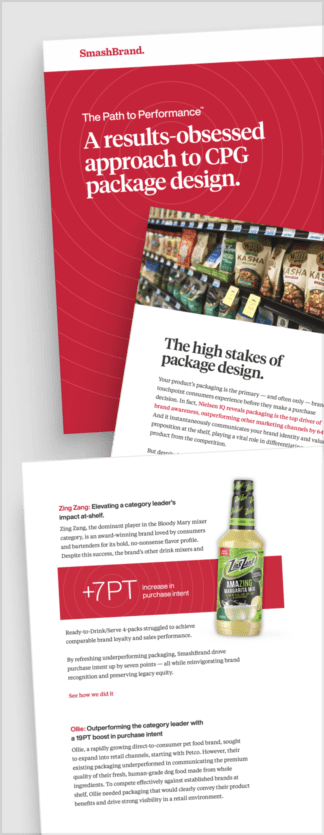
Path to Performance™
Taking a results-obsessed approach to CPG package design.
Discover how SmashBrand’s proprietary process, rooted in scientific principles, informed by data, and validated by your target audience, eliminates the guesswork from package design and delivers guaranteed results.
Data-driven packaging design that uplifts sales performance.
SmashBrand is a data-driven packaging design agency specializing in high-stakes categories like protein powder, where shelf clarity, trust, and velocity determine growth. We help brands remove guesswork from packaging decisions and turn design into a measurable revenue lever across grocery, club, and mass retail.
Our process integrates strategy, packaging design, and consumer validation into one system. We identify the purchase drivers that matter, design packaging built to perform at shelf, and test it before launch to reduce risk and accelerate time-to-market.

A seasoned veteran in the CPG (Consumer Packaged Goods) industry, Jason Vaught brings a wealth of knowledge and hands-on experience as the director of content and marketing for SmashBrand. His comprehensive role at the forefront of brand communication ensures that CPG brands remain well-informed about the suite of services SmashBrand offers. Furthermore, his insights derived from the company's strategy, design, and testing services are invaluable to brand owners and managers seeking expert guidance.
From his early endeavors in launching a successful sports nutrition brand that gained prominence in significant bodybuilding and fitness retail spaces to his entrepreneurial ventures in kick-starting multiple brick-and-mortar and e-commerce startups across diverse industries, Jason's career is studded with substantial milestones. Notably, he has innovated numerous products later embraced by leading industry brands, showcasing his knack for anticipating market demands and setting trends.
Jason's journey in the CPG industry commenced at age 21. Over the years, he has worn multiple hats, ranging from a manufacturer and retailer to a distributor and brand owner. This multifaceted experience equips him with the rare ability to offer practical advice grounded in real-world expertise. His mission is to guide and support other CPG brand owners, directors, and managers on their path to success.
Subscribe to
Nice Package.
SmashBrand’s Nice Package: Stay current with our latest insights
Free Resource.

CPG product repositioning guide.
Explore the five undeniable signs your CPG product needs repositioning along with strategies for leveraging consumer insights for a guaranteed market lift.
Download Whitepaper About CPG product repositioning guide.