
We love a bizarrely fabricated beverage bottle, almost as much as we adore trying to cram arbitrarily assembled keywords into our articles for the purposes of search engine relevance. “Beverages design” (why plural?) has the potential to be fantastically creative; after all, we have centuries of wine bottle and decanter designs to draw from. Why not go wild with the ideas? C’mon, we dare you.
Well, since the results largely have to fit into center console cup holders (not wine bottles, obviously, except in Europe), not every single beverage container design will soar, but designers do have a great deal of conceptual leeway, which we highly encourage. The point is to push boundaries to be noticed, while avoiding the age-old pitfalls: do too much, and nobody will “get” it; do too little, and nobody will notice you from within the crowd of competitors. There’s a delicate balance between the two, and knowing how far you can push the envelope is key to breaking through in almost any industry. But, pictures are worth a thousand words. Here are some examples of beverage designs that take things to the next level, without going overboard.
Single Serve Wine Glasses
Talk about a market hit! In the past three or so years, several wineries have been exploring the single serve wine glass concept, since many consumers consider carrying a full wine bottle with glasses on picnics to be quite cumbersome. Also, since it isn’t something that comes on-tap, sports stadiums typically don’t sell wine (except in skyboxes, where it’s also possible to buy raw seafood platters and massages administered by Jean-Claude Van Damme or Heidi Klum).
The single serve wine glass might be a bit on the wasteful side in terms of pure material consumption, but most disposable wine vessels are recyclable. Also, if you’re concerned about hygiene, Zipz, a single-serve wine manufacturer, uses a specialized wrapper that keeps the glass sterile and prevents wine oxidation.
Energy Drinks and Beverages
Design of these suckers can seem deceivingly easy — you just take an undersized aluminum can, slap on something that looks like it belongs in the X Games, and cover it with energetic, neon colors. That should help you fit in with, the rest of your competition, and get lost on the store shelves also. You can’t just follow the crowd, you have to lead it by seeing where the trends are and figuring out where branding and design is going.
Fictional Energy Drink Bottling
Alright, our admiration isn’t limited to packaging for real, actual beverages. Design ideas, regardless of whether or not they have made it to store shelves, can influence the industry, and we want to see someone run with this weird concept.
This conceptual beverage design looks like a motor oil container, which is probably meant to convey the idea that your about to have a high-octane experience. Of course, it does fail the cup holder test, but a bit of re-engineering can fix that. The fact that the alcohol content for the imagined “energy drink” is 8 percent is a bit disconcerting though. Of course, drunks can be highly energized right up until the point when they pass out.
Potent Potables
Since liquor is both a luxury and prestige product, it’s important that its packaging has elements of fine artistry if the brand is to be taken seriously. Even the most whimsical designs, when done well, look as though they could easily appear in a MOMA installation. Check out 1000 Acres Vodka bottling. This isn’t some wretched, charcoal-filtered stuff; this is what Superman serves in his Fortress of Solitude.
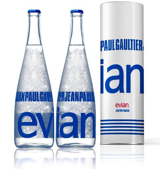
Elite Water
Alright, this is the water Superman serves in his Fortress of Solitude. Jean-Paul Gaultier? Oh, come on!
This Evian bottle design actually makes water seem more watery than it is. It’s crisp, beautiful, crystalline and bold while being simultaneously delicate. Of course, it was done in cooperation with the French crystal icon Baccarat, so it darned well better be glorious. Even when the luxury-to-the-extreme element is removed, the ready-to-wear version isn’t half bad.
Beverage bottle design is one of the packaging concepts that gives designers the ability to flex their muscles from a creative point of view. They’re fun; they’re functional; they can be elegant or hilarious and when well designed they can actually heighten the beverage drinking experience. Just look at the elite water bottles. For heaven’s sake, they almost make you forget that they only contain friggin’ water.
Data-Driven Brand Development
Want a best-selling brand? SmashBrand is a brand development agency for FMCG and CPG companies. From brand strategy to packaging design testing, our Path To Performance™ process guarantees a retail performance lift. Book a time to discuss your project with our team.
Subscribe to
Nice Package.
SmashBrand’s Nice Package: Stay current with our latest insights
Free Resource.

CPG product repositioning guide.
Explore the five undeniable signs your CPG product needs repositioning along with strategies for leveraging consumer insights for a guaranteed market lift.
Download Whitepaper About CPG product repositioning guide.