
If “keeping it real” is a virtue, then some of the most elegant packaging designs embrace simplicity, modernism, and that effortless feeling of cool you just can’t resist. Coolness is incredibly seductive; being cool requires complete self-assurance and a total aversion to trying too hard.
We like to think of ourselves as pretty cool among the field of way-hip packaging design companies and some of the stodgier firms. The coolest kids can hang at either lunch table, but they often create their own.
Elegant packaging designs that incorporate a cool factor make products irresistible and convey status without seeming to try. When creating new packaging or rebranding an existing product line, packaging design companies that keep it cool can help transform a brand’s reputation among customers who may have previously thought it behind the times.
Here are six very cool, modern, and casual elements that add that certain je ne sais quoi to your packaging designs and make buyers want them for their elegance, status, and simplicity.
1. “Sketchy” Elements
While the sketchiest kids in the lunchroom probably weren’t sitting at the cool kids’ table, sketchbook elements add a tongue-in-cheek component that creates equally unfussy and elegant packaging designs. We like the rendered feel of these Vigilant Eats oatmeal containers and the self-aware hint of design-with-in-a-design that they invoke.
2. Cardboard
When packaging design companies integrate cardboard elements on clean designs, they lend the product a triple-threat cool factor of earthiness, utility, and ecological responsibility. Think of Starbucks’ emblematic cardboard cup sleeves and the combination cool cat-crunchy granola appeal of the Bota Box line of boxed wines.
3. Homespun Appeal
Sometime in the last five years, homespun elements became undeniably haute. The more you can create the idea of homemade, DIY, resourceful goodness, the more consumers aspire to fake it until they can actually make it. We like chef-celebrity Jamie Oliver’s line of fine jams and condiments packed up to fool the casual guest into thinking you might have just made them yourself.
4. High-Contrast
High-contrast color combinations, especially the measured restraint and bursting glory of black and white designs incorporating a single pop of color, make a powerful impact. They’re simultaneously considered and effortless. It’s an irresistibly cool combination. The JONES SODA CO. line of naturally flavored artisan sodas come to mind.
5. Nautical
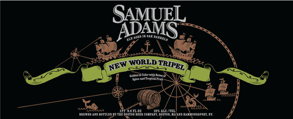
For some reason, nautical elements make things simultaneously chill and aspirational. Who doesn’t want to know what’s going on in the mind of the crusty sea captain or the neatly-appareled preppy sailor? Tommy Hilfiger is a brand that has largely cashed in on the cool factor surrounding simply sea-focused and elegant packaging design that wins on shelf.
6. Clean Lines & Negative space
The combination of simplicity of line and dynamic use of negative space makes packages that make you want to cave to cool kid peer pressure. Check out the sleek look of the Public-Supply line of office supplies with a higher purpose. Packaging design companies should endeavor to incorporate more of these cool elements to entice customers to get in on the trend.
If being the coolest kid in the lunchroom is your packaging design company’s goal, incorporating some of the above elements will help your firm become known for sleek and elegant packaging designs that make even the in-crowd lust for your client’s products. The essence of cool is the feel of not trying too hard; that’s what makes these elements feel impossibly hip. These design elements can take a so-so concept to the next level by adding major with-it points and upping your design’s cool factor in an effortless and organic way.
Subscribe to
Nice Package.
SmashBrand’s Nice Package: Stay current with our latest insights
Free Resource.

CPG product repositioning guide.
Explore the five undeniable signs your CPG product needs repositioning along with strategies for leveraging consumer insights for a guaranteed market lift.
Download Whitepaper About CPG product repositioning guide.