
A graphic, labeling, and packaging design company will take its design cues from its clients’ brand culture. If it is a boutique, family-owned brand, the design will reflect that by incorporating familial elements into the overall aesthetic. If the brand is a strong corporate entity, the logo will represent stability, trustworthiness and endurance. If the brand is “Kardashian,” the logo might involve litigation.
Of course, if the brand name or the name of the line within that brand is especially evocative, a graphic or packaging design company would be foolish to ignore it. Take… oh, just for example’s sake, Fighting Eagle Vodka. Fighting Eagle Vodka happens to have been designed by little old us, but it is nonetheless relevant due to the incorporation of highly patriotic American iconography. Heaven knows, vodka is American to the very backbone. Just trust us on this.
Optimizing or even changing your brand image can be as simple as merging the brand name with the label design in a nearly literal way; it is an effective way to add a bit of whimsy and freshness to an otherwise tired and stogy aesthetic. It is also a clear way to convey self-awareness; the name of the brand and/or the product line was given for a reason, and a darned good reason. Here are a few examples of how using a brand name within a labeling or packaging design can be highly effective.
Boxhead Wine
What could be more obvious than the integration of boxes on a wine brand called “Boxhead?” Well, obvious or no, this label is probably one of the most interesting and graphically impressive wine labels we’ve seen. It manages to be intricate, complex and detailed while remaining thoroughly harmonious — no eye fatigue here (not easy). It’s highly engaging, fun and yet completely confident. These designers certainly thought outside the box on this one [Ha! Rim shot!].
Nocturnalis/Durinalis
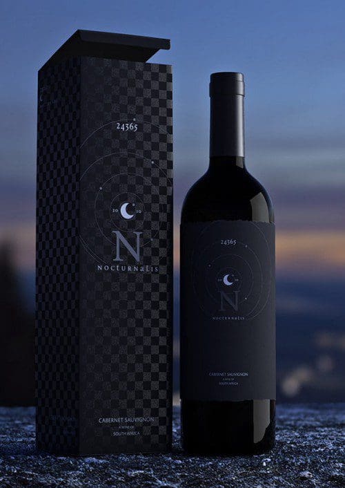
This label design concept uses solar and lunar symbology; the white wines were given the white, daytime labeling (Durinalis), while the reds have the black, nighttime labels (Nocturnalis). This strategy even leaves room for a sunset/rosé design, but if any winemakers want us to elucidate further, they’ll have to write a big, fat check.
Clif Bar
And now it’s time for one of our favorite energy bar package designs: Clif Bar! Yup, we’ve sung the praises of Clif Bar package and graphic design many times. We’ll continue to do so because it is so folksy, natural and unassuming — unlike any other energy bar package/label design on the market. And lookit — it has a cliff on to the left of the brand name, making it relevant to this article. Is there nothing this design can’t do?
Art Haus Lemonade
If you are looking for a refreshing, delicious beverage that will make people think you regularly attend prestigious European gallery openings, boy — do we have a drink for you!
SmashBrand’s own Art Haus Inc. Lemonade beverage design is one of our contributions to the label-as-packaging-inspiration zeitgeist. The limited edition bottles were given individual, visually stimulating Arthaus design patterns that were conceptualized to enhance the natural color of the different beverages. The result is, we think, pretty darned stunning if we do say so ourselves.
Changing your brand image might not be as simple as designing a suitable badge for your product label. Still, it is a single and efficient step towards rejuvenating your identity. It is important that neither the design nor the new brand image are forced — the public can see through a shallow attempt to develop a personality quite clearly.
Data-Driven Brand Development
Want a best-selling brand? SmashBrand is a brand development firm for FMCG and CPG companies. From brand strategy to packaging design testing, our Path To Performance™ process guarantees a retail performance lift. Book a time to discuss your project with our team.
Subscribe to
Nice Package.
SmashBrand’s Nice Package: Stay current with our latest insights
Free Resource.

CPG product repositioning guide.
Explore the five undeniable signs your CPG product needs repositioning along with strategies for leveraging consumer insights for a guaranteed market lift.
Download Whitepaper About CPG product repositioning guide.