
Every now and again we like to shuffle through our favorite inspiring label designs and highlight some of what we consider the most interesting and inspirational. These exciting, enticing and, occasionally, delicious label designs will hopefully jar loose some creative genius from your stagnant brain, and get you on the road to designing your own label masterwork. We’re here to serve you.
Stranger & Stranger: Spirit No. 13
This label combines old-westy charm, distillery know-how and all of the comforts of drinking liquor out of a paper bag in one eye-catching label concept. If you look closely, you’ll find that the phrase “Easy Sippin’, Good Mixin'” has made its way onto the bottle. If there has ever been a better endorsement for a Christmas season moonshine, we haven’t heard it.
Briaura Artisan Foods
How is it possible that an instant food package label can manage to convey homemadeiness effectively? The Briaura Artisan Foods mixes use eye-pleasing light and bright colors, folksy typography, and drool-worthy food photos to give their products mega consumer appeal. For our part, we’ve never wanted pancakes more in our lives.
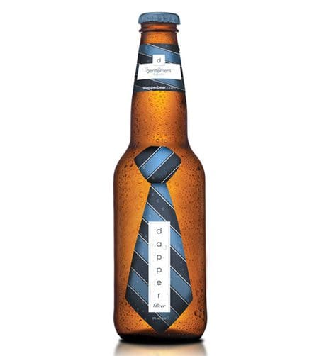
Dapper Beer
What says “dapper” more effectively than a thick, silky Windsor-knotted tie? This beer’s simple label stands out against its frost-brewed, Ice Cube-endorsed malty competition.
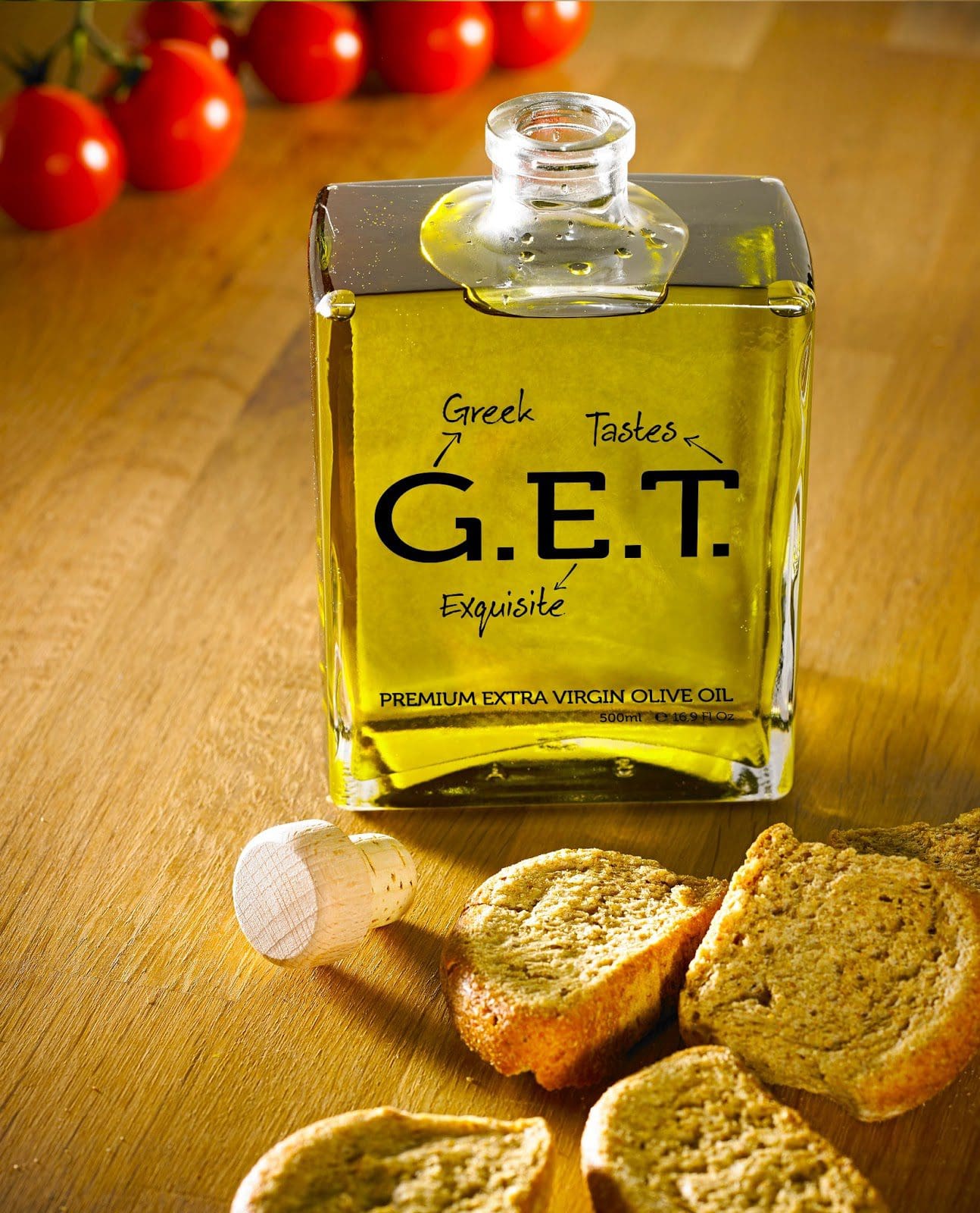
G.E.T Olive Oil
In addition to the forceful nature of the bottle’s label (we command you to GET olive oil), the label designers have managed to use label clarity quite effectively in a market pretty well dominated by busy paper labeling. The bottle’s shape is pretty darned good, too.
Fighting Eagle Vodka
All the label designs for this Texas Distilling Company are fabulous, but we especially like the Fighting Eagle line we designed. These labels are super bold and evocative; we imagine patriotic Americans with their white suits and Mark Twain hair, delicately sipping martinis while loudly celebrating our veterans.
Perle
Look at these beauties! These bottles are so French they barely even seem like beer. We love the deliberately crumpled paper labels and the faded pinup photos. We feel classier and more insouciant just looking at them.
7up
Who knew that 7up could develop such an interesting pop-art label concept? Or rather, who knew that the corporate brain trust would ever have the guts to embrace the 7up brand’s inherent pop-artiness?
Ippon Matsu Beer
Japanese design is invariably lighter and more whimsical than most American or European design, and these Ippon Matsu Beer labels are no exception – although it might be inappropriate to describe a beer label designed to aid Tsunami reconstruction “whimsical.” To an American consumer, they don’t even look like what we are used to when we think of beer labels, but the single and simple white pine tree is infinitely more eye-catching than your standard shamrock and busty beer maid graphics. There’s nothing wrong with shamrocks and busty beer maids, mind you.
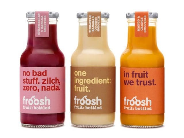
Froosh
How can your label go wrong with a name like “Froosh”? This smoothie brand doesn’t shy away from what it is, nor does it try to wholesome you to death. This label tells you loudly, graphically and specifically that this product is just fruit, all squashed up, which is all a smoothie should be.
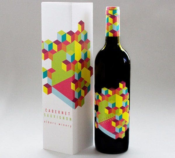
Meeta Panesar Op Art Wine Concept
This wine bottle concept uses the art of Joseph Albers as its inspiration. While a winery hasn’t yet been commissioned it, the designs have already sparked major interest within the design world. Art and wine aficionados will undoubtedly engage in heady conversations about the Op Art movement and its continuing validity within the spectrum of constantly evolving contemporary art trends. However, we just thought, “Q*bert! Cool!”
There you have it; some of the label designs we hold closest to our hearts. We hope you find them useful, engaging, titillating and perhaps even controversial. Even if they’ve done nothing but cause you to go out and buy a bottle of moonshine, we still feel we’ve done our jobs.
Data-Driven Brand Development
Want a best-selling brand? SmashBrand is a brand development agency for FMCG and CPG companies. From brand strategy to packaging design testing, our Path To Performance™ process guarantees a retail performance lift. Book a time to discuss your project with our team.
Subscribe to
Nice Package.
SmashBrand’s Nice Package: Stay current with our latest insights
Free Resource.

CPG product repositioning guide.
Explore the five undeniable signs your CPG product needs repositioning along with strategies for leveraging consumer insights for a guaranteed market lift.
Download Whitepaper About CPG product repositioning guide.