You approved the new pouch. The colors popped in the boardroom. The claims felt strong. The render looked sharp enough for a poster design campaign. Three months later, velocity tells a different story. Why? because granola now competes head-to-head with cereal disruptors like Seven Sundays and Magic Spoon, while new brands launch every quarter with low barriers and aggressive positioning.
Packaging design for granola brands mostly fails because it fights itself. The front panel tries to behave like cereal, protein powder, and a granola bar all at once. Health claims stack up. Sugar sits quietly in the nutrition panel. The brand mark shrinks to make room. On the shelf, that confusion costs you.
This article breaks down how packaging design for granola brands actually wins. We’ll dissect hierarchy, sugar communication, pouch architecture, and the hard truths about granola packaging performance across market regions.
Why granola packaging is uniquely hard.
Granola lives in a space that looks simple from the outside and punishingly complex once you study the shelf. In North America, this category keeps absorbing competitors from cereal, protein snacks, and even granola bar packaging. The barrier to entry is low. The expectation for performance is not. That tension shows up directly in food packaging design decisions.
The health vs indulgence contradiction.
Granola lives in a “healthy” space with a sugar stigma that refuses to go away. Your granola packaging has to look craveable without triggering doubt. Texture, clusters, and inclusions must feel real. If it looks sterile, appetite dies. If it looks dessert-heavy, credibility takes a hit.
This tension forces discipline in food packaging design. The strongest brand identities control sweetness rather than hide it. Sugar positioning is clear. Claims are prioritized. The brand mark holds ground. When packaging tries to behave like cereal and granola bar packaging at once, confusion wins, and the shelf in any market region punishes it fast.
The beige shelf problem.
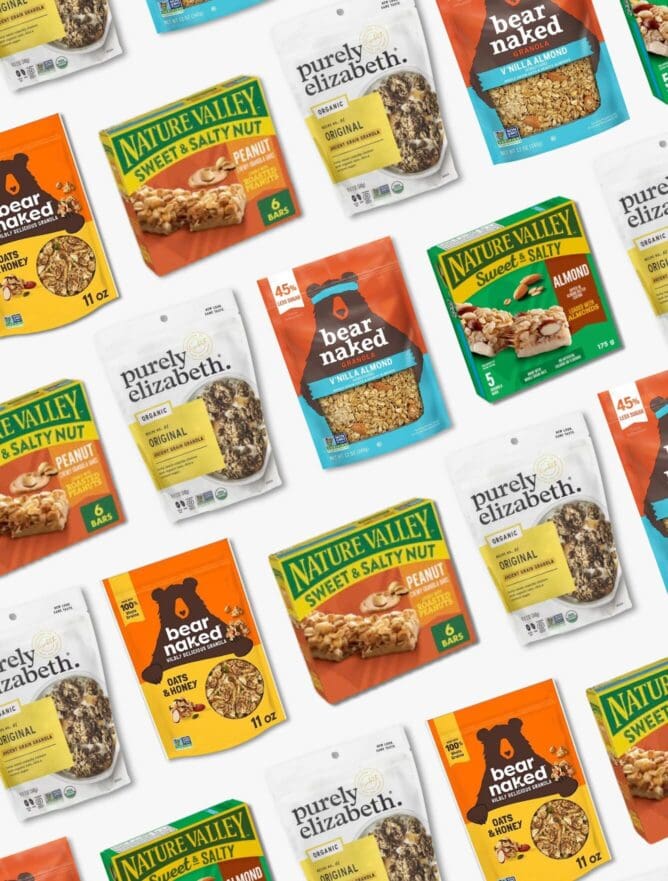
The granola aisle blends into one long wall of Kraft bags, earth tones, handwritten fonts, ingredient bowls, and clear windows. Every granola brand signals “natural” the same way. The result is zero separation. Flexible packaging makes it worse because the silhouette rarely changes.
Unlike protein bar packaging or even pet food boxes, granola rarely uses bold brand identity to break the pattern. Flavor cues get muted, protein claims drown, and sustainability messaging takes over. The resealable zipper and material choices protect shelf life, but they don’t create energy.
Structural limitations.
Stand-up pouches dominate the granola category because they help preserve freshness, prevent moisture absorption, and extend shelf life. They are efficient and functional, compressing differentiation across the shelf. From ten feet away, most granola products share the same silhouette, which means structure does not create brand memory or competitive advantage.
Every design decision must work harder and prove its value. Color systems must organize the portfolio clearly. Flavor cues must be intuitive. Protein claims must follow a disciplined hierarchy. Ingredient visualization must reinforce credibility. Health positioning must be communicated with precision. These are not aesthetic choices. They are purchase drivers.
Portfolio sprawl.
Granola brands rarely remain focused on a single SKU. What begins as a core offering often expands into protein variants, keto extensions, clusters, seasonal flavors, and bar formats. Growth introduces complexity quickly.
Without a cohesive, scalable visual architecture, expansion weakens the brand rather than strengthening it. Flavor colors begin competing for attention. Functional claims overpower the masterbrand. Sub-lines shift tone and create inconsistency. A bar extension can unintentionally compete with the pouch instead of reinforcing shared equity.
Portfolio growth should increase brand awareness and improve shopability. It should clarify segmentation and strengthen authority at the shelf. That requires a system designed to flex without losing hierarchy or coherence.

Common Packaging mistakes granola brands make.
When packaging underperforms, it does not fail quietly. It erodes velocity. Most of the breakdowns we see are not creative failures. They are failures of discipline. Brands attempt to communicate everything instead of prioritizing the one message that drives purchase at the shelf.
Below are the patterns that consistently weaken granola performance.
Saying everything at once.
Brands overload the front panel with certifications and claims such as organic, non-GMO, gluten-free, vegan, and whole grain, etc. The package becomes a parade of badges. When every benefit receives equal visual weight, nothing leads. Shoppers scan for a primary reason to choose. If the pack forces them to decode value, friction increases, and conversion drops.
Consider how Purely Elizabeth structures its protein line. “Protein” is clearly isolated and given space to dominate. Supporting claims are secondary and organized. The system feels intentional. In contrast, many emerging brands compress multiple badges across the top of the pouch, shrinking the brand mark to accommodate them. That flat hierarchy signals uncertainty and weakens authority.
Designing for Pinterest, not retail.
Many granola packs are designed for presentation decks rather than competitive shelves. These packaging designs leverage muted palettes, thin serif typography, and minimal layouts. But retail environments punish subtlety, particularly in granola, where Kraft textures and earthy tones dominate the set. Without contrast and blocking power, visibility collapses.
Bear Naked uses bold color blocking and high contrast to hold ground in mainstream grocery stores. That is not an aesthetic decision. It is a distance-read strategy engineered for shelf impact. Small logos are another hidden liability.
When the masterbrand sacrifices real estate to accommodate secondary messaging, recognition declines. Low contrast between background and typography further erodes legibility under fluorescent lighting.
Ignoring sugar transparency.
Granola carries inherent sugar skepticism. Avoiding the issue does not remove it. It amplifies doubt. When sugar grams are buried, and the front panel leans into indulgent visuals like chocolate chunks or honey drizzles, shoppers begin calculating the risk. Uncertainty slows decision-making.
High-performing brands address sugar head-on. NuTrail leads unapologetically with low-carb and low-sugar positioning. The macro hierarchy is clear and intentional, reducing friction.
If a granola skews indulgent, the sweetness story must be explicit. Is it maple? Honey? Monk fruit? How many grams per serving? Silence reads as avoidance. Transparency builds trust and accelerates choice. Winning granola packaging takes ownership of the sugar narrative instead of reacting defensively to it.
Weak portfolio systems
Granola brands expand quickly. Classic. Protein. Keto. Clusters. Seasonal flavors. Limited drops. Without a disciplined visual architecture, expansion fragments equity instead of compounding it. Inconsistent logo placement, unstable color systems, and unclear sub-line hierarchy dilute blocking power.
Three SKUs may technically belong to the same brand, but if they do not read as a unified system from six feet away, they are not reinforcing recognition.
Nature Valley maintains masterbrand dominance across formats, from bars to granola. Sub-lines operate within a consistent framework. Recognition is immediate because hierarchy is protected. A scalable design system preserves authority while allowing flexibility across variants. Without it, competitors occupy the visual space your portfolio should own.
Overusing the clear window.
Texture sells in granola. Seeing clusters builds credibility. An oversized front window often sacrifices brand dominance. When the majority of the pouch becomes product visibility, the brand recedes. In natural channels where many brands share similar structures, excessive transparency creates a commodity effect.
A window should support credibility, not replace identity. Premium systems control window size and integrate it into a broader graphic strategy. When transparency overwhelms color blocking and brand mark presence, differentiation weakens. Consumers do not choose based on the volume of visible products. They choose based on clarity, trust, and perceived value. Framing matters more than exposure.

What actually drives granola packaging performance?
Most granola packaging fails because they create doubt, confusion, or invisibility on the shelf. In a category this crowded, performance comes down to how clearly and confidently a pouch communicates its primary value in under three seconds. There are specific drivers that consistently separate high-velocity granola packaging from the rest.
Taste and texture communication.
Granola is purchased for health, but it is repurchased for taste. The pouch must communicate crunch, cluster size, and real inclusions in a way that feels substantial and credible. Overly stylized imagery makes the product feel artificial. Minimal, sterile design suppresses appetite appeal.
Brands that perform well use controlled, realistic product photography and clear flavor cues. The goal is not decoration. It is a reassurance that the granola will deliver a satisfying eating experience.
Clear health hierarchy.
Health matters in this category, but shoppers will not decode layered messaging. When protein, fiber, low sugar, organic, and functional benefits all compete for attention, none of them dominate.
Effective packaging design for granola brands isolates a primary health driver and builds the hierarchy around it. If protein is the lead benefit, it is unmistakable. Supporting claims stay secondary. This disciplined structure signals authority rather than desperation.
Distinctiveness within natural codes.
The granola aisle is filled with Kraft textures, muted greens, and similar layout patterns. Following category codes maintains credibility, but copying them erases visibility.
Performance comes from controlled differentiation. Strong color blocking, confident typography, and a dominant brand mark create presence without abandoning natural cues. The packaging must stand out on the shelf enough to be noticed while still feeling appropriate for the set.
Portfolio navigation clarity.
Granola brands are expanding quickly into protein, keto, and other functional categories. Without a clear system, the line becomes visually fragmented. Flavors blend together. Sub-lines look unrelated. The master brand loses dominance.
Strong portfolios are engineered intentionally. The brand block remains consistent across SKUs. Sub-lines are clearly segmented. Flavor distinctions are obvious from a distance. When the line reads as a cohesive unit, it strengthens recognition and improves navigation at shelf.
Occasion anchoring.
Granola competes across breakfast, snacking, and functional fuel occasions. If the packaging does not clearly signal its primary role, it forces the shopper to decide how it fits into their routine. High-performing granola packaging makes that role obvious. Whether it is positioned as a protein breakfast option or a clean, everyday staple, the occasion is clear and visually reinforced.
Mainstream vs natural channel: the hierarchy shift.
Granola does not fit into a single psychological environment. It competes in at least two. If you design one static hierarchy and expect it to perform equally in both mainstream grocery and natural retail, you are leaving sales on the table. The product may be the same. The shopper mindset is not.
| Driver | Mainstream Grocery Priorities | Natural Channel Priorities |
| Primary Decision Trigger | Taste and immediate appetite appeal lead the decision | Ingredient integrity leads the decision |
| Taste Communication | Strong flavor cues, visible clusters, indulgent photography | Balanced appetite cues with credibility, less exaggerated visuals |
| Shelf Visibility | Bold color blocking, high contrast, dominant brand mark | Controlled distinctiveness, credibility within natural codes |
| Health Messaging | Simplified, single leading benefit, such as protein or low sugar | Detailed health framing tied to ingredient quality and sourcing |
| Sugar Communication | Clear grams, simplified low-sugar callouts | Explicit sweetener source, transparency around sugar type, and impact |
| Brand Positioning | Confident, performance-driven, easy to decode | Values-driven, ingredient-first, mission-aligned |
| Hierarchy Structure | Taste first, health second, credentials third | Integrity first, sugar clarity second, values third |
| Visual Tone | Assertive and shelf-dominant | Credible, intentional, trust-building |
| Portfolio Segmentation | Clear sub-lines with strong blocking for quick navigation | Sub-lines differentiated with ingredient or functional clarity |
| Risk of Misalignment | Too subtle disappears; too detailed slows decision | Too loud feels commercial; too vague feels untrustworthy |

Nice Package
Don’t miss out on our monthly newsletter Nice Package!
Each month, we deliver a data-driven newsletter directly to your inbox, unpacking a critical topic in the FMCG & CPG industry.
"*" indicates required fields
Data-driven packaging design for granola brands that uplift sales performance.
SmashBrand is a data-driven packaging design agency that builds granola packaging to win at the shelf. We combine strategy, creative, and real consumer testing to eliminate guesswork and focus on what actually drives purchase.
Our process starts with diagnosing category drivers, identifying where your current product underperforms, developing multiple strategic design routes, and validating them in a real shelf context before launch. If you’re ready to fix underperforming granola packaging with evidence rather than opinion, contact us for a performance audit and a next-step roadmap.

A seasoned veteran in the CPG (Consumer Packaged Goods) industry, Jason Vaught brings a wealth of knowledge and hands-on experience as the director of content and marketing for SmashBrand. His comprehensive role at the forefront of brand communication ensures that CPG brands remain well-informed about the suite of services SmashBrand offers. Furthermore, his insights derived from the company's strategy, design, and testing services are invaluable to brand owners and managers seeking expert guidance.
From his early endeavors in launching a successful sports nutrition brand that gained prominence in significant bodybuilding and fitness retail spaces to his entrepreneurial ventures in kick-starting multiple brick-and-mortar and e-commerce startups across diverse industries, Jason's career is studded with substantial milestones. Notably, he has innovated numerous products later embraced by leading industry brands, showcasing his knack for anticipating market demands and setting trends.
Jason's journey in the CPG industry commenced at age 21. Over the years, he has worn multiple hats, ranging from a manufacturer and retailer to a distributor and brand owner. This multifaceted experience equips him with the rare ability to offer practical advice grounded in real-world expertise. His mission is to guide and support other CPG brand owners, directors, and managers on their path to success.
Subscribe to
Nice Package.
SmashBrand’s Nice Package: Stay current with our latest insights
Free Resource.

CPG product repositioning guide.
Explore the five undeniable signs your CPG product needs repositioning along with strategies for leveraging consumer insights for a guaranteed market lift.
Download Whitepaper About CPG product repositioning guide.