How often do you take the time to read product labels when you’re out shopping? If you’re like most people, you probably take a quick glance at the product and make an impulsive purchasing decision based on its packaging. Well, there’s a reason for that, and it has a lot to do with psychology and how we perceive things.
You might be surprised to find that most customers take about seven seconds to make a decision about a product. Since most shoppers don’t spend a whole lot of time looking at items on the shelf, companies need to come up with branding strategies that make their packaging design more appealing than their competitors. This can be done by making sure that customers can glance at your product and immediately know the following information:
– What your brand is.
– What your product does.
– Why someone would need your product.
But before your product can achieve that, your packaging design needs to should have some of these five components.
1. An Eye-Catching Design
There’s an emerging field, called neuromarketing, which looks at what types of imagery are more likely to grab our attention at first glance. Things like cusp shapes (sharp or angular designs), pictures we can relate to, and colors that trigger the right emotional response are all great elements to incorporate in your design to grab attention and stand out.
2. Minimalism
Cluttered, busy packaging is not only hard to read, it can also elicit feelings of stress and anxiety in a lot of customers. A lot of customers appreciate the simplicity of a less-is-more design, and if your product is stuck on a shelf around other brands with busy labels, a simpler design can also help your brand attract more attention.
3. Easy to Be Described
Part of having an iconic brand label is being able to describe it easily and properly. Take UPS as an example. If you were trying to describe the company to someone who’s never heard of UPS before, you’d probably say something along the lines of the brown courier.
Now try the same thing with their competitor, FedEx. That’s the one that has the arrow between the “E” and the “X.” But what about the trucks? White trucks aren’t so differentiating, are they? UPS has come up with unique imagery for its brand that can be easily described. Other examples include:
– Oreos – the black and white cookies in a blue package.
– DHL – the red and yellow courier.
– Coca-Cola – the red and white drink.
4. Emotional Responses
Emotions are big in marketing, and as mentioned earlier, different colors and pictures trigger different emotions. Some imagery, like soft curves, we tend to find comforting, while others, like sharp edges, make us think of danger. The ideal type of emotional engagement depends on what you’re selling and who you’re selling it to, which is why it’s important to know your target market and design your brand accordingly.
Putting it All Together
You want your design to incorporate elements that are instantly recognized across brands. Think of the Coca-Cola bottle shape or Google’s unmistakable color scheme. The thing that both of these iconic assets have in common is that you can see them anywhere, in any context, and immediately think of the brand. How people react to your brand emotionally is a key component to sales, and they need something to differentiate you form your competition. You might create a commercial that speaks to their craving for that cozy feeling on a lazy summer afternoon, but if your brand doesn’t stand out from the competition, all you’ve done is increased the demand for your industry, not you.
Don’t let your work result in sales for your competition. Get the consumer research done ahead of time on what your target market responds to and then take action, even if it means rebranding. Otherwise, what’s the point?
Subscribe to
Nice Package.
SmashBrand’s Nice Package: Stay current with our latest insights
Free Resource.

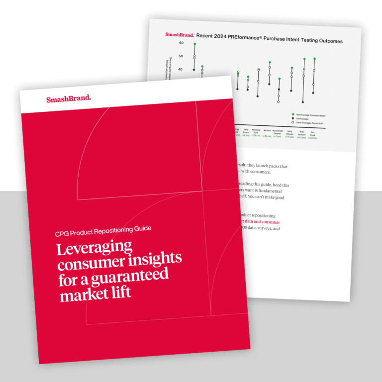
CPG product repositioning guide.
Explore the five undeniable signs your CPG product needs repositioning along with strategies for leveraging consumer insights for a guaranteed market lift.
Download Whitepaper About CPG product repositioning guide.