Let’s be blunt. Confused shoppers don’t buy. If your packaging isn’t clear, it won’t convert. And if it’s not converting, it’s not performing.
Nielsen research shows that 64% of consumers try a new product because the packaging catches their eye. That’s the moment of truth. You either win at the shelf, or you don’t. These are the most common ways packaging breaks that moment and how to fix them.
Structure that creates friction.
When your structure doesn’t look like it belongs in the category, consumers skip right past it. You don’t earn extra credit for innovation that doesn’t connect to usage cues.
A peanut butter jar flipped upside down might feel creative, but if it doesn’t look like something you scoop from, it won’t even register as peanut butter. The same goes for coffee that looks like a supplement.
 Fix it:
Innovative structures should deliver functional benefits, not confusion. Validate that the form signals what the product is, how it works, and how it’s used. Otherwise, it won’t make the shelf set—it’ll make the shopper pause and move on.
Names that get too cute.
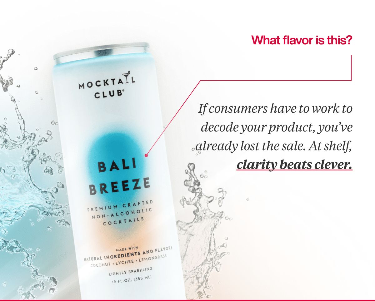
Naming is where creativity often overrides clarity. Shoppers don’t want to decode “Bali Breeze” to figure out what flavor they’re buying. Fanciful names can add personality, but they must be anchored in something that communicates the core experience.
Fix it:
Lead with what the shopper needs to know. If you’re going to use a creative name, pair it with a clear descriptor like “Coconut Breeze.” Flavor is a purchase driver, not a puzzle to solve.
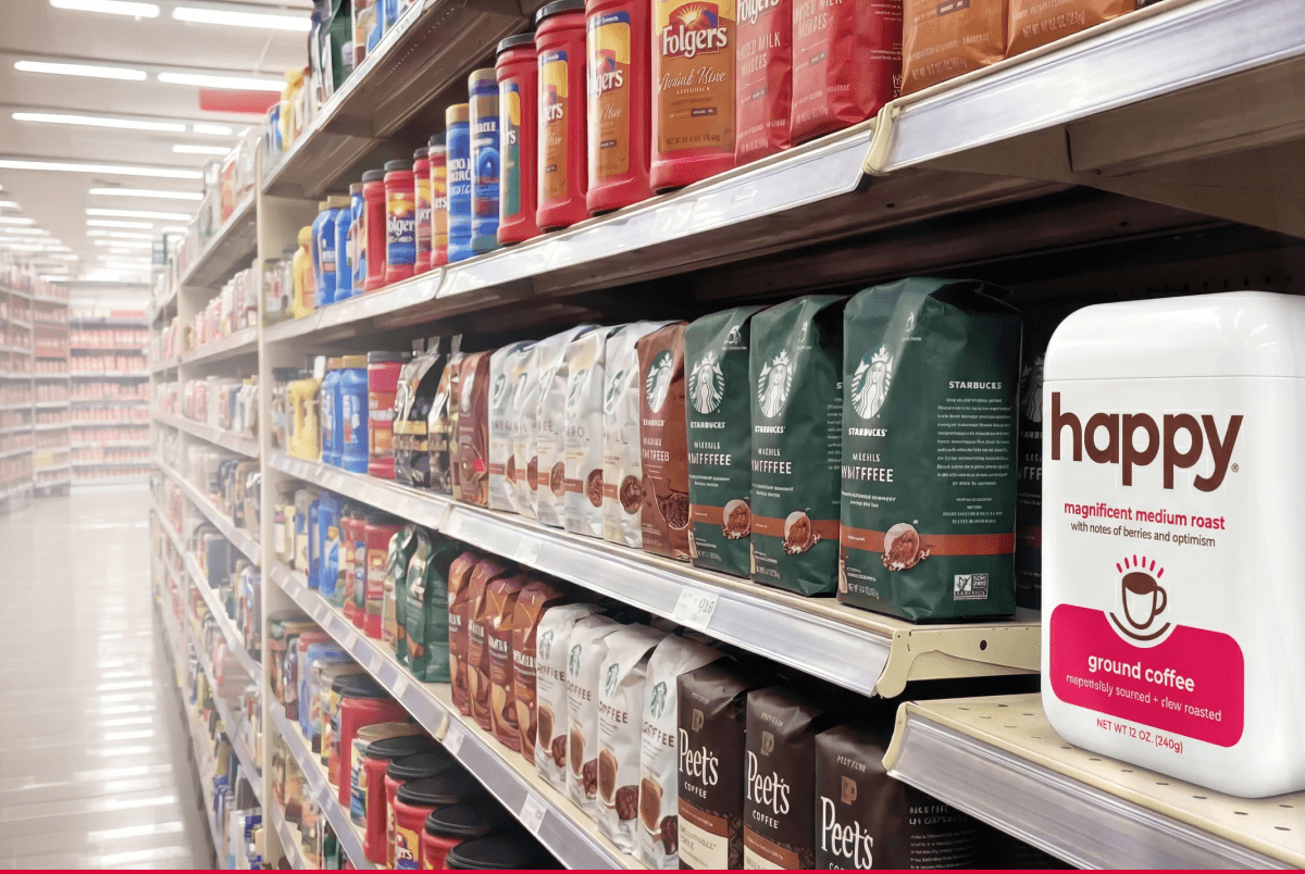
Logos and fonts that don’t pass the shelf test.
![]()
If your brand name can’t be read from the aisle, you’re invisible. That sounds harsh, but it’s real. Thin fonts, ambiguous letterforms, or crowded layouts sacrifice brand recall in the most critical context—three feet away, in a crowded set, with five seconds to make a decision.
Fix it:
Prioritize legibility over elegance. Shelf testing should assess your typography at a real distance and in a competitive context. If your logo doesn’t perform in that environment, no one will ever learn your name.
SKUs that don’t blur together.
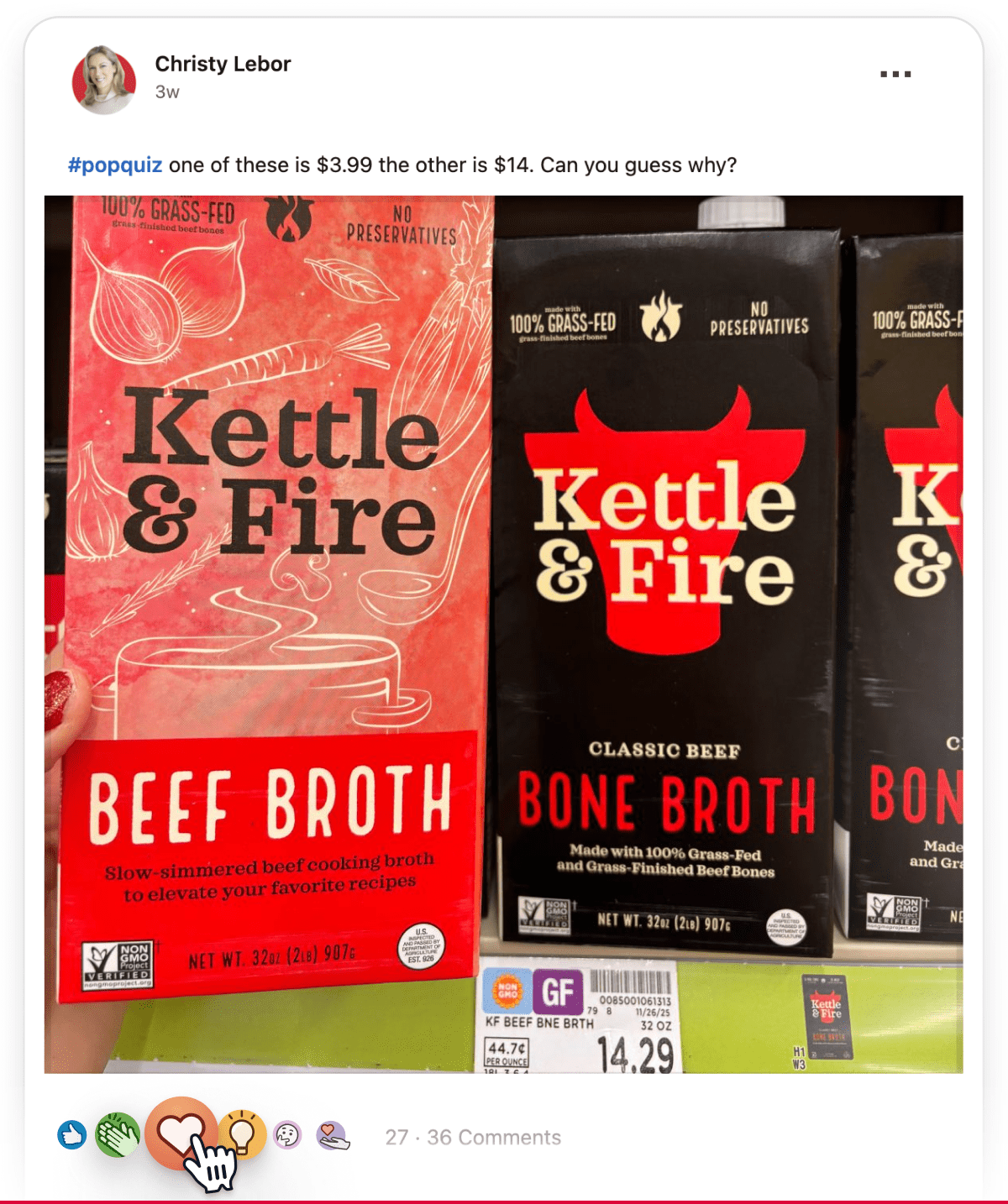
When your line extensions all look the same, shoppers don’t notice what’s different. Christy gave a perfect example: Kettle & Fire’s bone broth and beef broth look nearly identical but cost $10 apart. That’s a branding issue and a breakdown in portfolio navigation that can lead to accidental purchases or a loss of perceived value.
Fix it:
Treat SKU design like wayfinding. Use layout, color blocking, and iconography to guide shoppers between products. Make sure the hierarchy of information mirrors what matters in the decision process: form, flavor, benefits, and price tier.
Communication overload or underload.
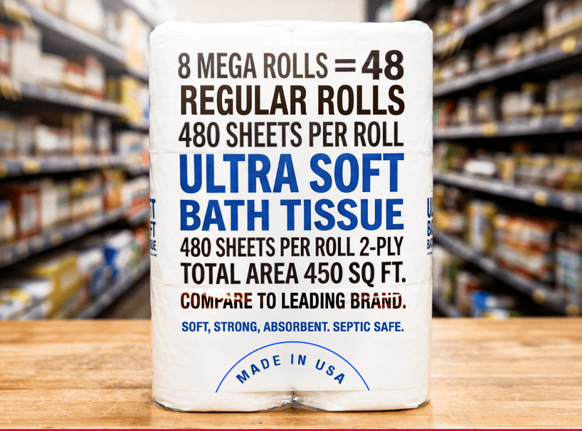
You’ve seen it: “6 Mega = 24 Regular = 48 Small.” Or worse, the front panel that says absolutely nothing in a category where consumers want reassurance. Either extreme—too much or too little—creates decision friction.
Keep it “second-grade math only.” No one should need a spreadsheet to understand what they’re buying.
Fix it:
Clarity is not minimalism. It’s targeted, relevant communication. Eliminate math, claims overload, and long copy. Prioritize the few pieces of information that matter most in that moment: what it is, what it does, and why it’s better..
Visual promises that mislead.
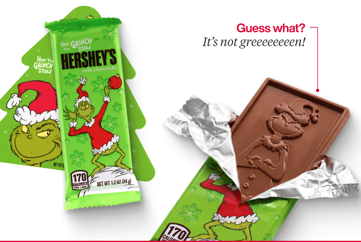
If your packaging looks like it’s offering a new experience, the product better deliver. A green Grinch-themed wrapper signals that something fun and different is inside.
But if it’s just the same chocolate bar, you’ve created disappointment and eroded trust in your brand.
Fix it:
Align your visual story with the actual consumer experience. Expectation-setting isn’t just a creative decision it’s also a strategic one. Don’t promise novelty or value unless you’re delivering it. Shoppers remember the letdown.
Value that gets missed.
Sometimes the problem isn’t what you show, it’s what you don’t. For example, club packs that contain bonus items but hide them at the bottom. Multi-format products where it’s unclear if bars are individually wrapped or bundled. Even a high-value add becomes irrelevant if the consumer never sees or understands it.
Fix it:
Be explicit about what the buyer is getting. Show the components clearly. Use icons or visual cutaways to illustrate format. Shoppers shouldn’t have to guess whether it’s a two-pack, a tray, or a bag of singles. If it changes the user experience, it needs to be obvious.
Let’s wrap this up.
Confusion is expensive. But it’s also avoidable.
At SmashBrand, we don’t rely on guesswork. We validate structure, messaging, claims, and design with real consumers in real shopping contexts. If your packaging might be part of the problem, we can show you exactly how—and how to fix it.

A seasoned veteran in the CPG (Consumer Packaged Goods) industry, Jason Vaught brings a wealth of knowledge and hands-on experience as the director of content and marketing for SmashBrand. His comprehensive role at the forefront of brand communication ensures that CPG brands remain well-informed about the suite of services SmashBrand offers. Furthermore, his insights derived from the company's strategy, design, and testing services are invaluable to brand owners and managers seeking expert guidance.
From his early endeavors in launching a successful sports nutrition brand that gained prominence in significant bodybuilding and fitness retail spaces to his entrepreneurial ventures in kick-starting multiple brick-and-mortar and e-commerce startups across diverse industries, Jason's career is studded with substantial milestones. Notably, he has innovated numerous products later embraced by leading industry brands, showcasing his knack for anticipating market demands and setting trends.
Jason's journey in the CPG industry commenced at age 21. Over the years, he has worn multiple hats, ranging from a manufacturer and retailer to a distributor and brand owner. This multifaceted experience equips him with the rare ability to offer practical advice grounded in real-world expertise. His mission is to guide and support other CPG brand owners, directors, and managers on their path to success.
Subscribe to
Nice Package.
SmashBrand’s Nice Package: Stay current with our latest insights
Free Resource.

CPG product repositioning guide.
Explore the five undeniable signs your CPG product needs repositioning along with strategies for leveraging consumer insights for a guaranteed market lift.
Download Whitepaper About CPG product repositioning guide.