Do you believe that subliminal messages in product logos influence your patronage or purchasing habits? Do you scrutinize logos, trying to find secret designs within the design? Neither do we, but many of the biggest companies include hidden messages in logos that somehow reflect their brand.
To kick this conversation off, let’s ask one more question you should consider throughout this article. Is the graphic representation of London’s city growth found in the Museum of London logo apparent to anyone besides the logo designers?
![]()
And remember this as you read on. Any good logo design must be clear and connect with the viewer, and a good logo designer will ensure it matches your brand theme. The fundamentals of branding are far more critical than tricks or tactics, such as hiding images in logos.
Whether you know it or not, subliminal logos with hidden messages occur in many brands. Some of them are brilliant; others require a decoder ring and precious, non-refundable hours of our lives to decipher successfully.
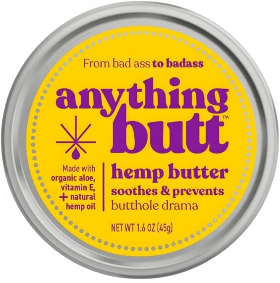
While some strongly believe hidden designs influence consumers’ buying habits, there is no real need to stuff a secret image into a logo design inelegantly; otherwise, you get this.
![]()
Ouch, right!
Why Create A Hidden Message In A Logo
Creating casual conversations about your company is a great way to keep your brand story alive for years. One way to accomplish this is by putting a hidden message in your logo. The trick is finding the right balance between consumer awareness and letting your hidden message be an insider secret.
Brands also include hidden meanings in logos for internal purposes, placing a visual representation of the brand’s mission within the logo. Also, companies can use the white space of their logo design to embrace their brand’s legacy.
Ultimately, the decision is yours, but we suggest testing your logo’s ability to drive brand recall with and without your secret message. Now, look at some of the most famous logos that incorporate hidden messages into their designs.
Addidas
![]()
The debate about Adidas’s hidden message in the logo has existed for years. Some claim the iconic logo stripes represent a mountain, symbolizing the brand’s commitment to strength and endurance. Others say the three stripes represent the company’s three founders, Adi Dassler and his two brothers.
Whatever the true inspiration behind the logo, one thing is sure: Adidas has become a household name, and its symbol is instantly recognizable worldwide. Maybe the hidden message in the Adidas logo is simply the power of great branding. Or perhaps it’s a mountain. Who knows? What is for sure is that it creates a conversation in the customer’s mind.
Apple
![]()
If you’re an Apple fan, you probably know their iconic logo like the back of your hand. The simple yet elegant graphic of the bitten apple has been around nearly since the company’s inception in 1976. Some people think the bite represents humanity’s first taste of knowledge in the biblical story of Adam and Eve, but Steve Jobs offered a more straightforward explanation.
In a 1981 interview with Playboy, he revealed that he and a friend were on LSD when they decided to use an apple for the logo. So, whether you’re a fan of psychedelics or just good design and branding, the Apple logo is still an excellent example of an effective and memorable logo.
Amazon
![]()
Amazon, the most efficient and varied online marketplace on the planet, uses its company logo to convey what it offers its customers: everything under the sun. The little arrow on the Amazon logo, which many consider a smiley face, points to the “a” and “z” in the word “Amazon,” signifying they provide all things from A-Z, which they do.
You could spend the afternoon shopping for groceries, a belt sander, and a Sham Wow while streaming the first season of Duck Dynasty. And we have all while having a smiling face
Baskin Robbins
![]()
Baskin-Robbins integrated its famous “31” right into its badge. The 31 flavors, part of the corporate branding for so long, couldn’t be abandoned, even though the number of flavors has undoubtedly changed. Regardless, the Baskin-Robbins logo is a tight, efficient, fun badge and surprisingly sleek for a brand that is nearly 90 years old.
Beats By Dre
![]()
You may have noticed that the Beats by Dre logo combines a lowercase “B” and a white circle, but did you know there’s more to it than these two letters? This logo is not only a nod to the brand’s name but also cleverly resembles a person’s head sporting a set of iconic headphones.
This simple design element makes Beats by Dre feel more relatable and human. It’s like the logo is saying, “Hey, we’re not just headphones; we’re your personal-audio companion!”
BMW
![]()
Do you ever wonder why BMW’s logo has a funky blue and white checkerboard pattern in the middle? Well, it’s not just for the show, my friend!
The design is a nod to the Bavarian flag, which has the same colors. Some folks say the sections also resemble plane propellers, which makes sense given BMW’s history in the aviation industry. We find this a clever way to incorporate hidden symbols into logos.
Cisco

Cisco, the guru of communication and networking, has masterfully hidden a message in its logo. The lines hovering above the Cisco wordmark cleverly resemble signal waves and electromagnets. But wait, there’s more! These lines are also a subtle nod to the Golden Gate Bridge, a reminder of the company’s birthplace. It’s like a game of “find the Easter egg,” but for logo design.
FedEx
![]()
Strength! Power! Reliability! When you look more closely at the FedEx logo, you can see a small arrow pointing to the right! The bold Federal Express logo incorporates all of these qualities. The little arrow is a charming touch and a strong example of a subliminal message in a logo’s imagery. No offense, Toblerone bear. It’s one of those things that once you see it, you’ll always see it first when watching a FedEx truck drive by.
Goodwill
![]()
Goodwill, a nonprofit that provides job training and employment services while selling used goods, may not be an organization that comes to mind when you think of hidden elements in logos. But take a closer look at this clever logo, and you’ll see that the lowercase “g” actually doubles as a smiling face.
This hidden message embodies Goodwill’s mission of empowering individuals, promoting positivity, and fostering a friendly, approachable brand image. It’s a small but effective design element that speaks volumes about the organization’s values and personality. Goodwill proves how logos with hidden images work for multinational corporations and nonprofits.

Le Tour de France
![]()
Lest you think the Tour de France is merely an event where heavily performance-enhanced athletes make names for themselves, only to lose those titles disgracefully, the brand logo reminds us that there is also some bicycling involved. The logo, rendered in playful cursive, makes it clear with a little cyclist pedaling furiously.
He is no doubt on his way to getting some human growth hormone. We kid, we kid!
LG
![]()
With so few letters in the name and a simple design, LG pulls off secret messaging easily. You might see the letters “L” and “G” when you look at the logo, but there’s more than what you see at first glance.
Take a closer look at that red symbol next to the letters. Notice how the positioning of those letters, along with the white circle background, forms the shape of a face? Clever, right?
The idea behind this design choice is simple: LG hopes to become more relatable and welcoming to customers by giving its logo a human touch. Who knows, maybe we’ll all chat with our LG devices one day like they’re old friends.

NBC
![]()
When NBC first launched, it sought a colorful, meaningful logo. Enter the peacock. The white space in the middle of the logo’s teardrop shapes is a nod to the feathered fowl. And it’s not just for show. The colorful tail feathers represent the network’s six divisions. With this logo, NBC captured the essence of its brand and embraced the exciting technological advances of the time.
Northwest Airlines
![]()
Northwest Airlines may no longer be in operation, but its logo still offers a fun hidden message for logo enthusiasts to uncover. Take a closer look at the plane’s red tail, and you’ll notice a small circle with a triangle inside. The layered shapes are not just a random design element; they’re a compass pointing to the northwest.
We’re uncertain how effectively this hidden message got people to choose Northwest Airlines for their travels. Still, we appreciate the clever design element that adds more meaning to the logo.
SONY VAIO
![]()
Here’s an example of a house of brands using text to create a hidden message. Sony VAIO’s logo is sleek and modern, incorporating analog and digital worlds with its unique font. Looking closely, you’ll notice how the letters “VAIO” are cleverly designed, representing both an analog wave and the numbers 1 and 0, symbolizing the digital world.
This subtle design choice speaks to the brand’s focus on bridging the past and the future, and it’s a clever logo we can’t help but admire.
Subway
Subway’s bright yellow and green logo is easily recognizable worldwide, but did you know it also has a hidden message? Look closely, and you’ll spot an arrow-like shape between the “S” and “U,” representing a subway tunnel. The design suggests speed and efficiency, like quickly passing through a tunnel. While some may not notice the message, it adds a clever layer of meaning to the logo for those who do.
Overall, Subway’s logo shows how a subtle, hidden message can enhance a design without overpowering it. So, next time you grab a sub, take a moment to appreciate the clever design of Subway’s logo.
Toblerone
![]()
The classic Toblerone logo, featuring the Matterhorn design, has a little bear in the negative space. See it now? The bear is to hark back to the company’s roots, which started in the Swiss city of Bern.
Cool, but we’re not sure if the hidden meaning is effective in getting people to put the bar of chocolate in their shopping carts. Still, incorporating hidden meanings into logos like Toblerone is a quaint way to honor the founder, Theodor Tobler, and the company’s beginnings.
Tostitos
![]()
The famous Tostitos logo features two little party-goers fighting over a single chip near a bowl of salsa. It may seem lighthearted, but there’s a bloodbath brewing. The Tostitos hidden logo design gets straight to the point, showing how this chip is the life of the party.
Toyota
![]()
If you’ve ever driven a car, you’ve probably seen the iconic Toyota logo on the front grille. It’s hard to miss that circle with three overlapping ovals inside it. But did you know that for many people, Toyota has one of the best-hidden logos in brands of all time and industries?
Some people think that the ovals stand for the three hearts of Toyota:
- The heart of the customer
- The heart of the product
- The heart of progress in technology
Another cool thing about the Toyota logo is that you can find the letters of the company name hidden inside it. With some imagination, you can see the letter “T” in the center of the emblem, and the other notes can be found by looking closely at the designs’ shapes.
Path to Performance™
Taking a results-obsessed approach to CPG package design.
Discover how SmashBrand’s proprietary process, rooted in scientific principles, informed by data, and validated by your target audience, eliminates the guesswork from package design and delivers guaranteed results.
"*" indicates required fields
Unilever
![]()
At first glance, the Unilever mark looks like a collage of random shapes, but look closer, and the logo’s hidden message becomes unmistakable. Every icon tucked inside that bold “U” represents a slice of the company’s massive CPG portfolio. It’s a masterclass in building meaning through detail, proof that logos with subliminal messages don’t need to be cryptic to be effective.
Its design works like a visual puzzle: dozens of symbols forming one cohesive identity, a perfect example of how companies with hidden logos create depth without compromising clarity. While some brands chase novelty with 100 hidden messages in logos, Unilever keeps the focus on versatility, purpose, and instant recognition.
Unlike the hidden meaning or other subliminal messages in logos that draw attention solely for clever tricks, Unilever’s strength lies in how well the elements reinforce what the brand actually does. It’s layered, intentional, and built for a global audience that sees the big picture once they notice the details.
Yoga Australia
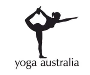
Yoga Australia is one of those famous logo designs that earns its reputation because the hidden message feels effortless. Even if you don’t immediately spot the continent tucked into the white space between the pose, the mark still communicates grace, balance, and purpose, everything a strong graphic design system should deliver.
What makes it especially compelling is how seamlessly the negative space works. It’s a masterclass in secret messages hidden in logos: relevant, intentional, and never gimmicky. Unlike some logo subliminal messages that distract more than they delight, this one enhances meaning without shouting for attention.
And yes, it absolutely makes you wonder whether a real person could replicate the pose and create the same outline. (Probably not, we’ll leave that to professionals unless we want to test the limits of human flexibility.)
Suppose you’re studying examples of hidden messages in the Beats logo and other icons. In that case, Yoga Australia is one of the clearest reminders that when the concept is strong, the execution doesn’t need to explain itself. It just works.
What We Can Learn From These Logos
The best identities, whether it’s the Baskin-Robbins logo, the Pinterest logo, the LG logo, or even that Hershey’s Kiss hidden in plain sight, prove a simple truth: negative space works when the hidden element strengthens the brand identity, not distracts from it. These marks succeed because the secret message reinforces what the brand already stands for.
Great identity work isn’t about being clever for clever’s sake. It’s about relevance. Whether you’re designing for San Francisco tech, global CPG, or any brand trying to rise above noise, every visual choice must serve the story. If the hidden element adds meaning, use it. If it’s just decoration, rethink it.

Nice Package
Don’t miss out on our monthly newsletter Nice Package!
Each month, we deliver a data-driven newsletter directly to your inbox, unpacking a critical topic in the FMCG & CPG industry.
"*" indicates required fields
Data-Driven Brand Development For CPG Brands
SmashBrand is a data-driven brand development agency built for CPG teams that makes data-backed package design decisions. We don’t rely on a hidden arrow, a cool logo, or a smiling face tucked in plain sight to win the shelf. We validate what actually moves consumers.
Through our integrated process of research, strategy, and iterative testing, we uncover the hidden symbol of growth: packaging and positioning that measurably improve customer satisfaction and brand loyalty. From refining your brand story to designing packaging that earns attention on closer inspection, we help you build a brand engineered for impact.

Kevin Smith is the founder of SmashBrand, a brand development agency specializing in the CPG and FMCG sectors. Under Kevin's guidance, SmashBrand seamlessly integrates brand strategy, design, and detailed consumer testing, ensuring impactful market outcomes and enhanced sales velocities for its clients.
Key milestones in his career:
Before establishing SmashBrand, Kevin ventured into entrepreneurship with Nutri-Sport at 21. Recognizing the untapped potential in sports nutrition, he rapidly expanded to seven retail locations within a year. This success led to the formation of a distribution company serving all nutrition stores throughout Arizona.
Subsequent ventures included pioneering e-commerce stores and launching Athletic Xtreme, a globally distributed sports nutrition brand. Notably, Athletic Xtreme won BodyBuilding.com's Brand of the Year in 2006 and found its place on the shelves of major retailers, from GNC and Vitamin Shoppe to Walmart successfully exiting in 2014.
Apart from brand milestones, Kevin's journey includes commendable service as a Marine Corps veteran, where he was honored as a DOD Marine of the Year in 2001.
While leading SmashBrand and investing in budding brands, Kevin is committed to mentoring aspiring CPG entrepreneurs. His profound industry knowledge, from grasping retail trends to understanding shelf dynamics, serves as invaluable guidance for brands striving to carve out their niche.
Central to Kevin's approach is a consistent philosophy: Marry actionable, data-centric findings with proven strategies to ensure brands stand out and succeed in retail.
Subscribe to
Nice Package.
SmashBrand’s Nice Package: Stay current with our latest insights
Free Resource.

CPG product repositioning guide.
Explore the five undeniable signs your CPG product needs repositioning along with strategies for leveraging consumer insights for a guaranteed market lift.
Download Whitepaper About CPG product repositioning guide.