
Why, oh why have we collectively decided that package design for energy drinks, bars and supplements should first be approved by Satan’s minions? At what point did “energy” become synonymous with ancient devilry? If you notice, nearly every energy drink bottle or can is black and/or red with gothic lettering and the occasional flame and demon. What’s in those cans, anyway? Goat’s blood?
On the other side of the spectrum is the bright, neon-colored package; the kind that leads the consumer to believe that not a single natural ingredient dwells within its contents. If the goal is the belief that the product will somehow encourage health and wellness, then why broadcast its inherent artificiality?
In our humble opinions, we think that the best route for energy food product packaging is bright, clean and healthy. Although there are relatively few packaging design companies that achieve this goal [ahem, SmashPack, ahem], we’d like to highlight the few we enjoy.
Elements Energy Drink
Elements Energy Drink, in spite of having been produced by the same organization that brought us Snapple, didn’t really take off. We’re guessing the reason was something other than the design, because it’s certainly alluring. We like the fact that it’s (in the energy drink parlance of our times) “high octane” without literally seeming like motor oil.
Hi Ball Energy
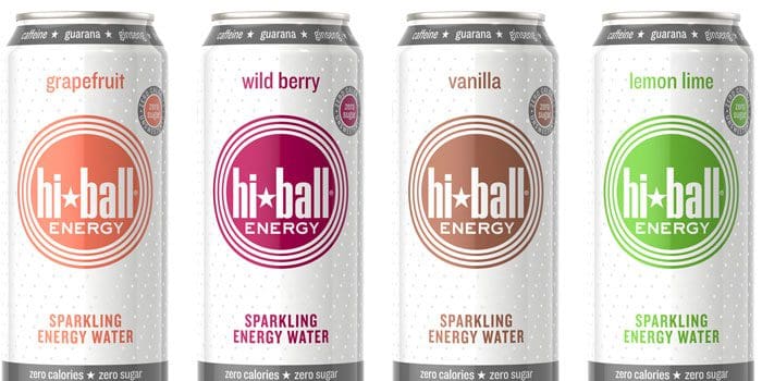
This can design is a departure from the more traditional energy drink style in that it looks like it contains a product that won’t cast an evil spell over you. The colors are bright and bold while being simultaneously fresh and cheerful, while the graphic elements convey vigor. Note also the different typographical styles and how they are actually harmonious, as opposed to this abomination before all that is decent.
Pro Bar
There are very, very few energy bars that are packaged in such a way as to suggest a product is delicious, but the Pro Bar really makes us want a PB&J — a sandwich we usually despise. The colors and textures of the graphics are rich and luscious in a way that actual peanut butter and jelly simply isn’t.
Clif Bar
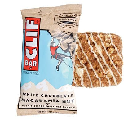
Ah, the crisp air; the altitude; the little man barely clinging to the rock face by his fingertips – it’s Clif Bar! The packaging style is the polar opposite of the majority of energy bar design concepts — it’s muted, it has a natural yet sophisticated feel and the colors exist in nature.
Einstein’s Energy Bar
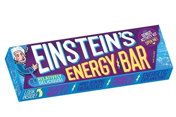
For sheer cuteness and whimsy, Einstein’s Energy Bar takes the kitsch cake, although we could maybe do without the little Einstein graphic in the left-hand corner (“it’s relatively delicious” isn’t really a screaming endorsement, when you think about it). Nevertheless, it is far more fun and light of heart than any other energy bar packaging on the market that we’ve seen, and it’s the first food product that has ever made us want to attempt to solve the Hodge conjecture.
Dee’s Cereal
This little packaging project was completed by yours truly, and we’re frankly quite proud of it. Notice the Triple Berry package — it’s almost a tribute to the little rock climbing man cartoon in the Cliff Bar series, only ours is a real person, and therefore at least 100 times more badass.
SmashPack
The SmashPack concept marries futuristic pouch packaging design with classic eye-pleasing colors and luscious textures. Note how the glistening berries seem almost to jump off of the package at you. That isn’t a threat; that’s deliciousness.
Why only design energy product packaging in the exact way the market expects, particularly if the market expects those packages to be exceptionally ugly? Let’s all agree that, from now on, we as package design companies will only make food packages look appealing, not as though we have to cover ourselves in garlic and carry a protective cross whenever we pass them on the aisle.
Subscribe to
Nice Package.
SmashBrand’s Nice Package: Stay current with our latest insights
Free Resource.

CPG product repositioning guide.
Explore the five undeniable signs your CPG product needs repositioning along with strategies for leveraging consumer insights for a guaranteed market lift.
Download Whitepaper About CPG product repositioning guide.