
We’d like to take this opportunity to salute creative packaging design. Creativity is the key to any designer’s ultimate success — the trick is keeping the design familiar enough to the consumer eye so as not to confuse or frighten the customer. It’s a fine and frustrating line.
The following designs have just enough of a smattering of creativity to make them stand out in a vicious market, while at the same time using a design concept that the customer finds instantly recognizable. Let’s get started, shall we?
1. Gallo
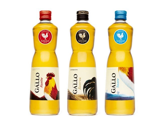
Okay, remember when we said that the packages we selected used a design concept that would allow the customer to recognize the product? Well… while the design of this bottle is certainly interesting, eye catching and well designed, we weren’t entirely sure what the package contains. Is it a dishwashing liquid? A funky hand sanitizer? A rooster extract? Wrong on all three counts — it’s olive oil. The designer highlighted the extremely colorful rooster (“Gallo,” in Spanish and Italian) rather than feature the more prosaic olives, olive groves or anything olive related. Bold.
2. Amore Tomato Paste
The fact that this brand of tomato paste comes in a tube rather than a can is laudable on so many levels. Unless you’re making a batch of spaghetti sauce that serves 40, you probably have absolutely no need to use a single 4-oz. can of tomato paste in one application, which leaves the problem of storing the excess, right? This brand of tomato paste comes in a re-sealable tube that can be popped in the fridge until needed. The package also has a bold, bright and sophisticated design; it makes tomato paste seem positively luxurious. Talk about your creative package design! Bravo, Amore!
3. Arroyo Vodka
This bottle packaging design is sharp, modern, and elegant. The crisp, mauve, and blue-tinged ocean stones make the viewer feel refreshed and almost clean. We certainly wouldn’t say no to an Arroyo seaside cocktail if anyone’s offering.
4. Artisan Salt Company
Who knew that the salt racket was so cutthroat? We thought that everyone’s salt needs were limited to the kind you sprinkle on food or throw on your driveway after a blizzard, but apparently, the salt you use is a stamp of sophistication. The Artisan Salt Company has designed a salt vessel that would look perfectly at home sitting on the Duchess of Kent’s breakfast table. The beauty and simplicity of the design make us feel almost unworthy of its contents until we remember that it’s just freakin’ salt.
5. Paul Mitchell Mitch Reformer Styling Pomade
The lines are clean, the colors are dark, the gender is unmistakable. This may be a designer hair styling product, but don’t let the purpose fool you (making guys look pretty). This is for men, baby. This isn’t some fluffy Paul Mitchell curling crème or lavender mint gelee, this is Mitch Reformer, something that men slap on their heads in a manly fashion, right before they replace the clutch on their rear-wheel drive and after they’ve showered with Butterscotch Bliss body wash.
6. Chobani Greek Yogurt
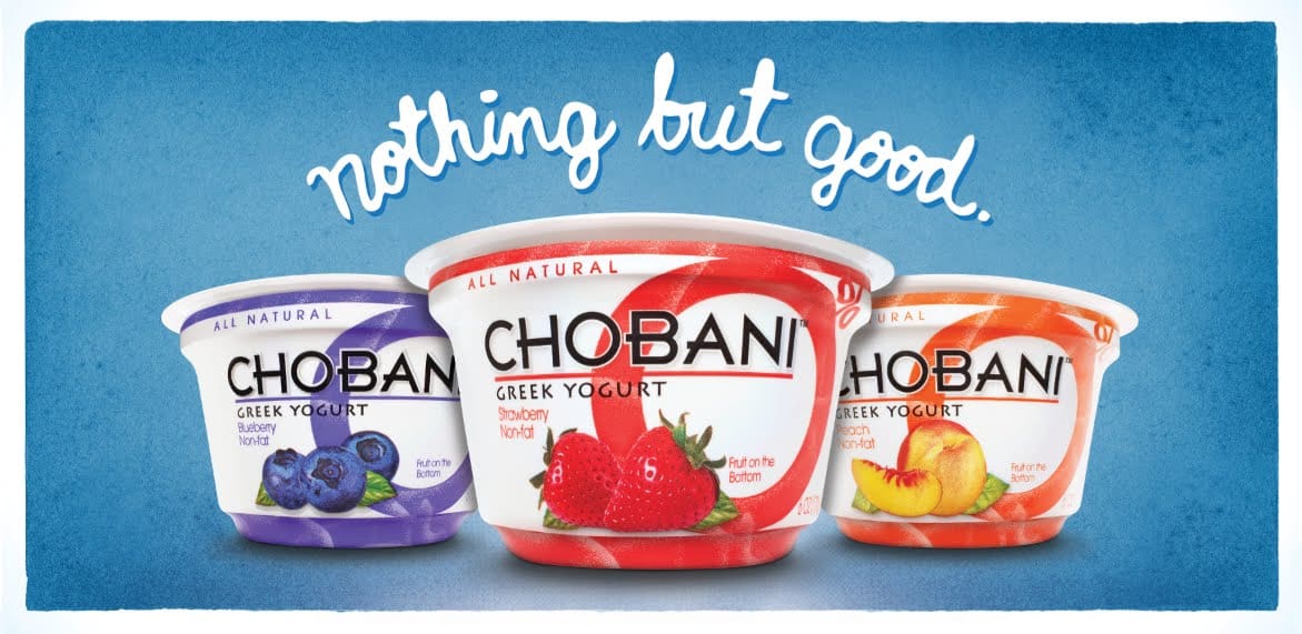
This design is big, colorful and decidedly unlike the frilly yogurt competitors sitting next to it in the refrigerator isle. Notice how the “0%” marketing device is pretty seamlessly incorporated into the design, rather than simply slapping an inelegant “fat free” on the label. Stay classy, Chobani.
7. Sir Kensington’s Ketchup
Sir Kensington is clearly a ketchup for the ketchup aficionado, and the packaging makes that perfectly clear. It’s folksy and charming, like something you’d buy in a mercantile after you’ve shunned the trappings of consumer society. You’re supposed to spoon this ketchup onto your plate like caviar, with the pinky finger elevated in a jaunty fashion. Ooh, la la!
8. Ikea Potato Chips (Potatischips Saltade)
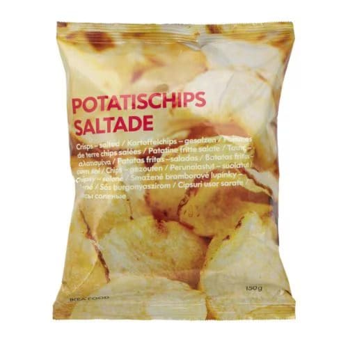
When you look at this bag with its simplicity and its Futura font and its close up of delicious, golden potato chips, you know that when you crack it open, you’ll be munching on Ikea itself. This brand has made the stripped-down aesthetic so popular that if it began selling hunks of unprocessed tree bark, the public would buy it as long as they seemed appropriately Europe-y. Even though the package contains the same salty, fatty, nutritionally void contents as a bag of Lay’s or Ruffles, the fact that the label is in Swedish makes one somehow think that the chips will be healthier, in some completely implausible way.
Some Self Flattery
While we don’t want to sound conceived, we must admit that we’ve done some amazing work. We love what we do and can’t help but be proud of it. We don’t want to fill the whole page with our work, so here are just two examples of some recent work we’ve done that our clients have loved.
9. Wayfare
Bold, colorful, and delicious to the eye. You know it’s true.
10. Walker Hall Winery
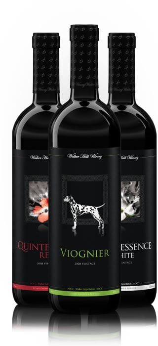
Just look at that proud Dalmatian! Look at that dark, streamlined, elegant, yet playful design! Creative packaging design, indeed.
There you have it! Ten glorious examples of creative packaging design that have succeeded in turning products such as ketchup, potato chips, and salt – products that can be acquired nearly for free in many situations – into luxury items. Raise your hand to whoever knows how to market fresh air and gravity cleverly – we want you on our team.
Data-Driven Brand Development
Want a best-selling brand? SmashBrand is a brand development company for FMCG and CPG brands. From brand strategy to packaging design testing, our Path To Performance™ process guarantees a retail performance lift. Book a time to discuss your project with our team.
Subscribe to
Nice Package.
SmashBrand’s Nice Package: Stay current with our latest insights
Free Resource.

CPG product repositioning guide.
Explore the five undeniable signs your CPG product needs repositioning along with strategies for leveraging consumer insights for a guaranteed market lift.
Download Whitepaper About CPG product repositioning guide.