Good Packaging Design
Cheap gets you average, and average is not awesome. Far too many people think they shouldn’t have to pay good money for a good design. After all, a logo is so small and simple. Surely it can’t be that complicated to make, right? Wrong. And if you think packaging is only as important as its size, then you’ve got a lot of catching up to do.
There are three main reasons why packaging design isn’t cheap, and about a million reasons more why you shouldn’t want cheap designs in the first place, but that’s another story.
1. Artists Work Hard
For some reason, artists have gotten the shaft for years. It was true when they scratched on cave walls, true when they painted in oils, and it’s still true now that they wrangle Photoshop. Why the outside world continues thinking that artists should be underpaid for doing something only a fraction of people can do well is one of the great mysteries of mankind.
Here’s the short list of things your designer has to accomplish with your package design:
- Catch the customers’ attention
- Stand out from the competition
- Sell your product
- Create brand loyalty
- Create an image that the public associates with your company
And all of this in approximately six seconds. Oh, plus, that design has to function in either color or black and white, at billboard-size or the size of a quarter, and has to work on every type of packaging you produce, whether box, bottle or letterhead.
Still think being an artist is an easy gig? Maybe you should go start a contest instead.
2. Icebergs Are Bigger Below
Most of the hard work your designer puts into your package design happens behind the scenes; all you see is the first concept poking its nose out of the water. You probably have no idea how much foundation has to be laid before the designing even takes place. That’s okay, though; we’re here to give you the pillars of pack design that increases purchase intent.
Research: Every design begins not with putting pen to paper (or fingers to keyboard, as the case may be) as you might expect. Instead, the design process starts with research. Researching the industry as a whole, researching both your company and your major competitors, and also researching your target market. Hours of research.
Process: The design process is fun but messy, because artists’ brains are all creative and confusing to the outside world. After conducting all their research, they’ll have to sketch a little. Then they’ll take a break and come back and change it all. Then they’ll come up with a new concept. Then they’ll go back to the drawing board. This may continue indefinitely until there’s the AHA moment that leads to a viable design. Oh, and they have to do all this by your deadline.
Presentation: Finally, designers have to display the fruits of their labor. This may be a single, perfect package concept or (more likely) a selection of a few that the client can choose from. They’ll need to explain and maybe defend their design choices, listen to client feedback and adjust as necessary. Or, they may have to start all over again from scratch.
3. Your Design Reflects Your Company
The bottom line is this: you’re choosing a design that bears the full weight of representing your company on its little vector shoulders. Unless your company is focused on a chintzy bargain-basement theme, you don’t want a cheap-looking logo or packaging. Like I said before, cheap is average. Today’s consumer does not want average.
Take a minute to think about shopping. When you’re at the store, do you reach for the cheap-looking box? Do you think the contents are reliable? Trustworthy? Tasty? Or do you want the eye-catching, slick-looking, brightly colored modern creation on the next shelf over?
Yeah, that’s the one we’d pick, too.
Cough It Up
There are plenty of places you can cut corners, but design packaging should never be one of them. This should be a foundation in your product development cycle. Your packaging, which represents your brand story and your vision, often delivers the very first impression of your company to the outside world. And, as such, it should definitely impress when it’s looked at.
Don’t judge a design’s price on its size. That little design is going to blaze a trail for you into the big, bad retail battlefield. The more time and effort you put into that foundation, the more likely it is that your design will do the job you need it to: entice customers to buy everything you’re selling. I like to call it the last 10 seconds of your marketing.
Data-Driven Brand Development
Want a best-selling brand? SmashBrand is a brand development agency for FMCG and CPG companies. From brand strategy to packaging design testing, our Path To Performance™ process guarantees a retail performance lift. Book a time to discuss your project with our team.
Subscribe to
Nice Package.
SmashBrand’s Nice Package: Stay current with our latest insights
Free Resource.

CPG product repositioning guide.
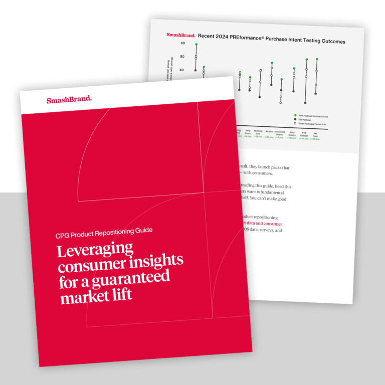
Explore the five undeniable signs your CPG product needs repositioning along with strategies for leveraging consumer insights for a guaranteed market lift.
Download Whitepaper About CPG product repositioning guide.