Description
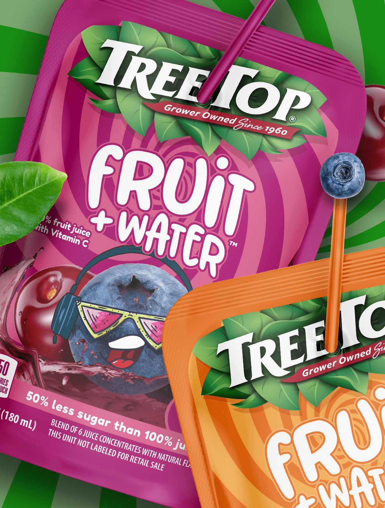
Distinctive assets can override logic at the shelf, and that’s exactly the point.
In a crowded tuna set, one brand wins not by explaining itself, but by signaling quality instantly. The lighthouse on Bumble Bee’s packaging does heavy lifting. It cues freshness, heritage, even a sense of coastal authenticity. Rationally, a lighthouse has nothing to do with tuna. Visually, it has everything to do with trust.
That’s the power of strong food packaging design. A single, consistent icon can anchor perception and help distract from weaker elements, such as a brand name that doesn’t naturally connect to the category. Compared to glossy, overly saturated competitors that feel artificial, this execution leans into restraint and classic maritime cues.
Great snack packaging design and center-store packaging alike rely on these assets. When done right, they create an emotional shortcut. Shoppers don’t analyze. They recognize. And recognition drives choice.
Subscribe to
Nice Package.
SmashBrand’s Nice Package: Stay current with our latest insights
Free Resource.

CPG product repositioning guide.
Explore the five undeniable signs your CPG product needs repositioning along with strategies for leveraging consumer insights for a guaranteed market lift.
Download Whitepaper About CPG product repositioning guide.