
Once in a while, Motor Trend will publish photos of a new concept car prospect from one auto manufacturer or another. More often than not, these concept cars will be incredibly futuristic — domed windshields; huge wheels; elongated frames; little aliens in the passenger seat (or hamsters). The designs are so stratospherically bizarre that you just know that no car company will ever have the cojones to actually produce anything so amazing, and, of course, you’d be right.
Granted, many of these vehicles are more ideally suited for extraterrestrial surveying than they are actual highway traffic, but that isn’t the point, darn it. The point is, will someone, just once, go out on the limb and produce something weird and extraordinary, even though millions of dollars might be lost in the attempt? Is that too much to ask? While we’re at it, we’d like to ask the same for packaging design concepts, too.
Students of design break their backs coming up with new and elegant packaging designs for products — both from real and imagined brands — and a lot of these designs are thoroughly awesome. Unfortunately, no major corporation snatches them up and puts them into actual production. Gutless! Here are some of our favorite packaging design concepts that you will probably never see on store shelves, even though you really should.
The Snack Cracker Canister
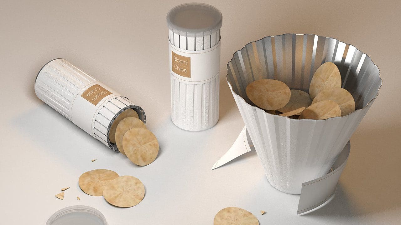
This design has everything we’ve lobbied for in previous blogs and then some. It has a multi-use container, aesthetic appeal, shine and snacks. It’s the epitome of elegant packaging design. Instead of trying to contort your hand so that you can reach the bottom of a popular snack canister that we’ll call “Shingles” so as not to take any fire-breathing brands to task for lack of foresight, you can simply fashion the container into a bowl! And before any naysayer out there tells us that maybe the consumer doesn’t want to immediately open the entire canister and spread out its contents for a single serving — just don’t open it all the way until you get to the end, smart guy.
Froot Loops Toucan Sam Box
It’s a box of Froot Loops shaped like the beloved product mascot, Toucan Sam! There is no earthly reason why Kellogg’s shouldn’t pay these designers a huge amount of money and adopt this adorable concept. They’re single serving sizes (much more interesting than the typical mini variety-pack boxes) and the display case can accommodate enough product for a standard convenience store. It’s a little flock of toucans! Freakin’ adorable!
The Stackable, Green Soda Bottles
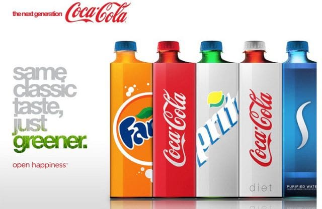
These bottle designs offer everything major beverage manufactures hold dear; they use less material to manufacture than the standard liter bottles, and they’re configured in such a way as to maximize the amount of product that can be shipped in pallets, resulting in lower shipping costs and a reduced carbon footprint. We’re waiting, Coca Cola!
Vitamin Water Capsule Bottle
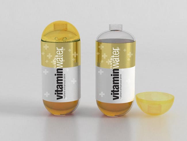
This design concept centers on the “vitamin” content and selling point of Vitamin Water. It is a capsule shape, and the multi-pack boxes recall pill boxes. If Vitamin Water wants to enhance the vitamin-y-ness of its products, using a clever and playful packaging design is a good start, particularly since it probably doesn’t want to go on the record and try to refute claims that it is nothing but watery calories.
The Honeycomb Bottle
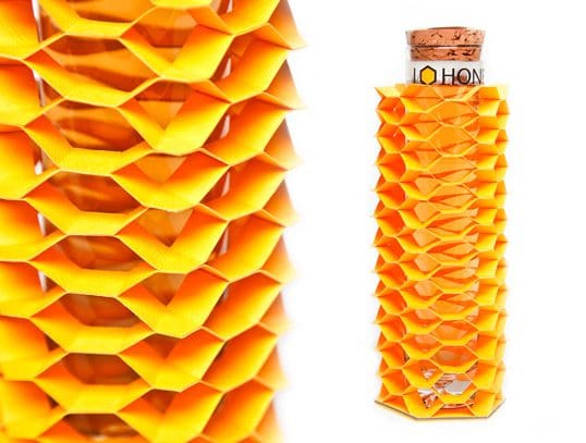
We weren’t sure what this even was, but it’s weird! We love it!
Apparently, this student project was for “I ‘Love’ Honey,” which is a… well, we still don’t really know. Honey, perhaps? A honey-based beverage? Whatever it is, it looks like nothing you’ll see on any store shelf, which means this package has nailed job one. It is visually engaging and yet clean. And, the glass bottle can be used as a tall glass independently of the honeycomb jacket. Attractive and multi-use! Double whammy!
Once again, you will probably never see these designs on your store shelves, but thanks to the Internet and the everlasting nature of all material uploaded onto it, these design concepts will never entirely fade into obscurity. Perhaps in 2175, when we’re driving our domed Nissan Pivos, we’ll also have our honeycomb bottles in our cup holders and our snack canisters in the front seats. We only hope that the corporate entities that have snatched up these designs pay the designers’ ancestors the appropriate rate, which will be several billion dollars by then.
Subscribe to
Nice Package.
SmashBrand’s Nice Package: Stay current with our latest insights
Free Resource.

CPG product repositioning guide.
Explore the five undeniable signs your CPG product needs repositioning along with strategies for leveraging consumer insights for a guaranteed market lift.
Download Whitepaper About CPG product repositioning guide.