Description
Limited editions live or die by how they show up at shelf, and this Kit Kat Churro display gets it right.
The flavor story is clear in seconds. Bold “Limited Edition” messaging, unmistakable Kit Kat branding, and a craveable churro visual create immediate impact. But the real win is in the structural detail. The slight die-cut pop and shadow effect add depth without adding cost-heavy materials. It’s still a simple PDQ, yet it feels dimensional and premium.
That small carve-out treatment signals indulgence. It suggests texture. It implies flavor bursting off the pack before you ever read a word. That’s smart chocolate packaging design using subtle structure to amplify appetite appeal.
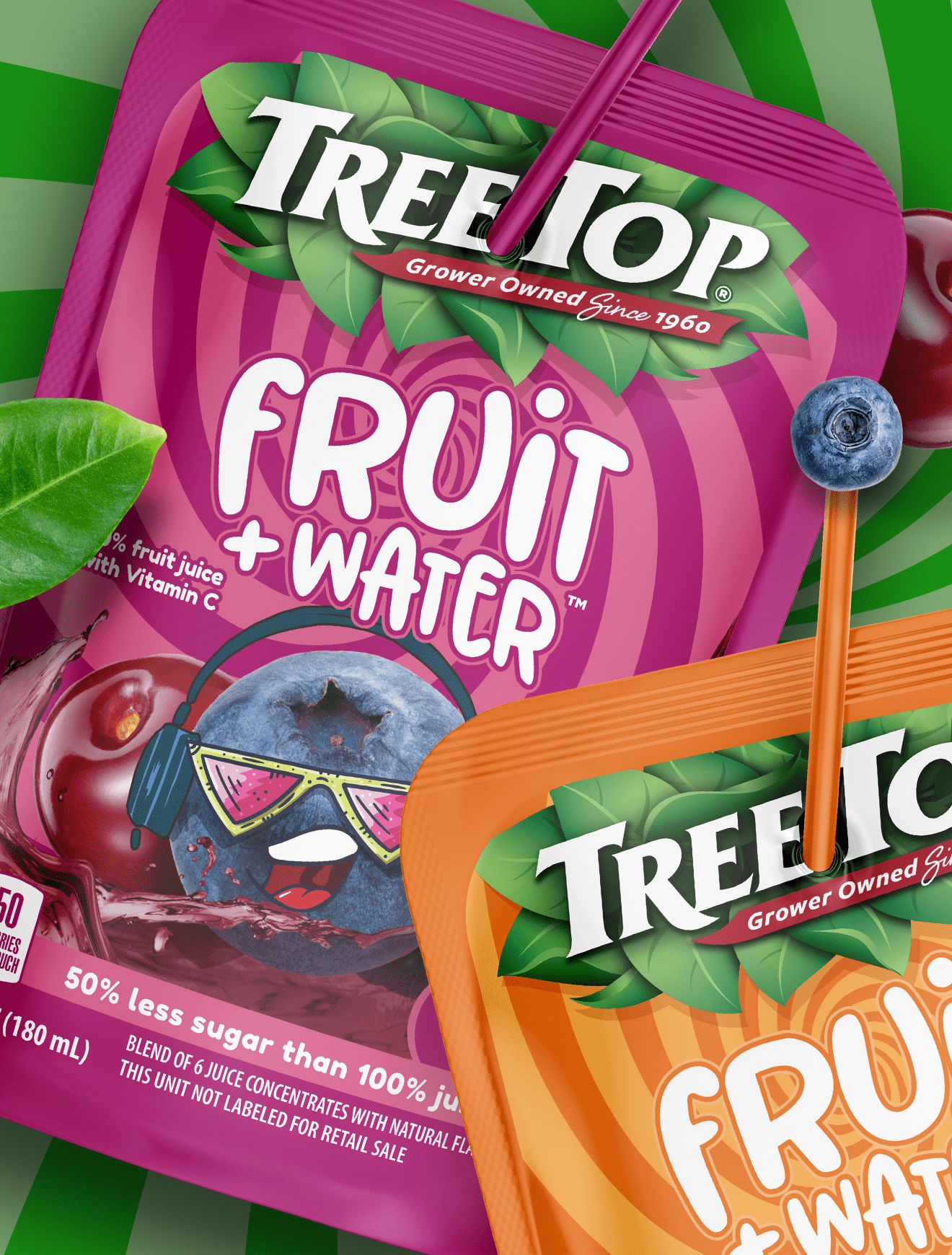
This same principle applies across categories, from chocolate to fruit-snack packaging: when graphics and structure work together, you create an interruption. And interruption creates trial.
Sometimes it’s not a full redesign that drives lift. It’s one intentional detail executed perfectly at shelf.
Subscribe to
Nice Package.
SmashBrand’s Nice Package: Stay current with our latest insights
Free Resource.

CPG product repositioning guide.
Explore the five undeniable signs your CPG product needs repositioning along with strategies for leveraging consumer insights for a guaranteed market lift.
Download Whitepaper About CPG product repositioning guide.