Brand development that increases sales velocity, guaranteed.

Here’s Why Nurri Changed it’s Packaging Design at Costco

Christy’s back at Costco breaking down Nürrí’s bold new packaging and what it says about this fast-rising protein shake brand. Is this rebrand a smart refresh, or just a louder shelf presence?

491 views
9 Likes
Oct 01, 2025

Description Description

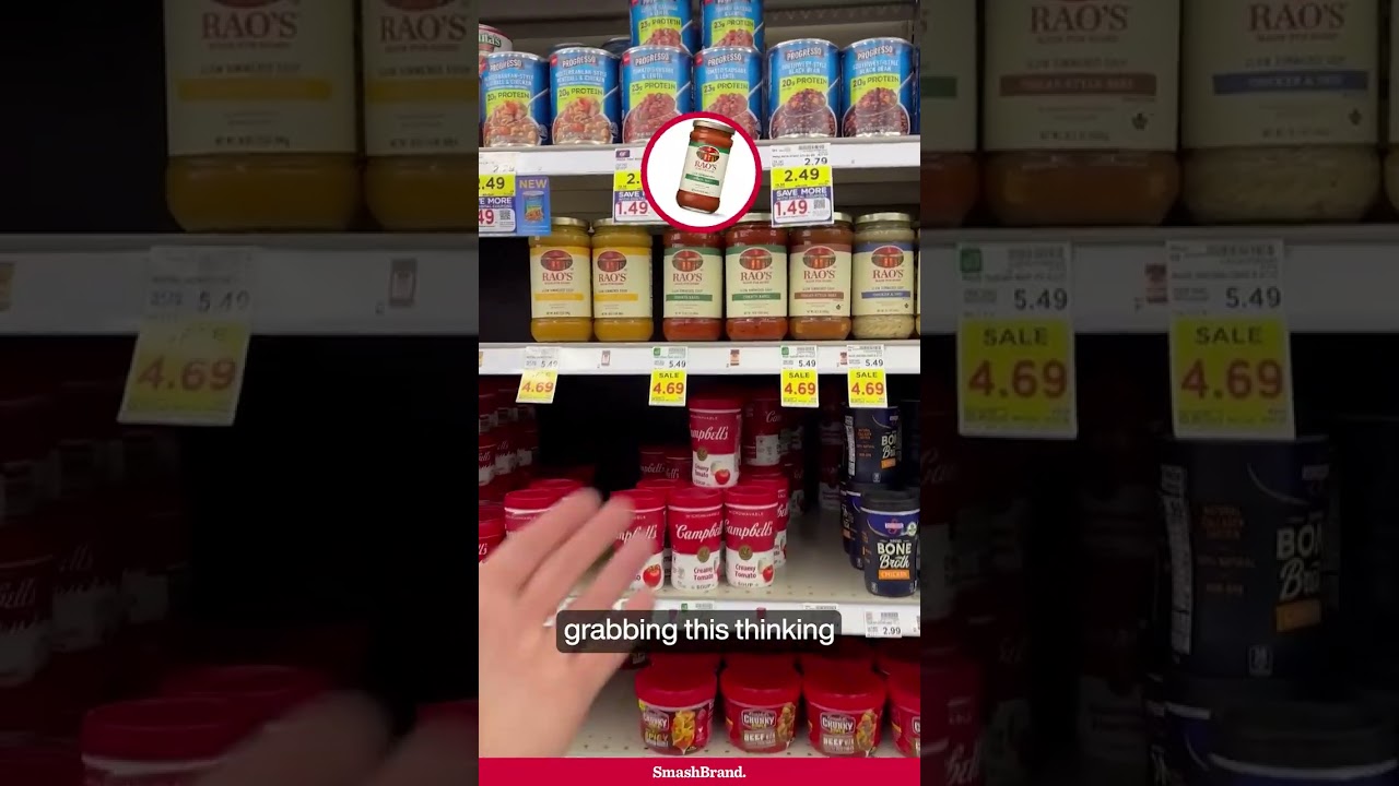
Fast-growing brands rarely stay static. What works at launch isn’t always what sustains momentum at scale.

This update shows a clear shift in strategy. The original execution leaned heavily into white space and icon-driven cues, signaling nutrition and functionality. It felt clean, but also slightly clinical, closer to kids’ nutrition than adult performance.

The new system flips that balance. Color takes over. Flavor becomes the hero. The fruit is larger, juicier, and far more expressive. That visual intensity matters in a crowded cooler where appetite cues drive trial. The 30g protein callout is still prominent, but now it sits within a more indulgent, craveable frame.

From a Costco packaging design standpoint, this makes sense. Big-box environments reward bold color blocking and clear benefit communication from a distance. The move toward stronger flavor equity mirrors what we see in adjacent categories, even in produce packaging design, where visibility and vibrancy directly influence perception of freshness.

It’s a smart evolution. Same core promise. Stronger shelf presence.

transcript Video Transcript
transcript-icon
  • 00:00:00 These strawberries are much more
  • 00:00:02 prominent.
  • 00:00:05 Hey everybody, it's Shopping with
  • 00:00:06 Christie. Today I'm at Costco with my
  • 00:00:08 daughter who's filming me. Thank you,
  • 00:00:10 Beia. And I noticed this new graphic
  • 00:00:13 rollout for Nuri. If anyone's been
  • 00:00:15 following this brand, it's been one of,
  • 00:00:17 if not the fastest growing protein shake
  • 00:00:20 brands on the market. When they
  • 00:00:21 originally launched, and still in most
  • 00:00:24 cases, they look like this. This brand
  • 00:00:25 was rapidly developed by a Coleman and
  • 00:00:28 actually launched at Costco. The brand
  • 00:00:30 they were repping, whatever it was, was
  • 00:00:32 not filling orders well and so they
  • 00:00:34 stepped in with their own brand and here
  • 00:00:36 it is. So they launched it quickly. They
  • 00:00:38 probably learned what worked and didn't
  • 00:00:39 work. And you can see their change in
  • 00:00:41 strategy from old packaging to new. On
  • 00:00:43 the old one looks a little bit more like
  • 00:00:45 nutrition, if you will. A lot of white
  • 00:00:48 almost childlike iconography, um, I
  • 00:00:51 would argue. So it looks a little bit
  • 00:00:52 like a kids nutrition drink. But when
  • 00:00:54 you look over here, what you can see
  • 00:00:56 graphically is the visual, the logo got
  • 00:01:00 a boost on sort of flavor and fun.
  • 00:01:03 There's a much bigger color flood here.
  • 00:01:05 And then even if you zoom in on these
  • 00:01:07 little icons, they still have icons, but
  • 00:01:10 what do you notice? These strawberries
  • 00:01:12 are much more prominent. They're a
  • 00:01:14 little bit I wouldn't say they're
  • 00:01:15 realistic, but they're bigger. And boy,
  • 00:01:16 are they juicy. You can see the liquid
  • 00:01:18 coming off. Whereas over here, I know
  • 00:01:20 it's a different flavor, but you don't
  • 00:01:22 really see. It's fun. It's more almost
  • 00:01:25 tech like, but you don't get that flavor
  • 00:01:27 coming out. You can see a little bit
  • 00:01:29 here. The old cans were mostly white all
  • 00:01:32 the way up and down. It really mirrored
  • 00:01:34 the case pack art, whereas the new cans,
  • 00:01:36 yeah, this is a good one. You can kind
  • 00:01:38 of see it. The bottom is white and
  • 00:01:40 actually the entire top is color. And
  • 00:01:42 you can see that sort of flavor and
  • 00:01:45 almost the juice of the strawberry
  • 00:01:47 coming out there. And a really nice hero
  • 00:01:49 of 30 grams right there. And only one
  • 00:01:51 gram of sugar. Who doesn't love that? So
  • 00:01:53 I think overall a wonderful graphic
  • 00:01:55 update for Nuri. We watch this category
  • 00:01:57 a lot. We work in this category even
  • 00:01:59 more. So excited to see the rest of the
  • 00:02:01 graphics execute. All right. B.

Subscribe to
Nice Package.

SmashBrand’s Nice Package: Stay current with our latest insights

Free Resource.
CPG product repositioning guide.

Explore the five undeniable signs your CPG product needs repositioning along with strategies for leveraging consumer insights for a guaranteed market lift.

Download Whitepaper About CPG product repositioning guide.

Why Rao’s Soup Misses the Mark on This Packaging Design.

Rao’s is a pasta sauce powerhouse, but their soup packaging tells a different story.

460 views
4 Likes
Nov 26, 2025

This Retail Display Tells You Everything About a Brand in Trouble

A once-hyped CPG brand is showing serious signs of decline and it’s all right there on the shelf. In this short, Christy breaks down what the pricing, graphics, and display strategy are really saying (spoiler: it’s not good). If you’re in retail or brand management, you’ll want to see this.

2036 views
7 Likes
Nov 19, 2025

Why This Parent and CPG Marketer Secretly Loves This “White” Bread

A subtle copy change. A clear packaging strategy. And a parent who also happens to be a CPG marketer, instantly sold. This is how Sara Lee’s “white” whole grain bread nails the moment of truth at shelf—by speaking directly to its real buyer with just the right message. If you’re in CPG, this is the kind of packaging move that moves product.

750 views
17 Likes
Nov 05, 2025

Wait, Sargento Makes Crackers Now? Not Exactly

Sargento’s known for cheese, not crackers. But when we spotted “Cheese Bakes” in Chicago, we had questions. Is it a cracker? Is it cheese? And what does Nabisco have to do with it?

1839 views
14 Likes
Oct 29, 2025
1.
Follow Christy

Follow Christy for real-world shopper insights, brand wins, and weekly takes on what’s working in retail.

2.
Subscribe on YouTube

Subscribe on YouTube for daily brand insights, shelf-winning strategies, and weekly retail breakdowns.

19,627 views
27+ Videos
3.
Don’t miss our Newsletter

Sign up for NICE PACKAGE, our newsletter on packaging design, CPG strategies, and real-world brand performance.