Description
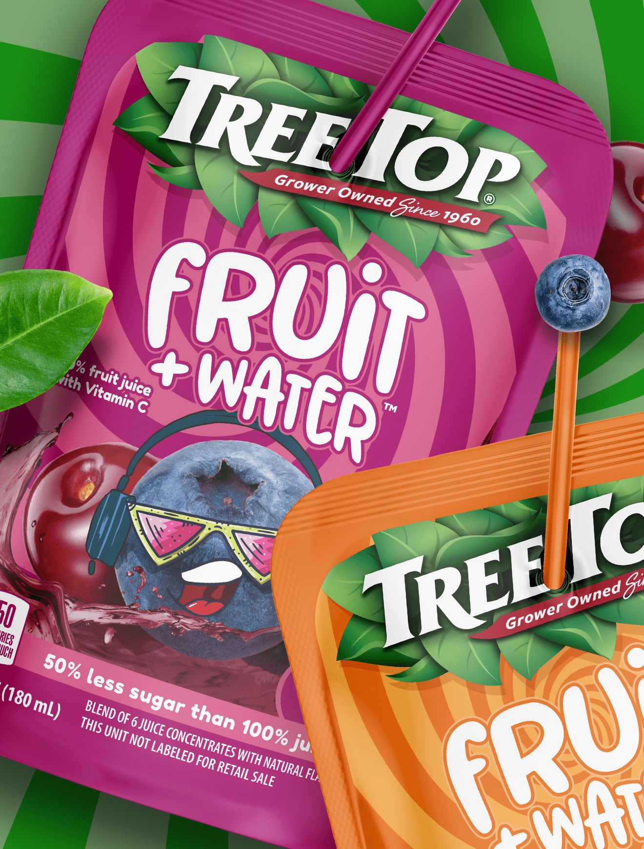
Fast-growing brands rarely stay static. What works at launch isn’t always what sustains momentum at scale.
This update shows a clear shift in strategy. The original execution leaned heavily into white space and icon-driven cues, signaling nutrition and functionality. It felt clean, but also slightly clinical, closer to kids’ nutrition than adult performance.
The new system flips that balance. Color takes over. Flavor becomes the hero. The fruit is larger, juicier, and far more expressive. That visual intensity matters in a crowded cooler where appetite cues drive trial. The 30g protein callout is still prominent, but now it sits within a more indulgent, craveable frame.
From a Costco packaging design standpoint, this makes sense. Big-box environments reward bold color blocking and clear benefit communication from a distance. The move toward stronger flavor equity mirrors what we see in adjacent categories, even in produce packaging design, where visibility and vibrancy directly influence perception of freshness.
It’s a smart evolution. Same core promise. Stronger shelf presence.
Subscribe to
Nice Package.
SmashBrand’s Nice Package: Stay current with our latest insights
Free Resource.

CPG product repositioning guide.
Explore the five undeniable signs your CPG product needs repositioning along with strategies for leveraging consumer insights for a guaranteed market lift.
Download Whitepaper About CPG product repositioning guide.