Description
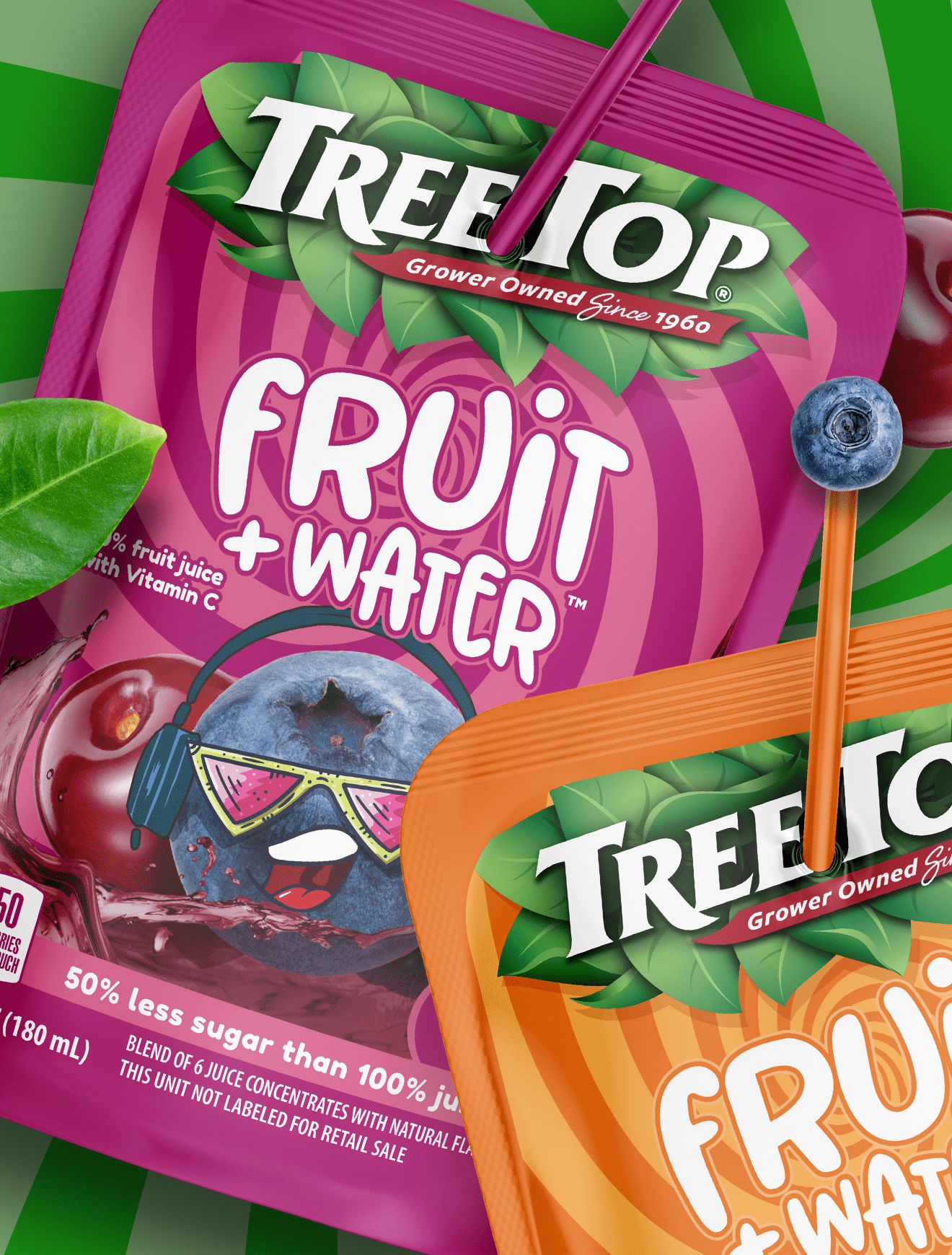
Brand extension can be a powerful growth strategy, but only if it’s executed with clarity. In this case, the transition from pasta sauce into soup creates confusion rather than differentiation.
The biggest issue is visual overlap. Using the same jar, color palette, and overall look as the pasta sauce line makes it difficult to immediately recognize this as soup. While that familiarity may help with brand recognition, it blurs product boundaries, especially in real-life usage moments like grabbing something from the pantry.
Structure plays a critical role here. A clear glass jar works well for pasta sauce, where the product typically looks smooth and appetizing. But with soups, especially chunkier varieties, the same transparency can work against appetite appeal. Visible separation, texture, and settling can make the product look less appealing, even if the quality is high.
This is where strong food packaging design and CPG packaging strategy come into play. Structure should reinforce both the category and the consumption experience. If it creates confusion or reduces the appeal of the product, it’s working against the sale.
Sometimes differentiation isn’t about standing out; it’s about being understood instantly.
Subscribe to
Nice Package.
SmashBrand’s Nice Package: Stay current with our latest insights
Free Resource.

CPG product repositioning guide.
Explore the five undeniable signs your CPG product needs repositioning along with strategies for leveraging consumer insights for a guaranteed market lift.
Download Whitepaper About CPG product repositioning guide.