Defending market share with ownable packaging.
Duracell, the leading battery manufacturer, came to us to help them recharge their packaging by standing out from a crowd of copycats and improving brand recall.
The Challenge
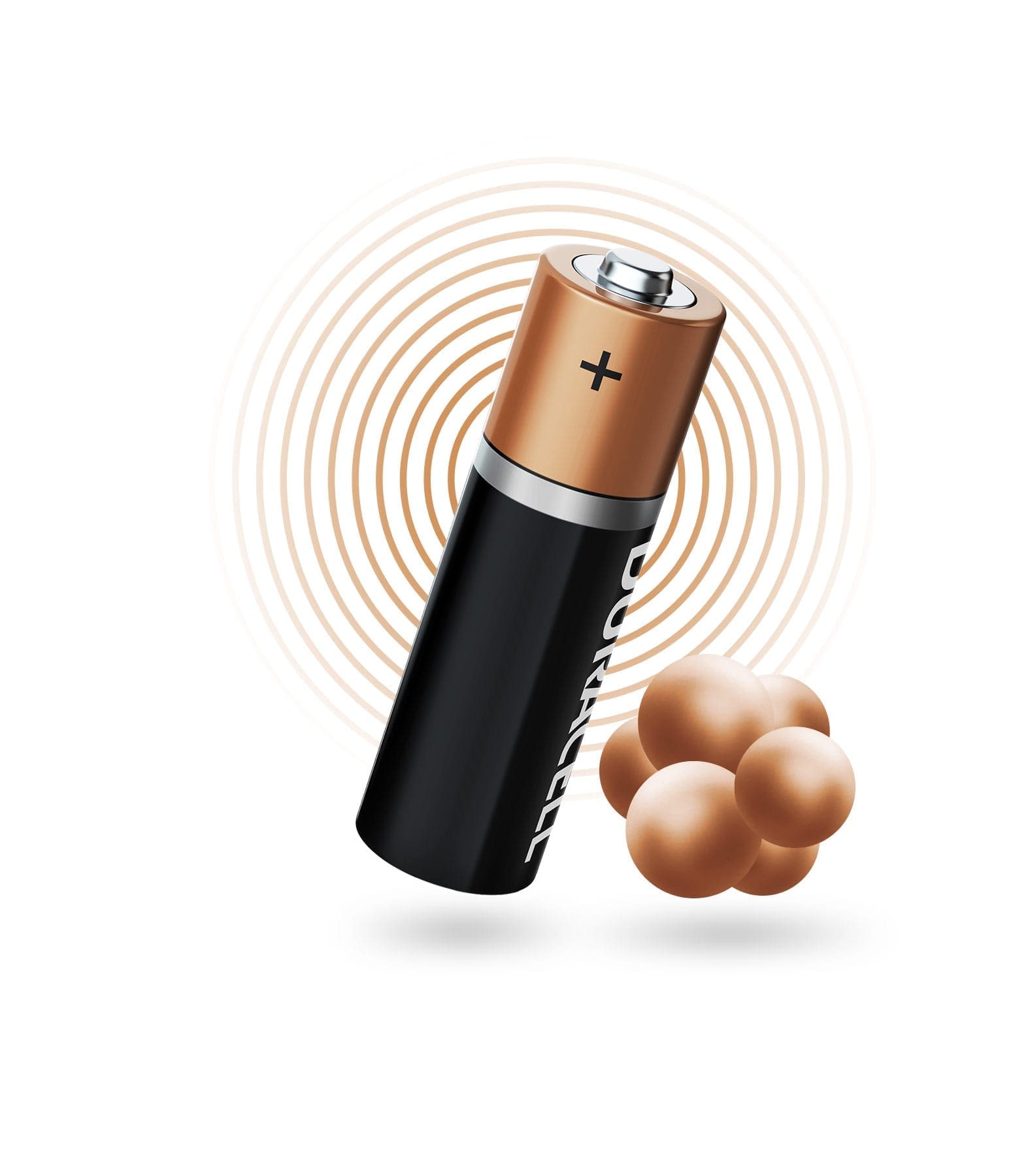
Duracell is an iconic, household brand needing no introduction. Despite the strength of their long-standing brand and quality of their product, they face continued and increased competition and desired to explore design concepts that could maintain the iconic feel of their coppertop battery, while modernizing and refreshing the brand for the shift in socio demographics for the next decade and beyond.
The Brief
Improve brand affinity with ownable packaging.
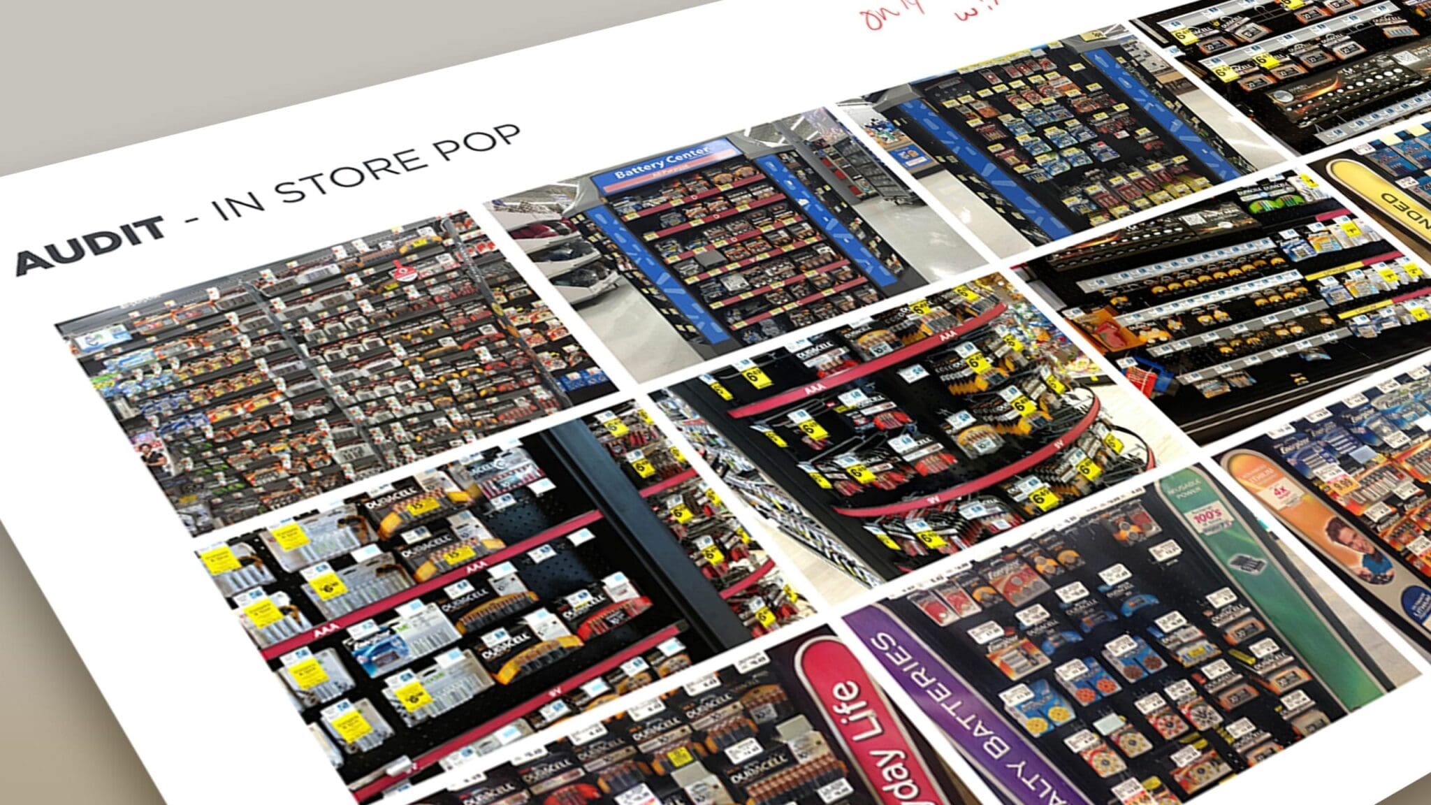
Duracell needed to defend their position as the go-to battery brand. To do that, they wanted us to explore packaging that would stand out on the shelf while remaining true to the globally-recognized product.
Case Study
How can leading brands defend themselves from imitators and maintain their market share?
Imitation may be the highest form of flattery, but when private labels start diluting your brand and eating into your market share, it’s the last thing you want. Our challenge was to create packaging true to Duracell’s brand and prevent imitation.
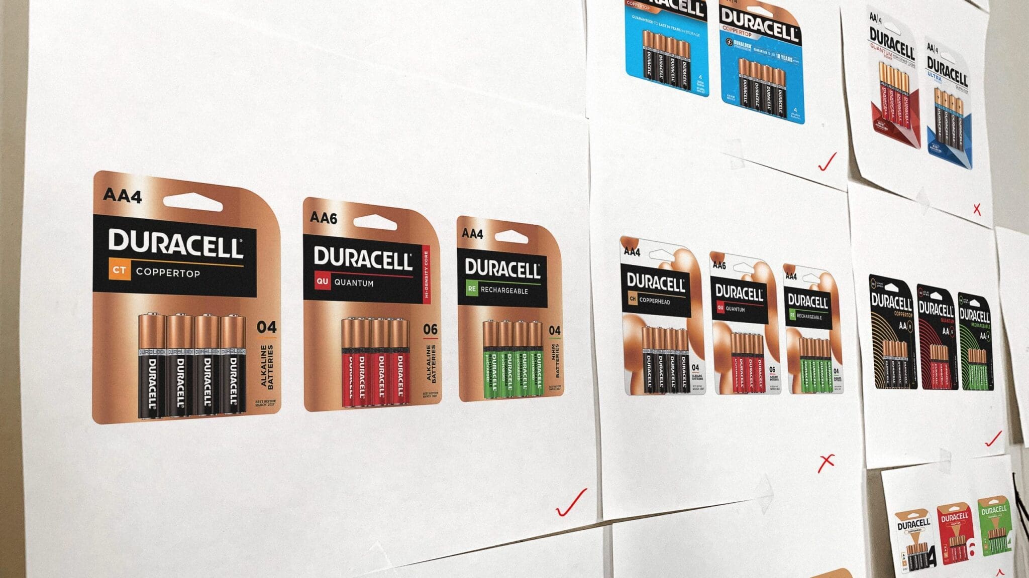
We leaned into the core of Duracell’s identity, the parts that couldn’t be copied, and let those inform the eventual packaging design exploration. The key was to communicate a sense of quality that other brands couldn’t emulate.
What We Did
The Process
Brand Strategy
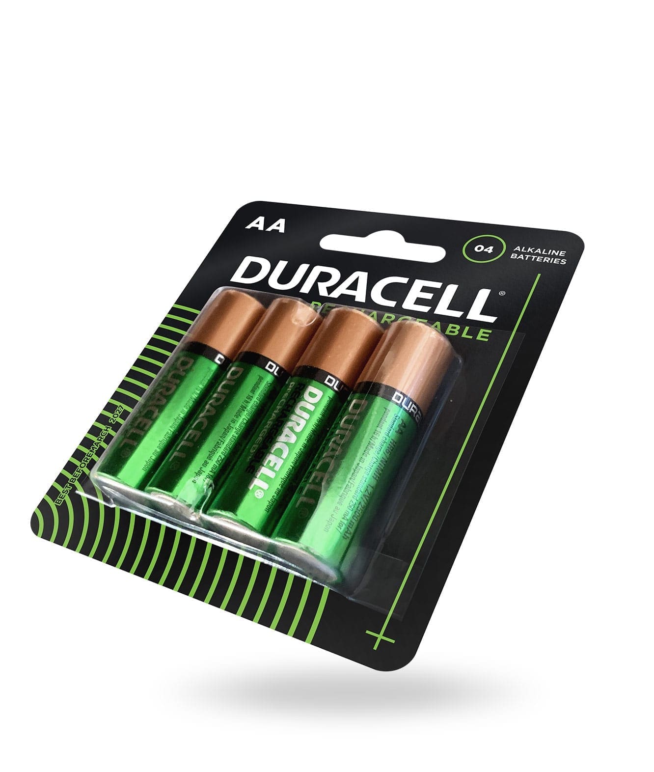
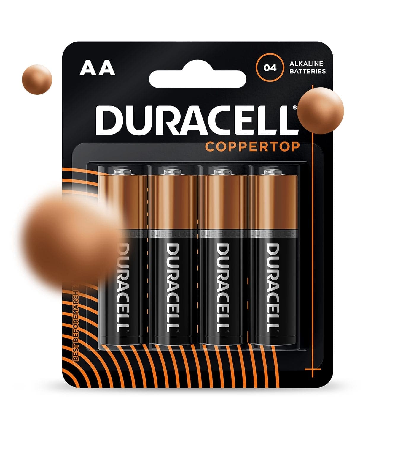
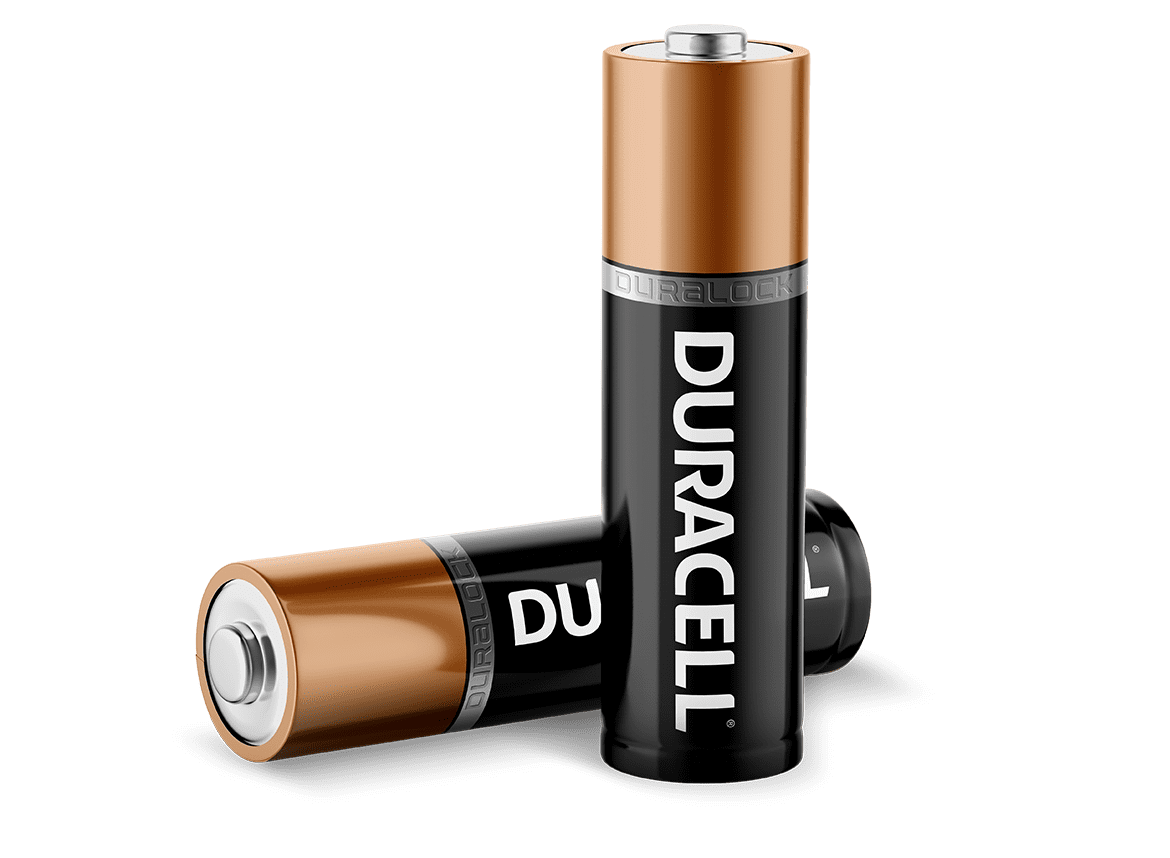
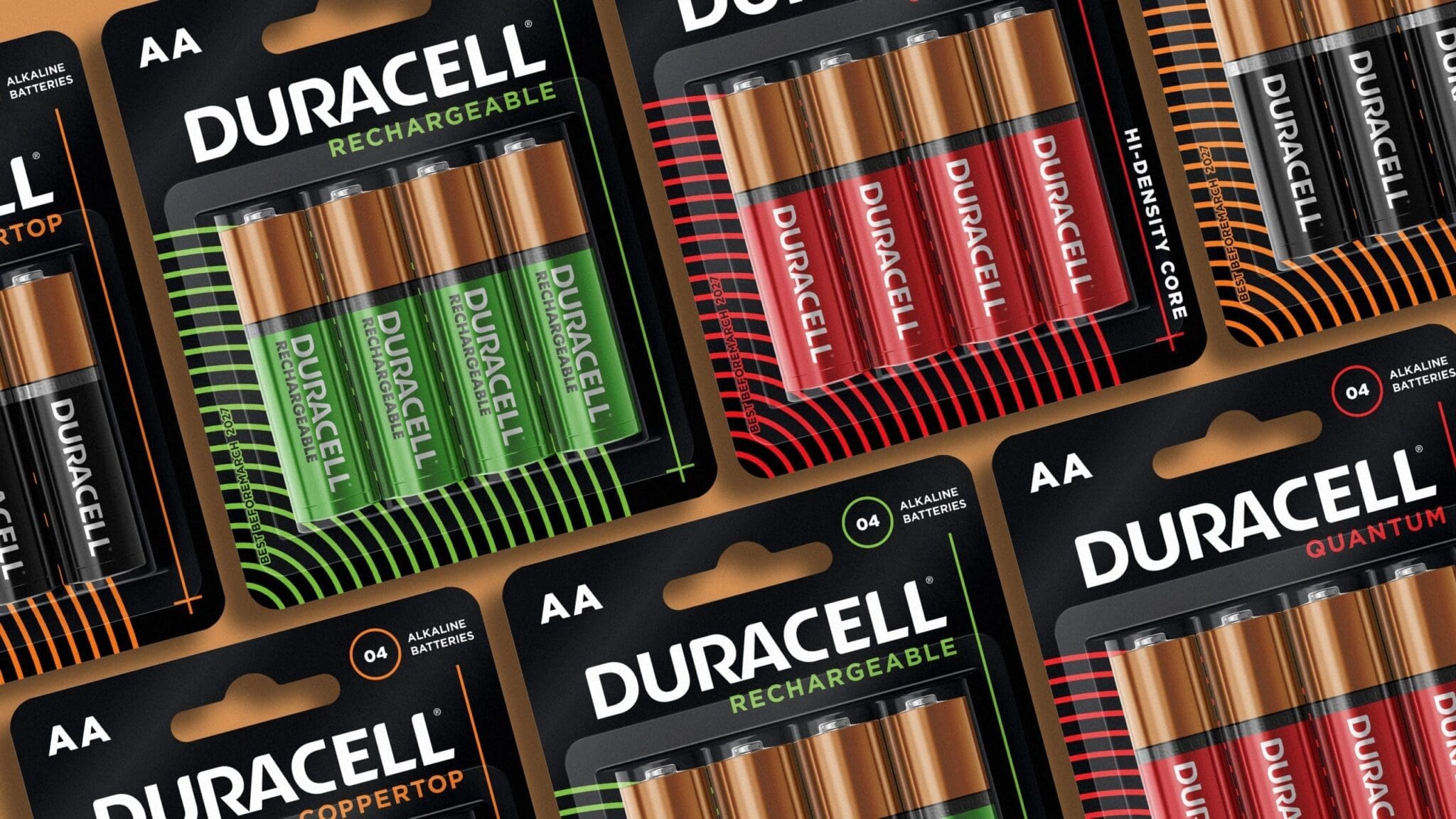
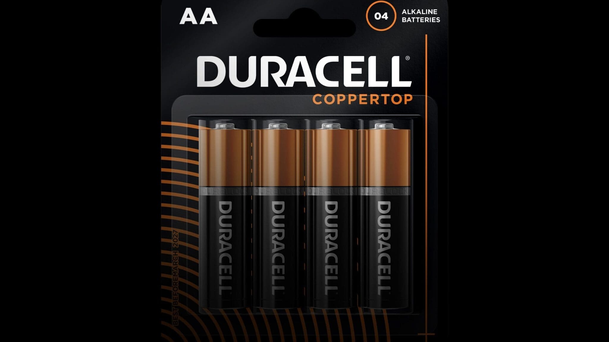
Creating an ownable brand means using unique, unimatable design elements. For Duracell, that was their iconic copper top. We decided to build the packaging concepts around that, using Duracell’s instantly recognizable black and copper color scheme to stand out.
Packaging Design
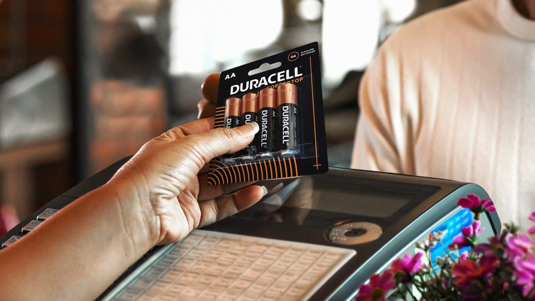
On top of the black and copper design, we added different colors for different product lines, making it easier for consumers to choose the right battery. We included visual cues to make people think about what’s inside the battery, and the quality of Duracell.
Leveraging Equity
Duracell needed high levels of brand recall so our designs focused on reinforcing the trust with their iconic black and copper colors and creating visual cues to drive the attention and visual disruption though distinctive assets.
Smash will push you past your comfort limit in efforts to drive a true breakthrough experience for your brand.
Duracell North America
